50 Shades of Tory Blue

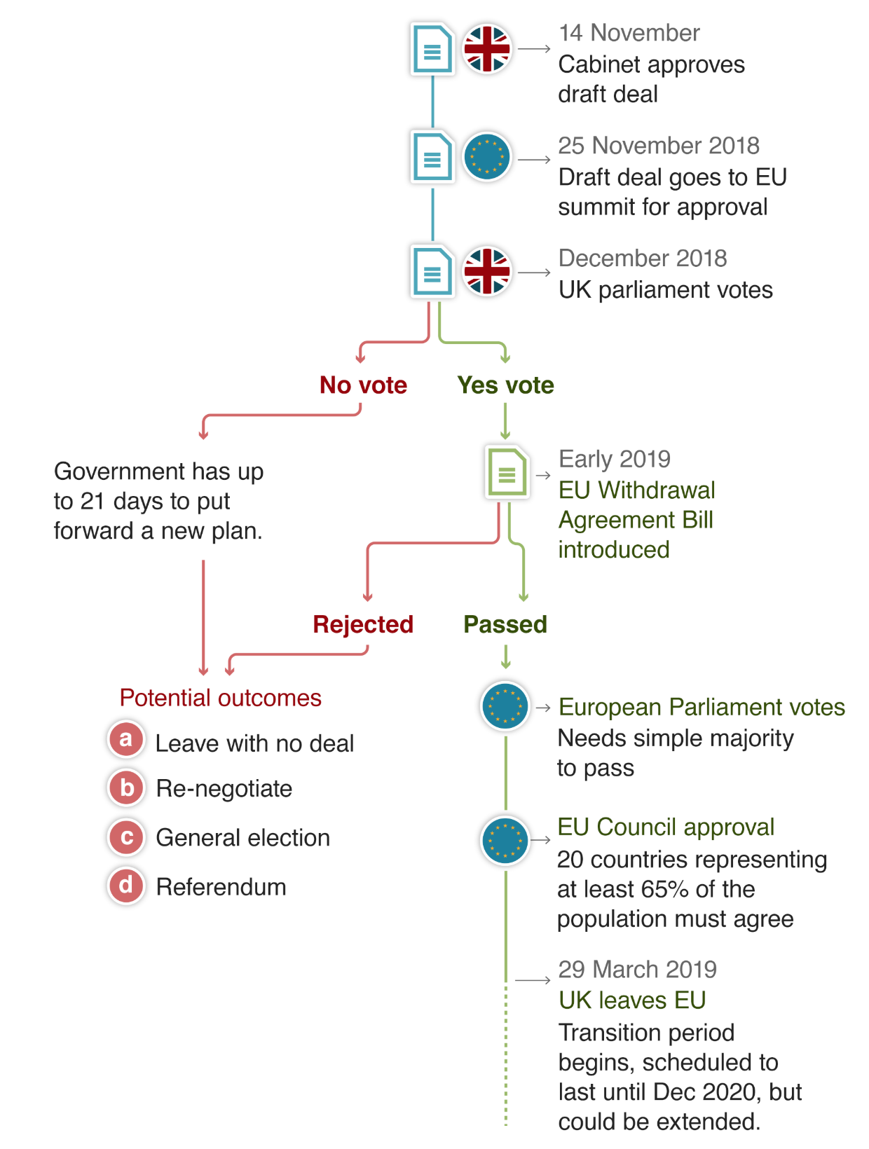
It is Monday, so it must be another Brexit vote day. And today we have Indicative Vote Day 2. If you recall from last week, the House of Commons wrestled control over parliamentary business away from the government and created a two-step process to try and see if any alternative to Theresa May’s Brexit plan can receive a workable, sustainable majority in the House.

The first step went about as well as could be expected. Nothing received a majority, but a customs union and a confirmatory vote by the public on the final deal both came very close to a majority: 8 and 27 votes, respectively. Likely, the vote today will be on those options.

But one reason for this lack of majority is that the idea of Europe has always fractured the Conservative Party. And in a recent piece by the Economist, we can see just how fractured the Tories have become.

The Tories are all over the plot

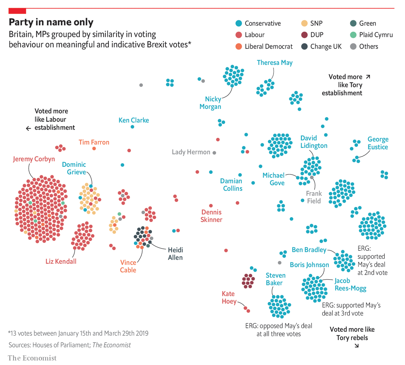
Maybe a little bit counterintuitively, this plot does not look at an MP’s opinion on Brexit, but just with whom they are more likely to vote. The clearest takeaway is that whilst Labour remains relatively united, the Tories are in a small little divisions across the field.

In terms of design, there is not much to comment upon. It is not a scatter plot in terms of the placement of the dots does not refer to Brexit opinions, as I mentioned. It is more about the groupings of MPs. And in that sense, this does its job.

Credit for the piece goes to the Economist Data Team.

Demanding the Impossible

The key problem in the Brexit deal remains what to do with the Irish border. In essence, the UK faces the same trilemma it has since the beginning. It wants three things it cannot have at the same time: exiting the EU single market and customs union, so it can create a free and independent trade policy; no hard border between Ireland and Northern Ireland, per the Good Friday Agreement that ended the Troubles; and territorial integrity, i.e. no hard border between Northern Ireland and the rest of the UK in the Irish Sea.

Essentially, the UK can choose two of these three options. Below, I have attempted to show how they relate and what the result is once two of the options have been chosen.

Choose two and only two.

Credit for the piece is mine.

Another Week, Another Brexit Day

Well we have another week and so we have another fraught day of House of Commons votes on Brexit. Once again, it looks like HM Government will lose all the votes, but the question is by how much? Significant defeats means there will be little support, but smaller defeats might show the European Union that it needs to open up the Brexit Withdrawal Agreement and renegotiate it.

But that’s not all. As this piece last week from the Economist shows, the Withdrawal Agreement is just one piece—an admittedly very large piece—of many pieces of legislation that need to be passed into law to manage the UK’s withdrawal from the EU. And while some have indeed been passed, many others are languishing.

So much to do, only a handful of business days in which to do it…

The piece overall is effective. It clusters the bills into those that have been passed and those still in the works. And then within each of those, the various stages of the British legislative process exist as colour-coded dots. My quibble would be with those dots. There are a few instances where dots overlap and I would have either made the dots transparent or stacked them vertically above and below the line, just to make it clearer to the reader where the dots are located.

Credit for the piece goes to the Economist Data Team.

What’s Next, Brexit?

A no confidence vote on Theresa May’s government, that’s what.

For those not familiar with parliamentary democracies, basically a no confidence vote is held when a substantial number of members of parliament have just that, no confidence, in the government of the day. The legislative body then votes and if the government wins, the government stays in power. If the government loses, typically, though not always, a new election is held to create a distribution of seats—it’s thought—that will yield a government that can hold the confidence. (There really is not an analogy for this in the US government that I can think of.)

To be fair, nobody really expects May’s government to collapse this afternoon. The Tories and her Democratic Unionist Party (a small Northern Irish party supporting the government) do not want to hold new elections nor do they want to give the Leader of the Opposition, Jeremy Corbyn, the chance to form his own government as much as they might despise May and her Brexit deal. So in all likelihood May survives by a dozen or so votes. On the other hand, the result yesterday was surprising in its scale, so could twenty or so of the 118 Tories who voted no vote against May? Possibly.

So then what next? Thankfully the Guardian put together two calendars showing just what happens and, crucially, in the context of how much time remains until the UK crashes out of the EU.

In case she wins, as we expect.

It still doesn't leave a lot of time to figure out what to do.
It still doesn’t leave a lot of time to figure out what to do.

If she loses, which is possible, but unlikely.

The UK would have even less time in this scenario.

The key thing to note is that the election campaign would eat up most of the time left and leave the UK very little time to do anything but ask the EU for an extension.

These are two small, but really nicely done graphics.

Credit for the piece goes to the Guardian’s graphics department.

The Brexit Deal Vote

Today’s (one of) the day(s). For those of you who haven’t followed Brexit, the British Parliament will vote this evening on whether to accept the deal Prime Minister Theresa May negotiated with the European Union…or not. And if not, well, the government now only has three—instead of the original 21—days to figure out a Plan B.

Of course this vote is only happening today because the government punted back in December when it was clear they were going to suffer a substantial loss. And back then, the BBC prepared this article about Brexit, where it was and where it was going. Funny thing is, after a month, not much has changed.

The screenshot below is of the process. As I noted above, the most critical change is that the government no longer has 21 business days to figure out what’s next. So instead of, to use the American football phrase, running out the clock, May will have to come up with something and present it to Parliament before 29 March, the day the UK leaves by statute.

How neat and orderly it must all seem…

I think the thing missing from the graphic is the chaos that happens if the deal is rejected. And while that may have been far from clearly the most obvious result two and a half years ago, it is now. And Parliament is scheduled to start voting around 19.00 GMT, or 14.00 EST for those of us on the East Coast or 13.00 CST for those of you in the Midwest.

Credit for the piece goes to the BBC graphics department.

The London Job Exodus

Brexit is bad for Britain. Here is some proof from an article by Bloomberg that looks at where London-based banking jobs are headed post-Brexit. Spoiler alert, not elsewhere in Britain. The article purports to be more of a tracker in that they will add on data about jobs moving places when news breaks. But I cannot verify that part of the piece.

What I can verify is a sankey diagram. Underused, but still one of my favourite visualisation forms. This one explores where companies’ London-based banking jobs are moving. Right now, it clearly says Frankfurt, Germany is winning.

Look at all those job…

As sankeys go, this one is pretty straightforward. Aesthetically I wonder about the colour choice. I get the blues and that the banks are coloured by their ultimate destination. But why the gradient?

But conceptually the big question would be what about London? I probably would have kept London in the destination set. While many jobs are likely to leave Britain, some will in fact stay, and those lines will need to go somewhere in this graphic.

The piece also makes nice use of some small multiple maps and tables. All in all, this is a really solid piece. It tells a great—well, not great as in good news—story and does it primarily through visuals.

Credit for the piece goes to Gavin Finch, Hayley Warren and Tim Coulter.

Open Door Cabinets

Here in the States we are accustomed to unstable governments—the Trump administration has set records for the most departures so early in its term. But the United Kingdom is not to be outdone as Amber Rudd, the Home Secretary, resigned in response to an immigration scandal. She makes six the number of cabinet officials who have left the British government.

The Economist put together a small graphic showing how long it took various governments, British and otherwise, to reach the level of so many departures. May’s government has been the fastest to reach so many departures in recent years.

I wonder where the US administration falls…

The key thing to note here is what I pointed out last week, which is the use of a thin white stroke on the outside of the lines being highlighted with the Theresa May government using a bolder weight to make it stand out just a wee bit more. This is a bit different than the Times version which uses the outline approach for only what would here be the May line, but it still works overall to draw attention to the British governments.

Credit for the piece goes to the Economist graphics department.

Adding to the British Line of Succession

When I woke up this morning, the BBC was reporting that the Duchess of Cambridge was in labour. Clearly by the time I sat down to write today’s blog post, she gave birth to the child, a boy. And so now we have this graphic from the BBC showing how the new child fits into the line of succession to the British throne.

Family trees always fascinate me

In all likelihood, the BBC had this graphic prepared well in advance. And once the child’s name is announced, it can be rapidly updated to include that additional information.

An interesting quirk I wanted to point out was the graphic’s use of orange. The graphic clearly shows how purple is used for the line of succession (and the dotted lines for divorce). But, what about the two orange circles, one for Philip, Duke of Edinburgh, and the other Prince Harry? Interestingly, those two are both in the line of succession as well, just not directly.

For example, Harry becomes monarch only if William and his children all die without heirs. But we all sort of knew that. Philip, on the other hand, is a few hundred down on the list, but is himself also eligible. Though the odds of that happening are so remote it’s a wonder it was put on the graphic. But still a neat little piece of trivia.

Credit for the piece goes to the BBC graphics department.

Post-Brexit Trading

Off of yesterday’s piece looking at the potential slowdown in British economic growth post-Brexit, I wanted to look at a piece from the Economist exploring the state of the UK’s current trade deals.

Still loathe the use of bubbles though…

I understand what is going on, with the size of the bubbles relating to British exports and the colour to the depth of the free trade deal, i.e. how complex, thorough, and wide-ranging. But the grouping by quadrant?

With trade, geographical proximity is a factor. Things that come from farther cost more because fuel, labour time, &c. One of the advantages the UK currently has is the presence of a massive market on its doorstep with which it already has tariff- and customs-less trade—the European Union.

Consequently, could the graphic somehow incorporate the element of distance? The problem would be how to account for routes, modes of transport, time—how long does a lorry have to queue at the border, for example. Alas, I do not have a great answer.

Regardless of my concepts, this piece does show how the most valuable trade partners already enjoy the deepest and largest trade deals, all through the European Union. And so the UK will need to work to replicate those deals with all of these various countries.

Credit for the piece goes the Economist Data Team.

The NHS Winter Crisis

In the United Kingdom, the month of January has been less than stellar for the National Health Service, the NHS, as surgeries have been cancelled or delayed, patients left waiting in corridors, and a shortage of staff to cope with higher-than-usual demand.

But another problem is the shortage of hospital beds, which compounds problems elsewhere in hospitals and health services. The Guardian did a nice job last week of capturing the state of bed capacity in some hospitals. Overall, the piece uses line charts and scatter plots to tell the story, but this screenshot in particular is a lovely small multiples set that shows how even with surge capacity, the beds in orange, many hospitals are running at near 100% capacity.

Some of the worst hospitals

Credit for the piece goes to the Josh Holder.