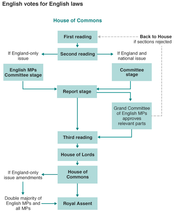
Last week the British government announced plans to solve the West Lothian Question that centres on devolution parity for England. Many legislative powers have been devolved from London and given to the regional parliaments in Scotland, Wales, and Northern Ireland. And on the one hand that is great as the national parliament no longer tells Scottish schools what to do, which is important because of England’s clout in London because England is by far the largest part of the Union. But the on the other hand, Scottish, Welsh, and Northern Irish MPs still get to vote on schools in England. You can begin to see how the English feel that is unfair.
So the BBC put together this graphic trying to explain what was announced, because it is far more complicated than just giving England its own parliament. It’s a tricky and complicated issue that is worth a read. If only because the government apparently did not realise that its plan can be acronymised to EVEL.
It’s EVEL I tell you. Pure EVEL.
Credit for the piece goes to the BBC graphics department.
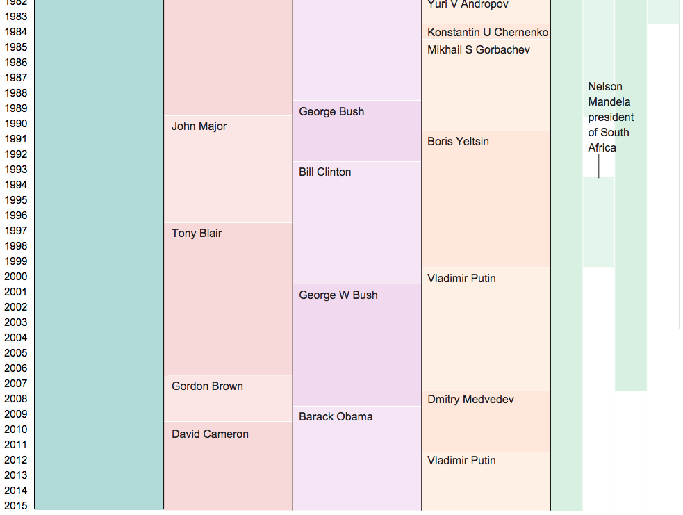
As of today, Queen Elizabeth is the longest reigning British monarch. She has surpassed the record of the famous Queen Victoria, Elizabeth’s great-great-grandmother at 63 years and seven months. Obviously a lot of things have changed over those 63 years, and in this article the BBC uses a graphic to look at how the world stage has changed.
Queen Elizabeth II’s reign
Credit for the piece goes to the BBC graphics department.
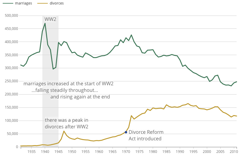
Friday was Victory in Europe Day, or VE Day for short, which marks the end of World War II in Europe. (The war continued in Japan for a few more months.) Anyway, the United Kingdom’s Office of National Statistics put together a couple of charts looking at the war’s impact on the structure of the British population. Many know the baby-boom phenomenon. But, did you know about the divorce-boom phenomenon?
Marriage and divorce rates over time
Credit for the piece goes to the ONS Digital team.
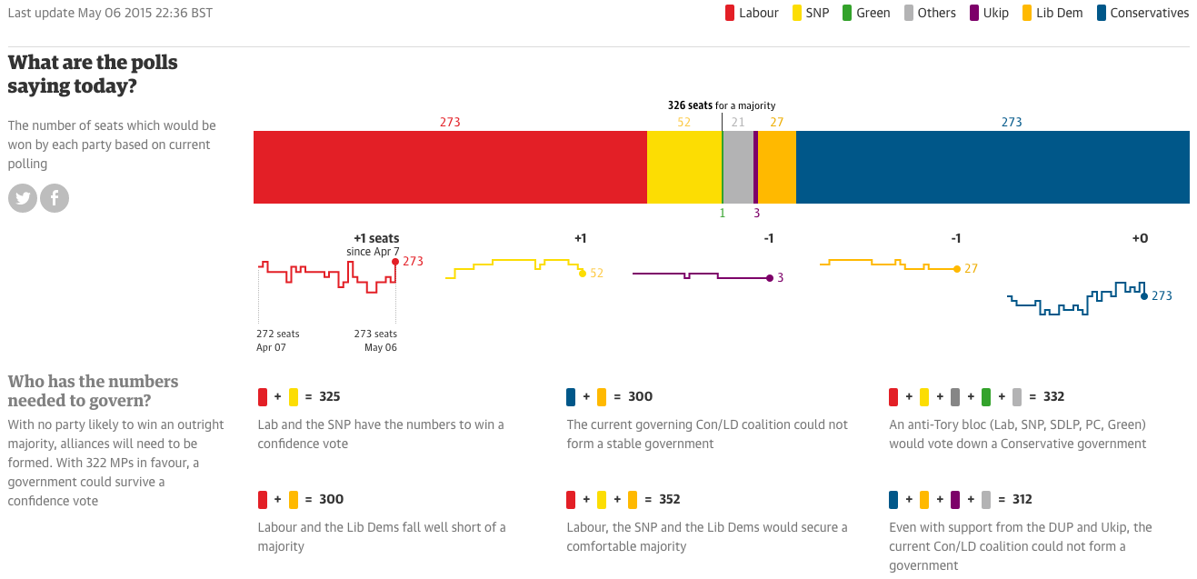
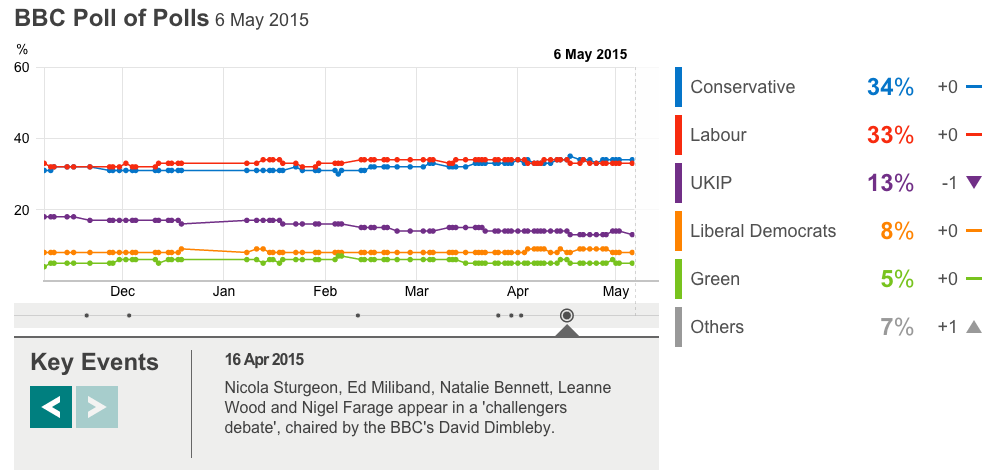
Well for those of you among my British audience, today is the big day. Can Malcolm Tucker save Nicola Murray from—wait, nope, that’s fictional British politics. But that doesn’t mean today’s results won’t be exciting. For those of you now from the UK, a majority of my readers, the UK is looking at what is called a hung parliament. In other words, nobody will win a majority of seats, which means that smaller parties will need to be included in a coalition government, a sort of fairly new—but also not really—development in British politics.
We could dive deep into all of these, but I have not the time. But, let’s start with the Guardian. They have a nice set of polling and prediction guesstimators. What is really nice, however, is the seat changing graphics. These show you where the gains and losses are predicted to originate.
The Guardian’s predictions
The BBC has a much less involved piece. This is the only thing I can find. However, the BBC will undoubtedly have interesting visuals during their live broadcast of the results. Jeremy Vine can always be counted on for weird presentational things. Oh, and they have the swingometer.
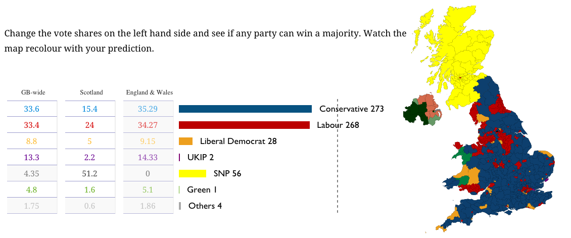
The Economist has a nice poll tracker with some simple controls for some simple filtering. But, these are, like the BBC’s, without an impact of number of seats. The Economist does, however, offer a separate build-your-own-majority calculator.
What the Economist shows on their Election homepage
The New Statesmen has built a site dedicated to May 2015, and their current predictions are as follows below.
New Statesmen’s predictions
The only drawback to all of these pieces is that I will be busy coaching softball tomorrow night. So I will be unable to watch the BBC’s coverage of election results. And that is most unfortunate, because British politics are far more fascinating than the bland and boring two-party politics of the United States.
Credit for the Guardian piece goes to Caelainn Barr, Helena Bengtssoni, Chia-Jung (Apple) C.Fardel, Seán Clarke, Cath Levett, Alberto Nardelli, and Carlo Zapponi.
Credit for the BBC piece goes to the BBC graphics department.
Credit for the Fivethirtyeight piece goes to Matthew Conien and Ritchie King.
Credit for the Economist piece goes to the Economist’s graphics department.
Credit for the New Statesmen piece goes to the May 2015 graphics team.
(To be fair, I forgot to schedule to publish this post before I left somehow.)
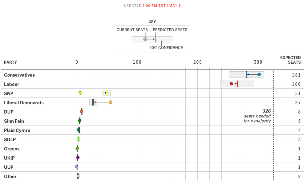
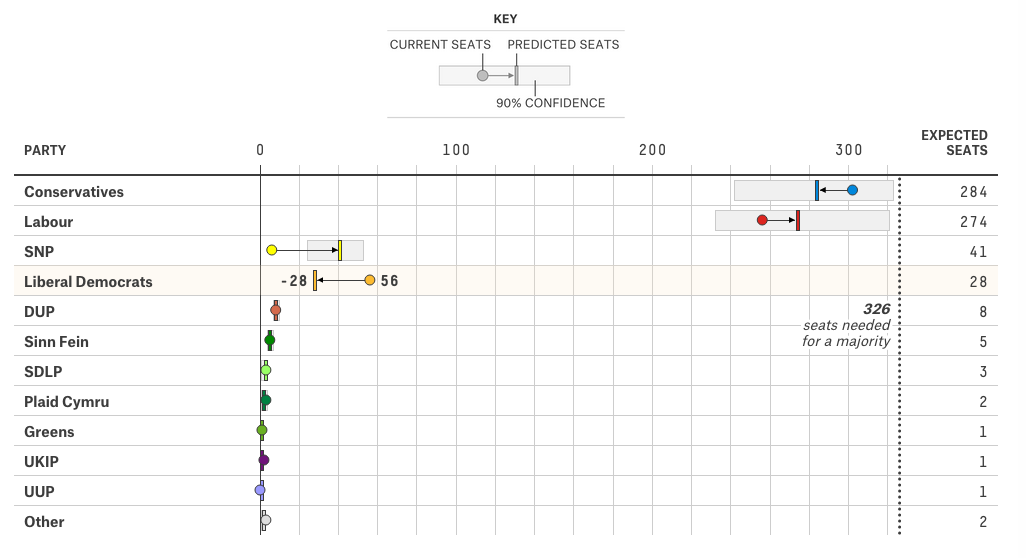
Your humble author is still on holiday. So, today, you can enjoy a nice interactive piece from FiveThirtyEight that predicts the results of the 7 May general election. Of particular interest, the box part of the plot that shows the 90% confidence range.
Dot plotting the results
The piece also has a choropleth map. My only feature request(s) would be to have a zoom feature for urban constituencies and/or to have a search field that allows the user to see the predicted results for a specific constituency.
Credit for the piece goes to Matthew Conlen and Ritchie King.
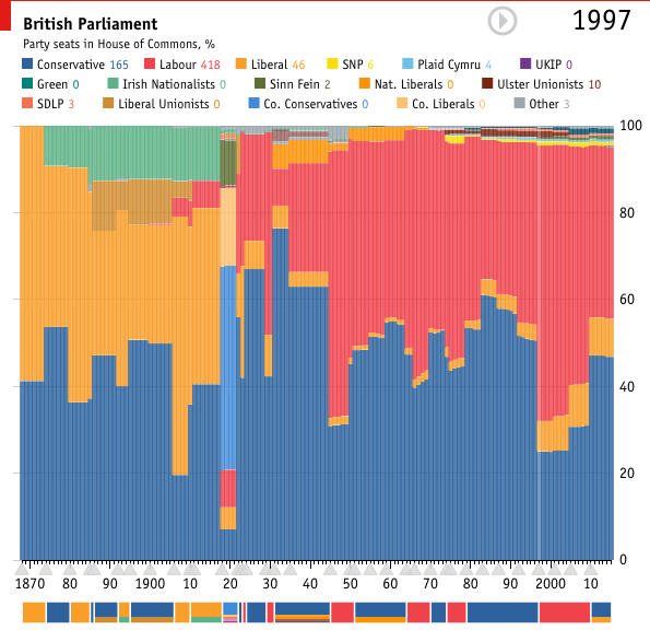
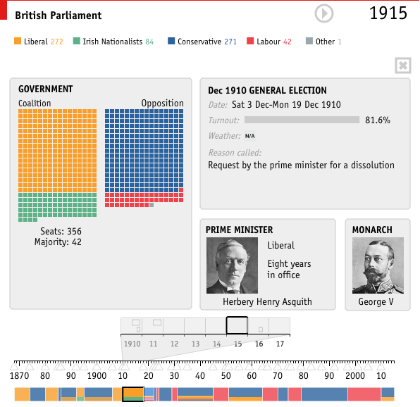
For those of you who don’t know, the British Parliament was dissolved today ahead of the 7 May elections. In other words, it is now election time. Last week the Economist published a small interactive piece that allows you to look at the composition of the British Parliament from 1870 through today.
Parliament over the years
While many (some?) of us would remember times from recent history, e.g. the 1997 electoral victory of Tony Blair, the memory might be a bit foggier one hundred years in the past. But to help you, if you click on a particular year, the view changes from an overview to a focus on Parliament in that particular year.
Parliament in 1915
Credit for the piece goes to the Economist’s Data Team.
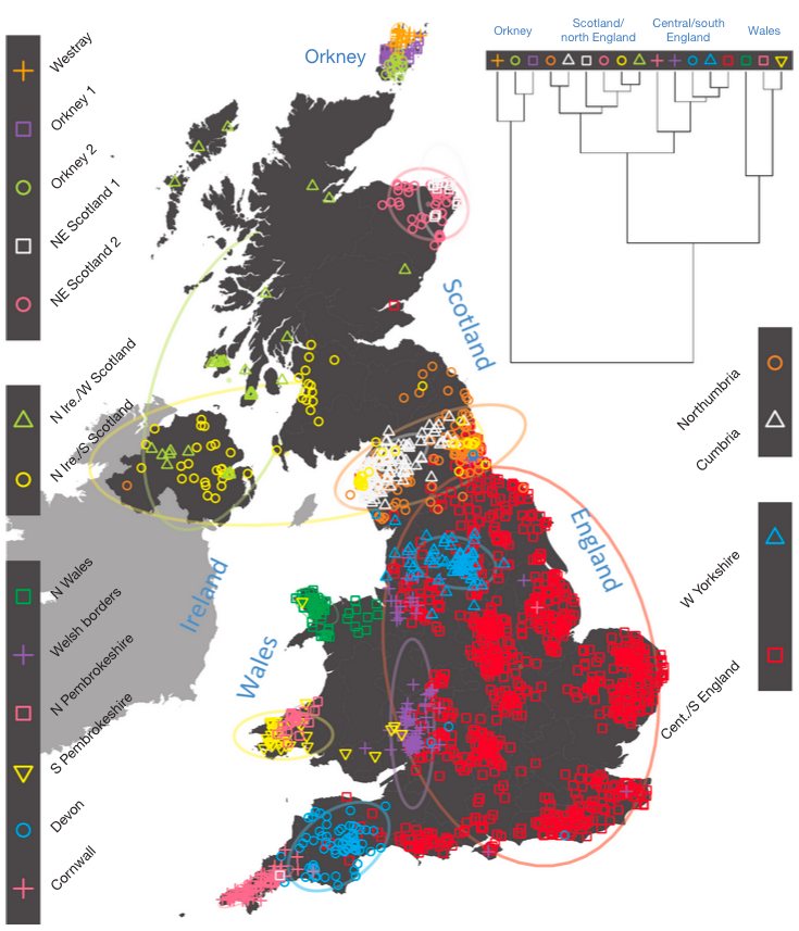
I always enjoy the combination of two of my interests: data visualisation and genealogy. So this BBC article that references a Nature article piqued my interest. It looks at the distribution of DNA across the United Kingdom and identifies different cluster areas. The most important finding is that the Celts, i.e. the people of Scotland, Northern Ireland, Wales, and Cornwall are not a single genetic group. Another finding of interest to me is that the people of Devon are distinct from both Cornwall and Dorset, Devon’s bordering regions. That interest is because my New England ancestors largely hailed from Devon and Dorset.
The colours don’t imply relationships, for what it’s worth
Credit for the piece goes to the Nature article authors.
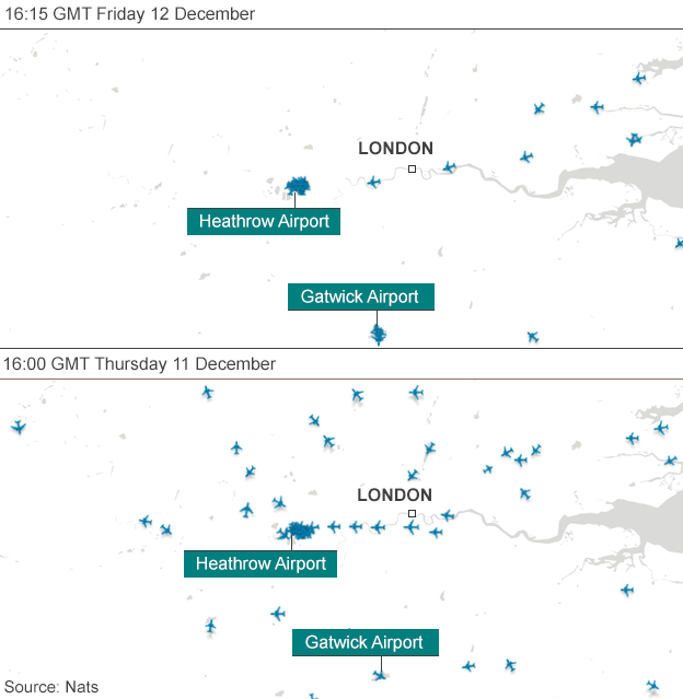
Last week, there was a disruption at the air traffic control centre for the United Kingdom. It caused many travel problems. And the BBC included a graphic showing how the problem was shutting down London air space.
Empty skies over London
Credit for the piece goes to the BBC graphics department.
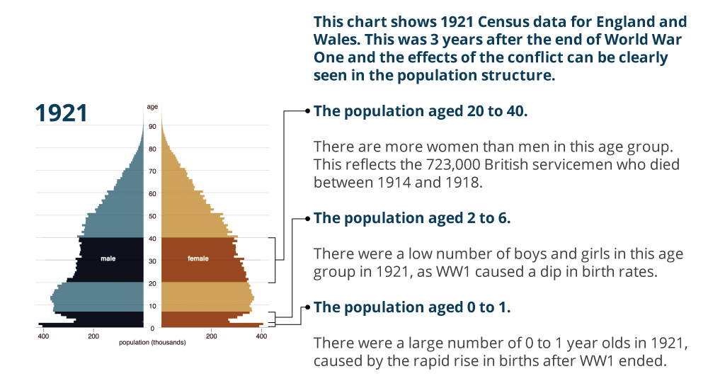
Today is Armistice Day, alternately known as Remembrance Day or Veterans Day. Originally the date remembered the armistice that ended World War I (hence those two names). The war ended at the 11th hour on the 11th day of the 11th month. But in the preceding years, millions of Europeans died along with just over a hundred thousand Americans. (We entered the war quite late.) This had a dramatic impact on the populations of European countries. In the United Kingdom, the Office of National Statistics put together a page for Remembrance Day 2014 that looks at four charts detailing the changes to the UK’s population structure. Suffice it to say there were lasting effects.
UK population in 1921
Credit for the piece goes to the ONS graphics department.
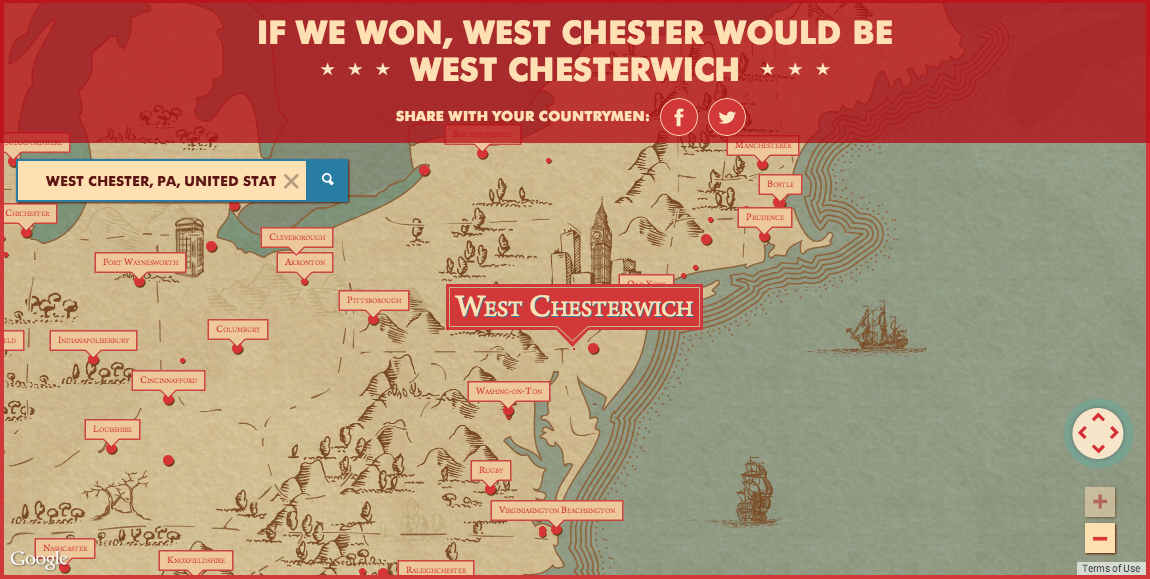
A few weeks ago, one of my coworkers, sent me a link to a Newcastle Ale campaign video asking what would America be like if Britain had won the Revolutionary War. Anybody who knows me really well knows I am an Anglophile. I say mobile instead of cell phone, from time to time I switch from apartment to flat or truck to lorry or elevator to lift. So naturally I checked out the campaign site and what did I find? A map of place names if the Americans had not won the war. You can search for your residence or hometown and see what the Brits would have named it.
Though this ignores the fact that most of where I am from was actually named by the Brits. West Chester was originally called Turk’s Head, but after the a bunch of boundary changes that separated the British named Chester from my area, Turk’s Head was renamed West Chester because it is west of Chester, located on the Delaware River. Anyway, place names are cool. Happy Friday, everybody.
I would have grown up in West Chesterwich
Credit for the piece goes to the design team behind the ad campaign.