Bus Transit in Philadelphia

I have lived in Philadelphia for almost ten months now and that time can be split into two different residences. For the first, I took the El to and from Centre City. For the second, I walk to and from work. I look for living spaces near transit lines. In Chicago I took the El for eight years to get home. But to get to work, I often used the 143 express bus. Personally, I prefer trains and subways to busses—faster, dedicated right-of-way, Amtrak even has WiFi. But, busses are an integral part of a dense city’s transit network. You can cram dozens of people into one vehicle and remove several cars from the road. Here in Philadelphia, however, as the Inquirer reports, bus ridership is down over the last two years at the same time as ride-hailing apps are growing in usage.

For those interested in urban planning and transit, the article is well worth the read. But let’s look at one of the graphics for the article.

Lots of red in Centre City

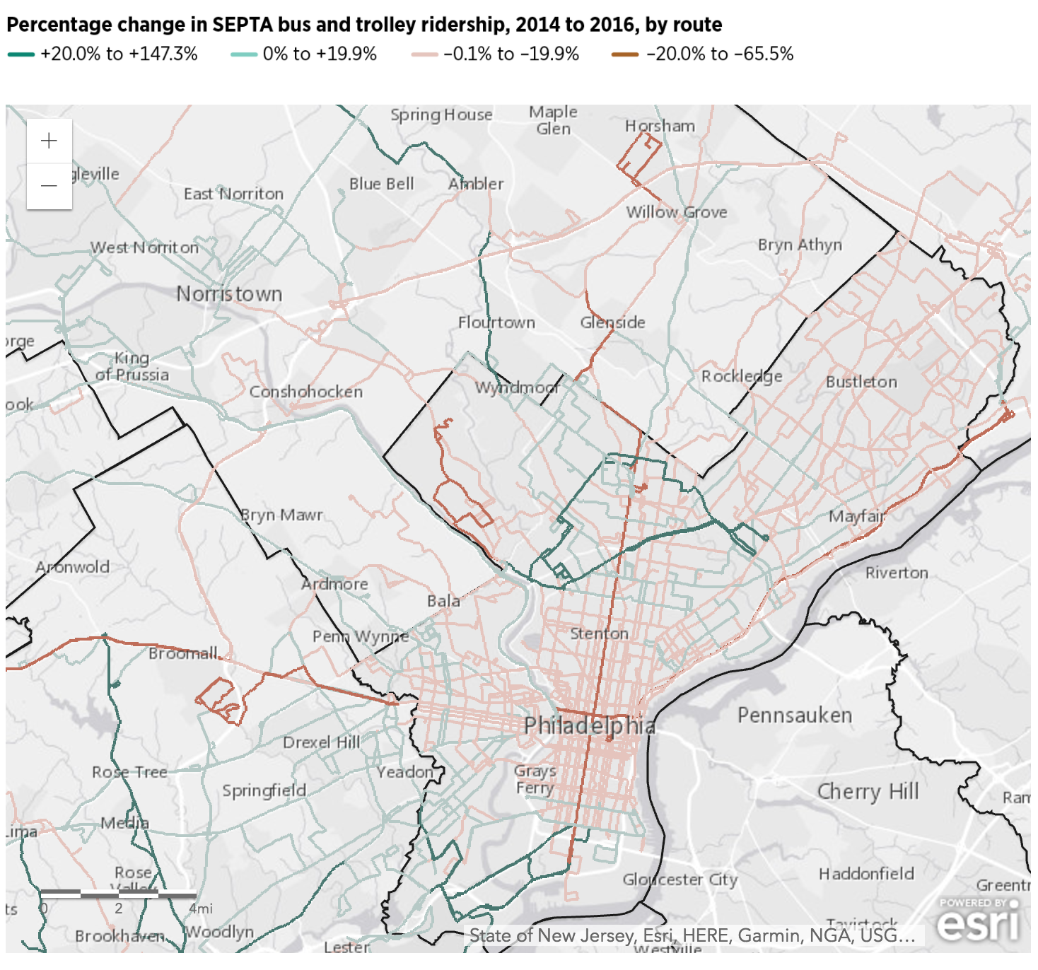
The map uses narrow lines for bus routes and the designer wisely chose to alternate between only two shades of a colour: high and low values of either growth (green) or decline (red). But, and this is where it might be tricky given the map, I would probably dropdown all the greys in the map to be more of an even colour. And I would ditch the heavy black lines representing borders. They draw more attention and grab the eye first, well before the movement to the green and red lines.

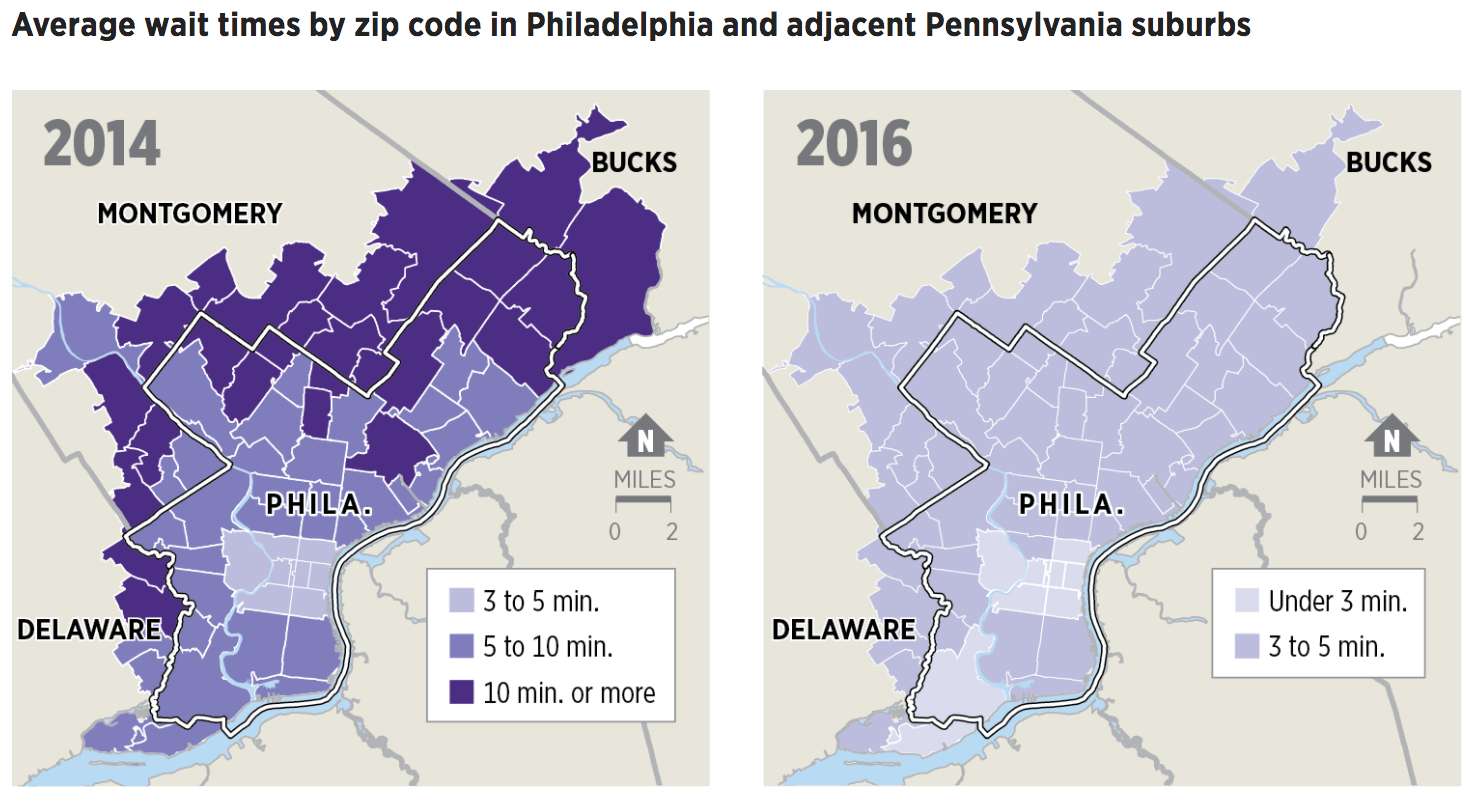
And the piece did a good job with the Uber time wait map comparison as well. It uses the same colour pattern and map, small multiple style, and then you can see quite clearly the loss of the entire dark purple data bin. It is a simple, but very effective graphic. My favourite kind.

Still haven't used Uber yet. Unless you count the times I'm being put into one by a friend…
Still haven’t used Uber yet. Unless you count the times I’m being put into one by a friend…

Anyway, from the data side, I would be really curious to see the breakout for trolleys versus busses—yes, folks, Philly still has several trolley lines. If only because, by looking at the map, those routes seem to be in the green and growing category. So as I complain to everyone here in Philly, Philly, build more subways (and trolleys). But, as the article shows, don’t forget about the bus network either.

Credit for the piece goes to the Inquirer graphics department.

High-rise Living

I was reading my print edition of the Economist last night and found this graphic—screenshot from the online version—about the rising importance of skyscrapers in the urban landscape.

The article was written after the Grenfell Tower inferno and looks at things that could be done to improve safety in high-rises.

Where's Philly?
Where’s Philly?

Naturally, I was reading this on my 11th story balcony in the high-rise tower block in which I live.

Credit for the piece goes to the Economist graphics department.

Philadelphia’s Growth Since the 1940s

I stumbled upon this article last night on philly.curbed.com that takes a look at the growth and slowdown in said growth in Philadelphia. For the purposes of this blog, that included an animated .gif that showed the expansion in the metro area since the 1940s.

At this point I was far from being born…let alone living in the city

My quibble with the piece is that the lighter blue loses out to the darker. And so one really sees the presence of the city at the expense of the growth. I wonder if reversing the two colours or in some other way de-emphasising the areas built up would allow the new growth areas to come to the forefront of the map.

Credit for the piece goes to BuildZoom.

Where is Normal America?

Not every graphic information graphic is a sexy chart or map. Sometimes tables communicate the story just as well. Maybe even better. Today’s post comes from FiveThirtyEight, which examined a claim about what places represent “Normal America”. Turns out that when one looks at the data, here age, race, ethnicity, and education, Normal America is found in the eastern half of the country. And it includes some big cities, notably both Philadelphia and Chicago. The whole article is worth a read, as it goes on exploring states representing Normal America and then places that represent 1950s America.

Where is Normal America?

So where is Normal America? New Haven, Connecticut.

Credit for the piece goes to Jed Kolko.

Mapping a New America

The United States of America consists of 50 states and hundreds of cities. In Sunday’s edition of the New York Times Parag Khanna argued for the switch of priority away from the state-level and to effectively the city-level. We have clusters of cities that dominate and drive the national economy.

The classic case-in-point is Bowash, the megapolis of interconnected cities from Boston to Washington, where there is a plan to extend Baltimore’s MARC public transit train to Wilmington, Delaware. If that were to happen, one could take public transit from the northern suburbs of New York City to Washington through Trenton, Philadelphia, Wilmington, and Baltimore. But today, those decisions must be taken as many as six different states. What if it were handled by a single, regional body?

The Great Northeast
The Great Northeast

The above map looks at what a New America could look like, as grouped into seven different regions and their urban clusters.

Credit for the piece goes to the New York Times graphics department.

Parking in LA

Today’s piece comes via a colleague with the original article appearing in Wired. The article looks at new parking signs that the city of Los Angeles has proposed. The reason? Parking on streets with multiple signs for parking sometimes make no sense. These signs aim to simplify the communication of those parking regulations.

The proposed new LA parking signs

Credit for the piece goes to the Los Angeles Department of Transportation, which was inspired by Nikki Sylianteng.

The Growth of Urban Walmarts

Today’s piece comes via my co-worker and is about the growth of urban Walmart stores. The article is from NPR and includes a nice series of small multiples of store locations in three select cities: Washington, Chicago, and Atlanta. In full disclosure, I live about two blocks from one of the urban Walmarts in Chicago. So go figure.

The growth of urban Walmarts

Credit for the piece goes to April Fehling, Tyler Fisher, Christopher Groskopf, Alyson Hurt, Livia Labate, and Ariel Zambelich.

The Urban Future

Today’s selection is a little old—dating from July of last year—but is still a nice example of an inline graphic supporting the premise of its accompanying article. The New York Times looks at what was then data published by the United Nations on urban growth out to 2030. The article talks about the growth of megacities in lower income countries and those in the tropical regions. So smack in the middle of the article are two stacked bar charts breaking down urban populations into those two categories.

Urban population makeup

Personally I would have preferred a series of line charts to better compare the growth—the lack of a common baseline makes it very difficult to compare segments of the bars. But below the stacked bar charts we have a nice table. Those are always good to see. They organise information clearly and make it quick to find what is relevant.

Credit for the piece goes to the New York Times graphics department.

The City Liveability Index

Several months ago the Economist looked at city liveability, which in their words looks at safety, healthcare, educational resources, infrastructure, and environment. And, well, it turns out that Canada, Australia, and New Zealand do really well. The only two cities not in those countries within the top-ten: Vienna, Austria (no. 2) and Helsinki, Finland (no. 8).

City liveability index

What I like about the dot plot is the separation of the data into three sections based on city movement. Those moving up on one line, those moving down on another, and then those with no change plotted in the centre. The cities with the most change in each of the movement sections are then called out in bold. Simple, but clear and effective.

Credit for the piece goes to G.S., K.N.C., and G.D.

Growth of Inland Cities

Some of the nation’s fastest growing cities are inland, away from the coast where housing prices are high. To support an article about the demographic shift, the New York Times created this map. Circle size represents growth over a six-year period while the colour of the bubble represents housing prices.

Fastest growing cities

Credit for the piece goes to the New York Times graphics department.