Yesterday we talked about a static graphic from the New York Times that ran front and centre on the, well, front page. Whilst writing the piece, I recalled a piece from Politico that I have been lazily following, as in I bookmarked to write about another time. And suddenly today seemed as good as any other day.
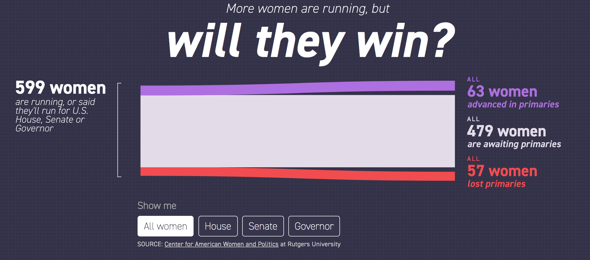
After all, this piece also is about women running for Congress, and a bit more widely it also looks at gubernatorial races. It tracks the women candidates through the primary season. The reason I was holding off? Well, we are at the beginning of the primary season and as the Sankey diagram in the screenshot below shows, we just don’t have much data yet. And charts with “Wait, we promise we’ll have more” lack the visual impact and interest of those that are full of hundreds of data points.
Still too many unknowns. But at least these are known unknowns…
But we should still look at it—and who knows, maybe late this summer or early autumn I will circle back to it. After all, today is primary day in Pennsylvania. (Note: Pennsylvania is a closed primary state, which means you have to belong to the political party to vote for its candidates.) So this tool is super useful looking ahead, because it also shows the slate of women running for positions.
Aside from just the number of women running, today’s primaries will be fascinating because of the whole redistricting thing
I really like the piece, but as I said above, I will want to circle back to it later this year to see it with more data collected.
If you haven’t heard by now, this year is a US Congressional midterm election year meaning that eligible American citizens will be voting for their local representative and 1/3 of the states will be selecting their senator. But perhaps because yesterday was Mother’s Day in the States, the New York Times ran a front-page, above-the-fold piece on the number of women running for Congress this year, either as incumbents or challengers.
It certainly got my attention…
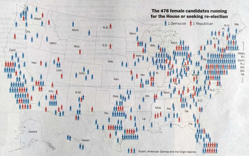
Those of you familiar with this blog will know that I am excited basically anytime smart graphics work their way onto the front page. The map itself shows the rough location of where women candidates are running for office and a quick comparison shows there are more blue, Democratic, women than red, Republican. Nothing too special here.
Where the women are running
But as I began to read the article, I became more interested in my questions that then fortunately became some of the article’s points about where these women were running in terms of competitive seats. Unfortunately the map does not contain any information about that.
Until I got to the inside page later on.
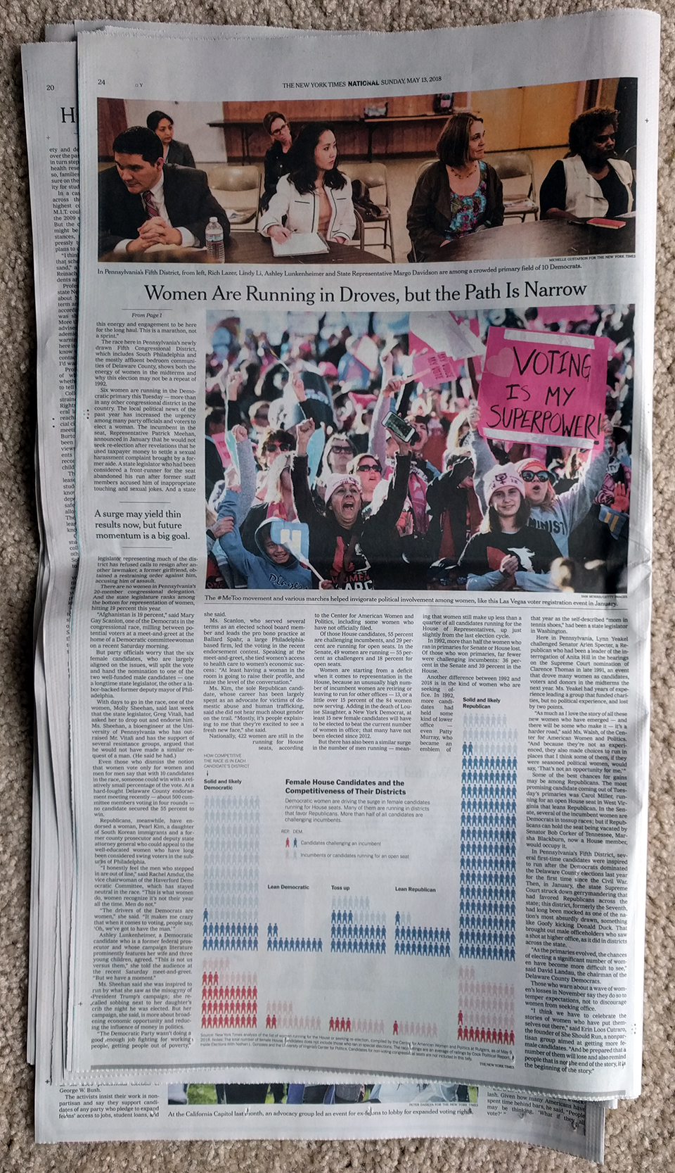
Naturally what I was interested in was on the inside page
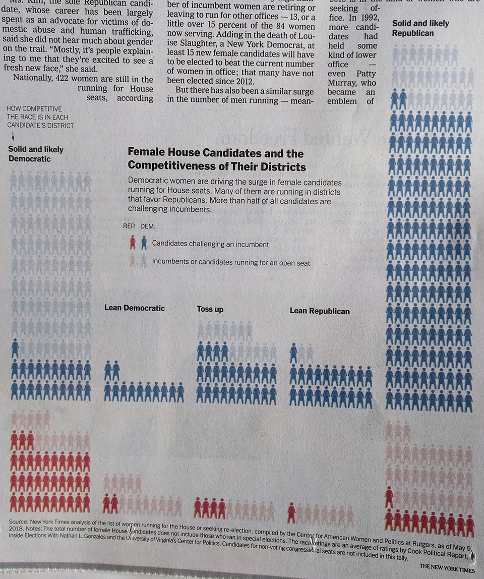
This graphic is the more impressive of the article’s two. As a brief inside, these types of graphics always intrigue me. What kind? The kind that do not fit neatly into a box. As part of my job, I serve as creative director, graphics designer, page designer, and production designer for the Philly Fed’s premier quarterly economics journal. Sometimes the job is having a box and filling said box with a graphic, the map on the front page is a great example. But with this graphic, that would leave too much white space at the top and so how do you design around or rather with that?
To the graphic specifically though, we get a nice little treat.
Let’s come back in six months and see how this pans out
Nothing is complicated in this one. We have three conditions, running in an open seat or running against an incumbent, an incumbent, or running for an open seat. Since this piece focuses on the difficult path to get these women into office, especially because of the challenges of facing an incumbent, that group is the highlighted one. (A less focused piece that shows all three conditions would be neat.)
Then we basically have a graphic where we count the number of icons. In this case, we could have even used little boxes as the icons are not necessary. Personally, I would have opted for something like boxes, but these icons are not too distracting. The icons are then grouped by the competitiveness of the district, the part that interested me, and at this point note that the designer makes certain each grouping is an equal ten units wide.
Visually it becomes quite clear that women should certainly expect greater representation in Congress come 2019, but with so many women running as Democrats against safe Republican incumbents, it will be difficult to see many of these women in Congress. Of course with all this talk of a wave election, if that is true, you would expect some of the seats on the right to move to the left, i.e. safe Republican become lean Republican become tossups.
Overall, this was a nice treat for a Sunday read of the paper.
Credit for the piece goes to Kate Zernike and Denise Lu.