Redaction Action

Last week, the Department of Justice released the Mueller Report. It was—and still is—sort of a big deal. But this week I want to take a look at a few different approaches to covering the report in the media. We will start with a piece from Vox on the redactions in the report. After all, we only know what we know. And we know there is about 7% of the report we do not know. And we do not know what we do not know.

7% is still a fair amount of black when it's concentrated in one section.
7% is still a fair amount of black when it’s concentrated in one section.

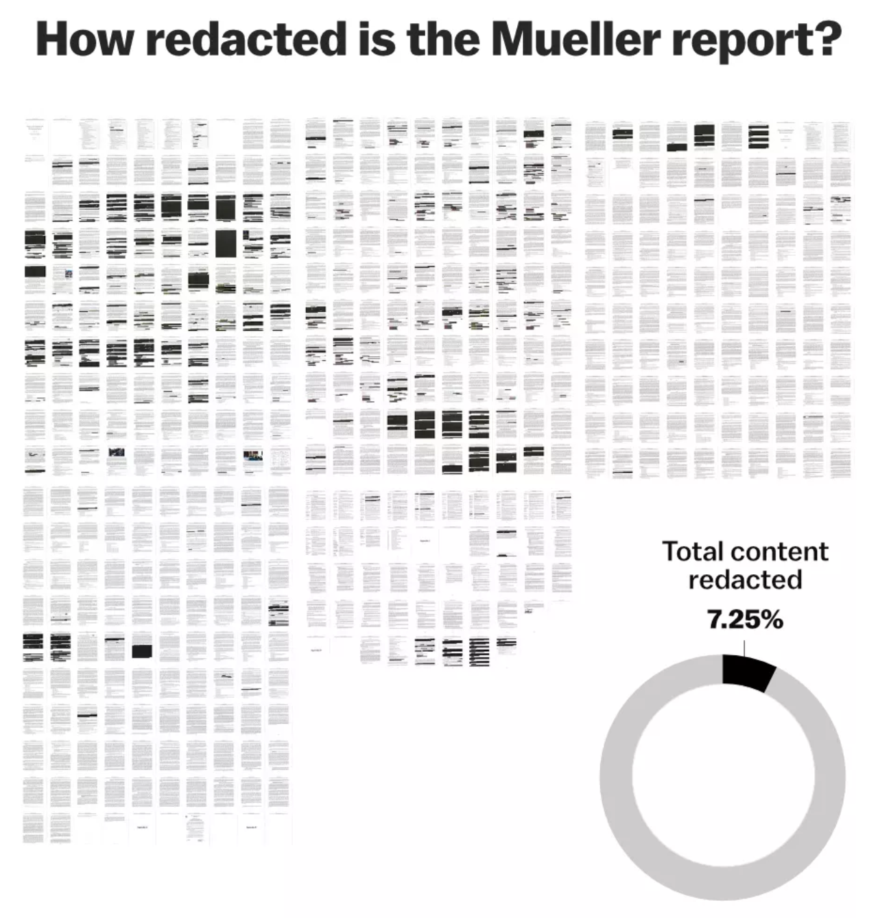
The above graphic looks at overall redactions as images of each page show how much was withheld from the public. Then we have a small donut chart to show that 7.25% was redacted. Did it need to be a donut? No. A simple factette could have worked in its place. It could be worse, though, it could be a similarly sized pie chart.

The rest of the article moves on to a more detailed analysis of the redactions, by section, type, &c. And this screenshot is one of the more interesting ones.

Different coloured sharpies

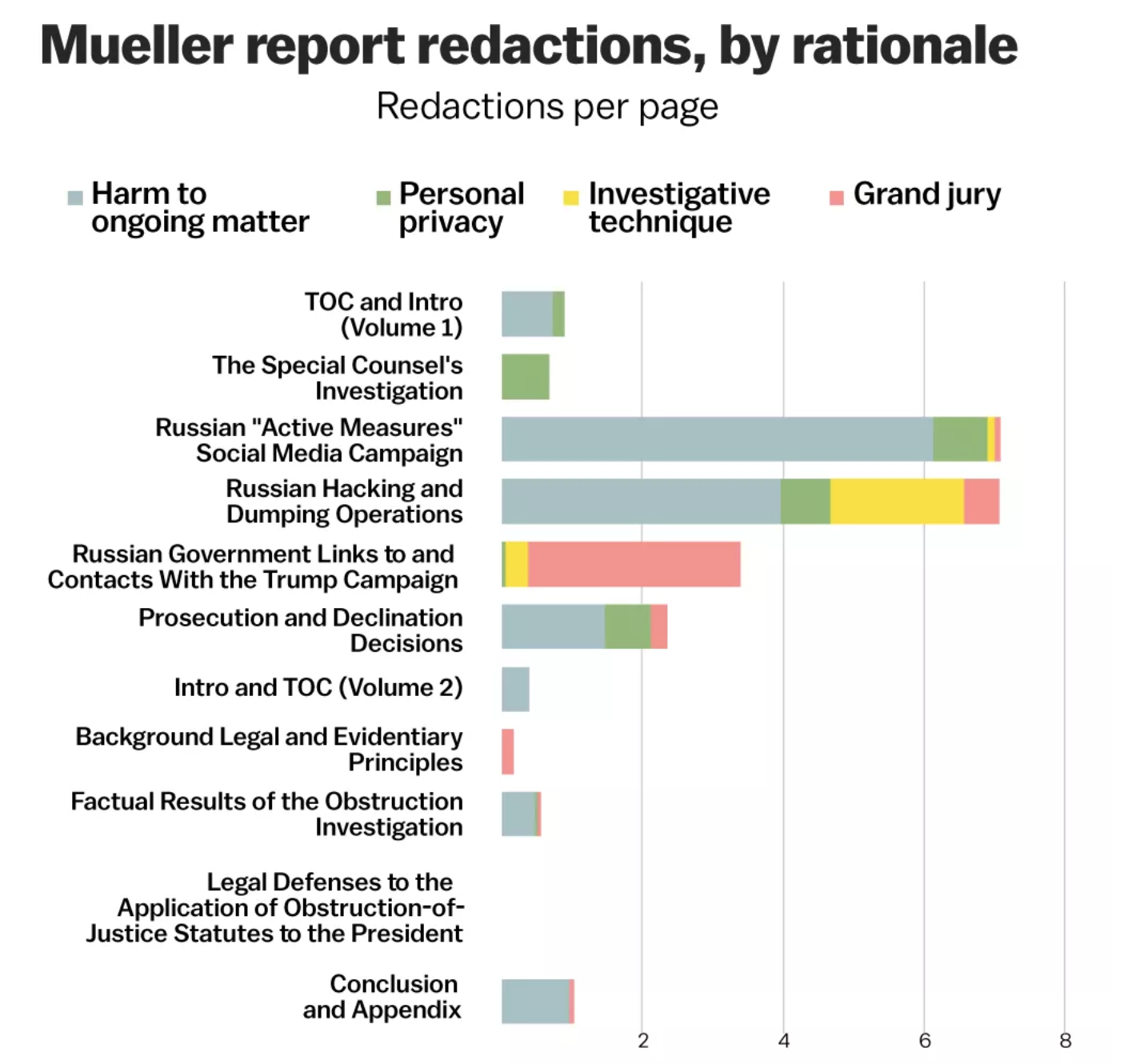
Fundamentally we have stacked bars here, with each section’s redactions per page broken down by type. And that is, on the one hand, useful. Of course, I would love to see this data separated out. That is, show me just “investigative technique” and filter out the rest. Imagine if instead of this one chart we had four slightly smaller ones limited to each type of redaction. Or, if we kept this big one and made four smaller ones showing the redaction types.

Overall the article does a really nice job of showing us just what we don’t know. Unfortunately, we ultimately just don’t know what we don’t know.

Credit for the piece goes to Alvin Chang and Javier Zarracina.

Longest Lunar Eclipse of the Year

For those of my readers in Europe, Africa, Asia, Australia, and South America, you are in for a treat tonight as you get to experience the longest lunar eclipse of the year. For those of us in North America, i.e. Canada, the United States, and Mexico, we get nothing.

So for a reminder, we turn to this nice piece from Vox that explains a lunar eclipse and why they are not as common as one might expect.

It's all about the nodes
It’s all about the nodes

The piece uses illustrations like these from Vox and supplements them with graphics from NASA. The whole piece is worth a read, especially if you enjoy space things.

Enjoy your Friday, and if you live anywhere but North America, enjoy your lunar eclipse tonight.

Credit for the piece goes to Joss Fong.

Hurricane Winds

Irma swept the northern coast of Puerto Rico last night after devastating some of the Leeward Islands. What’s next? Well after the Turks and Caicos, Cuba, and the Bahamas we are probably looking at a Florida landfall. (Though in the last 24 hours the track has shifted ever eastward so Tampa Bay looks fine from a direct impact standpoint.)

Harvey was an exception in many ways because most deaths occur not from rainfall flooding, but from the storm surge. Basically a massive wave of water driven by low pressure and strong winds that is literally pushed ashore.

Now even though I just said that, I wanted to talk about the winds for a second. Why? Well it turns out that at 185mph, Irma has some of the strongest sustained winds ever recorded for an Atlantic hurricane. And 185mph winds, they can do quite a bit of damage. How much? Well for that we turn to this illustration from Vox.

You do not want to be around for a Category 5

Assuming the worst case scenario and Irma would strike just southwest of Miami, say Homestead or Key Largo, 185mph winds could do some damage to non-hurricane-safe buildings in a very large American city. And then there is the storm surge, which could be problematic for a city that is already struggling with rising tides. (Thanks, climate change.) The reason I say worst case is southwest of Miami is because hurricanes do most of the their damage—though certainly far from all of it—on their righthand side, which in a northward moving storm would be the eastern half.

The rest of the Vox piece does a nice job explaining Irma, its historic nature, and how it could be so dangerous. Worth a quick read, unless you live in Florida and then you should probably be packing up to evacuate.

Credit for the piece goes to Zachary Crockett.

Solar Eclipse Day

Today is Solar Eclipse Day.

Thankfully Vox has put together a great interactive piece to help you plan your day. This is for my viewing area in Philadelphia. We only max out at 75% of the sun, but that is still pretty fantastic.

I'm totally excited for this
I’m totally excited for this

Credit for the piece goes to Casey Miller, Ryan Mark, and Brian Resnick.

One Insurer Counties

Let’s go back in time briefly to last week and the whole Obamacare thing. It’s not perfect and could be improved. I stridently believe that what the administration proposed was worse. But this article from Vox does highlight one of the things that could be improved—making more choices available to consumers. And they make the point with a map.

Lots of red counties there

That map shows the counties where there is only one insurer and almost a dozen counties in Tennessee where there are none. Note the colour—blue are counties that voted for Clinton and red for Trump. If Trump attempts to “explode” Obamacare, he will—much like the plans from last week—be hurting most those people who voted for him. Very strange politics if you ask me.

Credit for the piece goes to Sarah Frostenson.

What do People Look for on Black Friday?

Well, today is Black Friday. And so there were probably lines at the door of your local department store at the wee early hours of the morning. But I was working, and partly to bring you this. Google has data on what each state searches for the most. And Vox turned that into a map. Turns out a lot of you want boots.

All the boots
All the boots

Credit for the piece goes to Javier Zarracina.

Expensive Wines Taste the Best…

But not for the reasons you might think. This video from Vox looks at the notion that expensive wines taste better. And it turns out they do. Sort of. In terms of the design of the piece, it uses some nice charts and motion graphics to make its point. Plus, it includes snippets from Sideways, notably: “I’m not drinking any fucking Merlot.” Classic.

Wine ratings
Wine ratings

Credit for the piece goes to Joss Fong, Anand Katakam, Joe Posner, and the Vox.com staff.

What It Means to be Black in the US…Census

As I said yesterday, I’m up in northern Wisconsin. But sometime later today I should be starting a long drive back to Chicago. So let me continue with one more piece of genealogy- and information-related content that is especially relevant given recent events. Vox posted an article a couple of days ago that looked at the definition of black via census options. Of particular interest is the supplemental  or sidebar information: whether you could choose your own race or whether it was chosen for you by the enumerator.

A history of choices

Maybe it’s only a coincidence that the 1890 census records went up in flames.

Credit for the piece goes to the Vox graphics department.

What if the World Were of States with Equal Populations?

Well, thanks to a reddit editor frayuk, via a nice post on Vox, we now can look at what that world would look like. It’s a bit difficult to see some of the details, but click through to the Vox piece to see just those.

A map of equals
A map of equals

Credit for the piece goes to frayuk.

How to Better Alight an Aircraft

Alighting an aircraft is a time consuming pain in the arse. Probably number one for me, after security. Anyway, Vox looked at the slow boarding and alighting process and how to improve it. And why, most likely, airlines are not terribly interested in improving it. Hint, follow the money.

Doing it right
Doing it right

Credit for the piece goes to Menkes van den Briel.