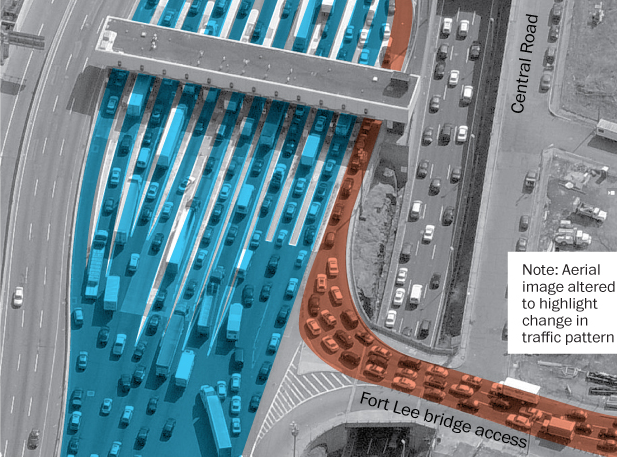
A lot of people have been talking about Bridgegate, a scandal in New Jersey wherein the governor’s office allegedly abused its power to negatively impact the residents of Fort Lee, New Jersey. What actually happened for a few days this past fall? The Washington Post uses aerial photography and illustration to diagram the normal traffic flow and the flow during the traffic “study”.
Traffic on the George Washington Bridge
Credit for the piece goes to the Washington Post graphics department.
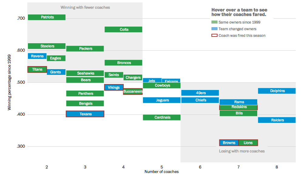
This weekend we will have yet more football. My preferred team, the Philadelphia Eagles, is of course now out of contention. But more than likely, the coach’s job is secure for at least another year. As we have already seen, however, that cannot be said for other coaches. So the Washington Post looked at ownership’s role in the success of their respective team by the hiring and firing of coaches.
Coaches in the NFL
Credit for the piece goes to Bonnie Berkowitz, Darla Cameron, Dan Keating, and Rick Maese.
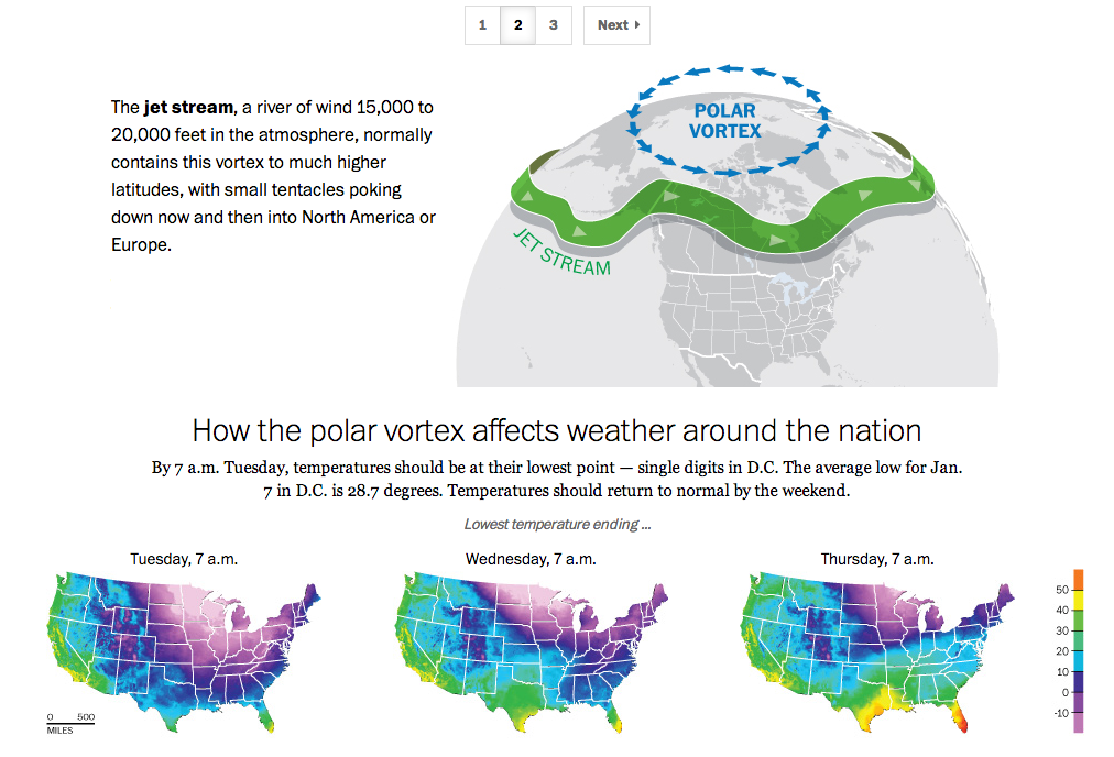
If you live in the United States, you probably have heard the term polar vortex by now. People have been using the term to describe the bitterly cold temperatures affecting the eastern two-thirds of the country. But the term polar vortex is a meteorological term that means a specific phenomenon. In other words, it’s more than a hashtag along the lines of snowmageddon. The Washington Post explains what the polar vortex is.
The Post explains the polar vortex
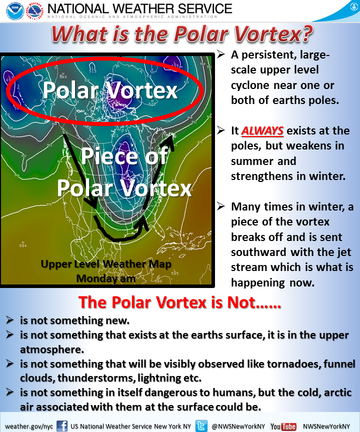
My caveat for this piece is that from my understanding, it’s not entirely correct. Or perhaps not detailed enough. In brief, we turn to the National Weather Service out of New York for a more technically correct, but more poorly designed graphic.
National Weather Service explanation
Poor type, poor colours, poor hierarchy. Those are abundantly clear, but the important part is that the NWS wants to correct many of the popular misconceptions. Somewhere between the well-intended but less-than-entirely-clear Post piece and the accurate-but-also-unclear National Weather Service piece is an opportunity to explain the concept to the public.
Credit for the Washington Post piece goes to Bonnie Berkowitz, Richard Johnson, Katie Park, and Gene Thorp.
Credit for the National Weather Service goes to the graphics team at the National Weather Service of New York.
Today’s post comes from the Washington Post, which looks at further revelations about the NSA surveillance programme. Specifically, the Post details how the NSA tracks Americans by what is called co-traveler analytics. The piece does a really nice job of explaining how the tracking works through illustrative examples.
Tracking via co-traveler analytics
Credit for the piece goes to the Washington Post graphics department.
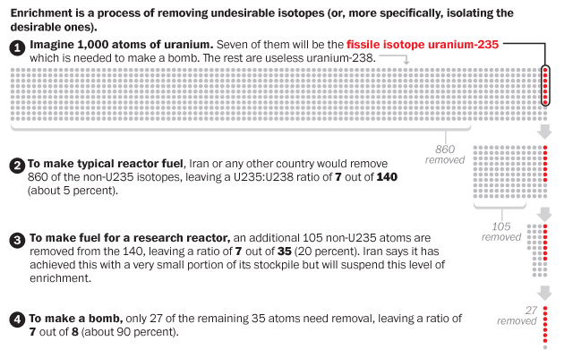
This past weekend, the US and allies reached an agreement with Iran on the Iranian nuclear programme. In this graphic the Washington Post explains the several steps necessary to take uranium and make it useful for a reactor, a research reactor, and nuclear weapons. Admittedly, a simplified diagram, but still quite useful.
Enriching uranium
Credit for the piece goes to the Washington Post graphics department.
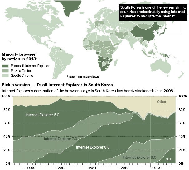
The Washington Post had an interesting story on how, in South Korea, Internet Explorer dominates the internet. I won’t spoil the story, it is kind of fascinating and worth a short read, but the accompanying graphics show just how dominant the browser has been in a leading technology country in Asia.
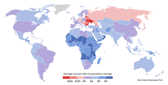
Last week the Washington Post published a piece that looked at demographic trends and their impact on the world’s different geographies. None of the graphics in the piece are revolutionary, nor are they mind-blowing fantasticness. They are, however, clear and concise and show the story. In fact the overall piece is well done because while the graphics show the trends and trajectories, the written word above and below the graphics explains some of the underlying causes and potential effects. In short, a solid piece that is worth the read.
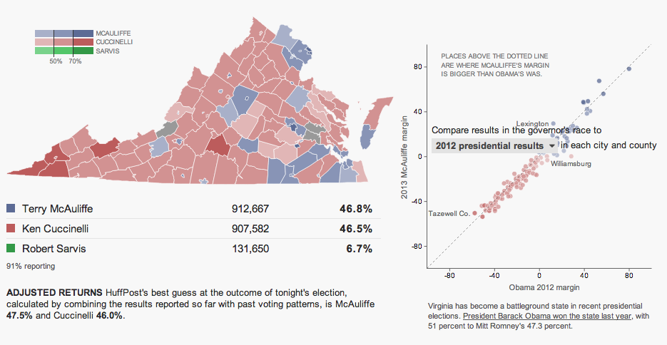
Last night was election night. Okay, maybe not the big midterm, but there were still a few interesting races. The one I want to look at it, however, is the gubernatorial race in Virginia. Maps are pretty much the default in big, statewide races like these and it is no surprise that the three screenshots here are use a map as an anchor component.
The Huffington Post uses a scatterplot to compare the margin of victory for Terry McAuliffe to that of Barack Obama in 2012. A technical flaw places the drop down menu atop the plot, unfortunately, but the component works to show differences in just one year.
Huffington Post results
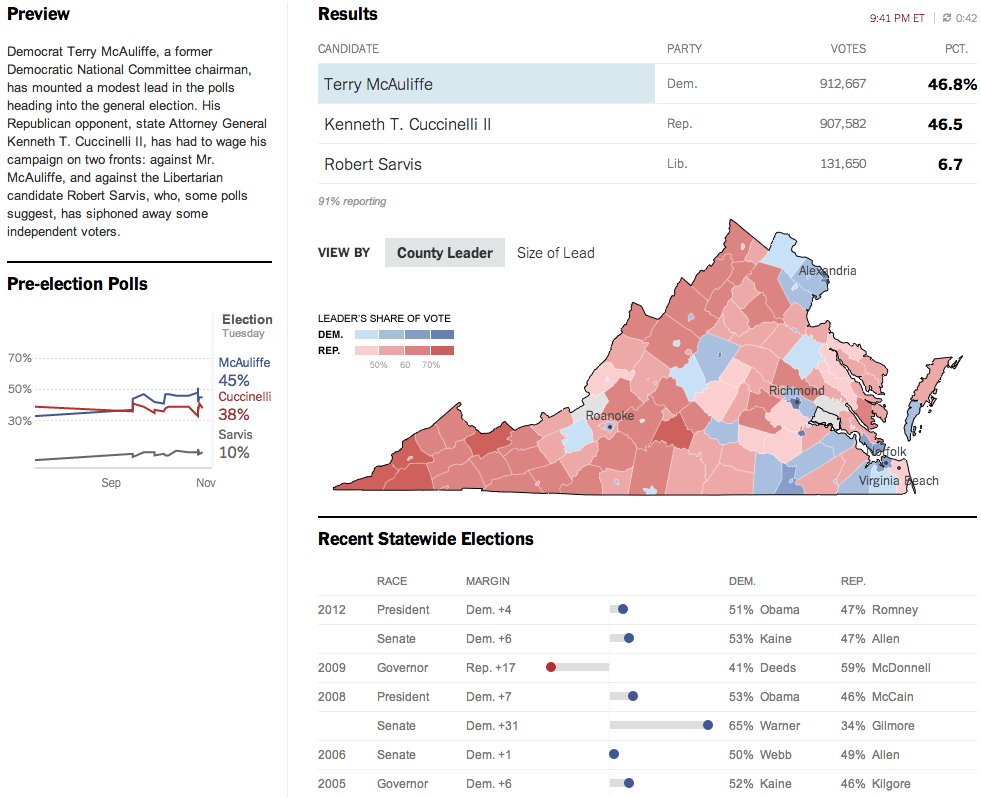
Over at the New York Times, the Virginia results were given a nice overview. Here they used a text summary to explain the race in short. They used a small amount of space to show polling results over time. And then beneath the map they looked at recent elections across the state.
New York Times results
The Washington Post, which reports to the northern counties of Virginia, had a much simpler piece. They used solely a map to present the data.
Washington Post results
Credit for the Huffington Post piece goes to Aaron Bycoffe, Jay Boice, and Hilary Fung.
Credit for the New York Times piece goes to the New York Times’ graphics department.
Credit for the Washington Post piece goes to the Washington Post’s graphics department.
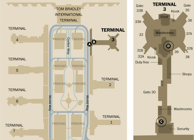
I didn’t see a lot of informative graphics regarding the shooting at LAX. But, here are two pieces. The first is from the Los Angeles TImes. Terminal 3 is rendered in three dimensions. Different buttons add views of the remainder of the airport.
Los Angeles Times’ terminal diagram
The Washington Post opted for a flat, two-dimension drawing in one graphic with both all of LAX and Terminal 3 in the same graphic.
Washington Post’s terminal diagram
The thing about the three-dimensional rendering is that it adds too much complexity whereas the two-dimensional schematic strips most of it out. Is it important to know the specific details of a building? Or is it more important to see its general shape and an area inside of it?
Credit for the Los Angeles Times piece goes to Javier Zarracina, Raoul Ranoa, Lorena Iniguez, and Anthony Pesce.
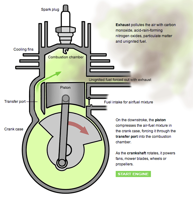
Infographics of the science-y, illustration-y kind have always been my favourite. They show you how the world works. Now, it has been a long time since I have used a leaf blower or lawn mower, but I always took for granted how they worked. But this fantastic graphic from the Washington Post makes sure that I know how they work. In animated .gif form. For an infographic. It’s really nice and worth a look.