Gravity was released recently. You know, that film about a station in space that gets hit by something and drama ensues. The Washington Post has this fantastic infographic that illustrates how the station was built over the past 15 years. Scroll down the page and watch the station deconstruct itself into its initial Russian power module. Fantastic.
Deconstructing the ISS
Credit for the piece goes to Alberto Cuadra and Katie Park.
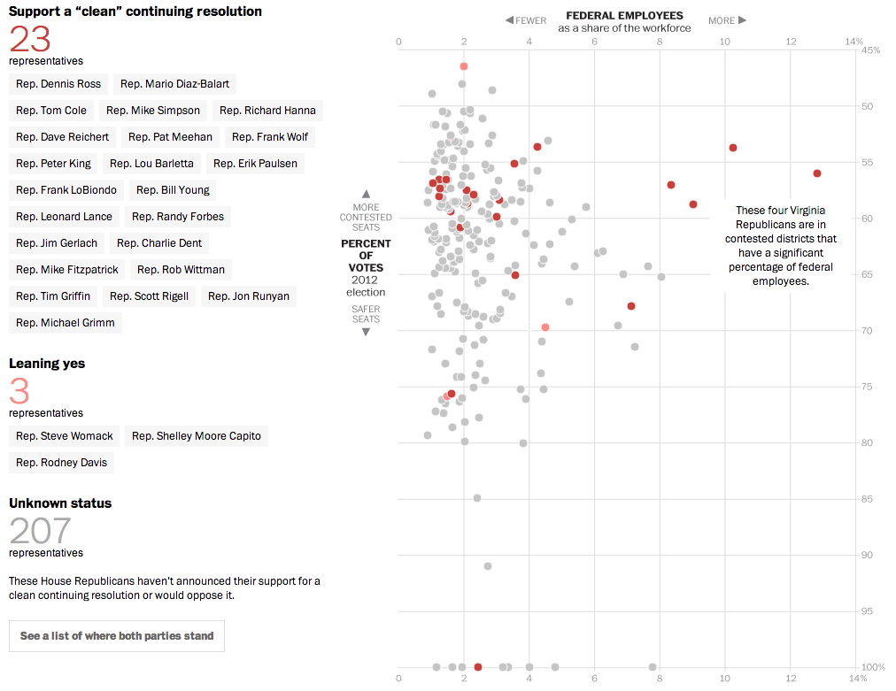
Yesterday, we looked at the new Conservative Party of America. But those are the votes that John Boehner fears to upset—and possibly fracture his party and cost him his job—if he should let a clean budget resolution come to the floor and should it pass. But why would it pass if it needs 217 votes and there are only 200 Democrats? Well, now we have a nice interactive graphic from the Washington Post that explores the moderate Republicans. Which, if this count is accurate, would provide enough votes when combined with Democrats to pass a clean budget.
The moderate Republicans…
Why are these Republicans in favour of a clean budget resolution? The y-axis shows that they are in moderate or mixed congressional districts, i.e. not Conservative districts. The x-axis shows that a fair number of these moderates have a high proportion of federal workers within their respective district. And who’s not working/earning money during the shutdown? Yep, a lot of federal workers.
Credit for the piece goes to Aaron Blake, Dan Keating, Ted Mellnik, and Darla Cameron.
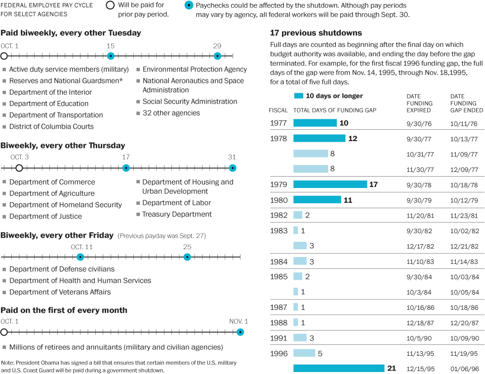
The Washington Post put together this infographic looking at paydays for federal employees who will still be working during the shutdown, e.g. military service personnel. Of course, if the shutdown drags on, the paychecks for those still working would be delayed.
Paying essential personnel
Credit for the piece goes to Lisa Rein and Todd Lindeman.
This interactive map from the Washington Post is one part of a long-form piece that looks at NASA and the improbable tasks facing the agency. Specifically the piece looks at how NASA wants to get to Mars, but how difficult that is and how an also difficult asteroid mission is as a backup plan.
Funding the improbable
Really fantastic is about all I can say.
Credit for the piece goes to Joel Achenbach, Alberto Cuadra, Kennedy Elliott, Rebecca Rolfe, and Ricky Carioti.
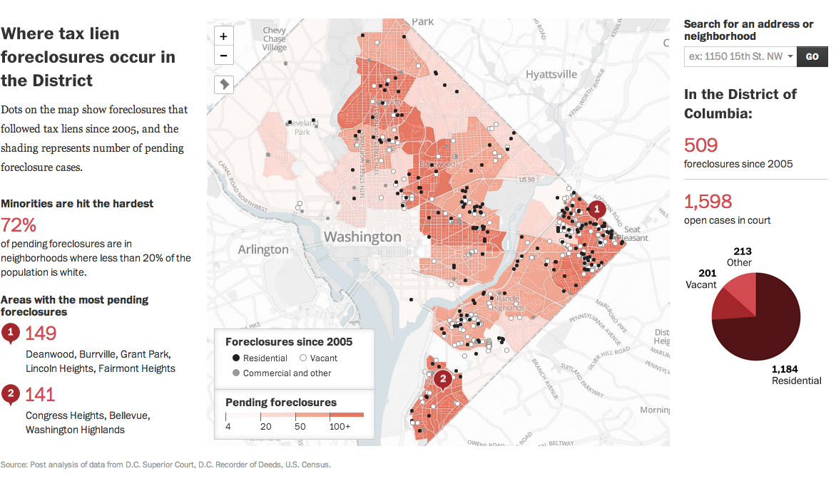
Today’s post comes from the Washington Post. It is a single interactive graphic, a map, that supports a long-form article about foreclosures in Washington.
DC foreclosure map
Credit for the piece’s graphics goes to Ted Mellnik, Emily Chow, and Laura Stanton.
A little while ago the Washington Post published this graphic on Metro ridership. But not just anybody’s ridership, that of the individuals who sit on the DC transit agency’s board. After all, should not those overseeing Washington’s transit agency be intimately familiar with the conditions faced by DC commuters?
How agency board members ride their transit agency…
The graphic is a really nice use of small multiples and shading and tinting to indicate which lines are travelled by specific persons. An icon of a bus denotes bus ridership. This is a very good piece.
Credit for the piece goes to Wilson Andrews, Dana Hedgpeth, Mark Berman, and Luz Lazo.
Mark Zuckerberg wants to get more people on the internet. And why not, it’s not like his company, a small entity you may not have heard of called Facebook, has anything to do with the internet. So this map by the Washington Post looks at what proportions of the world’s countries are using the internet.
Yes, yes it is. This map from the Washington Post looks at global temperature change since 1901. The article it supports is about how scientists are now all but certain mankind is responsible for global warming. Personally I prefer the term climate change because global warming sounds as if everything warms and as this map shows, clearly that is not the case.
This map comes from the Washington Post and it uses the American Community Survey to explore languages spoken by Americans at home other than English.
Who speaks what?
I got stuck (in a good way) on the seemingly random counties of German speakers. After I poked around a bit, I found one where almost 50% of the county speaks German. After some quick investigation, it turns out that Holmes County, Ohio is a centre for the Amish population. The Amish, of course, will often speak German or Pennsylvania Dutch, thus accounting for the abnormally high percentage of German speakers.
Credit for the piece goes to Dan Keating and Darla Cameron.
A few weeks ago the Washington Post published a graphic that explained how space weather can have significant impacts on Earth. This is more of an illustrated diagram and less of a data visualisation piece, but it still worth a read. Why? Because, if scientists are correct, the sun’s magnetic poles should soon finish a polarity reversal. And that creates the potential for some stormy space weather.
Impacts of space weather
Credit for the piece goes to Bonnie Berkowitz and Alberto Cuadra.