Over the last week or so, we have been receiving some encouraging news from the makers of three viable Covid-19 vaccines: Pfizer, Moderna, and AstraZeneca. All three have reported their vaccines as at least 90% effective. This doesn’t mean the relevant regulatory agencies have verified that data, but it’s better than injecting ourselves with bleach.
Keep this in mind, though, a full vaccination roll out will take months. Having 20–40 million doses is great, but the population of the United States is 330 million. The expectation is a return to normalcy will not really begin until the end of Q3 or beginning of Q4 2021.
This article from the Washington Post does a good job of explaining some of the next steps—and some of the significant logistical hurdles. They illustrate part of the process of shipping the Pfizer vaccine, which needs to remain cooled -70ºC. That’s -94ºF. A wee bit colder than most normal freezers operate.
The Post article also illustrates how the Pfizer/Moderna type of vaccine works—the Pfizer and Moderna tackle it one way whilst AstraZeneca tackles it via a second method.
The first steps in the process.
There’s a lot going on here, but I like the simplified approach the designers took. This whole situation is complicated, but here we see the process distilled to its most essential elements. And the restrained use of colour helps tremendously.
The vial and then needle are filled red, and that red colour carries through into the messenger RNA (mRNA) that is absorbed by the cells and ultimately creates the spike proteins used by the virus (not the virus itself).
Credit for the piece goes to Carolyn Y. Johnson and Aaron Steckelberg.
Yesterday Pew Research released the results of a survey of how the rest of the world views select countries throughout the world. The Washington Post covered it in an article and created some graphics to support the text. The text, of course, was no big surprise in that the rest of the world views the United States poorly compared to just several years ago and that, in particular, President Trump is a leader in whom the world has no confidence.
But that’s not what I want to talk about. Instead, I want to address a design element in the one of their graphics. (But you should go ahead and read about the survey results.)
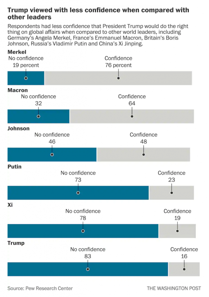
The issue here is the positioning of the labels for each bar, representing a world leader. At the very top of the graphic, things are in a good way. We have Merkel with a small space beneath that text then another label, “No confidence, 19 percent”, and then a connecting line to a dot to the blue bar. We then have a small space and the label Macron, meaning we have moved on and are on the next world leader.
But what if the reader sees the title and starts towards the bottom? They want to see the leaders in whom the world has no confidence. Now look at the bottom of the chart and the positioning of the labels for Trump, and above him, Xi, Putin, and maybe even Johnson. Because the “No confidence, x percent” labels have moved further to the right, there is an enormous space between the leader’s name and their coloured bar. Visually, this creates a link between the leader’s name and the preceding bar. For example, Trump appears to have a no confidence value of 78 with an unlabelled bar chart beneath him.
I suggest that there are two easy fixes to better link the labels to the data. The first is to move the leaders’ labels down, once the “No confidence” label has moved sufficiently far to the right. Like so.
The leader is now very clearly attached to his or her data with little confusion.
My second option is to fix the “No confidence” labels permanently to the left of the chart so as not to create that visual space in the first place, like so.
Here, after seeing the first option, I wonder if there is enough visual space at all between the leaders. But, this is only a quick Photoshop exercise. If I wanted to really tweak this, I would consider putting the data point or number in bold to the right of the label.That would eliminate an entire line of type that could be repurposed as a visual buffer between leaders.
I think either option would be preferable because of increased clarity for the reader.
Credit for the piece goes to the Washington Post graphics department.
I mean, technically he’s correct. Eventually the universe will likely end with heat death as all the energy dissipates and stars die out and space becomes a truly empty, cold void. So it’ll get cooler, eventually.
But what about right now? In one to three generations’ time? 30–90 years? Not looking so great.
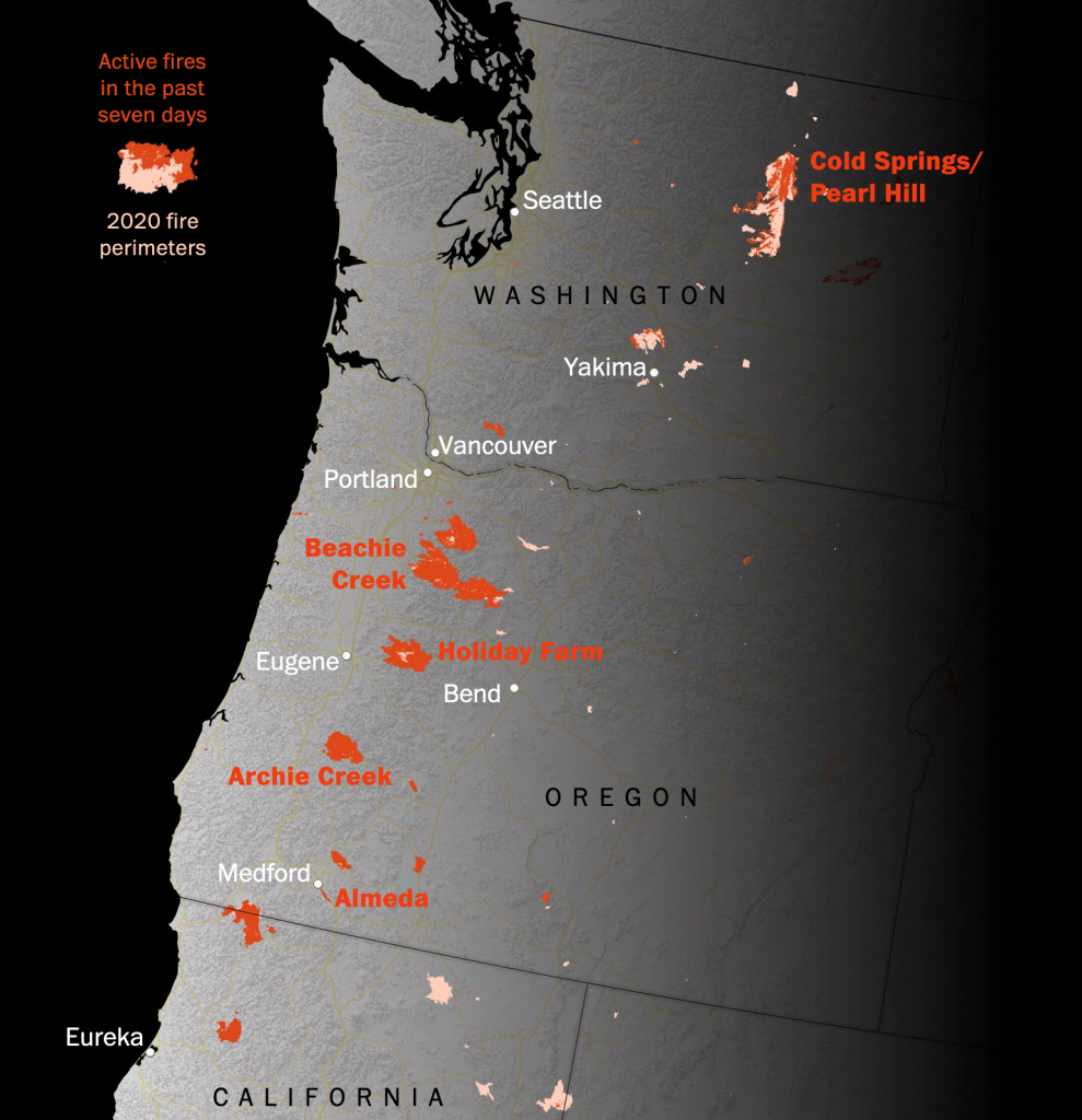
So what sparked this ludicrous comment? This year’s wildfire season on the West Coast, usually relegated to California, this year’s season has burned up forests in both Washington and Oregon as well, states whose usually wetter climate inhibits these kind of rapidly spreading fires.
A few days ago the Washington Post published a piece looking at the fires out west. It started with a map showing ultimate fire perimeters and currently active fires.
In a normal year, those fires in Oregon and Washington wouldn’t be there. Welcome to the new normal.
Frequent readers will know I’m not a fan of the dark background for graphics, but I’m betting it was chosen because as you scroll through the article, it makes the photo journalism really pop off the page. Contrast the bright yellows, oranges, and reds with a dark black background and c’est magnifique, at least from a design standpoint. And given this piece is really about the photography depicting the horrors on the West Coast, it’s an understandable design decision.
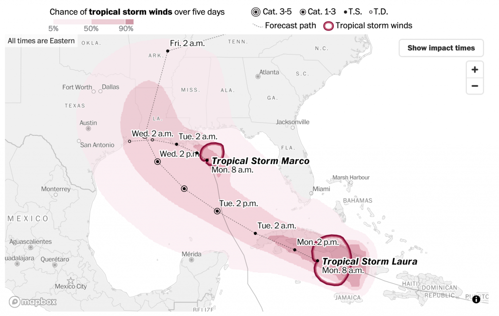
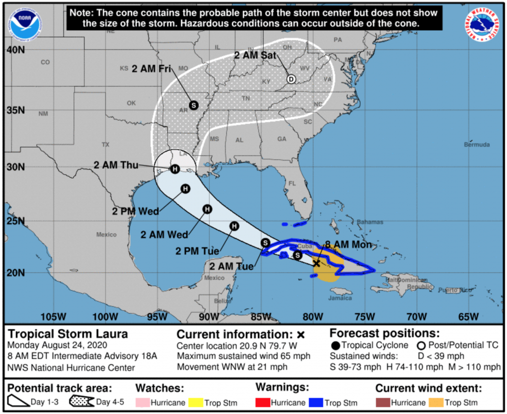
In a first, the Gulf of Mexico basin has two active hurricanes simultaneously. Unfortunately, they are both likely to strikes somewhere along the Louisiana coastline within approximately 36 hours of each other. Fortunately, neither is strong as a storm named Katrina that caused a mess of things several years ago now.
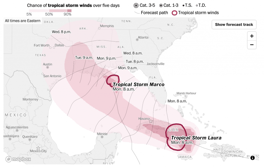
Over the last few weeks I have been trying to start the week with my Covid datagraphics, but I figured we could skip those today and instead run with this piece from the Washington Post. It tracks the forecast path and forecast impact of tropical storm force winds for both storms.
The forecast path above is straight forward. The dotted line represents the forecast path. The coloured area represents the probability of that area receiving tropical storm force winds. Unsurprisingly the present locations of both storms have the greatest possibilities.
Now compare that to the standard National Weather Service graphic, below. They produce one per storm and I cannot find one of the combined threat. So I chose Laura, the one likely to strike mid-week and not the one likely to strike later today.
The first and most notable difference here is the use of colour. The ocean here is represented in blue compared to the colourless water of the Post version. The colour draws attention to the bodies of water, when the attention should be more focused on the forecast path of the storm. But, since there needs to be a clear delineation between land and water, the Post uses a light grey to ground the user in the map (pun intended).
The biggest difference is what the coloured forecast areas mean. In the Post’s versions, it is the probability of tropical force winds. But, in the National Weather Service version, the white area actually is the “cone”, or the envelope or range of potential forecast paths. The Post shows one forecast path, but the NWS shows the full range and so for Laura that means really anywhere from central Louisiana to eastern Texas. A storm that impacts eastern Texas, for example, could have tropical storm force winds far from the centre and into the Galveston area.
Of course every year the discussion is about how people misinterpret the NWS version as the cone of impact, when that is so clearly not the case. But then we see the Post version and it might reinforce that misconception. Though, it’s also not the Post’s responsibility to make the NWS graphic clearer. The Post clearly prioritised displaying a single forecast track instead of a range along with the areas of probabilities for tropical storm force winds.
I would personally prefer a hybrid sort of approach.
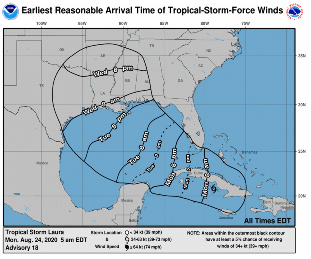
But I also wanted to touch briefly on a separate graphic in the Post version, the forecast arrival times.
This projects when tropical storm force winds will begin to impact particular areas. Notably, the areas of probability of tropical storm force winds does not change. Instead the dotted line projections for the paths of the storms are replaced by lines relatively perpendicular to those paths. These lines show when the tropical storm winds are forecast to begin. It’s also another updated design of the National Weather Service offering below.
Again, we only see one storm per graphic here and this is only for Laura, not Marco. But this also probably most analogous to what we see in the Post version. Here, the black outline represents the light pink area on the Post map, the area with at least a 5% forecast to receive tropical storm force winds. The NWS version, however, does not provide any further forecast probabilities.
The Post’s version is also design improved, as the blue, while not as dark the heavy black lines, still draws unnecessary attention to itself. Would even a very pale blue be an improvement? Almost certainly.
In one sense, I prefer the Post’s version. It’s more direct, and the information presented is more clearly presented. But, I find it severely lack in one key detail: the forecast cone. Even yesterday, the forecast cone had Laura moving in a range both north and south of the island of Cuba from its position west of Puerto Rico. 24 hours later, we now know it’s on the southern track and that has massive impact on future forecast tracks.
Being east of west of landfall can mean dramatically different impacts in terms of winds, storm surge, and rainfall. And the Post’s version, while clear about one forecast track, obscures the very real possibilities the range of impacts can shift dramatically in just the course of one day.
I think the Post does a better job of the tropical storm force wind forecast probabilities. In an ideal world, they would take that approach to the forecast paths. Maybe not showing the full spaghetti-like approach of all the storm models, but a percentage likelihood of the storm taking one particular track over another.
Credit for the Post pieces goes to the Washington Post graphics department.
Credit for the National Weather Service graphics goes to the National Weather Service.
For my non-American audience, the United States uses a federal system under which its constituent states retain the responsibility for organising and executing elections. And so we have 50 different electoral systems. A select few use the United States Post Office (USPS) to distribute blank ballots to voters and collect them when completed. Five states have used this system without issue for years (and infinitesimally small issues of fraud): Colorado, Hawaii, Oregon, Utah, and Washington.
But with the United States having failed to adequately deal with its Covid-19 outbreak, see yesterday’s post, most US states will be expanding their mail-in ballots to help protect voters and keep them safe. But this all depends upon the USPS. The Trump administration fears losing the election and in a press conference Trump admitted aloud that he wants to withhold funding from the USPS to prevent people from voting.
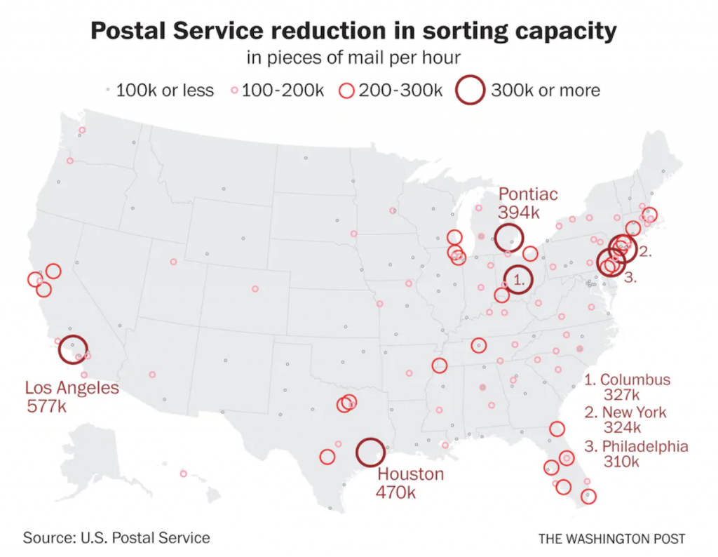
What does that look like? Well, Trump appointed a new postmaster general to carry out his wishes and the Washington Post created this graphic to show where the USPS has reduced the sorting capacity, a critical part of the delivery of postal ballots.
Is this why my mail is taking longer than usual?
Often I will write about how I don’t like the use of circles and their measurement by area.
First, the advantage of the circles here is that they are tied to specific geographic sites, and they do not refer to geographic areas like counties, states, or regions. So in this case, this is a plus.
Second, the circles appear to not be sized by area, but maybe by diameter. I would need more time to investigate this, but the areas look off. But I should add I do like how the largest postal facility impacts are called out by labels, and those in heavily clustered areas are numbered and placed off the southeast seaboard.
Third, I’m not really sure why the colours are necessary, or rather, what changing the colours adds given that the sizes of the circles is already changing.
So while I have some issues with what’s going on here, the content itself is critically important for people to see. Note that a number of the largest postal facilities by impact are located in Ohio, Pennsylvania, Michigan, and Texas. And Florida has a lot of medium-sized circles. And while Texas is likely still a Republican state in the electoral college, Biden is currently polling within a good night’s results’ reach of Trump there. The other states are all solidly swing states up for grabs or with Biden leading by some degree in the current polling.
Credit for the piece goes to the Washington Post graphics department.
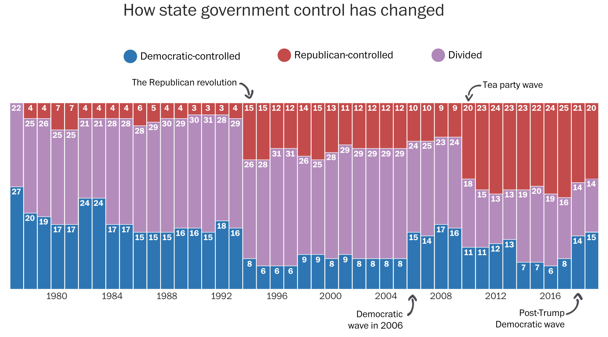
In a recent Washington Post piece, I came across a graphic style that I am not sure I can embrace. The article looked at the political trifecta at state levels, i.e. single political party control over the government (executive, lower legislative chamber, and upper legislative chamber). As a side note, I do like how they excluded Nebraska because of its unicameral legislature. It’s also theoretically non-partisan (though everybody knows who belongs to which party, so you could argue it’s as partisan as any other legislature).
At the outset, the piece uses a really nice stacked bar chart. It shows how control over the levers of state government have ebbed and flowed.
You can pretty easily spot the recent political eras by the big shifts in power.
It also uses little black lines with almost cartoonish arrowheads to point to particular years. The annotations are themselves important to the context—pointing out the various swing years. But from an aesthetic standpoint, I have to wonder if the casualness of the marks detracts from the seriousness of the content.
Sometimes the whimsical works. Pie charts about pizza pies or pie toppings can be whimsical. A graphic about political control over government is a different subject matter. Bloomberg used to tackle annotations with a subtler and more serious, but still rounded curve type of approach. Notably, however, Bloomberg at that time went for an against the grain, design forward, stoic business serious second approach.
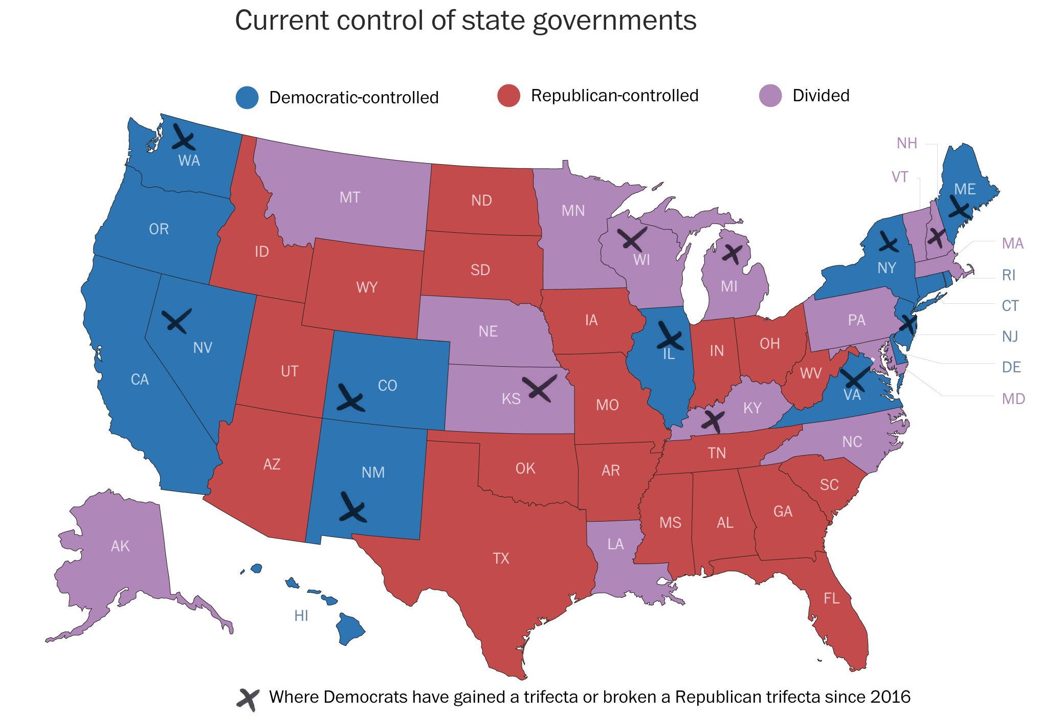
Then we get to a choropleth map. It shows the current state of control for each state.
X marks the spot?However, here the indicator for recent party switches is a set of x’s. These have the same casual approach as the arrows above. But in this case, a careful examination of the x’s indicates they are not unique, like a person drawing a curve with a pen tool. Instead these come from a pre-determined set as the x’s share the exact same shape, stroke lengths and directions.
In years past we probably would have seen the indicator represented by an outline of the state border or a pattern cross-hatching. After all, with the purple being lighter than the blue, the x’s appear more clearly against purple states than blue. I have to admit I did not see New Jersey at first.
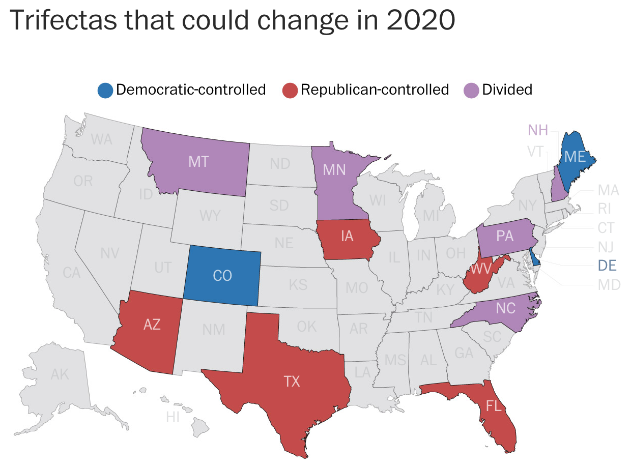
Of course, in an ideal world, a box map would probably be clearer still. But the curious part is that the very next map does a great job of focusing the user’s attention on the datapoint that matters: states set for potential changes next November.
Pennsylvania is among the states…
Here the states of little interest are greyed out. The designers use colour to display the current status of the potential trifecta states. And so I am left curious why the designers did not choose to take a similar approach with the remaining graphics in the piece.
Overall, I should say the piece is strong. The graphics generally work very well. My quibbles are with the aesthetic stylings, which seem out of place for a straight news article. Something like this could work for an opinion piece or for a different subject matter. But for politics it just struck a loud dissonant chord when I first read the piece.
Credit for the piece goes to Kate Rabinowitz and Ashlyn Still.
As many of my readers know, I have a keen interest in genealogy. And for me that has often met spending hours—far too many hours—wandering around cemeteries attempting to find memorials to ancestors, links to my history, a context to that soil from a different time.
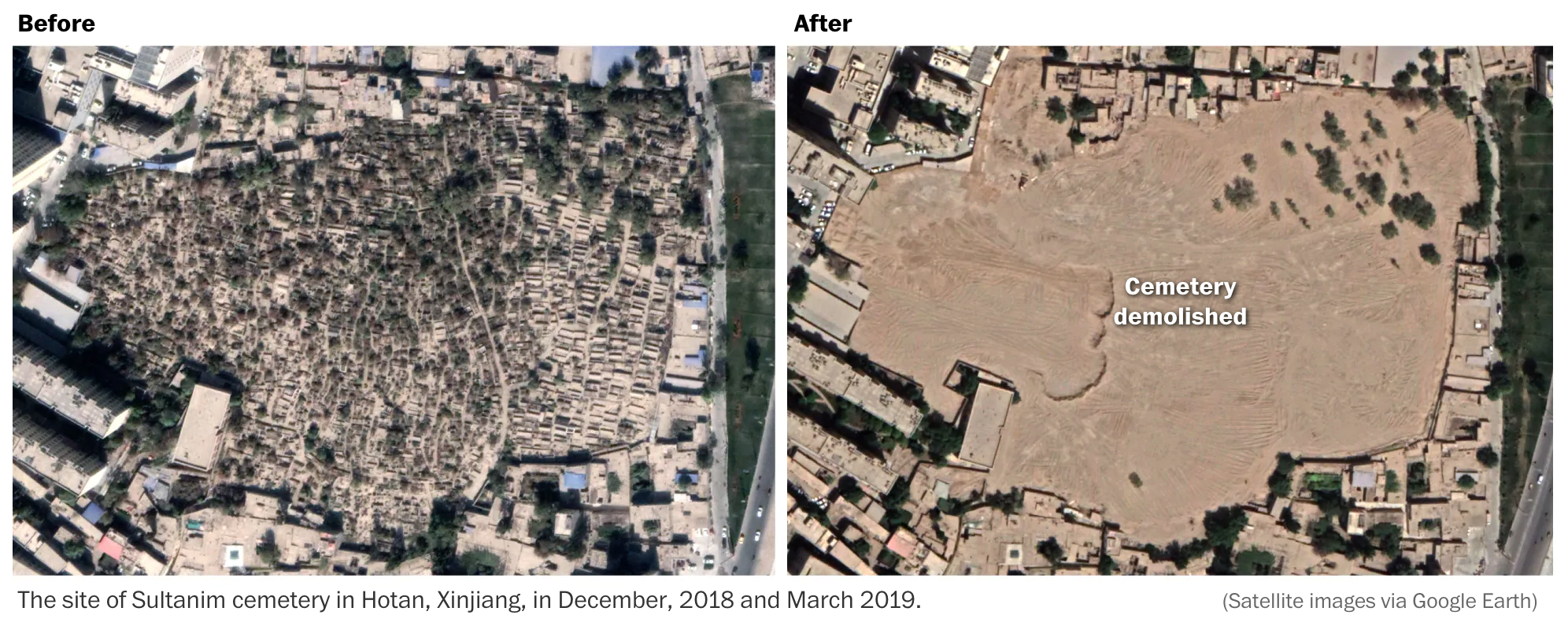
But if you live in Xinjiang or more broadly western China, and you’re not Han Chinese, you probably don’t have that luxury. The Uighurs, a Turkic Muslim people native to that part of Asia, have long been oppressed by the Chinese central government. Most recently they have been in the news after scholars and leading figures have “disappeared”, after news of re-education and concentration camps (though thankfully I have read nothing of industrialised death camps).
Instead, now Chinese authorities are destroying mosques (not news), but also now cemeteries, as this article in the Washington Post explains.
That’s a lot of empty space. Well done, Beijing.
The piece just uses some simple before and after photography to visualise its point. Sadly it does it to great effect.
I forget who originally said it, but someone once said that we all die, each of us, two deaths. The first time is when we die and our buried in the ground. The second and final time is when the last person who remembers us forgets us.
And we are now watching thousands of Uighurs in western China die for the second and final time.
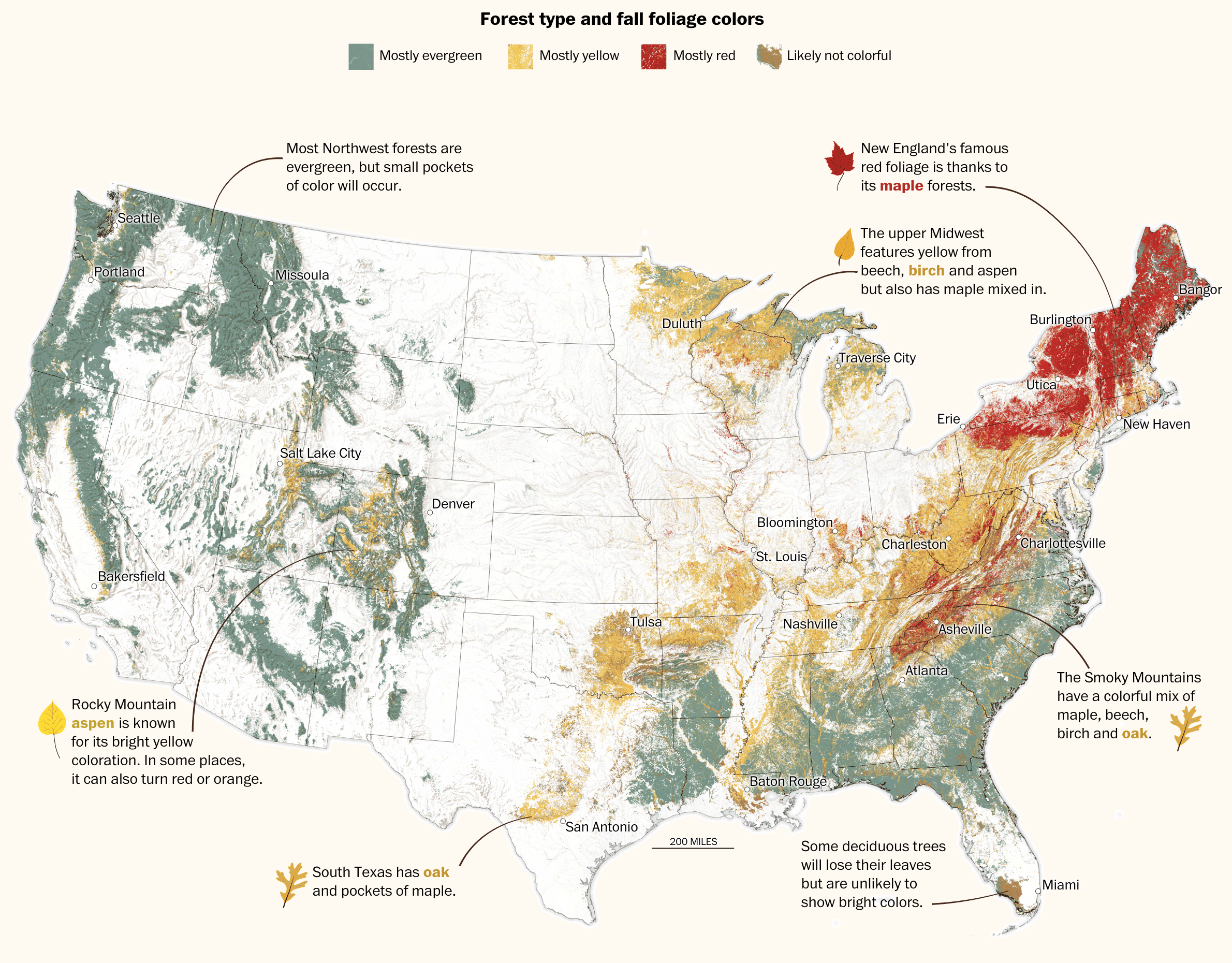
Autumn arrived this week in Philadelphia. And with the cooler weather came blustery winds blowing yellowing leaves from city trees. The yellows and reds of trees beneath blue skies makes for some great photography. But what is really going on? Thankfully, the Washington Post published an article exploring where and why the leaves change colour (or don’t).
The star of the piece is the large map of the United States that shows the dominant colours of forests.
All the colours
Little illustrations and annotations dot the map showing how particular trees (whose leaf shapes are shown) turn particular colours. The text in the piece elaborates on that and explains what is going on with pigments in the leaves. It adds to that how weather can impact the colour change.
Later on in the piece, a select set of photos for specific locations show at a more micro-level, how and where leaf colours change.
Overall, a solid piece for those of you who enjoy leaf peeping to read before this weekend.
Credit for the piece goes to Lauren Tierney and Joe Fox.
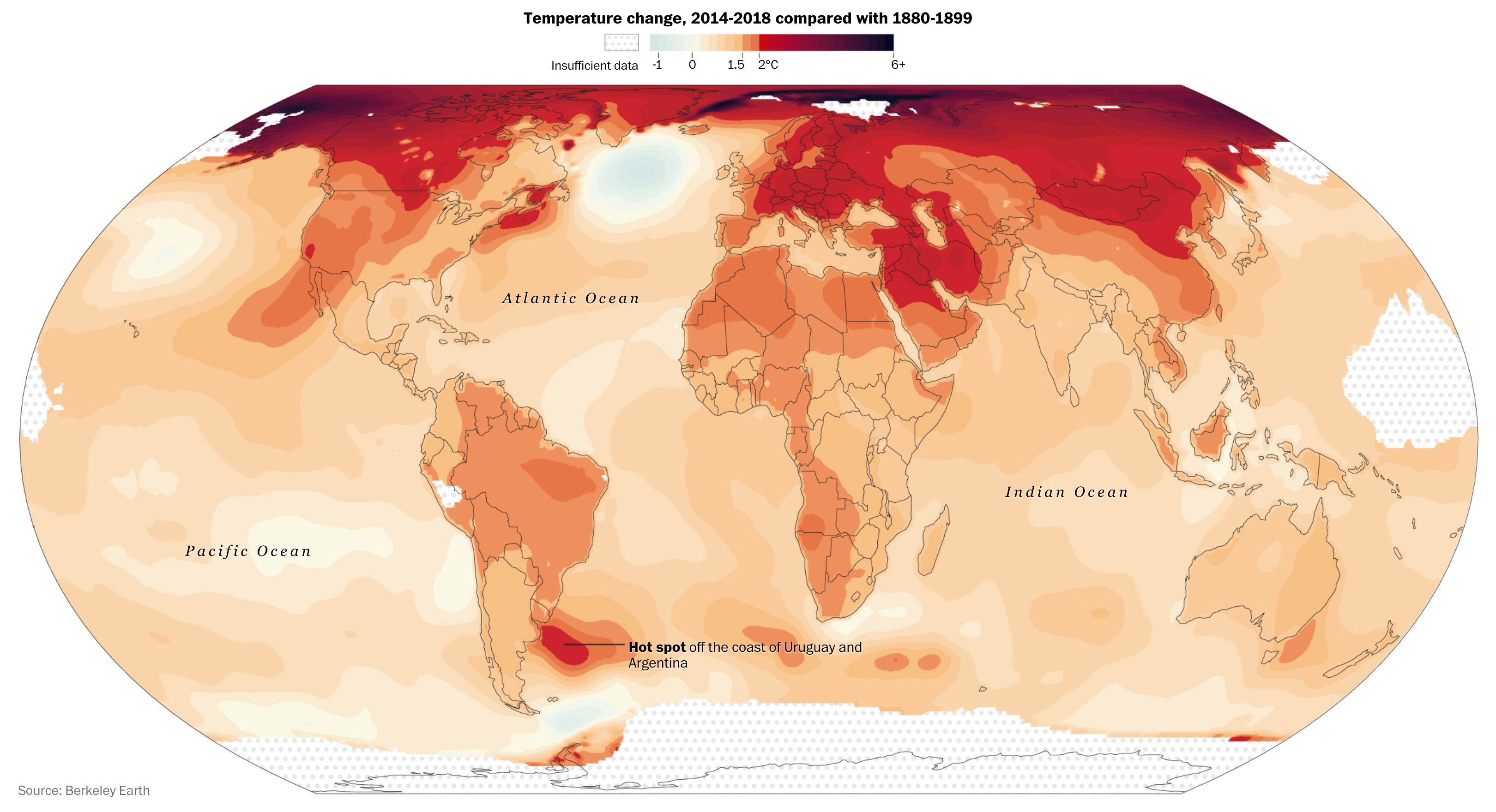
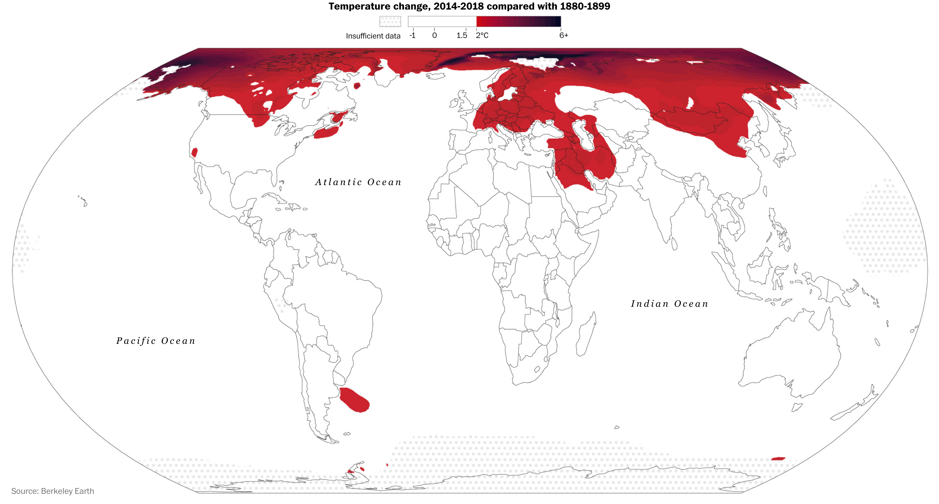
The UN climate summit begins in New York today. So let’s take a look at another data visualisation piece exploring climate change data. This one comes from a Washington Post article that, while largely driven by a textual narrative, does make use of some nice maps.
Ugh.
There is nothing too crazy going on with the actual map itself. I like the subtle use here of a stepped gradient for the legend. This allows for a clearer differentiation between adjacent regions and just how, well, bad things have become.
But where the piece shines is about halfway through. It takes this same map and essentially filters it. It starts with those regions with temperature changes over 2ºC. Then it progressively adds slightly less hotter regions to the map.
I mean at least it could be worse?
It’s a nice use of scrolling and filtering to highlight the areas worst impacted and then move down the horrible impact scale. And because this happens in the middle of the piece, giving it the full column width (online) allows the reader to really focus on the impacts.
Credit for the piece goes to Chris Mooney and John Muyskens.
So admittedly this post should have been up last week, but I liked the lunar cycle one too much. But today is Friday and who cares. We made it to the end of the week.
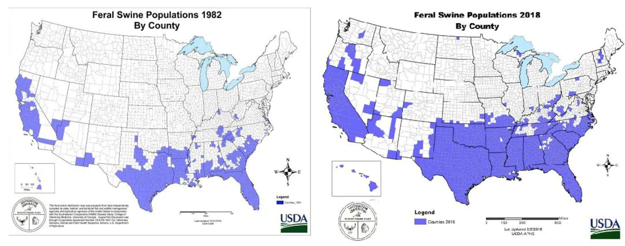
In the wake of the shootings last week, someone on Twitter posed the question:
Legit question for rural Americans – How do I kill the 30-50 feral hogs that run into my yard within 3-5 mins while my small kids play?
And with that the Internet was off. Memes exploded across the social media verse. Thankfully the Washington Post took it seriously and found data on the expanding footprint of hogs in the United States.
Pig problems
The article also points out, however, that the firearm that prompted the discussion, the now infamous AR-15, would also be a poor choice against feral hogs as its too small a calibre to effectively deal with the animals.
Credit for the piece goes to the US Department of Agriculture.