The ABCs of the F-35

Certainly in the more illustrative range, a few weeks back the Washington Post published a small piece that looked at the F-35. Somehow it has survived budget cuts and become a monstrous $400 billion defence project. Partly that is because it is being built in three different versions for all the main aircraft-flying service branches: the Air Force (A), the Marine Corps (B), and the Navy (C). The Post piece highlights some of the key differences between the  versions.

The F-35A
The F-35A

Credit for the piece goes to Rajiv Chandrasekaran, Alberto Cuadra, and Bill Webster.

National Pi Day

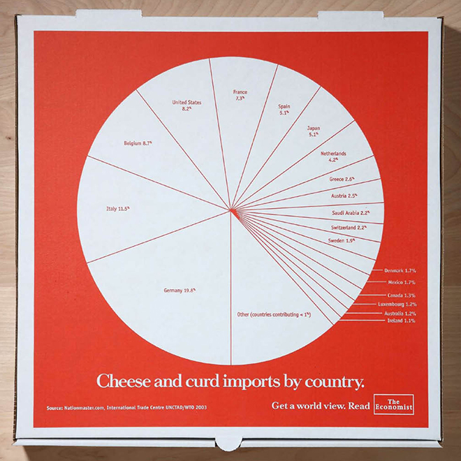
Yesterday was National Pi Day. That’s Pi as in 3.14…not as in pie pie. Unless you celebrated Pi Day with pie. In which case, way to go, you. Me, I’m more traditional. I celebrated Pi Day with talk of pie charts. But at the Wonkblog over at the Washington Post, Sarah Kliff posted about several really impressive pie charts.

My favourite was the actual advertising done by the Economist back in Philly a few years ago. Their advert was printed atop a pizza pie box. It’s the double-whammy of Pi Day: pie charts atop a pizza pie.

The image below comes from a different site about the Economist ad campaign, found here, but the link goes to the celebration of pi with pie.

Pizza Pie Pie Chart for Pi Day

Thanks to my co-worker Eileen for passing on the tip.

Wealth Inequality in the United States

Reality is never what you think. Over at the Washington Post’s Wonkblog I found a post about a YouTube video looking at wealth inequality in the United States. It looks at a study that compared what Americans thought the distribution of wealth in the United States is vs. what they think is an ideal distribution. And then the video compares that to the actual distribution.

The video is rather solid and does a fairly good job at explaining its point. And those unsure about wealth inequality and how it is different from and sometimes more meaningful than income inequality should read the post along with the video.

Wealth inequality
Wealth inequality

Credit for the video goes to a YouTube user named Politizane.

Influenza

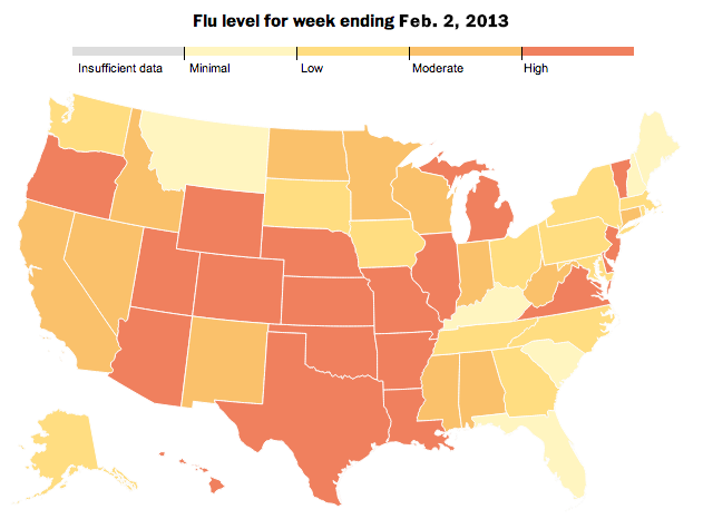
The Washington Post has an interactive infographic piece out about the spread of the flu. The big draw is of course the map—people like maps and they are easy to navigate. However, this time the map actually can serve a useful purpose because a virus spreads through the contact of people and communities. And when illustrated over time, the user can see a general spread from the deep south to the Mid-Atlantic than the west before becoming a national problem.

The geographic distribution of the flu

But a really sharp component that I enjoy is the index of flu cases from the four most recent flu seasons. While half the years displayed have seen a gradual increase in the number of hospitalisations, the 2012–13 season became quite troublesome quite quickly. It has even surpassed the 2009–10 levels that were affected by the H1N1 pandemic.

An indexed look at the rampancy of influenza outbreaks

Lastly, not shown here, is an illustration of just what the flu is—a virus—and how it spreads and where anti-viral drugs work.

Credit for the piece goes to Darla Cameron, Dan Keating and Alberto Cuadra.

All Your Drone Base Are Belong to Us

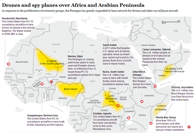
John Brennan’s confirmation for heading up the CIA begins today. He’s been pretty instrumental in strengthening the United States’ counter-terrorism programme, especially the use of drones to eliminate terrorists.

For those drones, the Washington Post mapped out the known bases in Africa and the Middle East from which we operate our drones.

Map of drone bases
Map of drone bases

Where in the World is the Secretary of State?

On Friday Hillary Clinton steps down as Secretary of State to (likely) be replaced by John Kerry whose confirmation votes will (likely) be later this week. One of the big roles for the Secretary of State is to travel abroad and represent the United States. If secretaries go where the US needs to be represented, that would imply that some states are more important for foreign visits. So has there been a shift in priorities in recent years?

In this interactive piece the Washington Post looks at where James Baker, Warren Christopher, Madeline Albright, Colin Powell, Condoleeza Rice, and Hillary Clinton visited during their tenure at Foggy Bottom. The screen shots below only show the maps—there are very useful tables for finding data on trips to specific countries—for Baker and Clinton and comparing the two. The shift from the European/Cold War mentality is quite pronounced.

James Baker's trips abroad
Hillary Clinton's trips abroad

Credit for the piece goes to Emily Chow and Glenn Kessler.

Healthy Living

Yesterday the Washington Post published an article and an accompanying interactive infographic on life expectancy. But not just how long one can expect to live, but also how long one can expect to live in good health. What makes the piece particularly nice and effective are the annotations that explain some of the data points, in particular the outlier of Haitian males.

Life expectancies
Life expectancies

Credit for the piece goes to Bonnie Berkowitz, Emily Chow, and Todd Lindeman.

More Evidence on Why You (I) Need a Good Night’s Sleep

The Washington Post looks at sleep and how lack thereof may lead to various health problems, including Alzheimers, diabetes, and others. Maybe this means I have a reason to sleep in the mornings now…probably not.

Credit for the piece goes to Bonnie Berkowitz and Alberto Cuadra.

Drone Wars

This is a small interactive piece by the Washington Post that looks at the drone wars being waged by the United States specifically in Pakistan and then Yemen/Somalia. Clicking on a specific date in the timeline brings that date into focus with articles about the attacks in question.

Drone Wars
Drone Wars

What would have perhaps been interesting is a comparison of the number and location of drone strikes between the Bush administration and the Obama administration. Regardless, it illuminates a dark front of our ongoing wars.

Credit for the piece goes to Julie Tate, Emily Chow, Jason Bartz, Jeremy Bowers, Anup Kaphle and Olga Khazan.

How a Dead Panda Should Have Grown

Earlier this month a panda was born in Washington. The Post did a small infographic looking at how a panda cub grows over the course of its first year. I decided I would probably wait until sometime later this week to publish it.

Except it died yesterday. So before the moment is gone, here’s a graphic from the Washington Post looking at how the cub should have grown up.

How it should have grown

Credit for the piece goes to Patterson Clark.