Discontinuous Lead Bars

Last week the Guardian published an article about drinking water pollution across the United States. Overall, it was a nicely done piece and the graphics within segmented the longer text into discrete sections. Each unit looks similar:

PFAs.

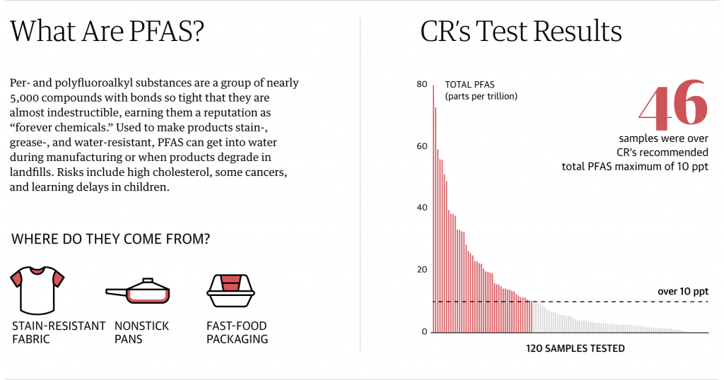
The left focuses on a definition and provides contextual information. It includes small illustrations of the mechanisms by which the pollutant enters the water system. To the right is a chart showing the levels of the contamination detected in the 120 tests the Guardian (and its partner Consumer Reports) conducted.

In almost all of the charts, we see the maximum depicted on the y-axis. And the bars are coloured if that observation station exceeds the health and safety limits. (The limit is represented by the dotted line.)

But towards the end of the piece we get to lead, a particularly problematic pollutant. There is no safe level of lead contamination. But how the piece handles the lead chart leaves a bit to be desired.

But how bad is it, really?

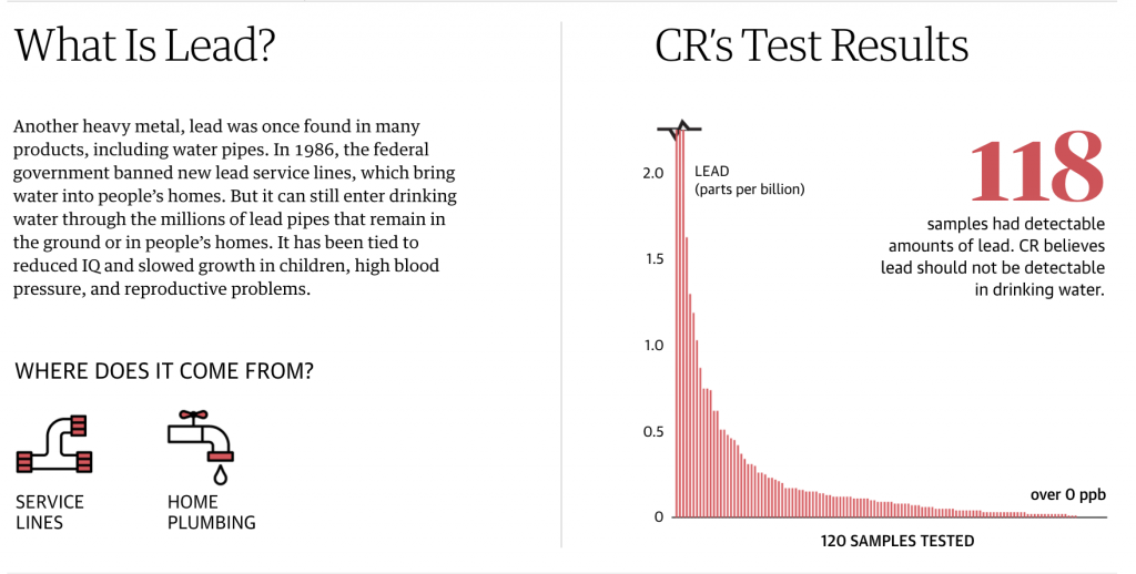
The first thing is colour, but that’s okay. Everything is red, but again, there is no safe level of lead so everything is over the limit. But look at the y-axis. That little black line at the top indicates a discontinuity in the lines, in other words the values for those three observations are literally off the chart.

But does that work?

First, this kind of thing happens all the time. If you ever have to work with data on either China or India, you’ll often find those two nations, due to their sheer demographic size, skew datasets that involve people. But in these kind of situations, how do we handle off the charts data points?

There is a value to including those points. It can show how extreme of an outlier those observations truly are. In other words, it can help with data transparency, i.e. you’re not trying to hide data points that don’t fit the narrative with which you’re working.

In this piece, it’s never explicitly stated what the largest value in the data set is, but I interpret it as being 5.8. So what happens if we make a quick chart showing a value of 6 (because it’s easier than 5.8)? I added a blue bar to distinguish it from the the rest of the chart.

It’s pretty bad.

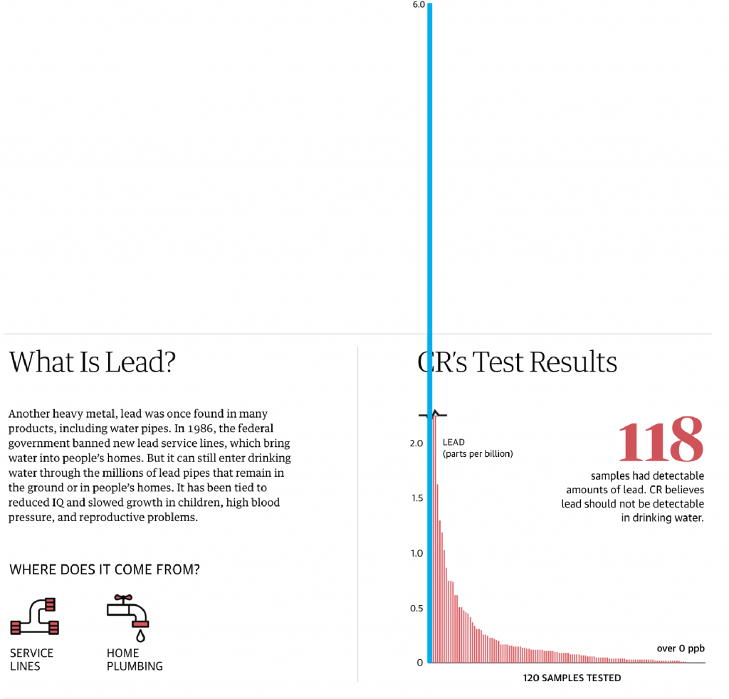
You can see that including the data point drastically changes how the chart looks. The number falls well outside the graphic, but it also shows just how dangerously high that one observation truly is.

But if you say, well yeah, but that falls outside the box allowed by the webpage, you’re correct. There are ways it could be handled to sit outside the “box”, but that would require some extra clever bits. And this isn’t a print layout where it’s much easier to play with placement. So what happens when we resize that graphic to fit within its container?

And resized

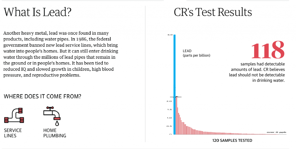
You can see that All the other bars become quite small. And this is probably why the designers chose to break the chart in the first place. But as we’ve established, in doing so they’ve minimised the danger of those few off-the-charts sites as well as left off context that shows how for the vast majority of sites, the situation is not nearly as dire—though, again, no lead is good lead.

What else could have been done? If maintaining the height of the less affected bars was paramount, the designers had a few other options they could have used. First, you could exclude those observations and perhaps put a line below the 118 text that says “for three sites, the data was off the charts and we’ve excluded them from the set below.”

I have used that approach in the past, but I use it with great reluctance. You are removing important outliers from the data set and the set is not complete without them. After all, if you are looking to use this data set to inform a policy choice such as, which communities should receive emergency funding to reduce lead levels, I’d want to start with the city in blue. Sure, I would like everyone to get money, but we’d have to prioritise resources.

I think the best compromise here would have actually been a small tweak to the original. Above the three bars that are broken (or perhaps to the right with some labelling), label the discontinuous data points to provide clearer context to the vast majority of the sites, which are below 0.5 ppb.

As easy as ABC

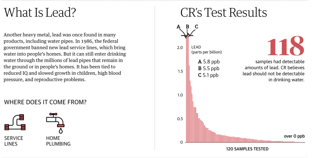
This preserves the ability to easily compare the lower level observations, but provides important context of where they sit within the overall data set by maintaining the upper limits of the worst offenders.

Credit for the piece goes to the Guardian’s graphics department.

Water, Water Everywhere Nor Any Drop to Drink Part II

Yesterday we looked at the New York Times coverage of some water stress climate data and how some US cities fit within the context of the world’s largest cities. Well today we look at how the Washington Post covered the same data set. This time, however, they took a more domestic-centred approach and focused on the US, but at the state level.

Still no reason to move to the Southwest

Both pieces start with a map to anchor the piece. However, whereas the Times began with a world map, the Post uses a map of the United States. And instead of highlighting particular cities, it labels states mentioned in the following article.

Interestingly, whereas the Times piece showed areas of No Data, including sections of the desert southwest, here the Post appears to be labelling those areas as “arid area”. We also see two different approaches to handling the data display and the bin ranges. Whereas the Times used a continuous gradient the Post opts for a discrete gradient, with sharply defined edges from one bin to the next. Of course, a close examination of the Times map shows how they used a continuous gradient in the legend, but a discrete application. The discrete application makes it far easier to compare areas directly. Gradients are, by definition, harder to distinguish between relatively close areas.

The next biggest distinguishing characteristic is that the Post’s approach is not interactive. Instead, we have only static graphics. But more importantly, the Post opts for a state-level approach. The second graphic looks at the water stress level, but then plots it against daily per capita water use.

California is pretty outlying

My question is from the data side. Whence does the water use data come? It is not exactly specified. Nor does the graphic provide any axis limits for either the x- or the y-axis. What this graphic did make me curious about, however, was the cause of the high water consumption. How much consumption is due to water-intensive agricultural purposes? That might be a better use of the colour dimension of the graphic than tying it to the water stress levels.

The third graphic looks at the international dimension of the dataset, which is where the Times started.

China and India are really big

Here we have an interesting use of area to size population. In the second graphic, each state is sized by population. Here, we have countries sized by population as well. Except, the note at the bottom of the graphic notes that neither China nor India are sized to scale. And that make sense since both countries have over a billion people. But, if the graphic is trying to use size in the one dimension, it should be consistent and make China and India enormous. If anything, it would show the scale of the problem of being high stress countries with enormous populations.

I also like how in this graphic, while it is static in nature, breaks each country into a regional classification based upon the continent where the country is located.

Overall this, like the Times piece, is a solid graphic with a few little flaws. But the fascinating bit is how the same dataset can create two stories with two different foci. One with an international flavour like that of the Times, and one of a domestic flavour like this of the Post.

Credit for the piece goes to Bonnie Berkowitz and Adrian Blanco.

Water, Water Everywhere Nor Any Drop to Drink

Most of Earth’s surface is covered by water. But, as any of you who have swallowed seawater can attest, it is not exactly drinkable. Instead, mankind evolved to drink freshwater. And as some new data suggests, that might not be as plentiful in the future because some areas are already under extreme stress. Yesterday the New York Times published an article looking at the findings.

More reasons for me not to move to the desert southwest

The piece leads with a large map showing the degree of water stress across the globe. It uses a fairly standard yellow to red spectrum, but note the division of the labels. The High range dwarfs that of the Low, but instead of continuing on, the Extremely High range then shrinks. Unfortunately, the article does not go into the methodology behind that decision and it makes me wonder why the difference in bin sizes.

Of course, any big map makes one wonder about their own local condition. How stressed is Philadelphia, for example? Thankfully, the designers kept that in mind and created an interactive dot plot that marks where each large city falls according to the established bins.

Not so great, Philly

At this scale, it is difficult to find a particular city. I would have liked a quick text search ability to find Philadelphia. Instead, I had to open the source code and search the text there for Philadelphia. But more curiously, I am not certain the graphic shows what the subheading says.

To understand what a third of major urban areas is, we would need to know the total number of said cities. If we knew that, a small number adjacent to the categorisation could be used to create a quick sum. Or a separate graphic showing the breakdown strictly by number of cities could also work. Because seeing where each city falls is both interesting and valuable, especially given how the shown cities are mentioned in the text—it just doesn’t fit the subheading.

But, for those of you from Chicago, I included my former home as a different screenshot. Though I didn’t need to search the source code, because I just happened across it scrolling through the article.

It helps having Lake Michigan right there

Credit for the piece goes to Somini Sengupta and Weiyi Cai.