One of the things I like about Chicago’s WGN network is its weather blog. They often include infographic-like content to explain weather trends or stories. But as someone working in the same field of data visualisation and information design, I sometimes find myself truly confused. That happened with this piece last Friday.
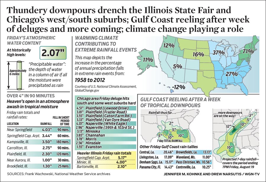
The map in the upper-right in particular caught my attention and not in the good way. The overall piece discusses the heavy rainfall in the Chicago area on Thursday and the map looks at the percentage increase in extreme weather rainfall precipitation. All so far so good. But then I look at the map itself. I see blue and thing blue > water > rainfall. The darker/more the blue, the greater the increase. But, no—check out Hawaii. So blue means less rainfall. But also no, look at the Midwest and Southeast. So does green mean anything? Beyond being all positive growth, not that I can tell. As best I can tell, the colour means nothing in terms of rainfall data, but instead delineates the regions of the United States—noting of course they are not the standard US Census Bureau regions.
So here is my quick stab at trying to create a map that explains the percentage growth. I have included a version with and without state borders to help readers distinguish between states and regions.
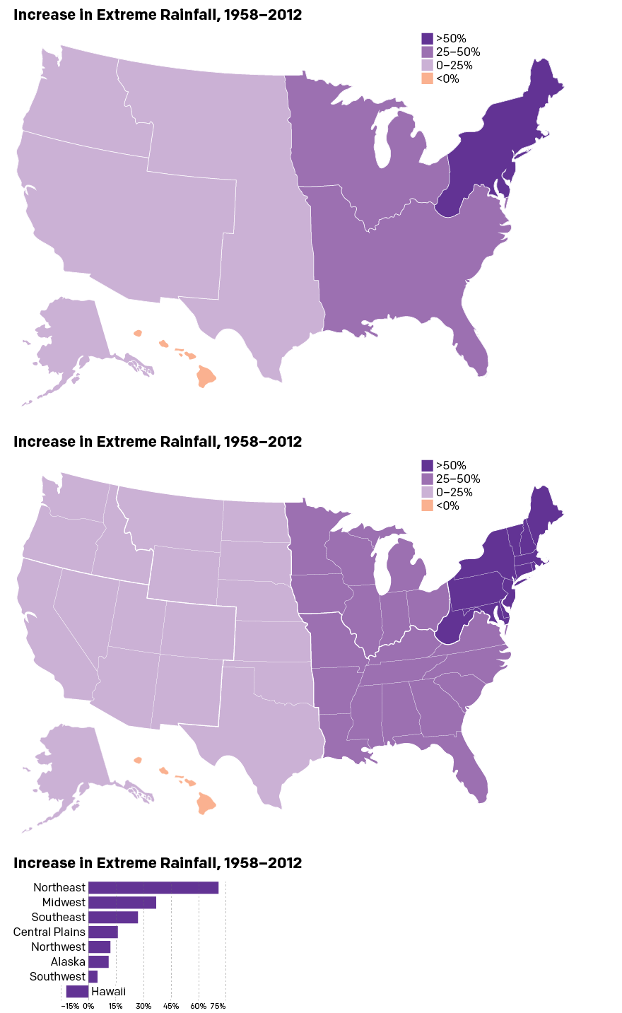
And what is that at the bottom? A bar chart of course. After all, with only eight regions, is a map truly necessary especially when shown at such an aggregate level? You can make the argument that the extreme rainfall has, broadly speaking, benefitted the eastern half of the United States. But, personally speaking, I would prefer a map for a more granular set of data at the state or municipality level.
Credit for the piece goes to Jennifer Kohnke and Drew Narsutis.