New Mexico Burns

Editor’s note: I was having some technical issues last week. This was supposed to post last week.

Editor’s note two: This was supposed to go up on Monday. Still didn’t. Third time’s the charm?

Yesterday I wrote about a piece from the New York Times that arrived on my doorstep Saturday morning. Well a few mornings earlier I opened the door and found this front page: a map of the western United States highlighting the state of New Mexico.

That doesn’t exactly look like a climate I’d enjoy.

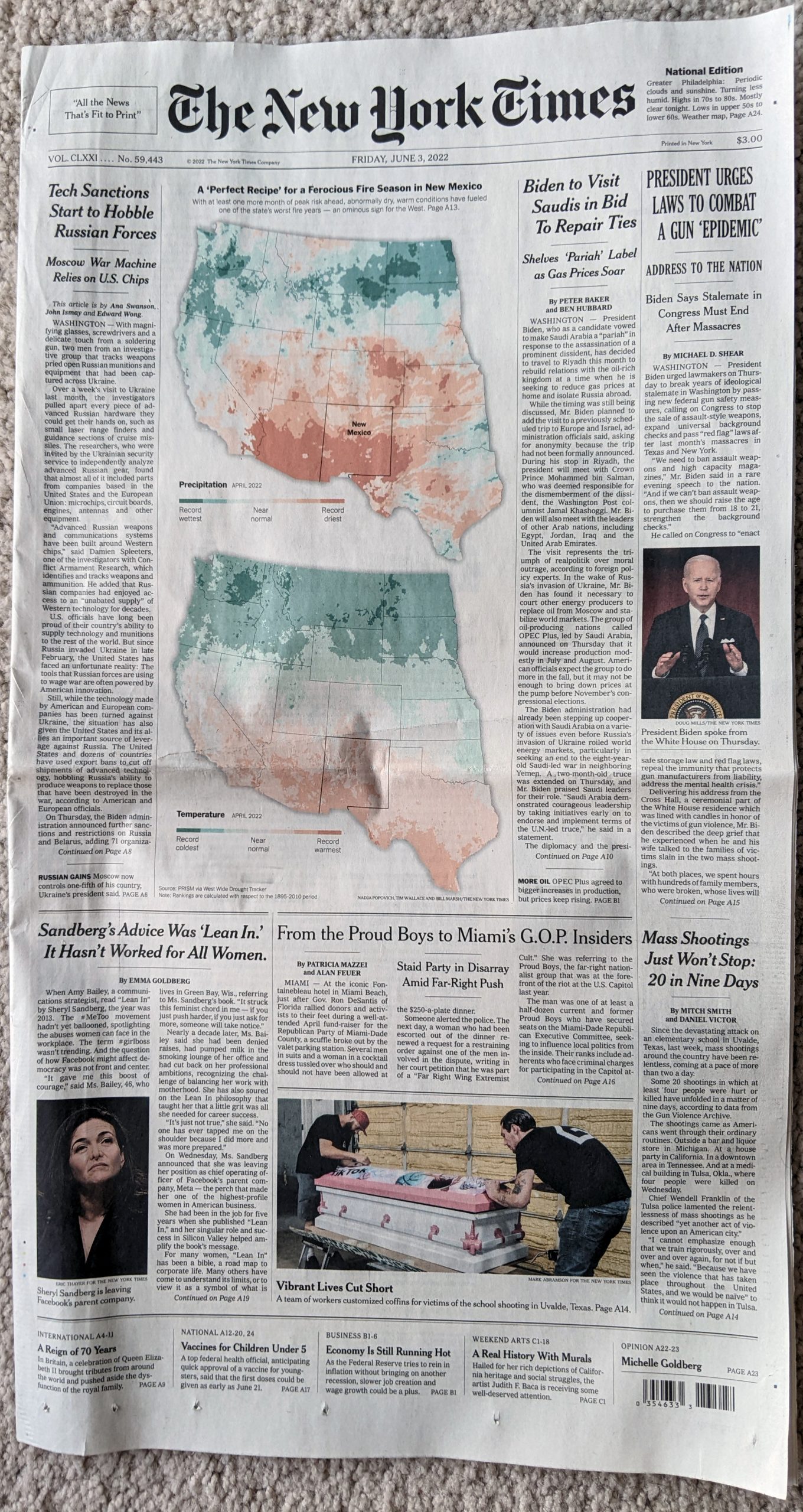
Unlike the graphic we looked at yesterday, this graphic stretched down the page and below the fold, not by much, but still notably. The maps are good and the green–red spectrum passes the colour blind test. How the designer chose to highlight New Mexico is subtle, but well done. As the temperature and precipitation push towards the extreme, the colours intensify and call attention to those areas.

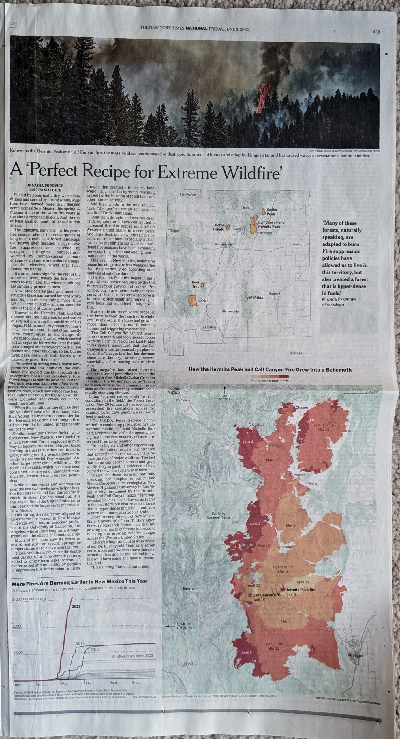
Also unlike the graphic we looked at yesterday, this piece contained some additional graphics on the inside pages.

Definitely not a place where I want to be.

These are also nicely done. Starting with the line chart at the bottom of the page, we can contrast this to some of the charts we looked at yesterday.

Burn, baby, burn.

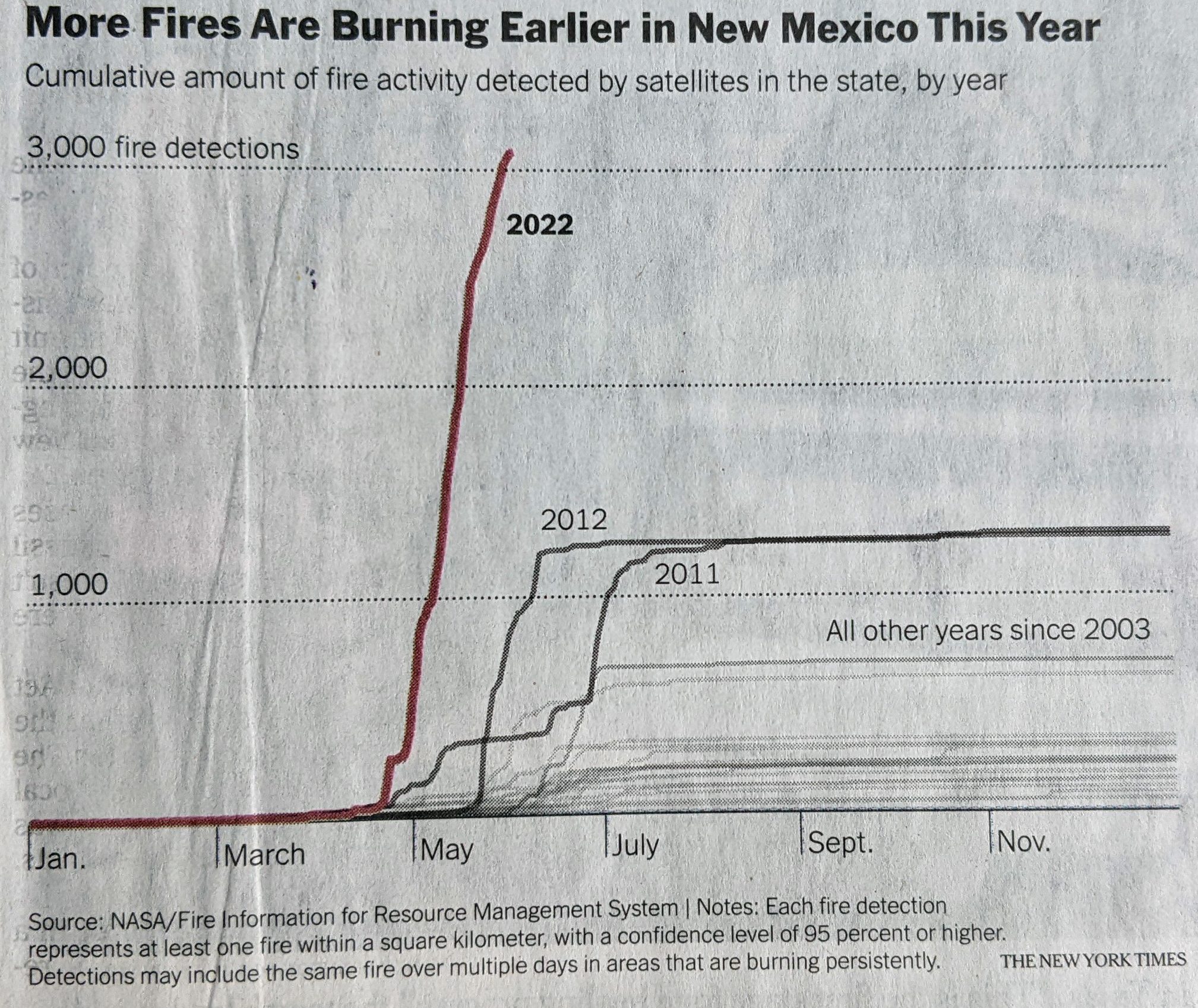
Here the designer used axis lines and scales to clearly indicate the scale of New Mexico’s wildfire problem. Not only can you see that the number of fires detected has spiked far above than the number in the previous years back to 2003. And not only is the number greater, the speed at which they’ve occurred is noticeably faster than most years. The designer also chose to highlight the year in question and then add secondary importance to two other bad years, 2011 and 2012.

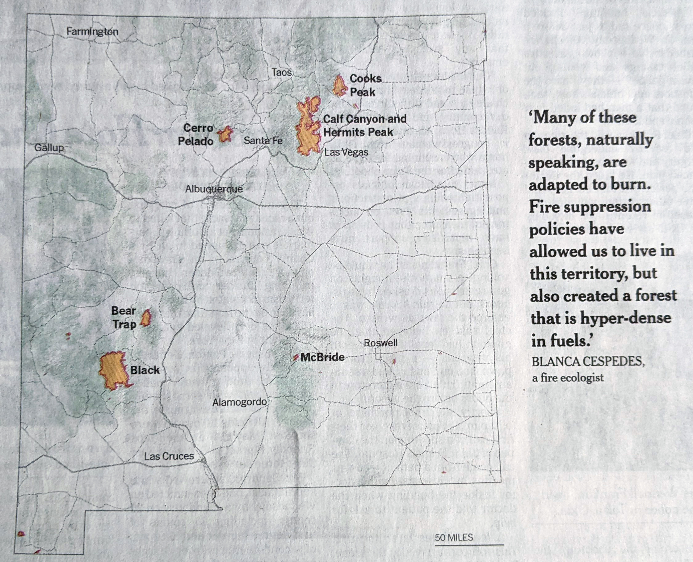
The other graphics are also maps like on the front page. The first was a locator map that pointed out where the fires in question occurred. Including one isn’t much of a surprise, but what this does really nicely is show the scale of these fires. They are not an insignificant amount of area in the state.

Pointing out where I really don’t want to be in New Mexico.

Finally we have the main graphic of the piece, which is a map of the spread of the Calf Canyon and Hermits Peak fire, which was two separate fires until they merged into one. The article does a good job explaining how part of the fire was actually intentionally set as part of a controlled burn. It just became a bit uncontrolled shortly thereafter.

Nope. Definitely not a place to be.

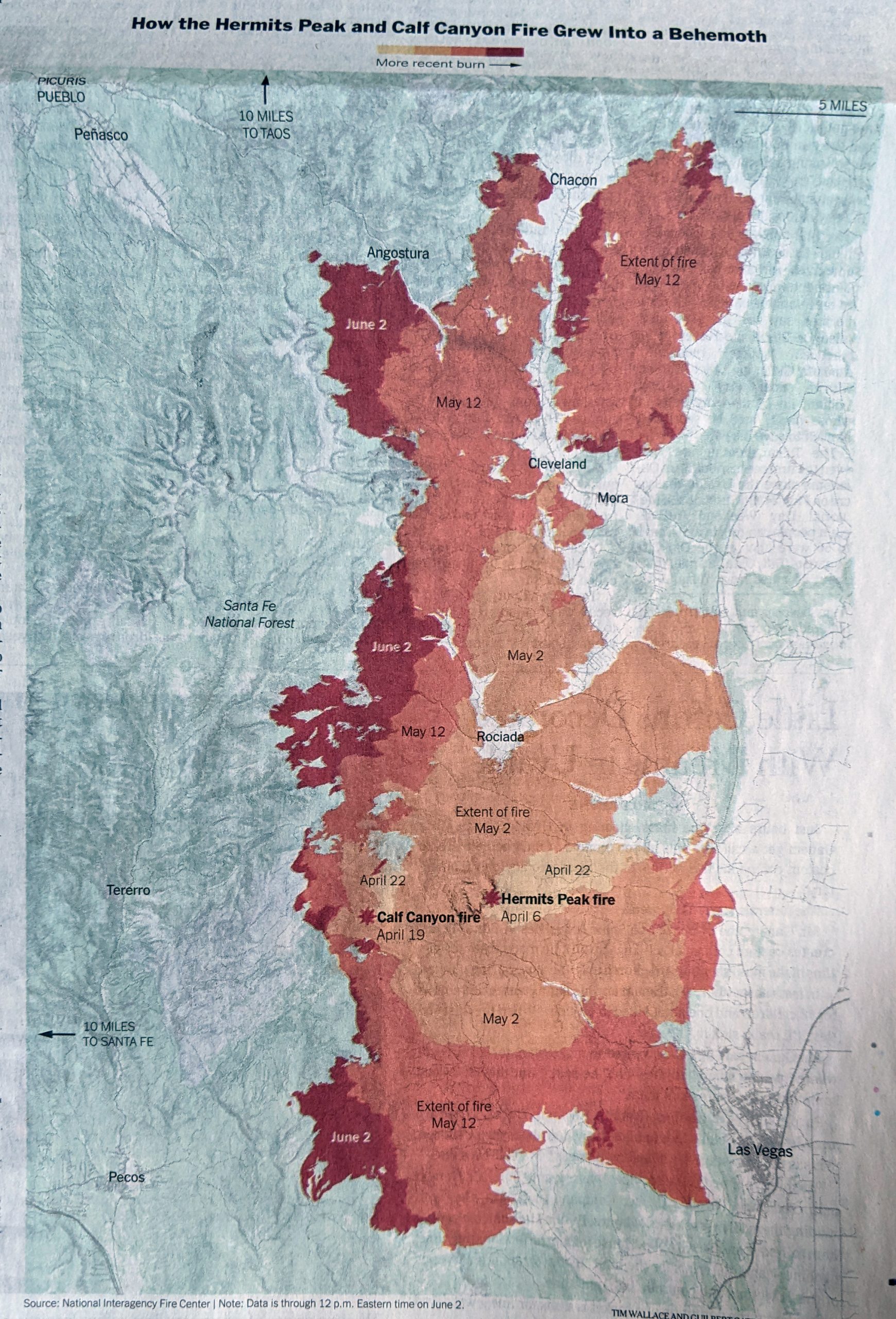
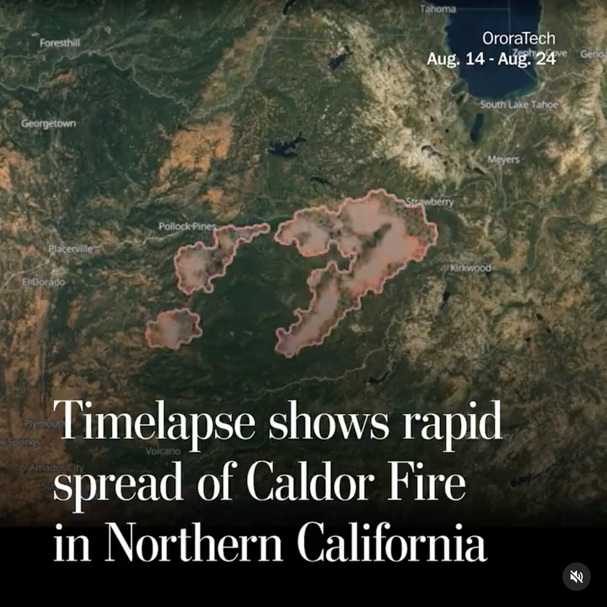
This reminded me of a piece I wrote about last autumn when the volcano erupted on La Palma. In that I looked at an article from the BBC covering the spread of the lava as it headed towards the coast. In that case darker colours indicated the earlier time periods. Here the Times reversed that and used the darker reds to indicate more recent fire activity.

Overall the article does a really nice job showing just what kind of problems New Mexico faces not just now from today’s environmental conditions, but also in the future from the effects of climate change.

Credit for the piece goes to Guilbert Gates, Nadja Popovich, and Tim Wallace.

Spread of the Caldor Wildfire

I’ve been searching to see if I could find a better motion graphic of this, alas not. I saw a post on Instagram from the Washington Post that featured a timelapse video or graphic of the spread of the Caldor Wildfire. The Caldor Wildfire presently rages southwest of Lake Tahoe and has now forced the evacuation of South Lake Tahoe, a city of more than 20,000 people.

If you can’t stand the heat?

The motion graphic just does a nice job of simply capturing the spread, in both direction and speed, of the wildfire. Obviously, the whole area could use the inches of rain that Hurricane Ida is dumping on the eastern half of the country.

Credit for the piece goes to the Washington Post graphics department.

The Size of the California Wildfires Compared to Philly

The West Coast is a different scale than the East Coast. After all, California alone is almost the size of New England and parts of the Mid-Atlantic combined. So when we take that enormous size into consideration, how big are these fires on an East Coast scale? It can be difficult to imagine.

Thankfully the Philadelphia Inquirer addressed the issue.

It’s a simple concept, but I love these kind of graphics. The East Coast is dense and cities and towns are clustered closer together, being they were founded before personal automobiles were things. And so the August Complex fire in California would cover a significant portion of the Philadelphia metropolitan area, almost wiping it all off the map.

Credit for the piece goes to John Duchneskie.

It’ll Get Cooler Eventually

President Trump, on climate change.

I mean, technically he’s correct. Eventually the universe will likely end with heat death as all the energy dissipates and stars die out and space becomes a truly empty, cold void. So it’ll get cooler, eventually.

But what about right now? In one to three generations’ time? 30–90 years? Not looking so great.

So what sparked this ludicrous comment? This year’s wildfire season on the West Coast, usually relegated to California, this year’s season has burned up forests in both Washington and Oregon as well, states whose usually wetter climate inhibits these kind of rapidly spreading fires.

A few days ago the Washington Post published a piece looking at the fires out west. It started with a map showing ultimate fire perimeters and currently active fires.

In a normal year, those fires in Oregon and Washington wouldn’t be there. Welcome to the new normal.

Frequent readers will know I’m not a fan of the dark background for graphics, but I’m betting it was chosen because as you scroll through the article, it makes the photo journalism really pop off the page. Contrast the bright yellows, oranges, and reds with a dark black background and c’est magnifique, at least from a design standpoint. And given this piece is really about the photography depicting the horrors on the West Coast, it’s an understandable design decision.

Credit for the piece goes to Laris Karklis.

More on California’s Dry Heat

Yesterday we looked at the wildfire conditions in California. Today, we look at the Economist’s take, which brings an additional focus on the devastation of the fires themselves. However, it adds a more global perspective and looks at the worldwide decline in forest fires and both where and why that is the case.

California isn't looking too…hot. Too soon?
California isn’t looking too…hot. Too soon?

The screenshot here focuses on California and combines the heat and precipitation we looked at yesterday into a fuel-aridity index. That index’s actual meaning is simplified in the chart annotations that indicate “warmer and drier years” further along the x-axis. The y-index, by comparison, is a simpler plot of the acres burned in fires.

This piece examines more closely that link between fires and environmental conditions. But the result is the same, a warming and drying climate leaves California more vulnerable to wildfires. However, the focus of the piece, as I noted above, is actually on the global decline of wildfires.

Only 2% of wildfires are actually in North America, the bulk occur in Africa. And the piece uses a nice map to show just where those fires occur. In parallel the text explains how changing economic conditions in those areas are lessening the risk of wildfire and so we are seeing a global decline—even with climate change.

Taken with yesterday’s piece with its hyper-California focus, this provides a more global context of the problem of wildfires. It’s a good one-two read.

Credit for the piece goes to the Economist Data Team.

Dry Heat Is Only Part of California’s Problem

Wildfires continue to burn across in California. One, the Camp Fire in northern California near Chico, has already claimed 77 lives. But why has this fire been so deadly?

FiveThirtyEight explained some of the causes in an article that features a number of charts and graphics. The screenshot below features a scatter plot looking at the temperature and precipitation recorded from winter through autumn every year since 1895.

The evolving California climate

The designers did a good job of highlighting the most recent data, separating out 2000 through 2017 with the 2018 data highlighted in a third separate colour. But the really nice part of the chart is the benchmarking done to call out the historic average. Those dotted lines show how over the last nearly two decades, California’s climate has warmed. However, precipitation amounts vary. (Although they have more often tended to be below the long-term average.)

I may have included some annotation in the four quadrants to indicate things like “hotter and drier” or “cooler and wetter”, but I am not convinced they are necessary here. With more esoteric variables on the x- and y-axis they would more likely be helpful than not.

The rest of the piece makes use of a standard fare line chart and then a few maps. Overall, a solid piece to start the week.

Credit for the piece goes to Christie Aschwanden, Anna Maria Barry-Jester, Maggie Koerth-Baker and Ella Koeze.