Today’s post clearly fits within the storyline of mapping, redistricting, and gerrymandering over the last week or so, but the work is a bit older. (Side note, the previously highlighted Pennsylvania 7th Congressional District, well it is in the news for a different story, its congressman just announced he would not be standing for reelection because of a sexual harassment case.)
We have the work of xkcd presenting the 2016 election results, but by mapping out the votes (approximately) in terms of 250,000 voters. It does a good job of showing you just where the population of the United States is concentrated (and vice versa).
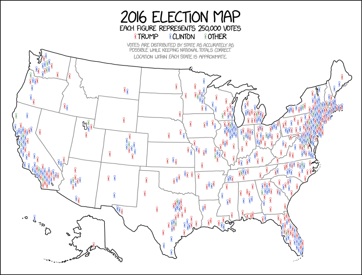
Credit for the piece goes to Randall Munroe.