This week I covered a lot of Red Sox stuff. (And I received some great feedback from people, so maybe more baseball-related stats things will be forthcoming.) But, since it is Friday, I wanted to keep today late. So over breakfast I worked on a flowchart to help you choose whom to root for in the playoffs now that Boston, Colorado, Arizona, Minnesota, Washington, and Cleveland have all been eliminated.
To be fair, my second choice was good old Terry Francona and the Indians (like last year). But, the Evil Empire is returning.
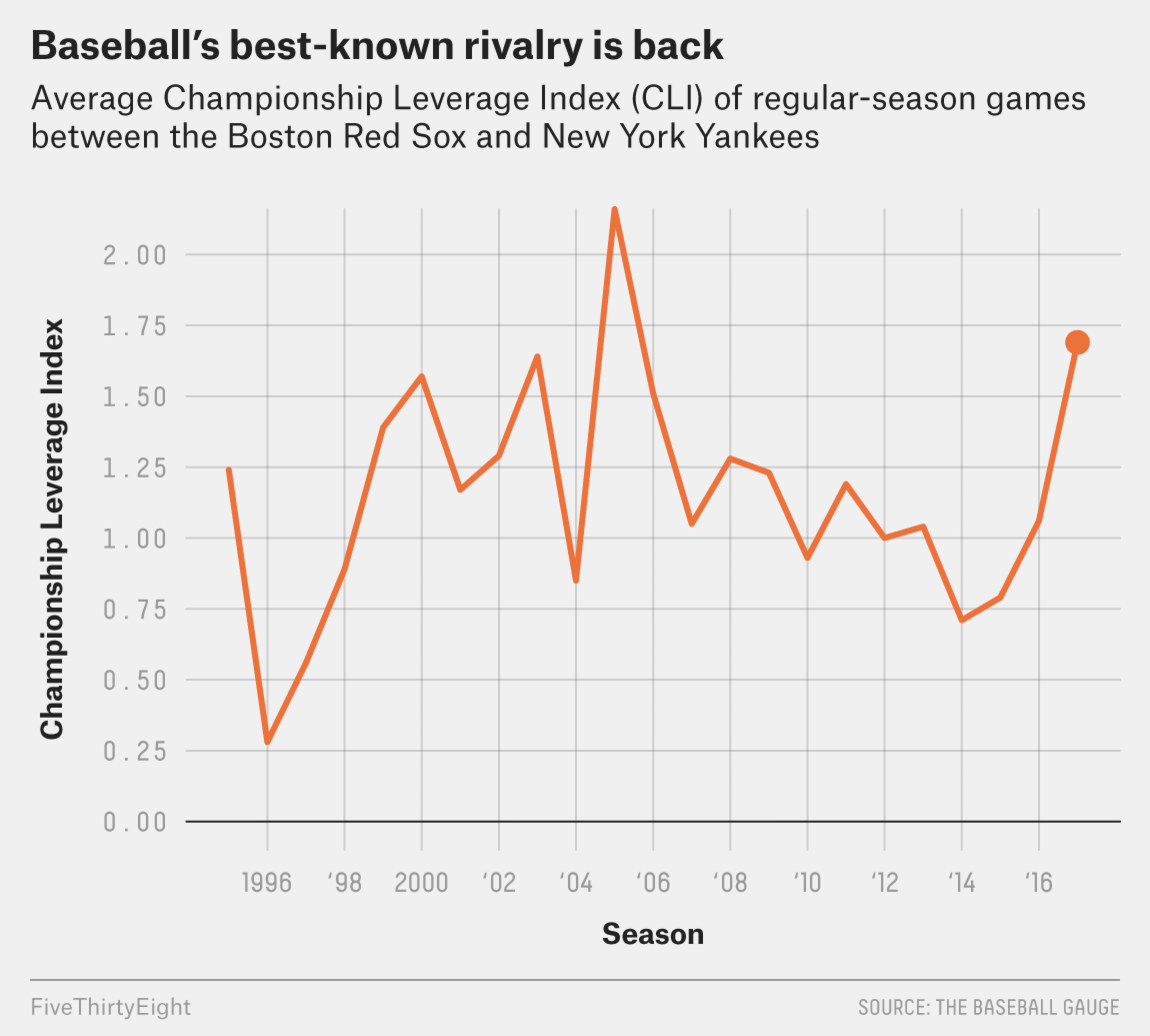
But to be honest, it never really went anywhere. As you know, your humble author visited Boston this past weekend and got to see two games of his Red Sox against Tampa Bay. Tampa, of course, is not the rivalry to which I am referring, but things were heated back in the days when Maddon managed Tampa.
No, I am of course talking about the Red Sox–Yankees rivalry. Two weeks ago FiveThirtyEight posted an article about the rivalry and how it has returned. Admittedly, they meant not from the perspective of bitter hatred for all things Yankees, but rather that the Yankees are attempting to be good again.
This chart from the article is nothing more than a line chart. But I just wanted to point out that the rivalry lives, though in my mind it never really went away.
Down with the Empire…
Credit for the piece goes to the FiveThirtyEight graphics department.
Major League Baseball is set to suspend Alex Rodriguez this morning—if the news reports are true. That will all but end the season for Rodriguez, though he could well play through his appeal so you never really know. But what does this mean for the Yankees and their offense?
The New York Times put together an interactive scatter plot charting the annual salary against the number of hits (roughly a measure of offensive production throughout the year) with benchmark lines for the league average of both. First, the user can see the team averages.
Comparing baseball teams salaries vs. offensive production
At the team-level, one can see that, roughly speaking, the more money a team pays to hitters, the more productive the team. Production it should be noted, does not necessarily equal wins. Look at the Angels, who have some of the most hits, but are in fourth place (out of five) and in a difficult place to make the playoffs.
Quick comparison of the Red Sox's hitters to the Yankees' hitters
But then the user can switch to the top-10 paid hitters on each team. (Four presets are offered beneath the piece, but click on a player from any team and his compatriots will appear.) You can see how the Yankees are hitting poorly in comparison to the Red Sox. (The only reason the Yankees are not truly awful is because their pitching has not been horrible.)
So if Rodriguez is suspended for this year and next, maybe they can use his salary for next year to buy a one-year free agent that isn’t at the bottom right of the this chart.
Credit for the piece goes to Mike Bostock and Joe Ward.