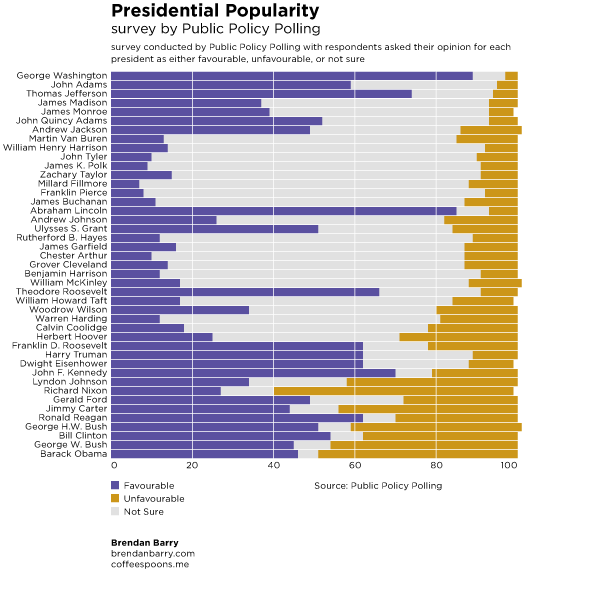
This time last year I used some data published by Public Policy Polling upon presidential popularity (alliterative, right?) to create a graphic looking at said popularity. So here it is again for Presidents Day. Next time I’ll try to remember the holiday is coming a bit further in advance and work on something newer.

A minor point, someone asked why the bar runs past 100 for some presidents yet stops before 100 for others. The data was rounded and some things didn’t add to 100. I saw no need to manipulate the numbers for aesthetic purposes.
Leave a Reply
You must be logged in to post a comment.