Stack It Up

Commentary, critiques, and observations on information design and data visualisation
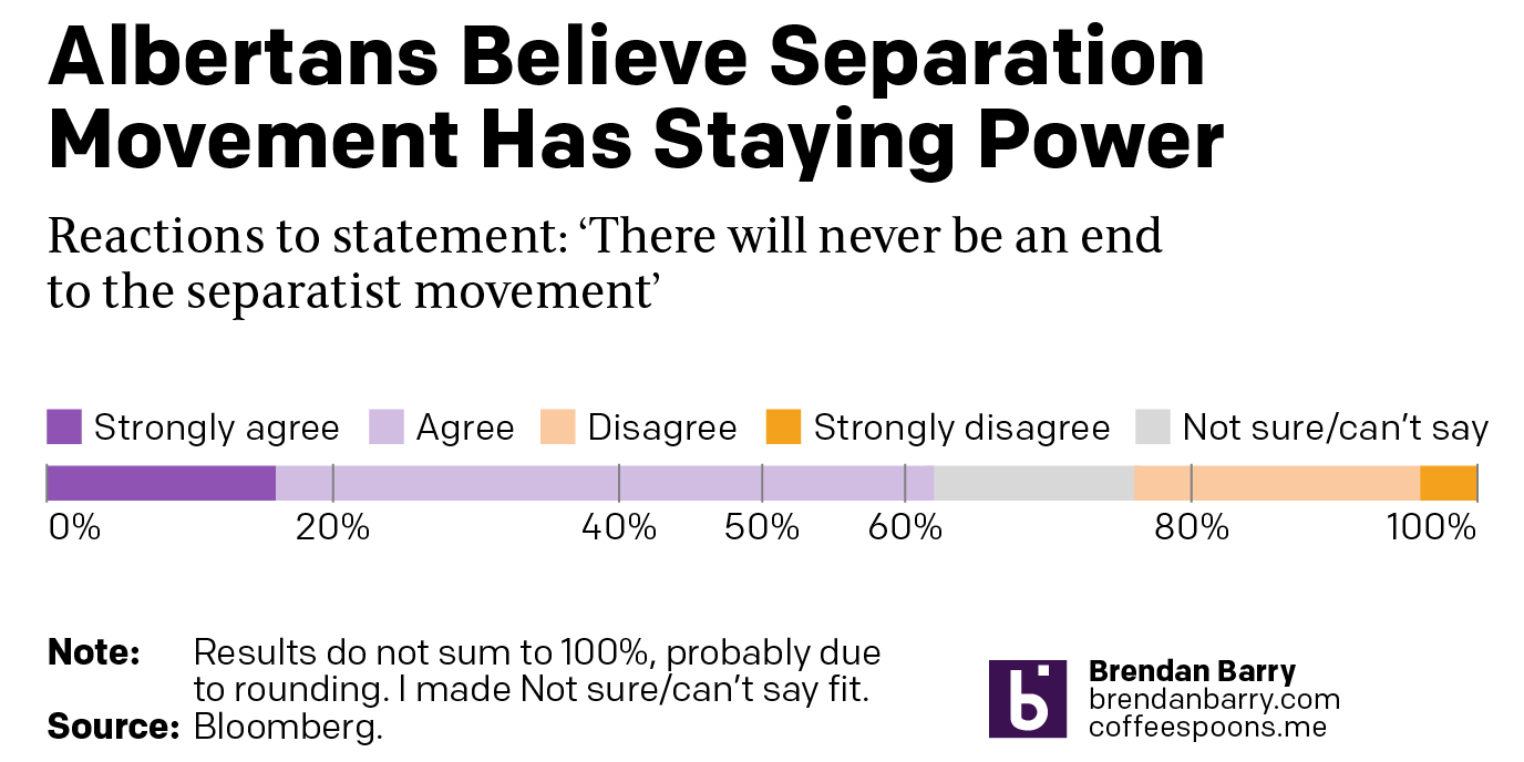
Normally I am not a fan of stacked bar charts. They do not allow users to easily compare the constituent elements of the stack. In spending a number of years working with economists I became familiar with decomposition charts, which help audiences understand what things contribute positively or negatively to, say, economic growth. But the charts fail to help users…
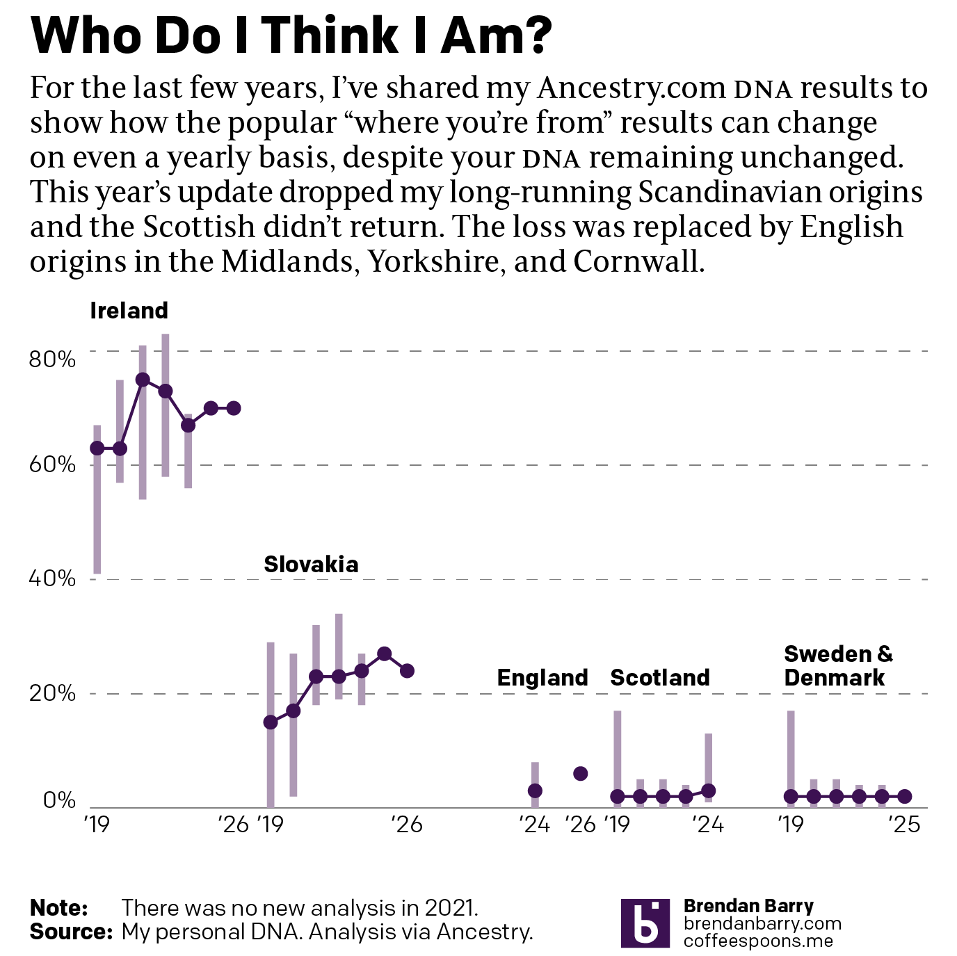
So this is not really a funny post, but certainly is more light-hearted than what I have been posting about of late. This week Ancestry.com updated their analysis of my DNA and my origins. For long-time readers, you know I find fascinating how this aligns with my decade-plus of paper record research. So I figured I would chart the changes,…
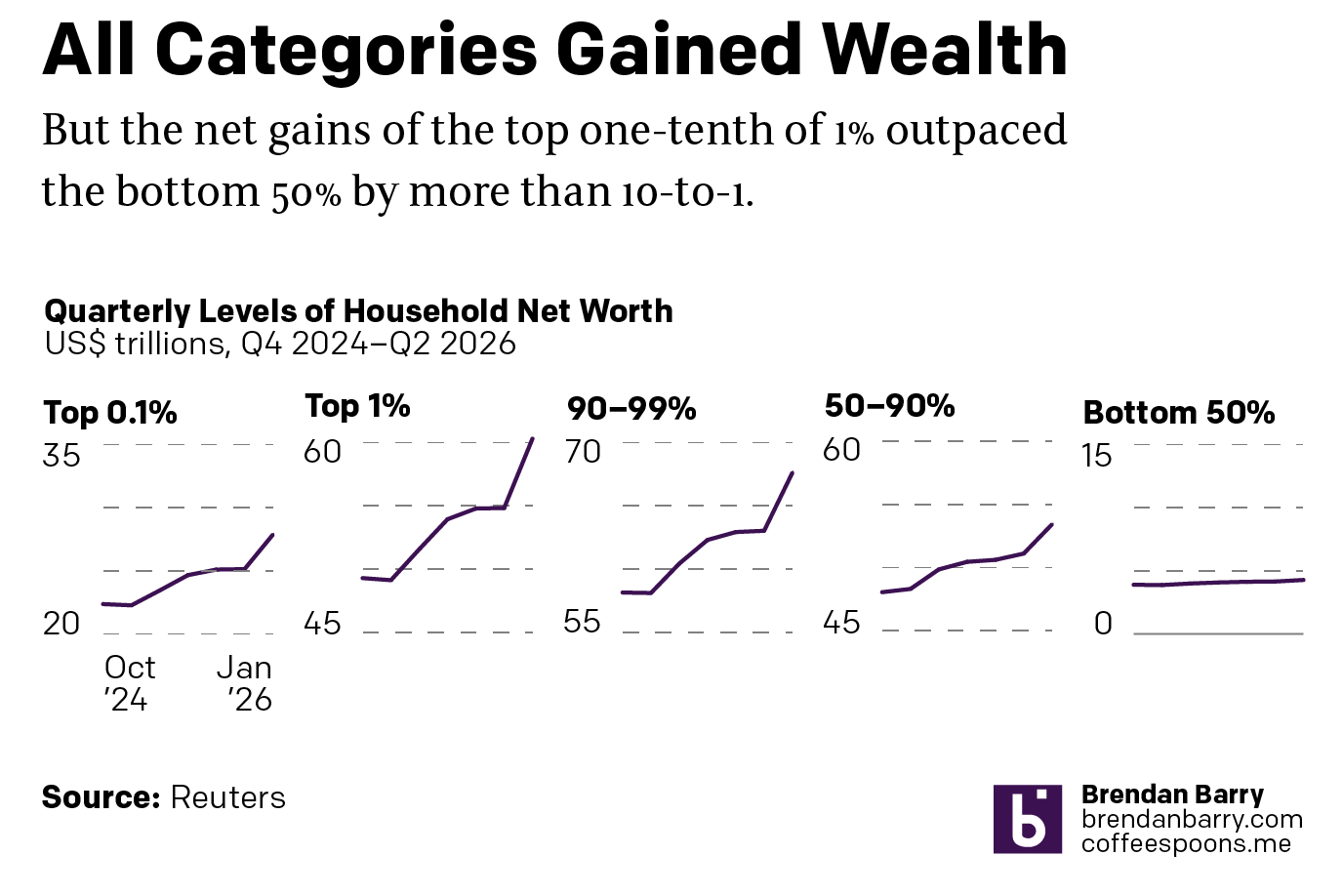
I was reading an interesting article from Reuters this weekend about the disparities in wealth in the United States. The article included this interactive graphic, small multiples of line charts showing US household wealth from October 2024 through January 2026. At surface level we have a nice little graphic. We are looking at wealth across five different slices of American…
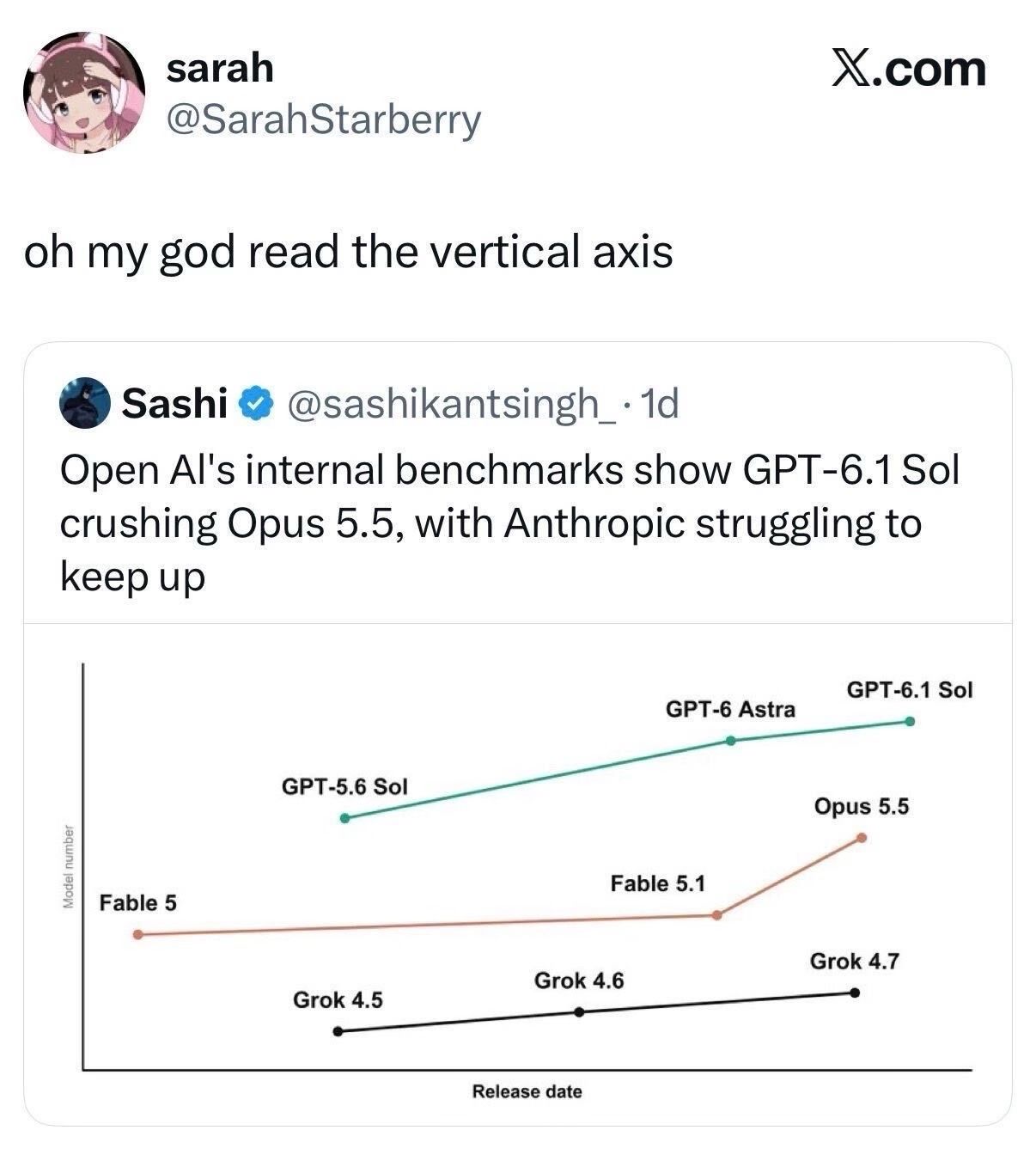
To be clear, I read this as a joke. But we can also use it as a learning opportunity, because I have certainly seen quite a bit of poor data visualisation out in the internet lands of late. Compounding the issue, a seemingly declining level of data visualisation comprehension amongst the consumers in magical computer land. Second, thanks to my…
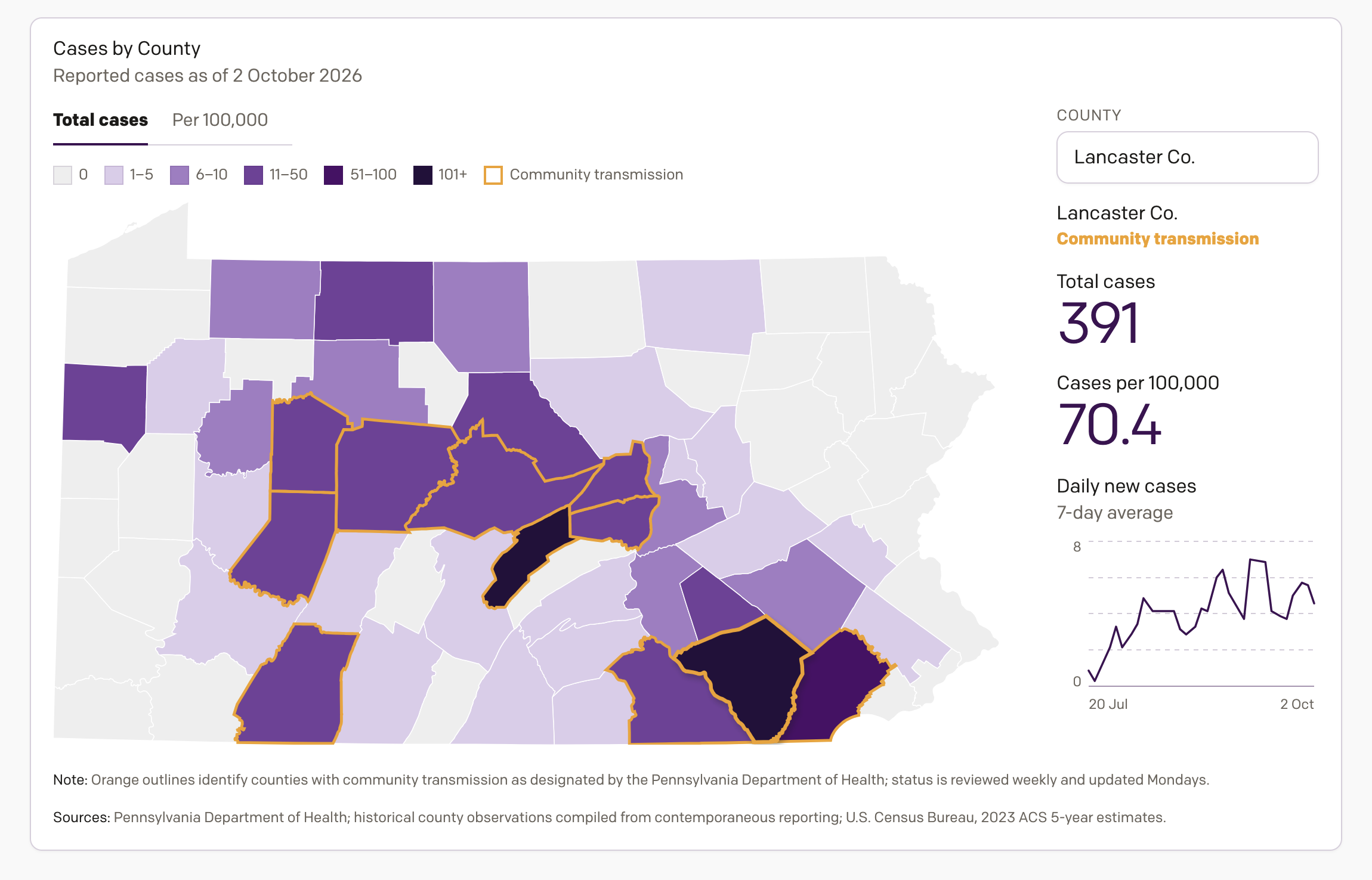
One project on which I have been working the last few weeks is an interactive data visualisation piece tracking the 2026 measles outbreak in Pennsylvania. A few years ago now I closely followed the COVID-19 pandemic, mapping it and charting it in a near daily series of datagraphics—to be clear, and this is a broad oversimplification, measles is less deadly…
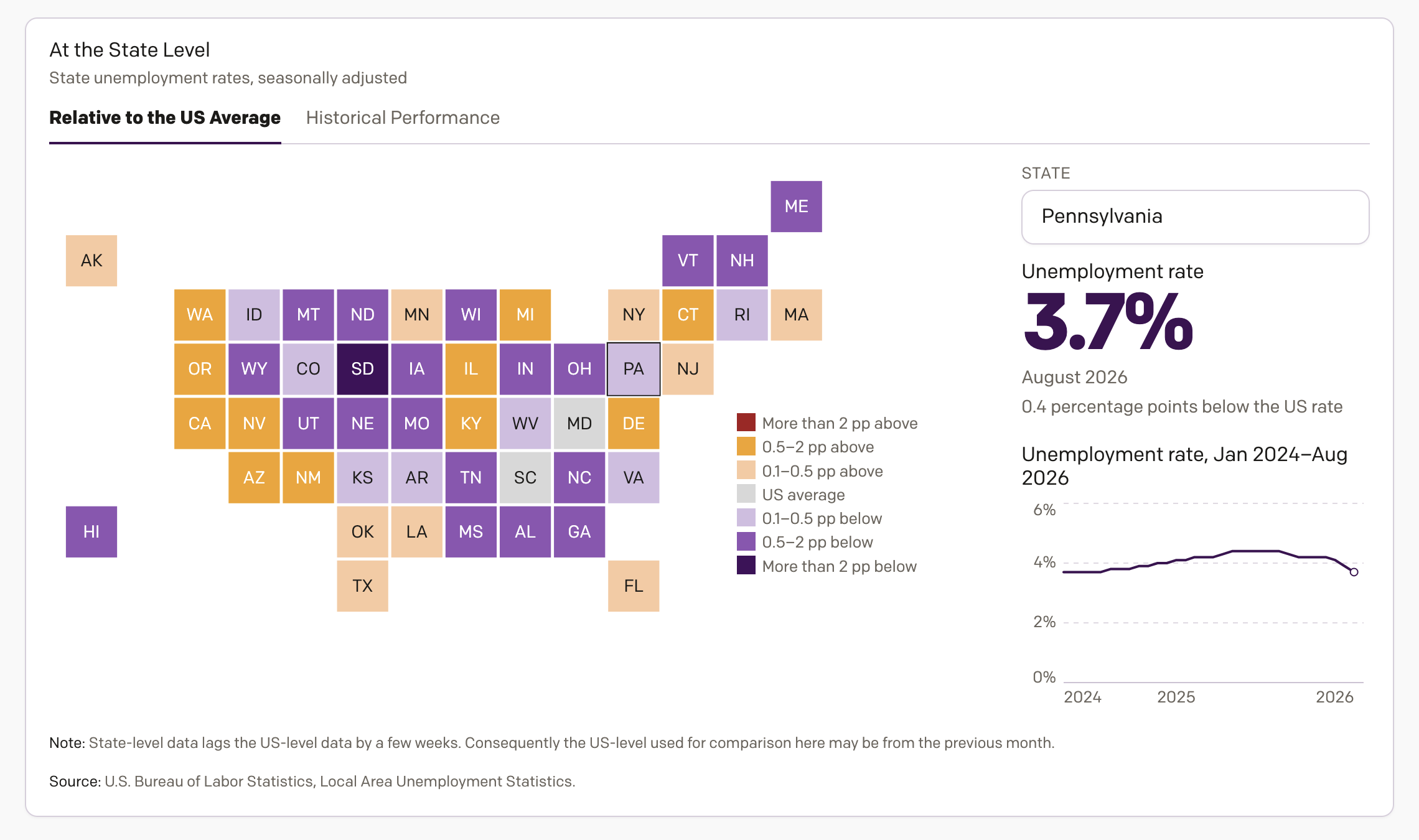
On Tuesday I wrote about my new inflation tracker—I need a better, more marketable name for that. Well, as I was designing the inflation tracker, I concurrently designed an unemployment tracker to track, well, unemployment. And I figured if I shared the one, why not the share the other? Thus, my unemployment in America tracker application thing. This one, however,…
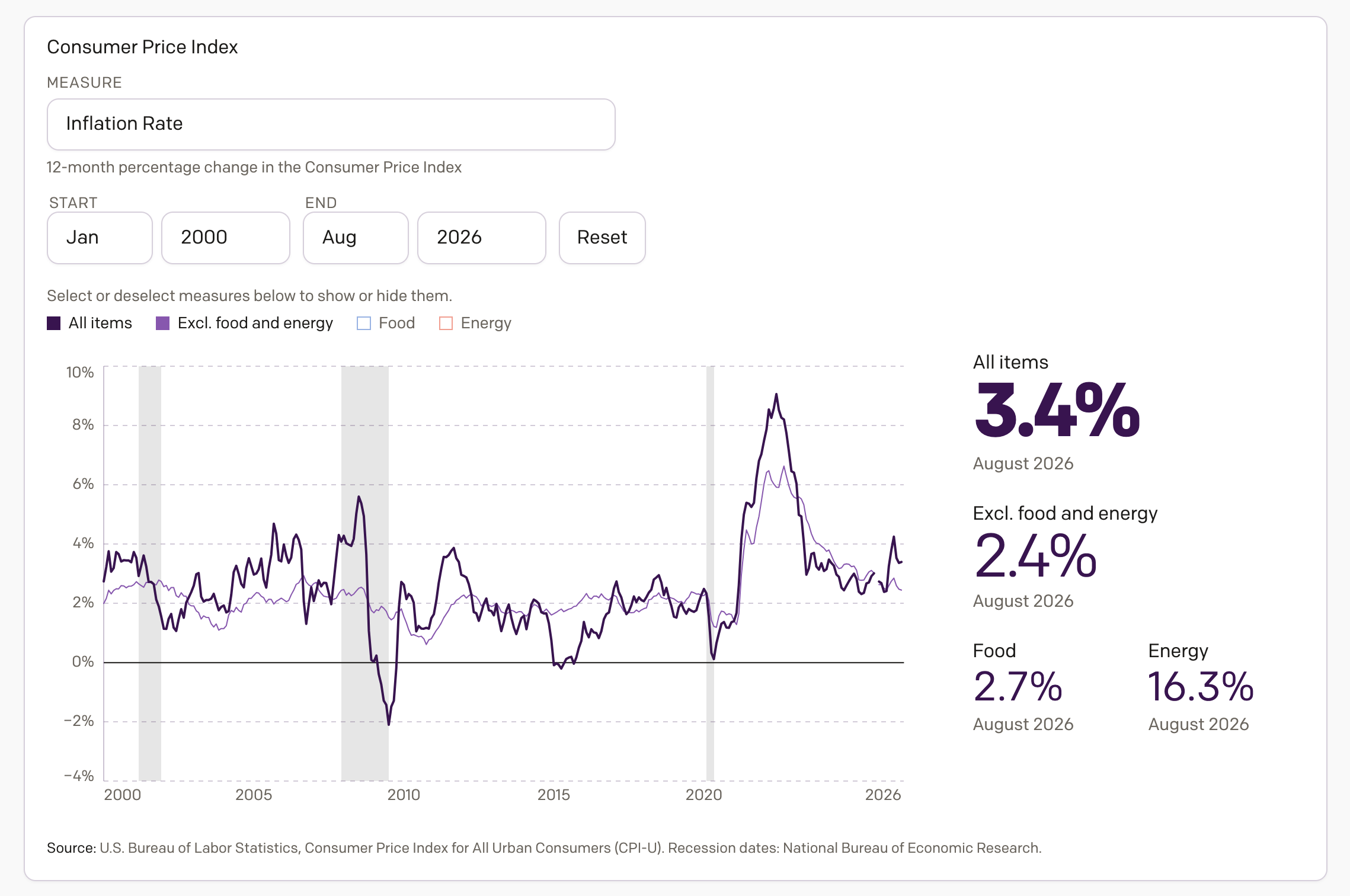
Apologies for the lack of posting over the last month, but it was a very busy month. And so here I am back to share something I have been working on the last several weeks, an interactive application exploring inflation in America. Spoiler: it’s too damn high. The screenshot above links to the piece now live on my portfolio, which…
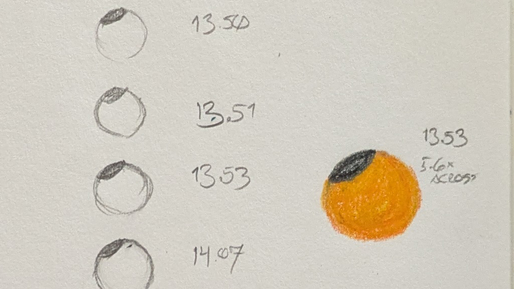
With eclipse glasses. This week saw a solar eclipse race across the surface of the Earth, from the high Arctic past the British Isles and the Atlantic coast of France and then right through the Iberian Peninsula. But that meant here on the East Coast of North America we could observe a sliver of the Sun eclipsed by the Moon.…
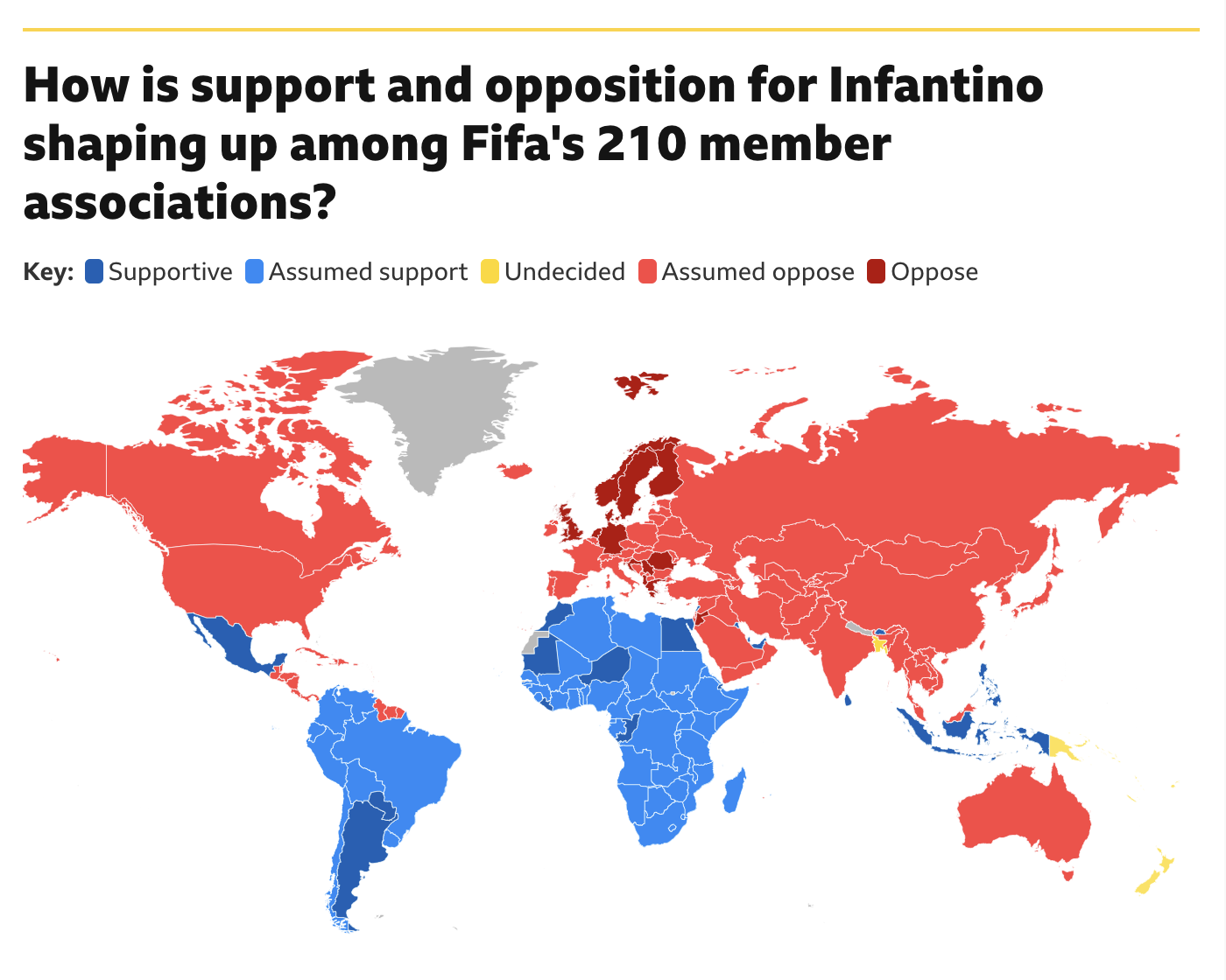
Fifa president Gianni Infantino has had a rough go of it of late. Turns out the world is not too enthused about the prospect known as Profit. He may have a strong right kick, but the world does not want to sacrifice the sport at Profit’s altar. At least not yet. And so Infantino’s plan, announced shortly after the World…
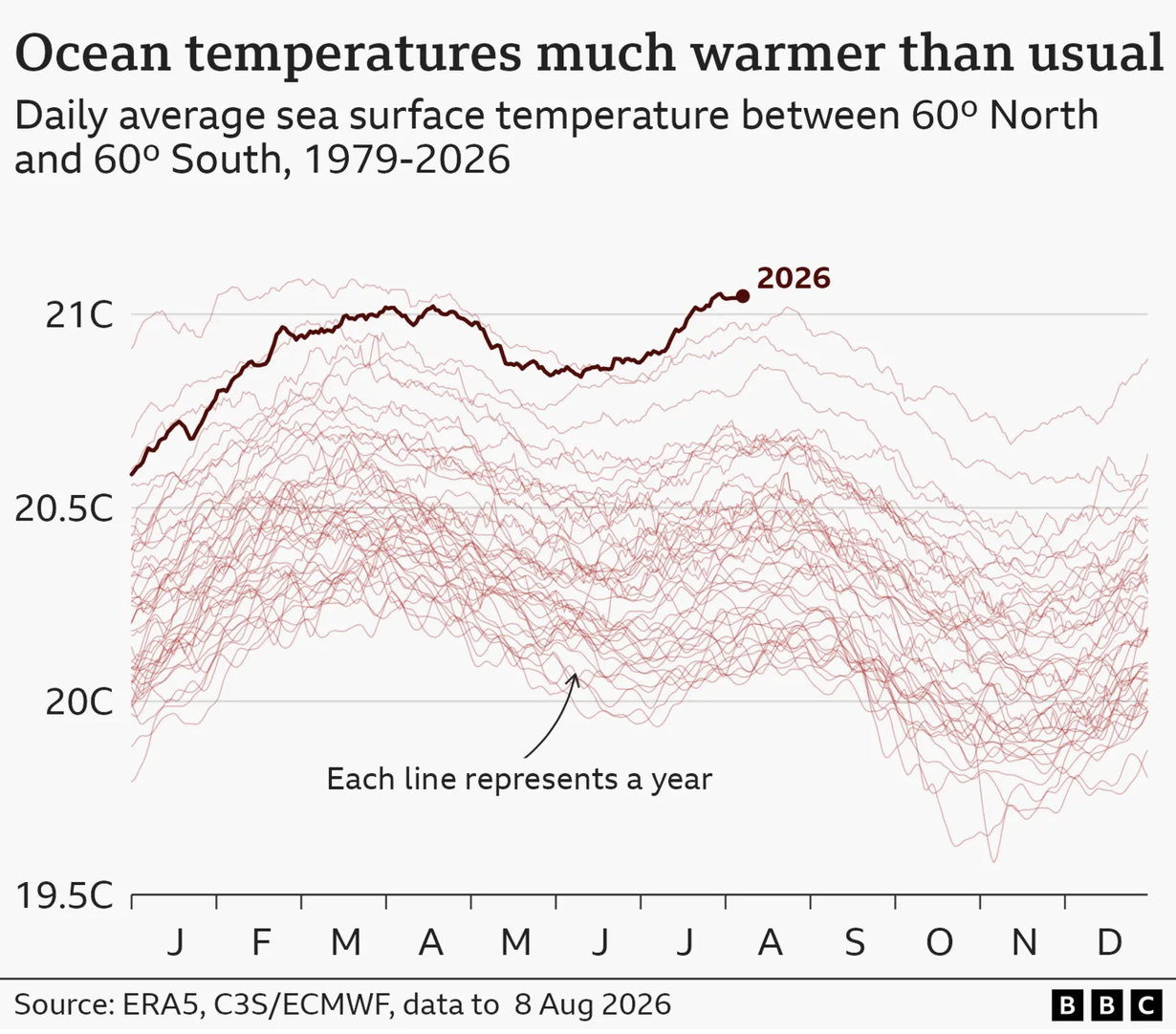
This weekend was a hot and steamy one in Philadelphia. And so this morning colour me not at all surprised when I read in the BBC that the oceans hit a record high in July. The article included a few graphics, one being a map of European soil moisture—spoiler, Europe’s dry. And I am certain that has nothing to do…