
Author: Brendan Barry
-
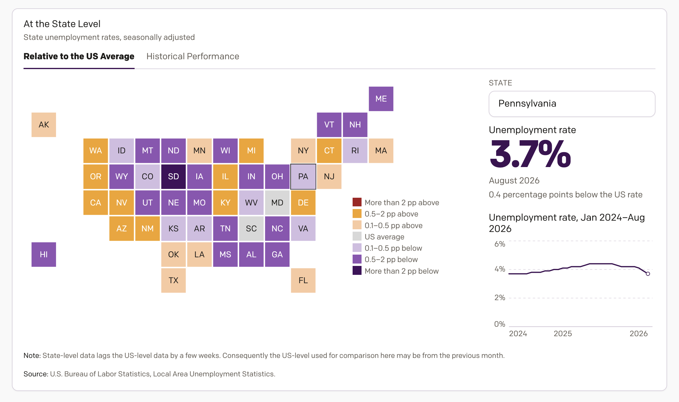
Unemployment in America
On Tuesday I wrote about my new inflation tracker—I need a better, more marketable name for that. Well, as I was designing the inflation tracker, I concurrently designed an unemployment tracker to track, well, unemployment. And I figured if I shared the one, why not the share the other? Thus, my unemployment in America tracker…
-
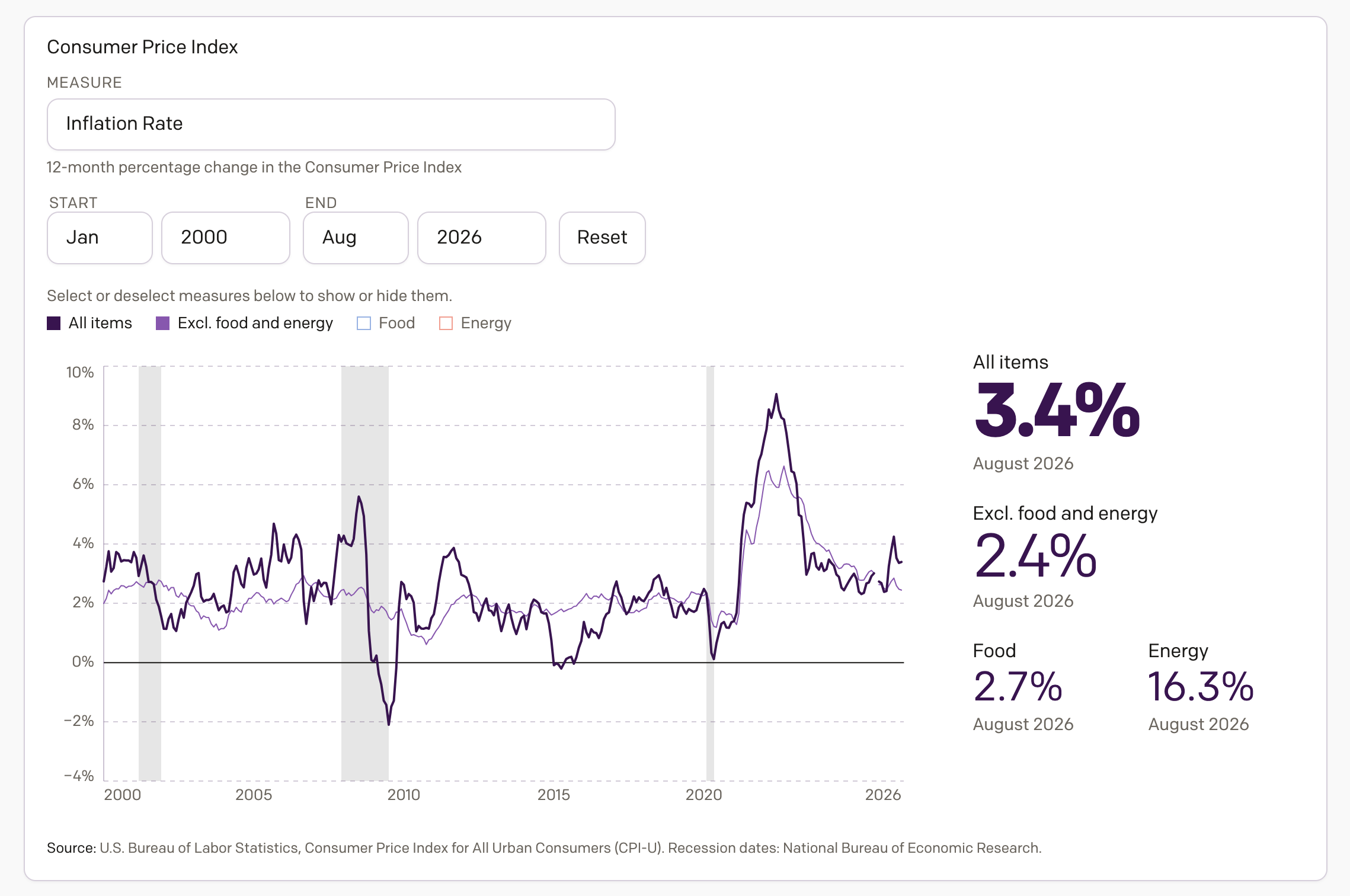
Inflation in America
Apologies for the lack of posting over the last month, but it was a very busy month. And so here I am back to share something I have been working on the last several weeks, an interactive application exploring inflation in America. Spoiler: it’s too damn high. The screenshot above links to the piece now…
-
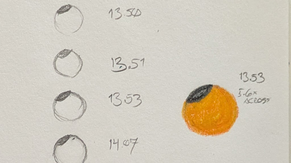
Do Not Look at the Sun—I looked at the Sun
With eclipse glasses. This week saw a solar eclipse race across the surface of the Earth, from the high Arctic past the British Isles and the Atlantic coast of France and then right through the Iberian Peninsula. But that meant here on the East Coast of North America we could observe a sliver of the…
-
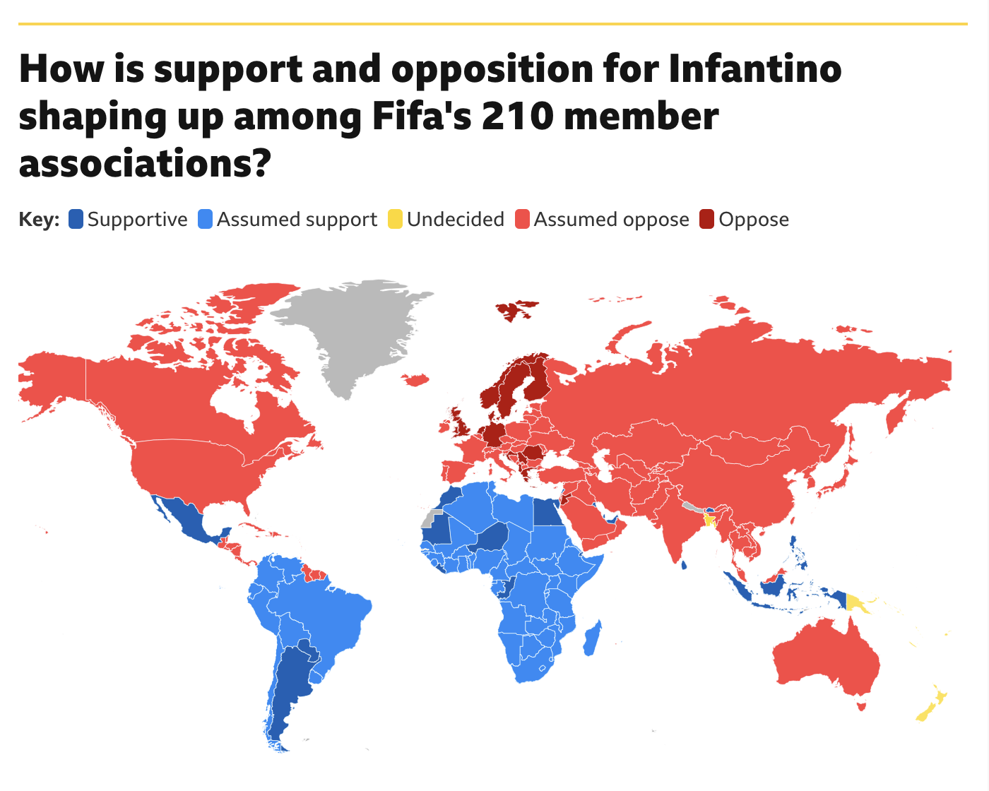
Will Infantino’s Own Goal Cost Him?
Fifa president Gianni Infantino has had a rough go of it of late. Turns out the world is not too enthused about the prospect known as Profit. He may have a strong right kick, but the world does not want to sacrifice the sport at Profit’s altar. At least not yet. And so Infantino’s plan,…
-
Steamy Sauna
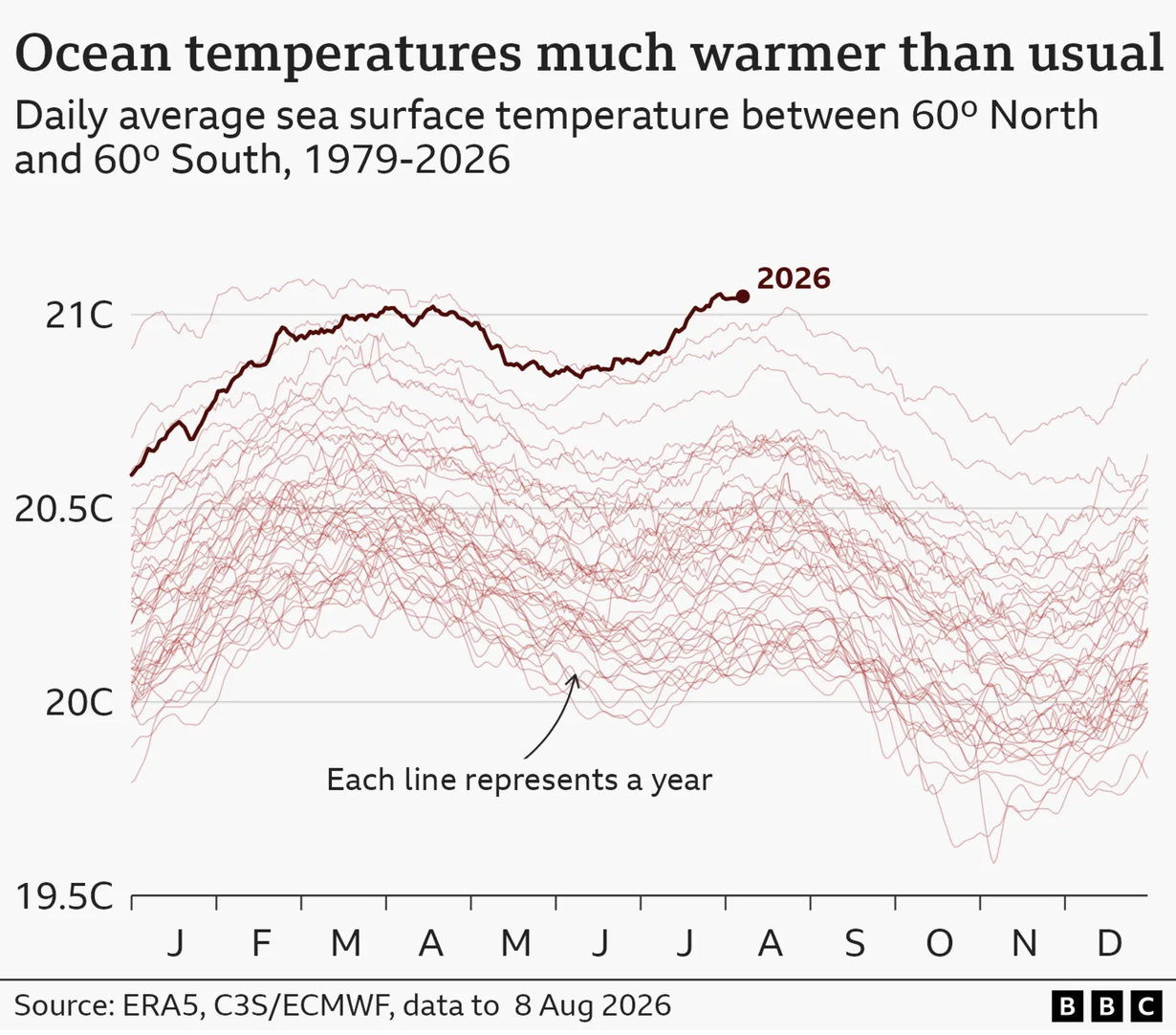
This weekend was a hot and steamy one in Philadelphia. And so this morning colour me not at all surprised when I read in the BBC that the oceans hit a record high in July. The article included a few graphics, one being a map of European soil moisture—spoiler, Europe’s dry. And I am certain…
-
There’s Nambia
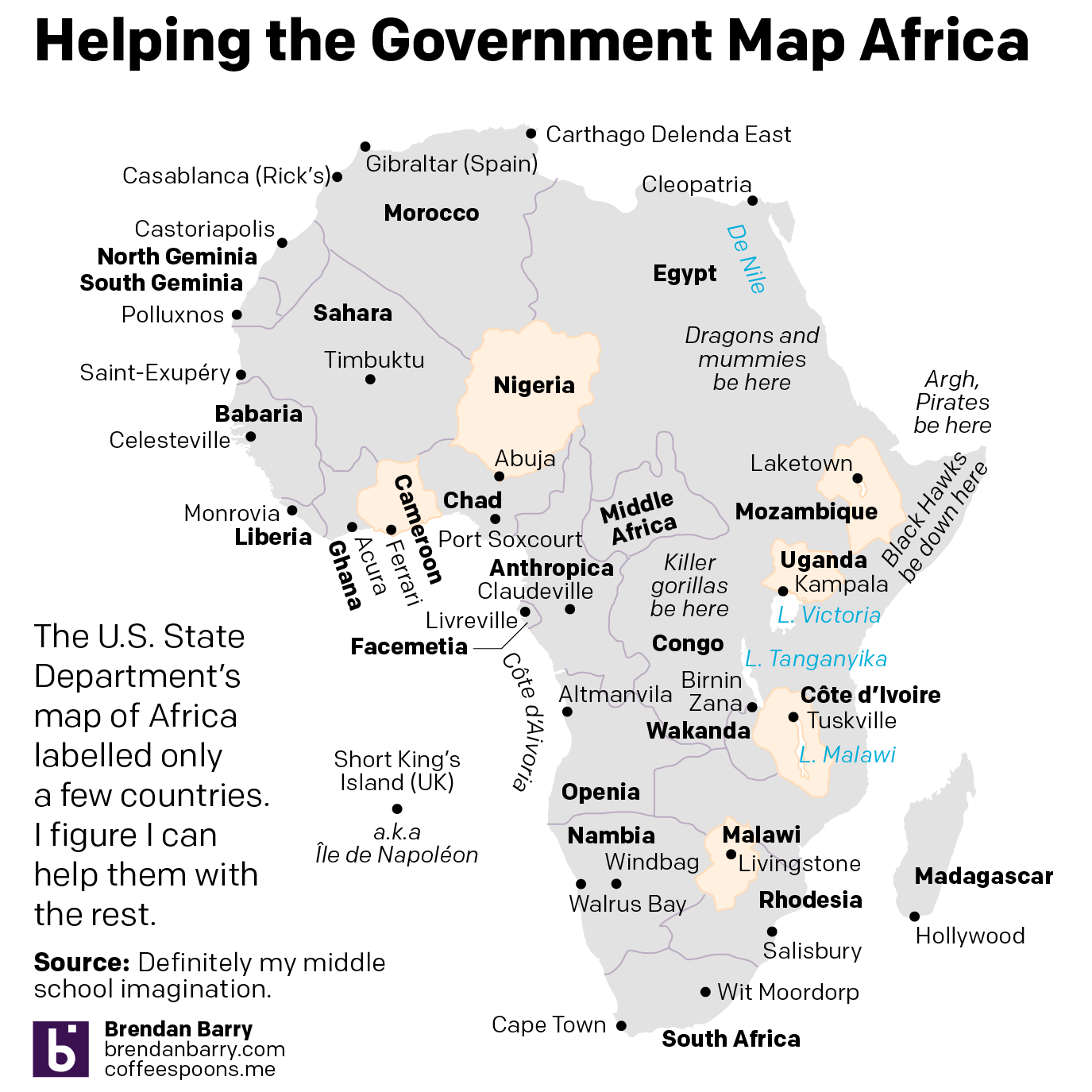
Happy Friday, all. We made it. Like the staffer at Foggy Bottom, we made it. (With a little help from our friends AI.) Earlier this week I wrote about the U.S. State Department’s map on American aid to Africa and how that map really stole the show. Unfortunately, the map was largely empty except for…
-
Shangr-AI La
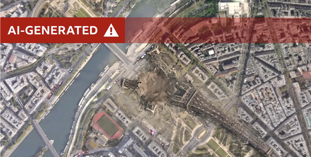
Last week Google announced its newest feature for Google Earth: the ability to use AI to create layers of images atop actual satellite images of Earth. Less than 24 hours later, Google abandoned those plans. We already have enough problems with the written word and the spoken word and the broadcast word, did we really…
-

But What About Nambia?
I was going to post about this Friday, but left it for today. We need to talk about this map. First, why so many colours? Each country is clearly separated from the other, and the best rationale for so many colours here would have been if the countries shared a border and you ran the…
-
Global Integration. The Bad Kind.
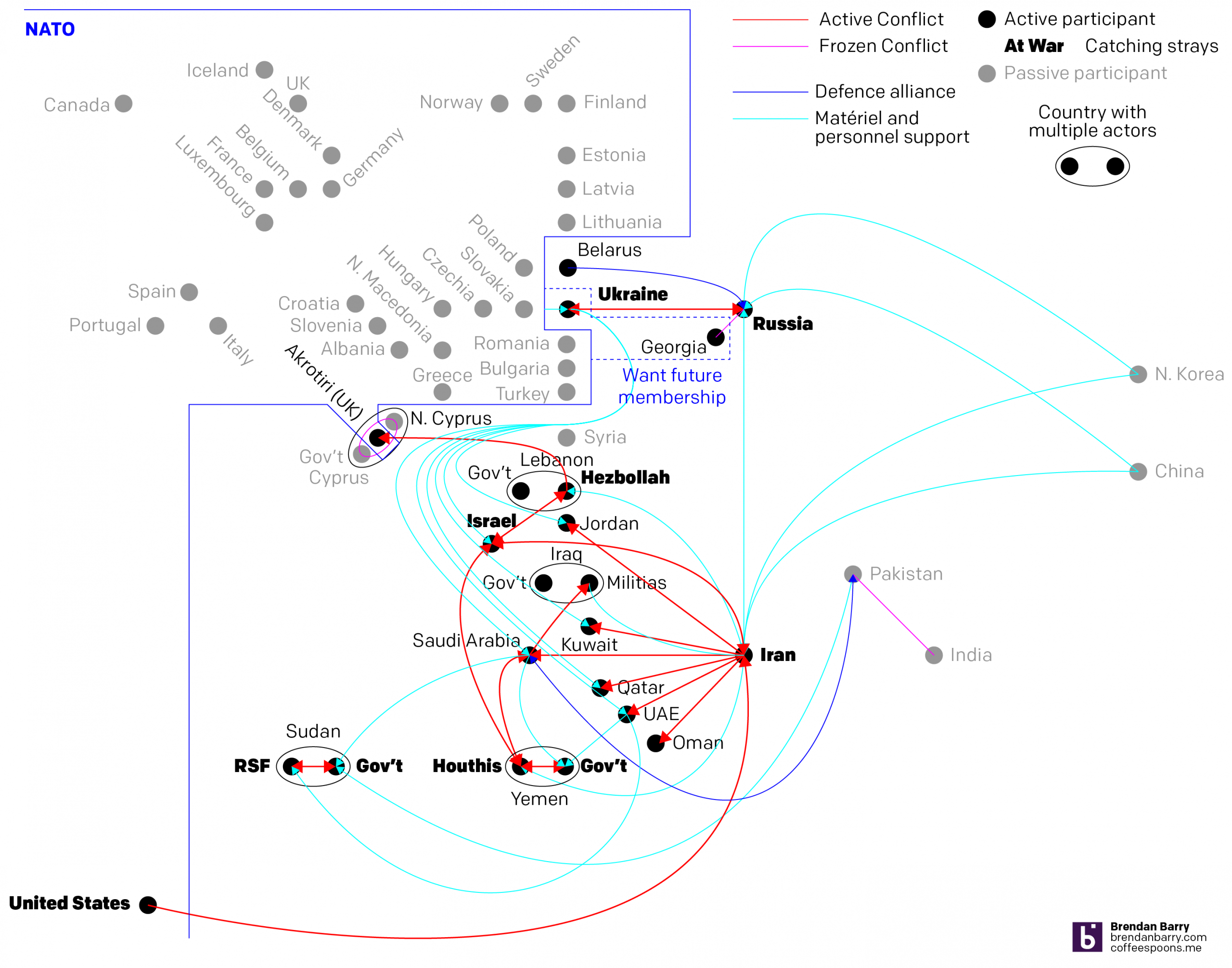
I was hoping to post this yesterday, but as you will see momentarily, it is very much still a work-in-progress. Earlier this week, Ukraine sank an Iranian freighter in the Caspian Sea—a pugnacious though innocuous sounding sentence. Of course, Ukraine battles Russia in its eastern oblasts whilst Iran battles the United States and Israel in…
-
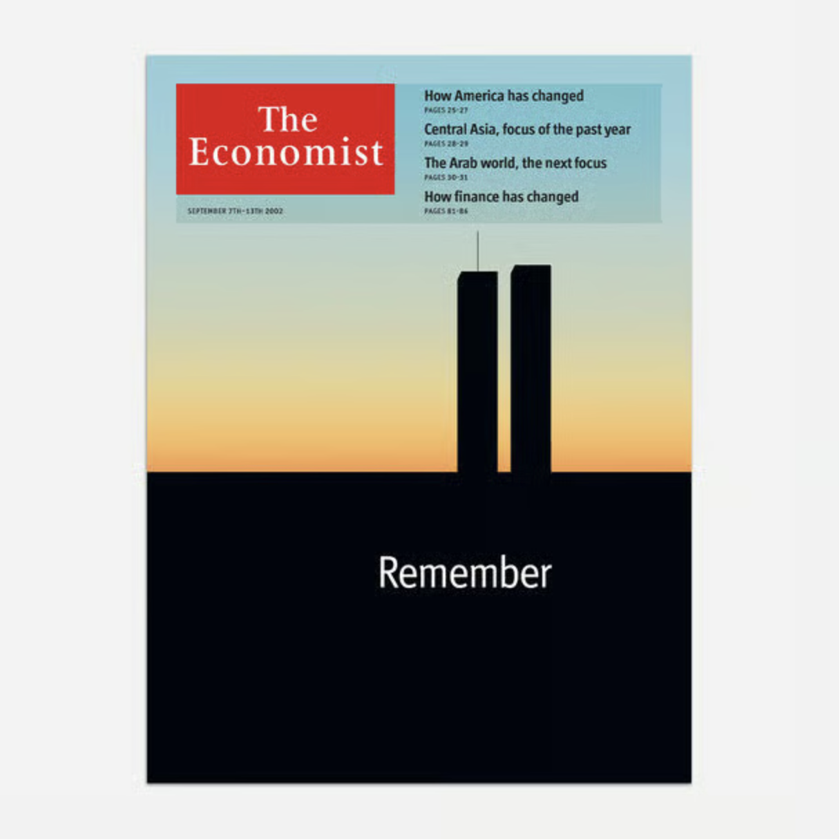
Judging a Magazine by Its Cover
Technically a newspaper, the Economist has been part of my weekly read since the early- to mid-2000s—my late high school and early university days. (It helped I worked in book shops through those years so could read it gently and replace it on the shelf.) This blog focuses mostly on information design, although I always…