
Johnston, the typeface of the London Underground, turns 100 this year. And so last Thursday the Guardian posted a short article about the typeface. It is worth a quick read, if only for the description of serif typefaces as “letters without the little flicks at the end of their strokes”. Some people overlook typeface selection when it comes to the display of data and information, but it is vitally important. Letters need to be clear and easy to understand, but also set at the right size for the audience. If they fail to do that, a work fails to be legible, and that means something is not being communicated. And that is a failure in design.
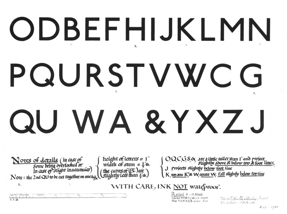
Note the handwriting for the notes versus the sans-serif letterforms.