Category: Infographic
-
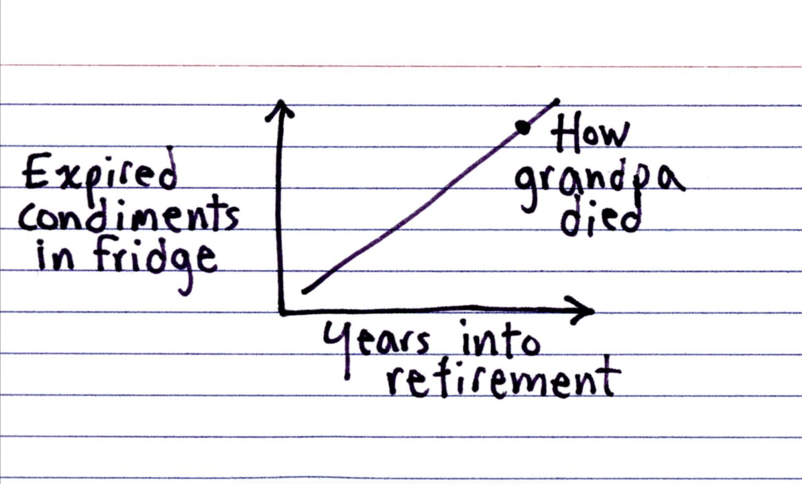
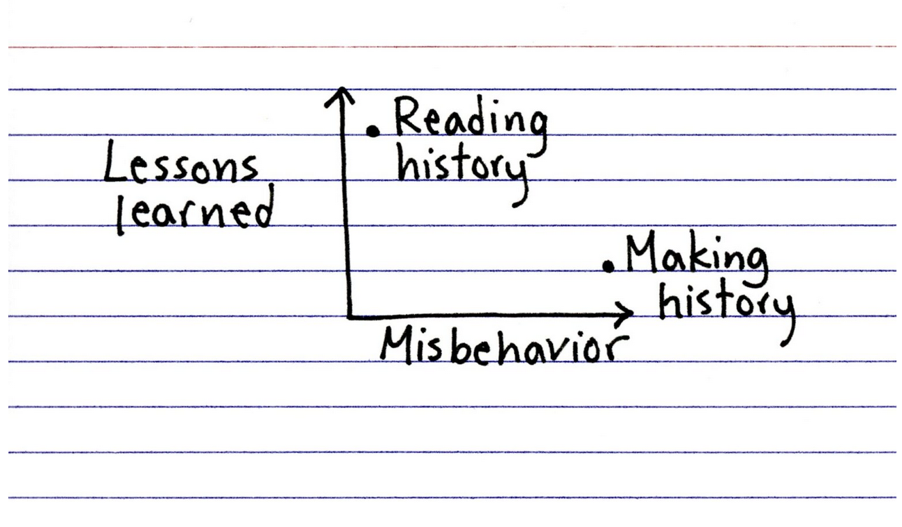
Colonel Mustard in the Refrigerator
Happy Friday, all. I have been eating a lot of leftovers and things scrounged up from fridges this past week, and being home today it shall likely be the same. But that does not mean you want to be looking into my refrigerator and seeing just what condiments I have available. Spoiler: (pun intended) it…
-

Vexing Vexillology
Happy Friday, all. As a young child, I always loved flags. I collected international ones from random places in the US. I no longer collect them, but I still love their design and was fortunate to live in a city that has a good one: Chicago. (Philadelphia and Pennsylvania, sadly, do not have good flags.)…
-
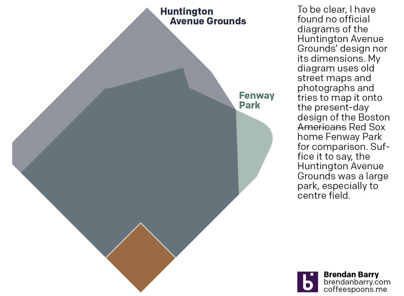
Back to Boston’s Beginning
And I don’t mean the city’s. No, 125 years ago today, the Boston Americans, later to be renamed the Boston Red Sox, played their first home game. Not at Fenway Park, mind you, but their original home—the Huntington Avenue Grounds. I decided to make a graphic comparing Huntington Avenue to Fenway, but could not find…
-
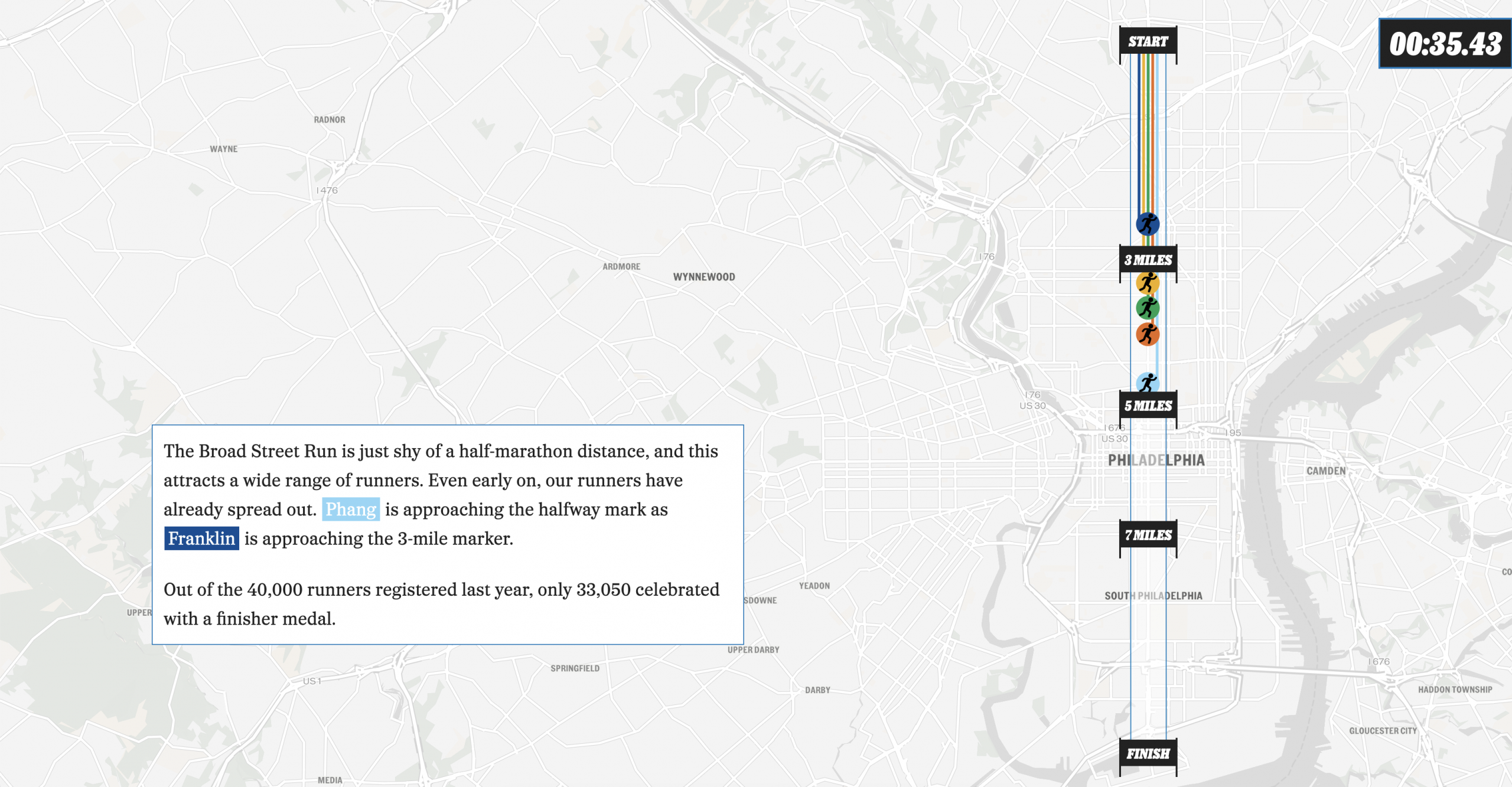
The Broad Street Run
This past weekend, Philadelphia hosted the Broad Street Run, a 10-mile run from the “top” of the city’s Broad Street in the north to the end at the bottom in the Navy Yard, a length of—you guessed it—10 miles. And congratulations to my sister for not just running it for the first time, but completing…
-
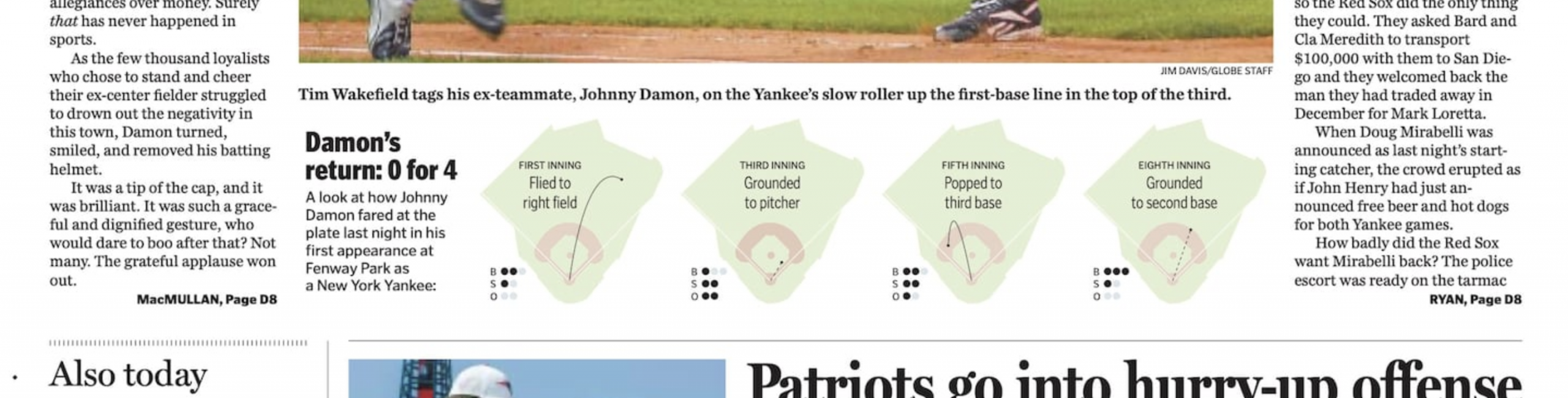
Damon the Bad
I guess we’re going to stick with the baseball this week. I forgot this year is the 20th anniversary of the Doug Mirabelli game. For those unfamiliar with the story, the Red Sox long employed knuckleballer Tim Wakefield, one of my all-time favourite pitchers. The knuckleball, however, is very difficult to catch because its lack…
-
Words. Words. Words.
This year—and last—I have been making a more concerted effort to read more and use social media less. I just finished reading an Isaac Asimov novella, Lucky Starr the Moons of Jupiter, but that interrupted my reading of The Carpathians, a non-fiction book about the history of the northern slopes of the Carpathian Mountains—the Polish…
-
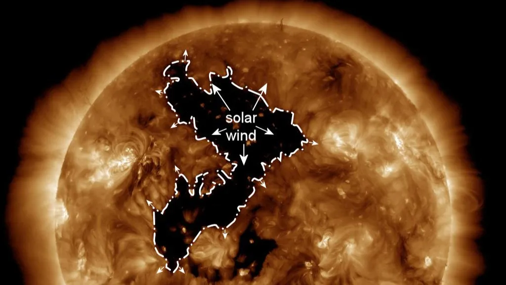
Here Came the Sun
Sorry, George, had to change the verb tense. As I alluded to on Friday, today we are looking at some space weather news. This past weekend, the Sun put on a light show over Canada and northern US states with the aurora borealis. Of course the grandeur and spectacle is not a thing that comes…
-

Born in the U.S.A.
Last Wednesday, when I was more focused on the Artemis II launch, the Supreme Court held oral arguments about the administration’s attempt to end birthright citizenship and overturn the 14th Amendment to the United States’ constitution. Kind of a big deal. NBC News ran a live blog covering the arguments and included an interactive map…
-

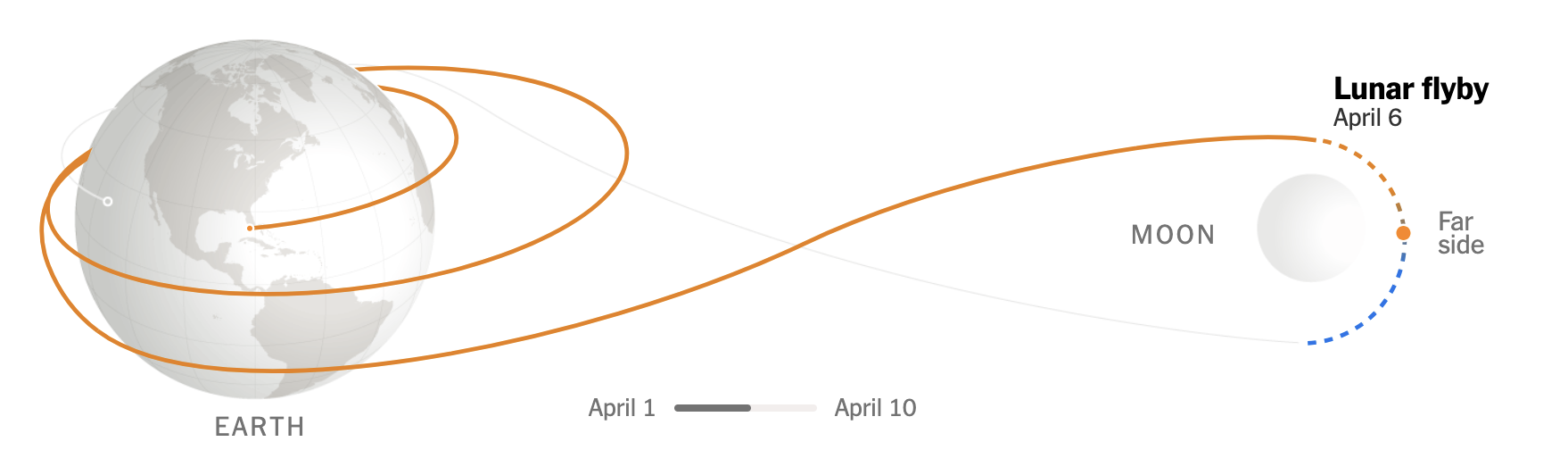
To the Moon and Beyond 2: Just Passing By
Today’s post was what I alluded to on Friday, thinking it was a fit then but realising perhaps it fit better here because of what a lot of graphics show when it comes to Artemis II and mankind’s return to (the orbit of) the Moon. Most graphics typically show the elongated eight track with the…
-
To the Moon, and Beyond!
At least a little beyond. Like the orbital height beyond. For those unaware, if the weather holds, later this evening East Coast time, NASA will launch the Artemis II mission from Cape Canaveral with the intention of sending a crew of four astronauts—three Americans, one Canadian—to the Moon. The last man on the Moon was…