Tag: flu
-

Aches, Fevers, and Chills, Oh My!
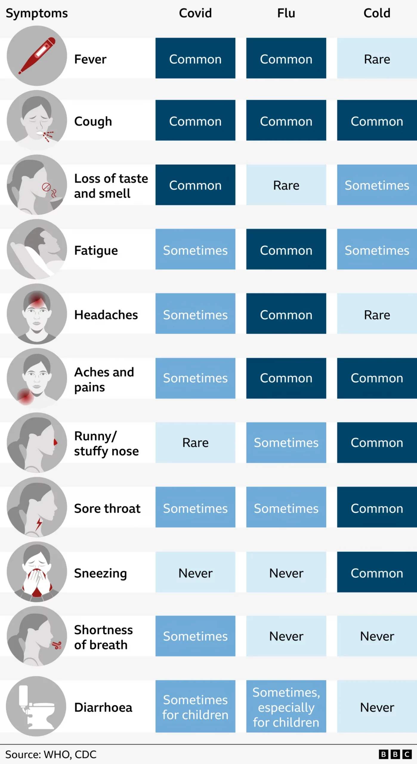
Last week I suffered from the aforetitled and wondered what just might be ailing me. My sore throat woke me up in the middle of the night with intense, sharp pain and reminded me of stories I had read earlier this flu season about “razor blade” sore throat associated with the latest COVID strain, Nimbus.…
-
The 2017–18 Flu Season
Last week I covered the Pennsylvania congressional district map changes quite a bit. Consequently I was not able to share a few good pieces of work. Let’s hope nothing goes terribly wrong this week and maybe we can catch up. From last Friday we have this nice piece from FiveThirtyEight looking at the spread of influenza…