Space Force.
Yep, that’s still a thing. I’ll spare you all the long history of Space Force, because we’ve all pointed and laughed at that enough. So much so there is a Netflix show about it. There was an old logo for Space Force, which basically was the logo for Starfleet Command. You know, the fictional Space Force of Star Trek.
Well, now there’s a new Space Force logo.
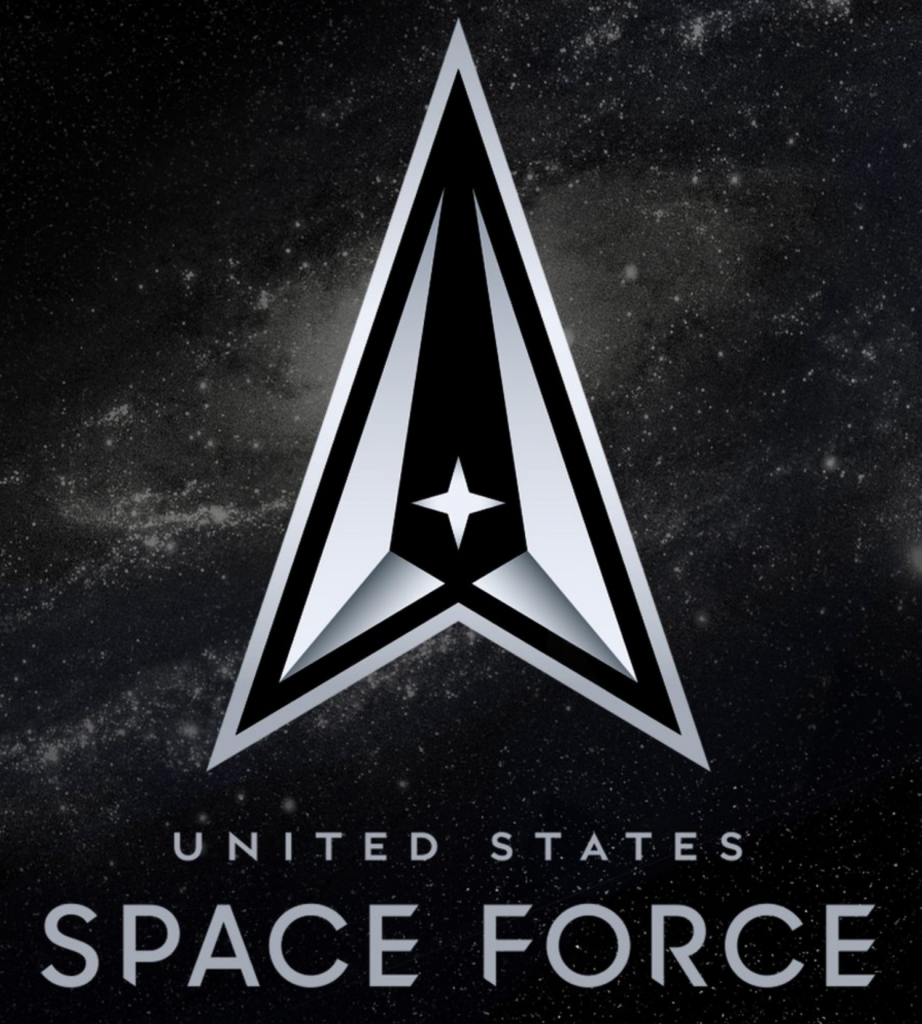
And, well, it’s still Star Trek-y. But at least they dropped the most obvious bits. But I want to point out that typography. I get it, geommetric sans serif representing science, technology, the future. Safe pick, easily defensible. But look at those slices in the stems and the crossbars.
I can understand those in the E and F perhaps. But the slices to the stems of the P, F, and R make those letters feel unsteady, as if you had managed to just axe a good chunk out of a tree trunk but somehow the rest of the tree was still upright.
And I would argue further that there’s way too much angling going on, or at least it’s all inconsistent. They have this nice delta shape with its angles. Those could be reflected in the typography. The C comes closest, but in a close examination, it’s also not a match.
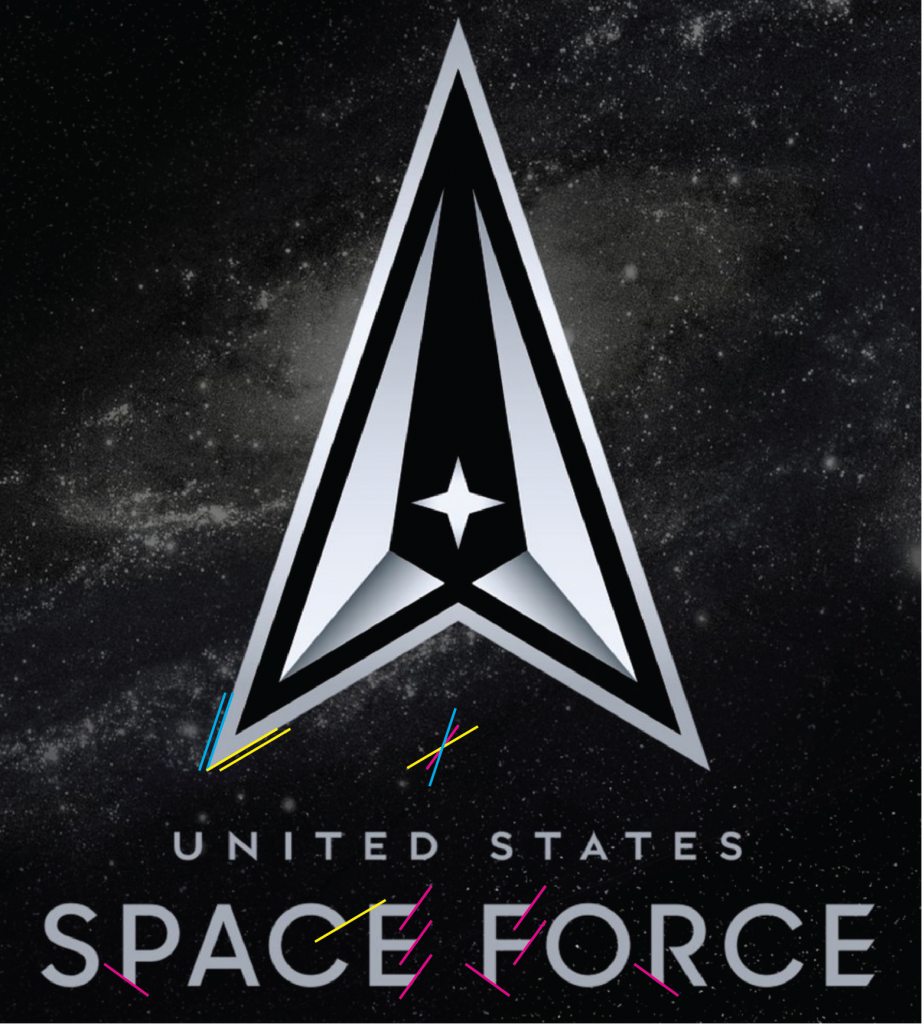
And so if you pretend the C is correct, with some less severe slices to the E and F perhaps, you can begin to see how a more refined Space Force logo could emerge. I used the blue lines, pulling off the strong angle in the delta shape, to slice the ends of the Es and F. (I don’t have a match for the original typeface, so I subbed in Avenir Next.)

I think that the quick exercise above, if paired with the original typeface, could work a bit better.
Credit for the original goes to somebody, no idea whom.
Leave a Reply
You must be logged in to post a comment.