Happy Friday, everyone. We’ve made it to the end of the week. Yesterday, I departed from the usual data visualisation discourse and delved into some branding/identity work. Spoilers, that’s a good part of my career as well.
But I thought it would be interesting to take a look at how the armed forces branch could be represented through some different typographic choices.
Like I discussed yesterday, the designers behind the new logo made some interesting choices. But the idea of setting the words in a geometric sans serif makes a lot of sense.
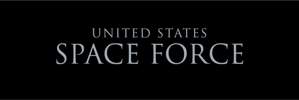
But a space force is really just the beginning of the American Empire. In Spacceeee. And so a typeface that evokes the expansion of an empire might work. So why not Trajan, inspired by the carved letters in Trajan’s column, a monument to Emperor Trajan and his victory over the Dacians.

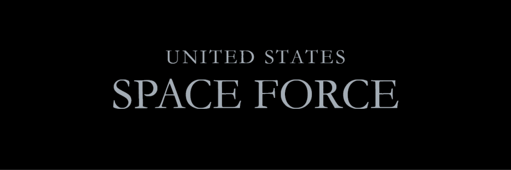
On the other hand, this administration isn’t the best with design. And so instead of a lovely but imperial face, they would probably just choose something safe like a Garamond.

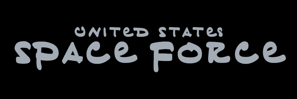
Not as grand, and a bit bookish, this doesn’t work really well for an armed forces branch. In Spacceeee. Plus, we also know that President Trump likes to brand everything with himself. And several years ago, Buzzfeed paid a type designer to create a typeface from some handwritten notes they had from Trump. They put it out for the public and of course I downloaded it. So it wouldn’t be surprising to see Space Force in Trump’s own hand.

Little difficult to read, but there is an interesting blend of upper and lower case letters in Trump’s handwriting. Maybe that could work with bringing big space to the little people of planet Earth?
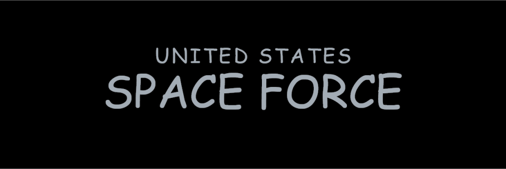
Nah, who am I kidding? We’re all here for what it really should be:

Leave a Reply
You must be logged in to post a comment.