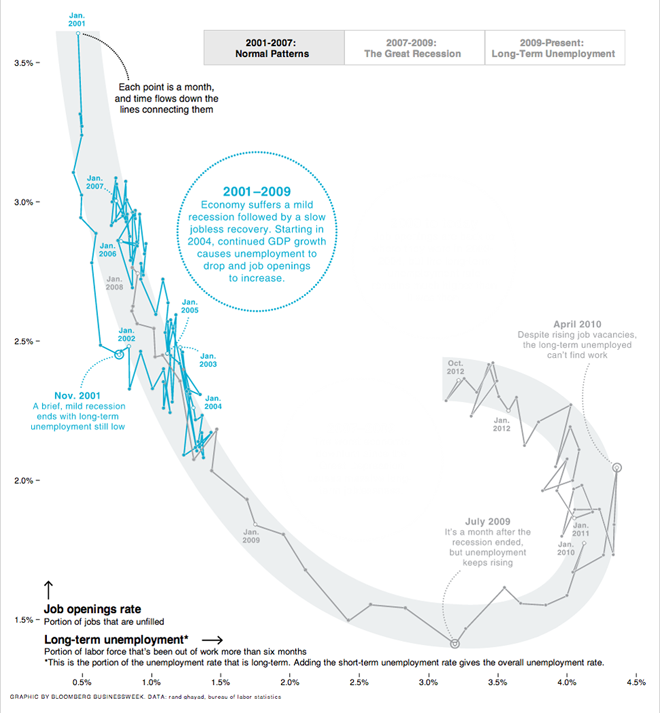
Two weeks ago Bloomberg published a really great example of annotating what some would find a complex infographic.
On occasion I hear concerns that charting two variables on a scatter plot is confusing. Further confusing people is to then plot the data over time, connected by a line. The approach is really no different than what I hear called “combo” charts. Those take two separate variables and plot them in the same space but use one axis to represent the two different variables—often without respect to scales and implicit meanings in the positioning of the two data series.
I find separating those two series onto separate axes and connecting them over time far clearer. And that’s just what the designers at Bloomberg did. But to allay any concerns about confusion—or so I assume—a series of annotations were made, guided by the buttons in the upper-right. These explain succinctly the view presented to the reader in the highlighted section of the overall graphic.

Overall a strong piece of data visualisation and analysis tied into effort.
Credit for the piece goes to Peter Coy, Evan Applegate, and Jennifer Daniel.
Leave a Reply
You must be logged in to post a comment.