Show Europe the Money

The Guardian has an interactive piece that details payments to and from European Union member states to institutions, determining whether each state is a giver or receiver.

Comparing payments and receipts in EU member states

The concept sounds all well and good. However, the piece itself feels clumsy with too much scrolling and whipping about to pan across the whole EU. The charts look a tad heavy—which could have been remedied for a more concise piece—and the callouts beg for a level of interactivity that is otherwise lacking.

Lastly, I have concerns about the list of countries at the top, although these may stem only from the point of view of an American not too familiar with Europe. Flags are not circles, they are, in most cases, rectangular in shape. Does cropping a symbol or icon of a country make it more or less useful of a symbol or icon? Furthermore, do the British recognise the flags of their fellow EU member states?

The country icons/flags call for some type of sorting function, to compare payments and receipts and their balance. But, instead, they sit there in unalterable silence, providing only an economic overview when clicked. An overview that through its staid design feels more like an afterthought.

Fresh Water Bulge in the Arctic Ocean

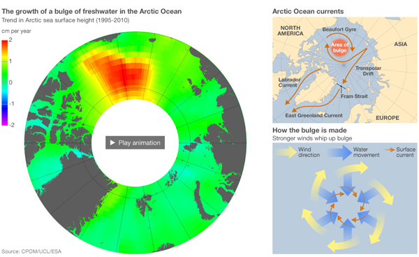
The BBC has an article on a discovery of a growing bulge of fresh water in the Arctic Ocean. The top of the article includes a large set of graphics that explains the story below and links to an animation. The animation depicts the growth of the Arctic ice sheet from the pressure beneath and plots the height of the ice.

The fresh water bulge in the Arctic Ocean

How the Costa Concordia Sank

The Costa Concordia sank nearly a week ago, but the questions of exactly how and why she sank will likely linger for much longer.

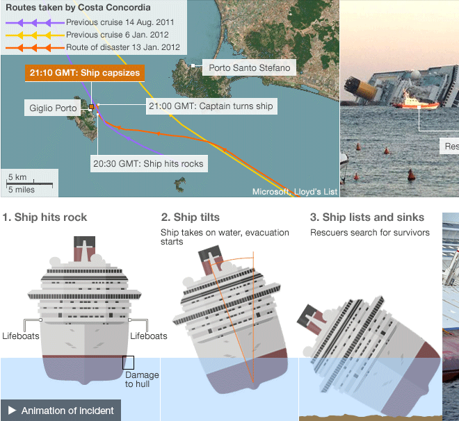
The BBC has had extensive coverage of the story, including this page that details what is known about how and why the cruise ship sank.

How She Sank
How She Sank

School’s Out For Ever

While on holiday, the Archdiocese of Philadelphia announced a sweeping series of school closures and consolidations in an effort to create a smaller and more sustainable school system. As I spent my earlier years of education in the parochial system I had more than a passing interest in the story.

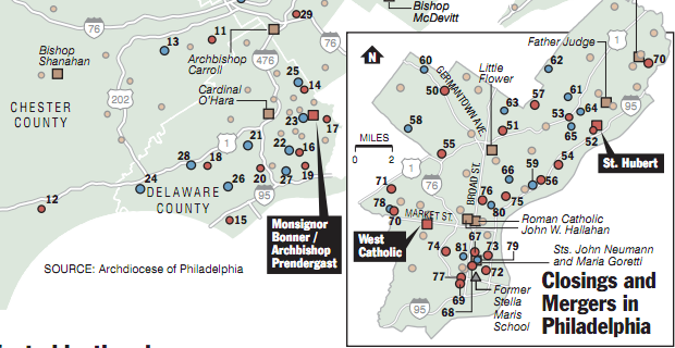
The Philadelphia Inquirer mapped out the changes, a cropping of which is below. As one can easily see, the bulk of the cuts came in the city itself and the suburbs in Montgomery County. The more distant, read wealthier, suburbs fared much better. Chester County, for example had a total of only two closings. Bucks only five.

Cropping of the School Closures in the Archdiocese of Philadelphia

Credit for the map goes to John Duchneskie and Cynthia Greer.

12 Days of Christmas (Corporate-ified)

Guess what? It’s Christmas season.

I am taking two weeks holiday starting tomorrow and so posting here shall be rather light until early January.

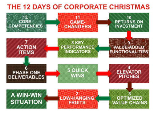
In business world, people like PowerPoint presentations with charts that show the flow of synergy. Scales of efficiency. Action item prioritisation. The kinds of things that the rest of us don’t every really need or want to understand. But, at happyplace.com, they have posted a series of Christmas charts and graphs that would feel right at home in such a presentation. Below is a flowchart showing the progression of the 12 Days of Corporate Christmas.

12 Days of Corporate Christmas

Earth-sized Planets

Kepler 20 System
Kepler 20 System

We have finally discovered two planets outside our solar system that have roughly the same size as Earth. Unfortunately, unless we learn that life can exist in the form of fire beings, these two planets are too close to their sun to support life. Their temperatures are in the hundreds and thousands of degrees. A bit balmy.

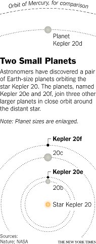
The New York Times has a small but interesting chart that fits inline with its article, at least on its website—presumably it fits similarly in its printed form. Seen here to the left, it plots the orbital distance of the planets that are known to orbit the star Kepler 20. (Unfortunately these planets have less than creative names: Kepler 20e and Kepler 20f.) The other planets are gas giants.

The use of scale of orbits and the gap between 20f and 20d allow for an annotation within the image. And then with a little bit more vertical space, to drive hom the point of these new planets’ nearness to their sun, the orbit of Mercury, the planet nearest our sun, is plotted for comparison.

The Family Tree of Kim Jong Il

Kim Jong Il is dead. And nobody really knows what is going to happen in North Korea.

But, what we do have, is the interactive family tree of Kim Jong Il, courtesy of the BBC. Select individuals are clickable and have short biographical sketches. Unfortunately, the tree has been simplified for clarity and it does not contain all members of the family.

The family tree of Kim Jong Il

The Rise of Newt

The Iowa caucuses are quickly approaching. And that means for many candidates a scramble to gain as many supporters as possible and then convert their poll ratings into votes. For the Republicans, this has been a truly topsy-turvy cycle with the distant refrain of “anyone but Mitt” echoing in the background.

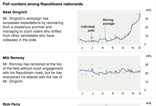
So, here we are looking at the return of Newt Gingrich. Over the weekend, the New York Times published a graphic comprised of small multiples of poll numbers for the various candidates. Each chart plots the individual polls and then the moving average.

The rise of Newt Gingrich

What one can clearly see is a moving wave of discontent. It begins small with Michelle Bachmann before rising with the arrival of Rick Perry. He floundered, however, and was soon overtaken by Herman Cain. And as his support ebbed, it buoyed Gingrich to the top or near-top, depending on the poll, of the Republican candidates.

All in all, a good series of charts that tells a convincing story rather quickly and succinctly.

The Finances of Social Security

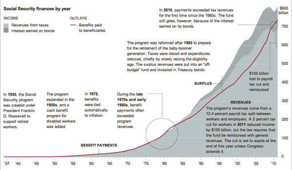
Simple graphs can tell great stories with little annotations. This graphic by the New York Times illustrates that point well with a stacked line chart set behind a line on the same scale. The two should match, or at least the red should be beneath the greys. When they don’t, you have a story and the Times calls it out.

Social Security Revenue vs. Expenditure