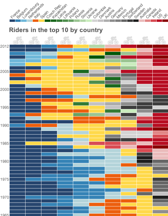
Bradley Wiggins won the Tour de France over the weekend; he is the first Briton to do so since the Tour began in 1903. (But to be more accurate, Wiggins was born to an Australian man and English mother in Belgium.) Naturally the BBC covered this topic in an infographic focusing on the nationality of those who finished in the Top-10 of the Tour over the course of its history.

Except when I first saw this I was confused. So far as I understood, the Tour is not run by individuals (as in the Olympics) or by national teams (as in European “football”). Rather, it is more like Formula 1 racing with individuals as part of a corporate team. So naturally I expected to see which teams had won. Instead I was looking at “by country”.
This I then figured meant by position within the Top-10 as each person/position is clearly segmented. That sort of made sense as I looked at the first few rows and saw red (America) and I recalled the success Lance Armstrong enjoyed. But that sense fell away when I reached the end of the list that should have had Frenchman in the top. It turns out that the legend for the piece dictates the order of the nationality of the winners of the Top-10 without respect to their actual placement. That perhaps could be a bit clearer.
The colours sort of make sense as groupings of countries. Blue groups the Benelux + France whereas red groups English-speaking countries. Orange for Italy and yellow for Spain while green groups former Soviet states and grey/black appears to be a collection of the rest.
Further down the rows, I ran into a smaller problem in that the number sequence seemed a bit out of sorts. The Tour was cancelled during the World Wars, but no mention of that is made in the graphic itself.
A worthwhile graphic—after all who does not want to see their country winning?—but its labelling could stand a bit higher finish.
Leave a Reply
You must be logged in to post a comment.