Category: Datagraphic
-

2025 Red Sox Draft Breakdown
Monday and Tuesday, Major League Baseball conducted its amateur player draft, wherein teams select American university and high school players. They have two weeks to sign them and assign them. (Though many will not actually play this year.) Two years ago the Red Sox installed Craig Breslow as their new chief baseball organisation. He has…
-
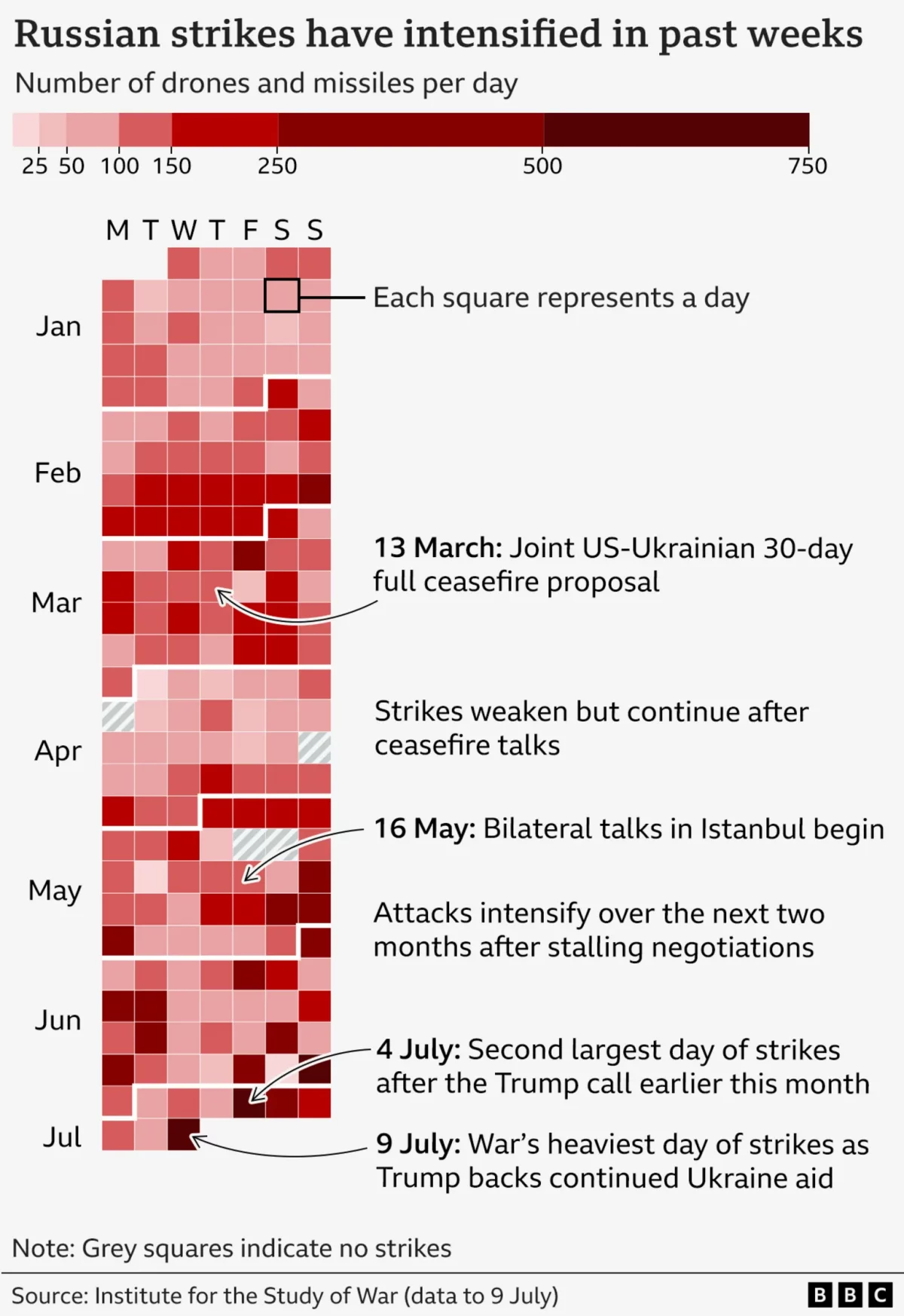
It’s Raining Drones
Last Friday the BBC published an article about the US’ resumption of supplying military assistance to Ukraine in its defence of Russia’s invasion. But in that article, the author referenced the increased intensity of Russian drone and missile strikes on Ukraine over that week. To show the intensity, the BBC included this graphic, which incorporates…
-
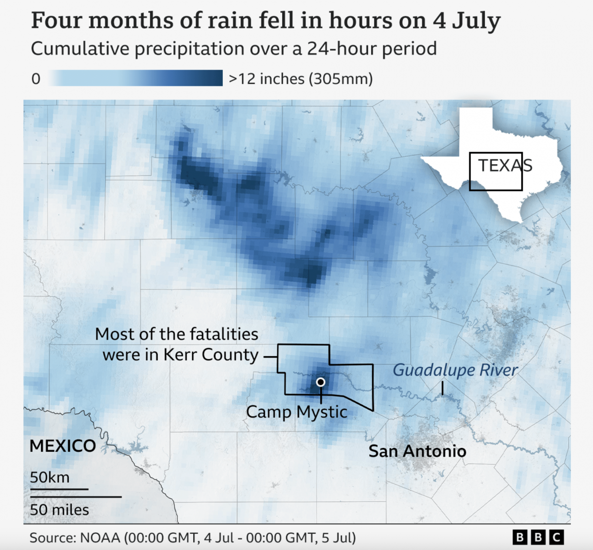
A Warming Climate Floods All Rivers
Last weekend, the United States’ 4th of July holiday weekend, the remnants of a tropical system inundated a central Texas river valley with months’ worth of rain in just a few short hours. The result? The tragic loss of over 100 lives (and authorities are still searching for missing people). Debate rages about why the…
-
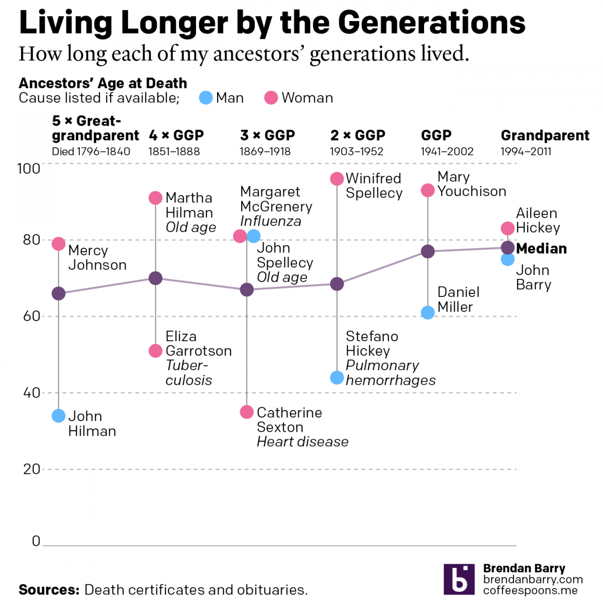
Living Longer by the Generations
Last weekend was Easter—for both the Catholics and the Orthodox—and I visited the Appalachian ancestral home of the Carpatho–Rusyn side of my family. Before leaving town I drove up to the old cemetery on a hill overlooking the old church and the Juniata River to pay my respects to those who came before me and…
-
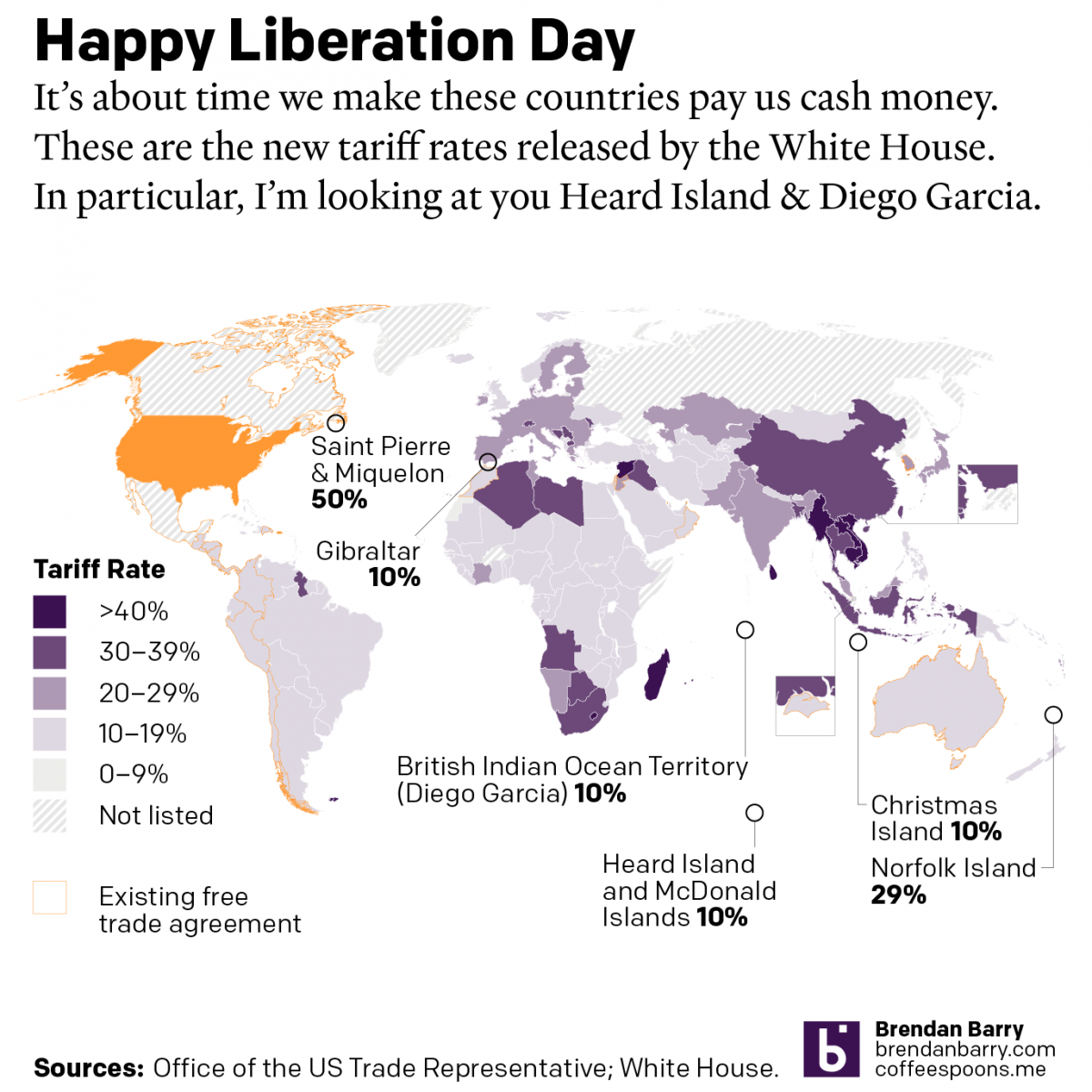
Happy Liberation Day
Yesterday I created a map detailing the new tariff rates released by President Trump on Wednesday. I was inspired by the curious inclusion of several small territories with almost no trade with the United States, and a few of whom are uninhabited. What follows is the graphic and the accompanying text I wrote as I…
-
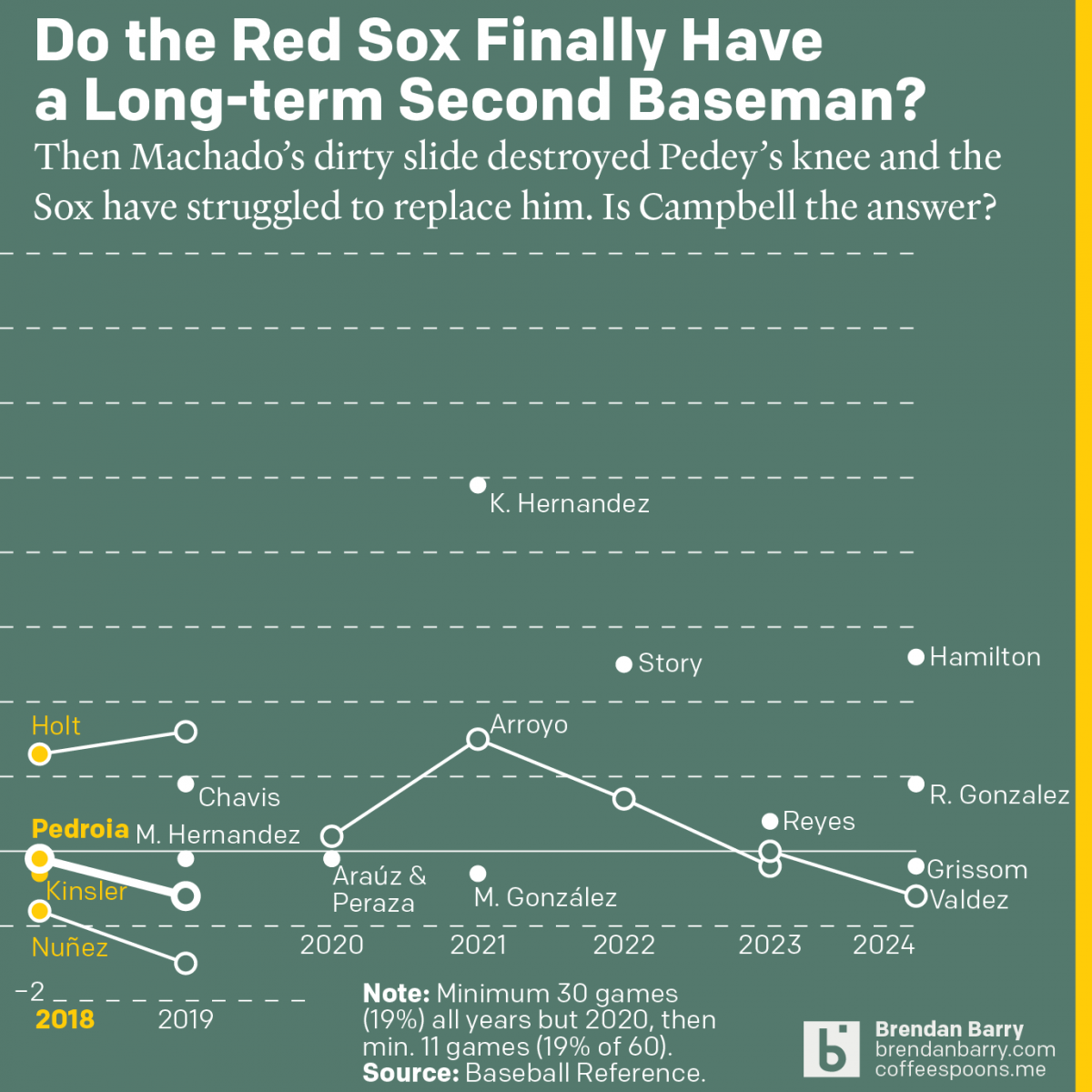
The Red Sox May Finally Have a Second Baseman
Last week was baseball’s opening day. And so on the socials I released my predictions for the season and then a look at the revolving door that has been the Red Sox and second base since 2017. Back in 2017 we were in the 11th year of Dustin Pedroia being the Sox’ star second baseman.…
-
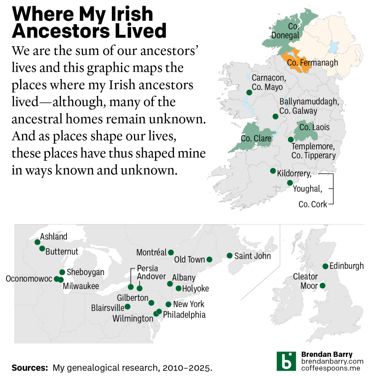
My Irish Heritage
This week began with Saint Patrick’s Day, a day that here in the States celebrates Ireland and Irish heritage. And I have an abundance of that. As we saw in a post earlier this year about some new genetic ancestry results, Ireland accounts for approximately 2/3 of my ancestry. But as many of my readers…
-
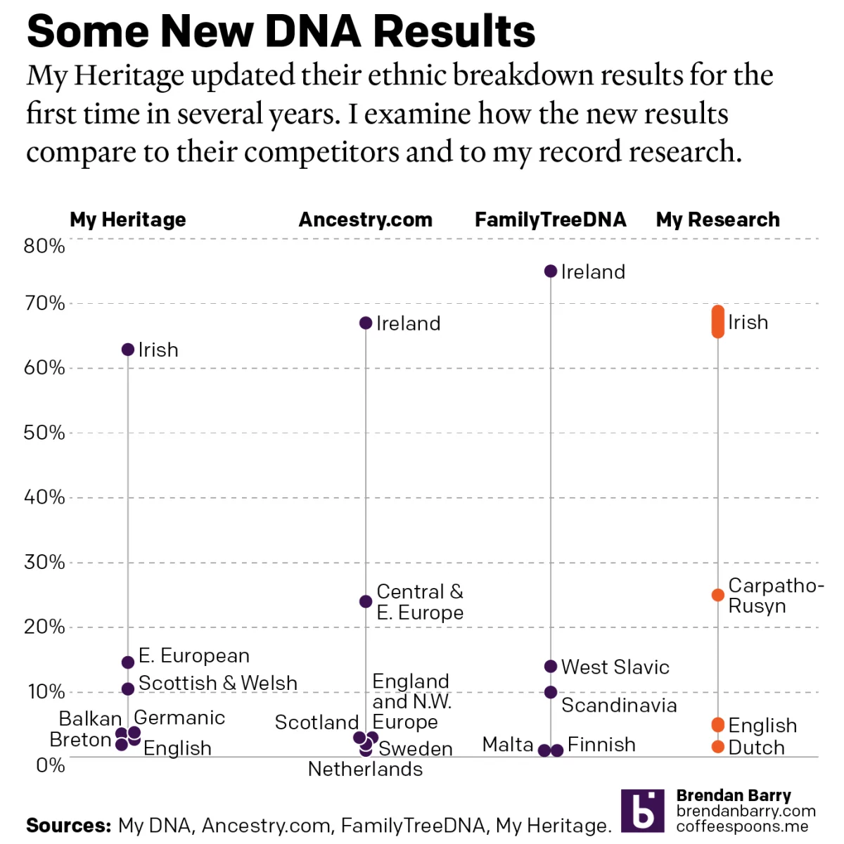
A Refreshed Look at My Ethnic Heritage
Late last week I received an update on my ethnic breakdown from My Heritage, a competitor of Ancestry.com and other genealogy/family history/genetic ancestry companies. For many years, the genealogical community had been waiting for this long-promised update. And it has finally arrived. For my money, My Heritage’s older analysis, v0.95, did not align with my…
-
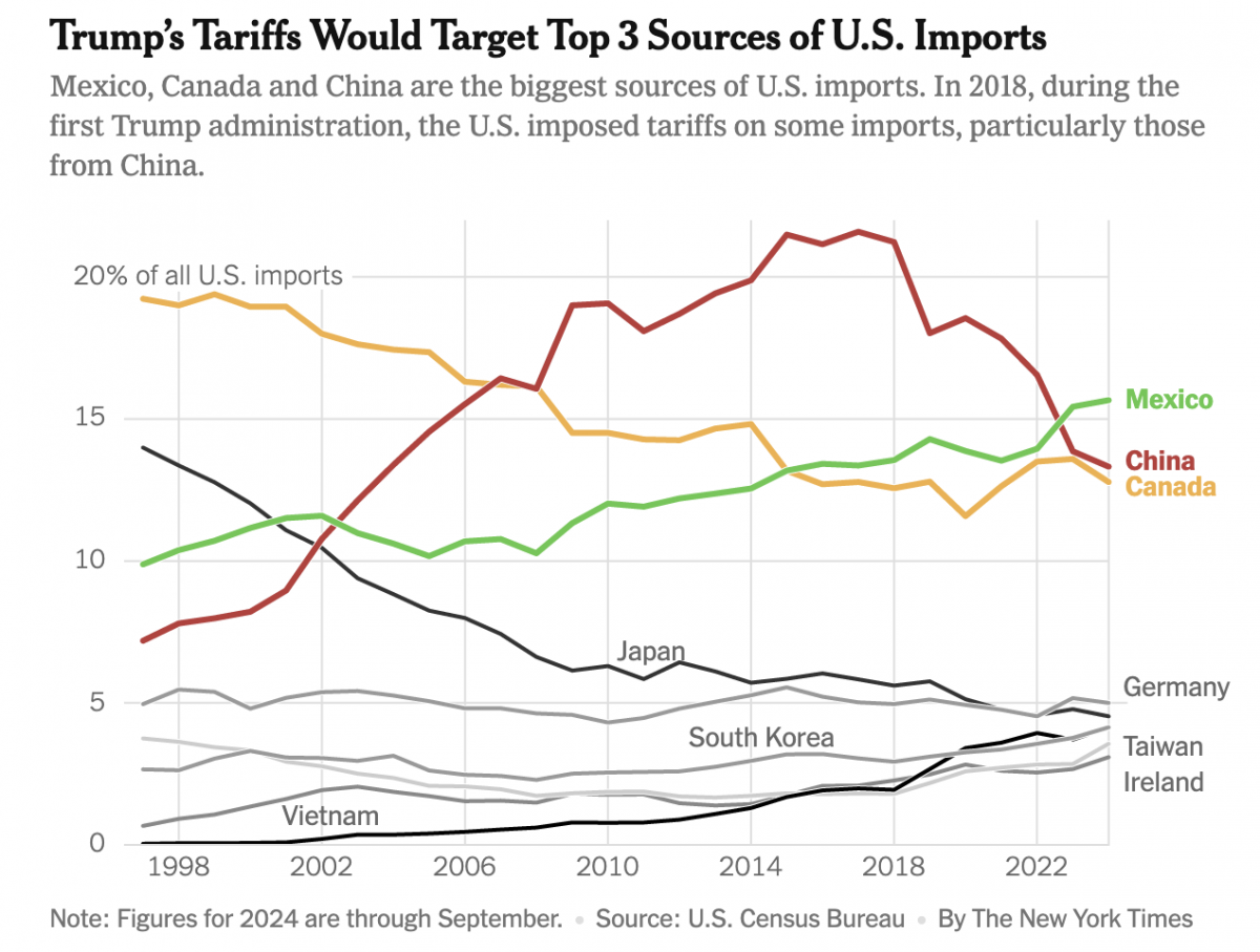
Imports, Tariffs, and Taxes, Oh My!
Apologies, all, for the lengthy delay in posting. I decided to take some time away from work-related things for a few months around the holidays and try to enjoy, well, the holidays. Moving forward, I intend to at least start posting about once per week. After all, the state of information design these days provides…
-
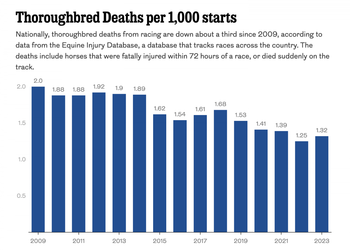
Racing to the Final Finish Line
Thoroughbred racing is big business. And Philadelphia’s Parx Casino owns a racing track that, in a recent article in the Philadelphia Inquirer, has seen a number of horse deaths. The article includes a single graphic worth noting, a bar chart showing the thoroughbred death rate. The graphic contrasts rising deaths at Parx with a national…