
Category: Datagraphic
-
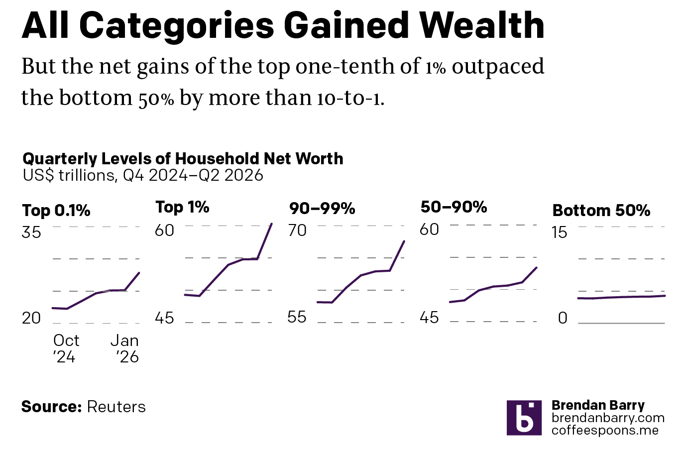
When Height Matters
I was reading an interesting article from Reuters this weekend about the disparities in wealth in the United States. The article included this interactive graphic, small multiples of line charts showing US household wealth from October 2024 through January 2026. At surface level we have a nice little graphic. We are looking at wealth across…
-

Y Bother?
To be clear, I read this as a joke. But we can also use it as a learning opportunity, because I have certainly seen quite a bit of poor data visualisation out in the internet lands of late. Compounding the issue, a seemingly declining level of data visualisation comprehension amongst the consumers in magical computer…
-
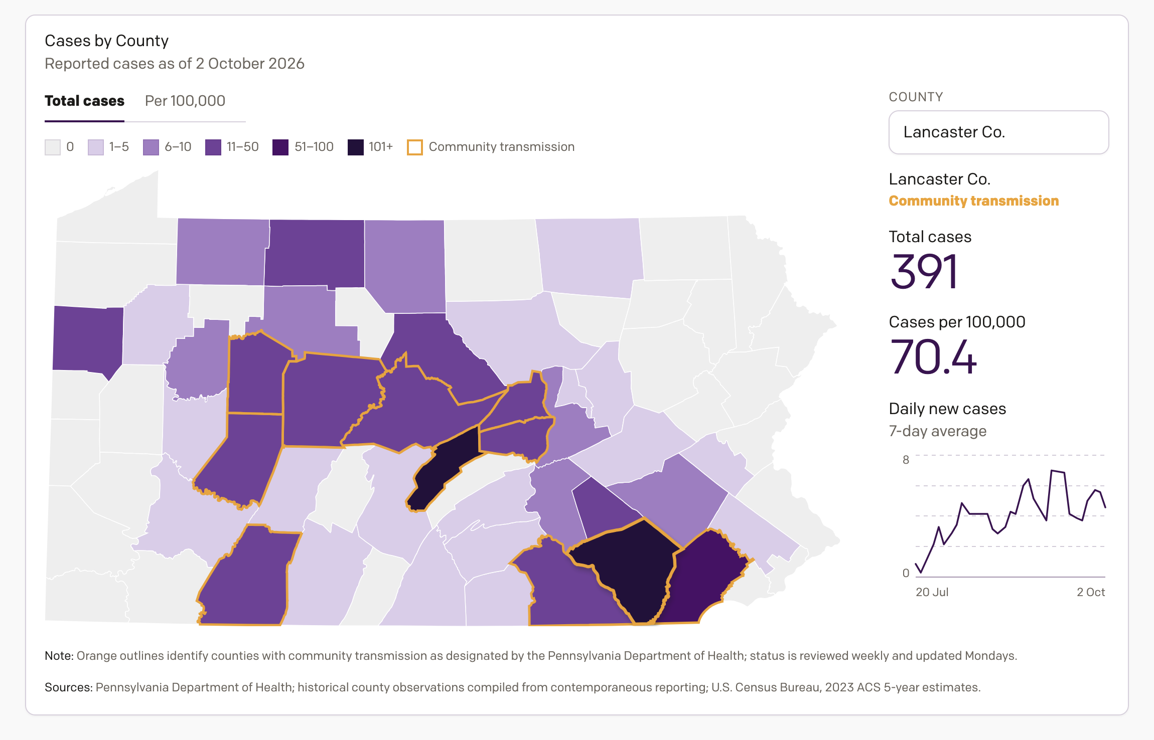
Tracking Measles in Pennsylvania
One project on which I have been working the last few weeks is an interactive data visualisation piece tracking the 2026 measles outbreak in Pennsylvania. A few years ago now I closely followed the COVID-19 pandemic, mapping it and charting it in a near daily series of datagraphics—to be clear, and this is a broad…
-
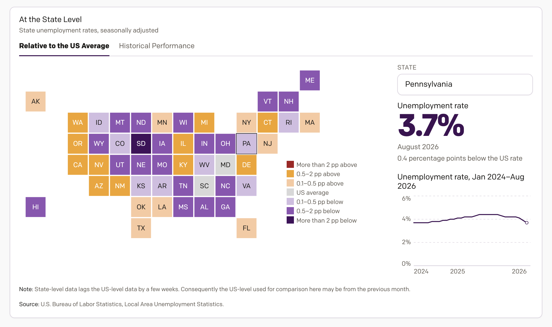
Unemployment in America
On Tuesday I wrote about my new inflation tracker—I need a better, more marketable name for that. Well, as I was designing the inflation tracker, I concurrently designed an unemployment tracker to track, well, unemployment. And I figured if I shared the one, why not the share the other? Thus, my unemployment in America tracker…
-
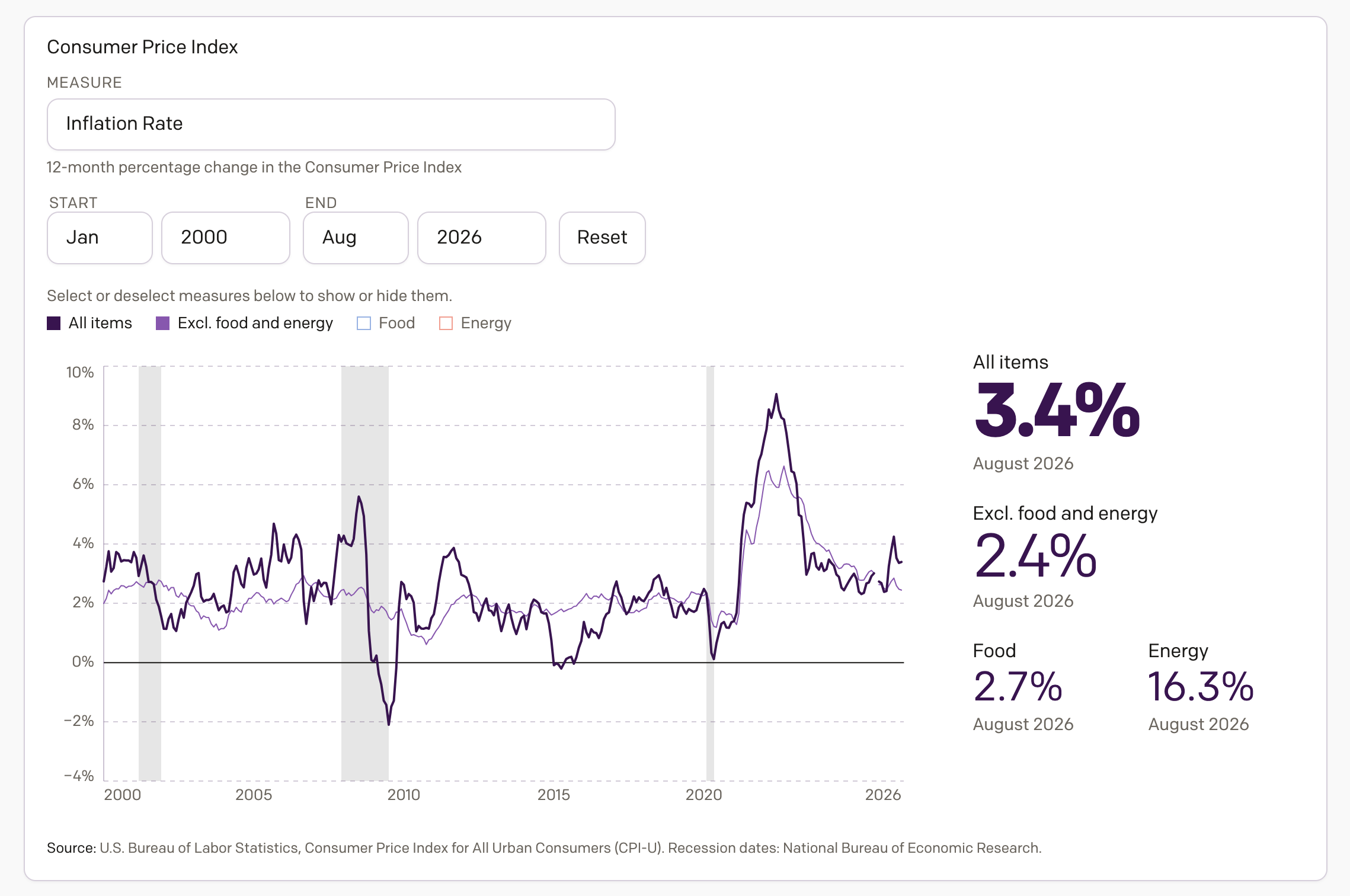
Inflation in America
Apologies for the lack of posting over the last month, but it was a very busy month. And so here I am back to share something I have been working on the last several weeks, an interactive application exploring inflation in America. Spoiler: it’s too damn high. The screenshot above links to the piece now…
-
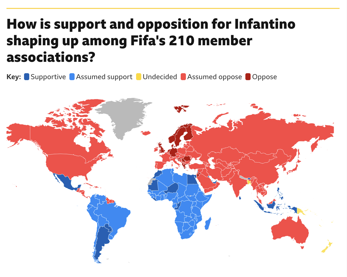
Will Infantino’s Own Goal Cost Him?
Fifa president Gianni Infantino has had a rough go of it of late. Turns out the world is not too enthused about the prospect known as Profit. He may have a strong right kick, but the world does not want to sacrifice the sport at Profit’s altar. At least not yet. And so Infantino’s plan,…
-
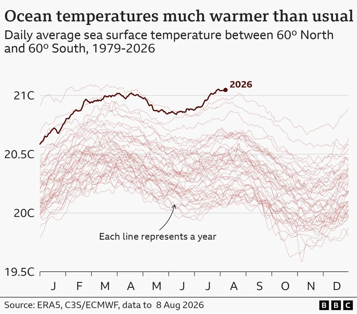
Steamy Sauna
This weekend was a hot and steamy one in Philadelphia. And so this morning colour me not at all surprised when I read in the BBC that the oceans hit a record high in July. The article included a few graphics, one being a map of European soil moisture—spoiler, Europe’s dry. And I am certain…
-

But What About Nambia?
I was going to post about this Friday, but left it for today. We need to talk about this map. First, why so many colours? Each country is clearly separated from the other, and the best rationale for so many colours here would have been if the countries shared a border and you ran the…
-
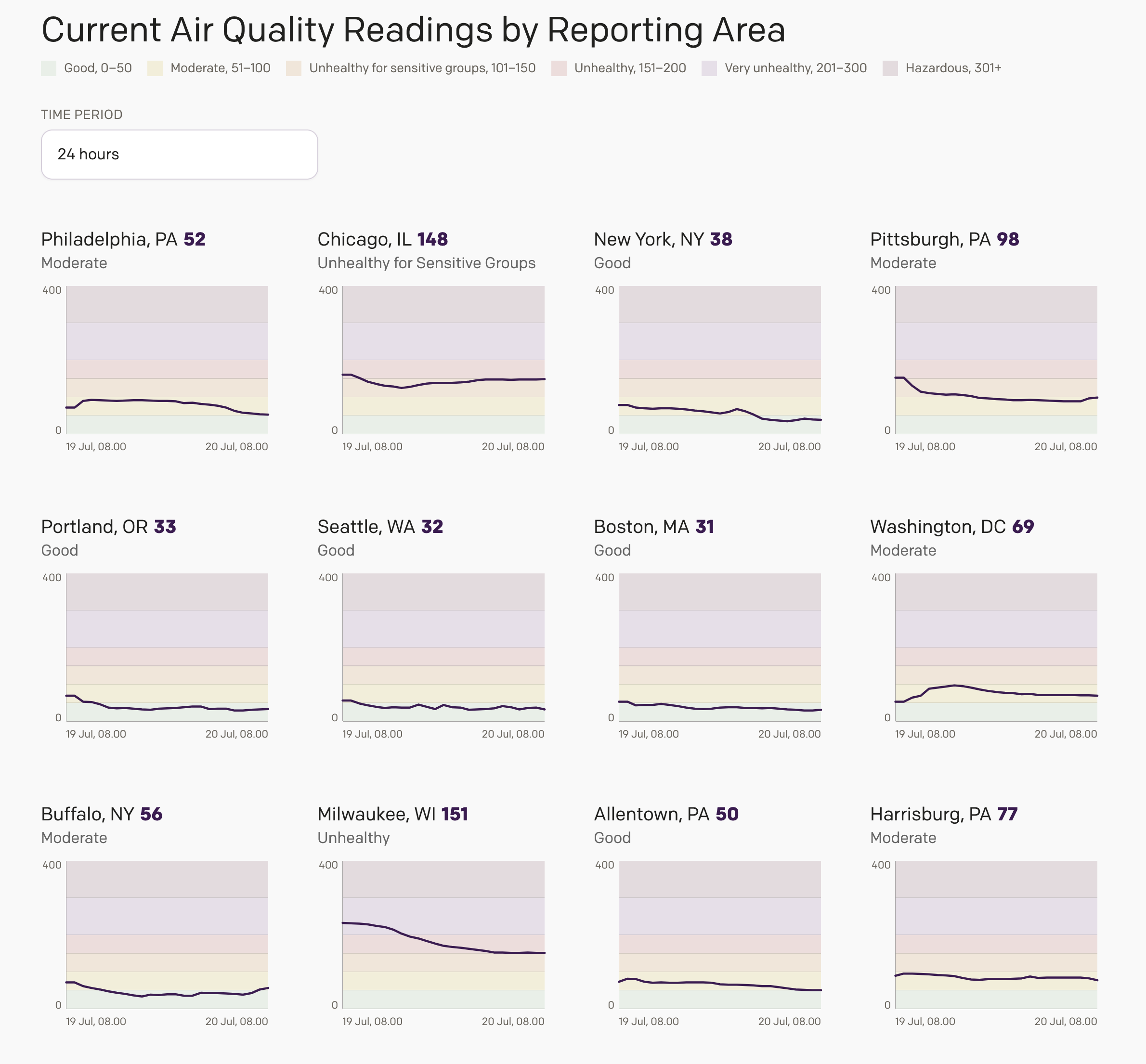
Smoke Here, Smoke There, Smoke Was (Almost) Everywhere
Friday I wrote about an interactive air quality web application I designed for my website after seeing a similar type of dynamically generated graphic in my local rag, the Philadelphia Inquirer. I did not have a lot of time to finish the project, and so it lacked the planned overview page, where I intended to…