Category: My Work
-

Opening Day
Happy Opening Day, everyone. Baseball is back. The Red Sox are back. Last year, I only posted my predictions on social media because they don’t include charts or graphs really. (But I did revisit them at year’s end.) These are mostly just tables. But, why not? Last year, shortly after Opening Day, I wrote about…
-
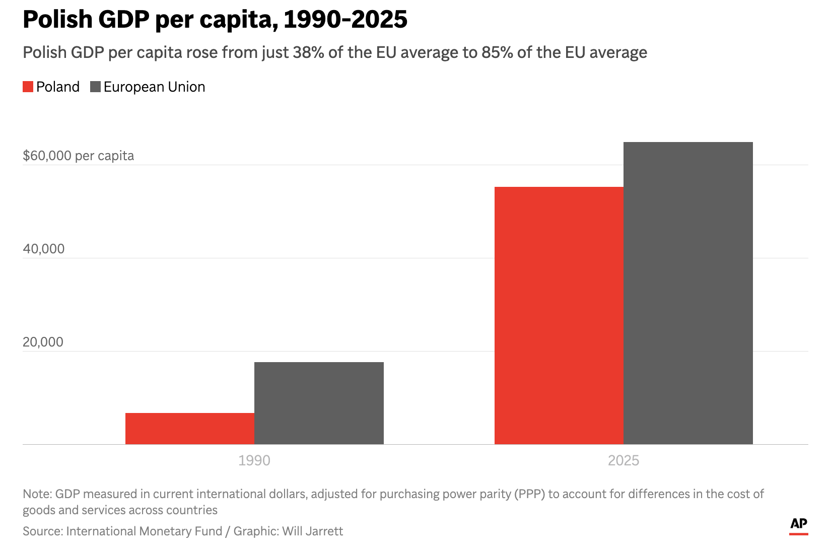
The Axis in Poland
Earlier this week I read an Associated Press (AP) article about Poland’s economic growth since the end of Communism in the former Soviet-bloc state. Generally speaking, things are good in Eastern Europe, though a revanchist Russia to Poland’s east rekindles memories of an earlier era and the disaster after the Molotov–Ribbentrop Pact. The article included…
-
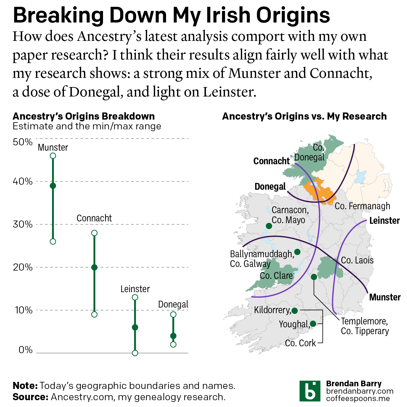
Still Irish
Last October Ancestry.com updated their ethnic origins breakdowns. Longtime readers will know these are not the most useful tools for helping one in their genealogical research. But, if they garner interest in one’s family history and motivate people to explore their own pasts, more power to them. I only encourage those people to dig a…
-

The Women in My Ancestry
International Women’s Day was Sunday and last weekend I attempted to research the occupations and careers of my direct line female ancestors. Including the scope to aunts and cousins broadened things too much in my mind. Unfortunately, there were too few who had recorded careers outside of “keeping house” or similar descriptions in census records.…
-
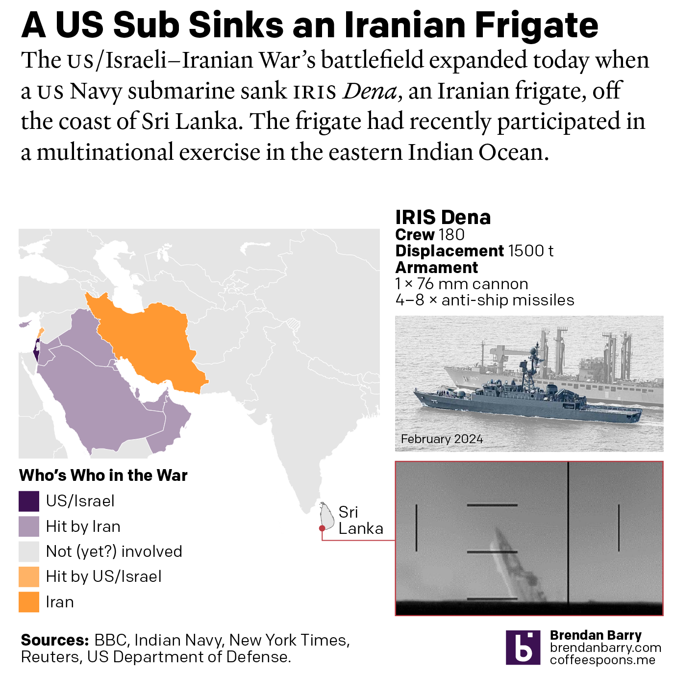
US Sub Sinks Ship off Sri Lanka
I woke up this morning thinking I was going to write about the graphics I mentioned on Monday. Instead, reading the news over breakfast brought me up to speed on the US Navy’s sinking of an Iranian frigate off the southwestern coast of Sri Lanka in the wee hours of the morning local time. Longtime…
-
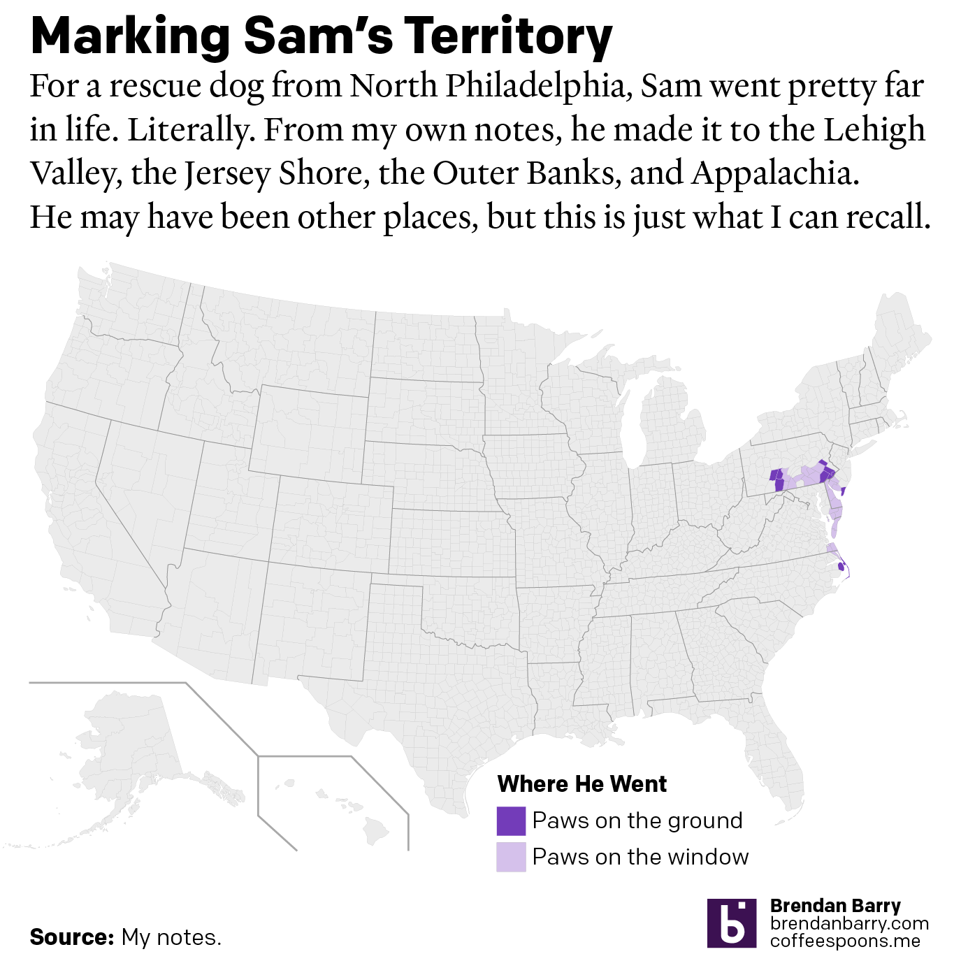
A Ruff Week
After last Friday’s post went live I headed home, because I received word that in the evening, we would be saying farewell to our family dog of 17 years, Sam. My sister adopted him after his first owners gave him up to a rescue shelter with injuries they could not afford to tend after he…
-
Just a Thought About a Thing That’s Been Nipping at Me
The democratisation of design tools ostensibly allows people to create high-quality graphics. But I think we can all admit to ourselves we see a lot of work that…misses its mark. As a general rule, I do not often post work here by untrained designers. My peers and I have the benefit of education and experience…
-
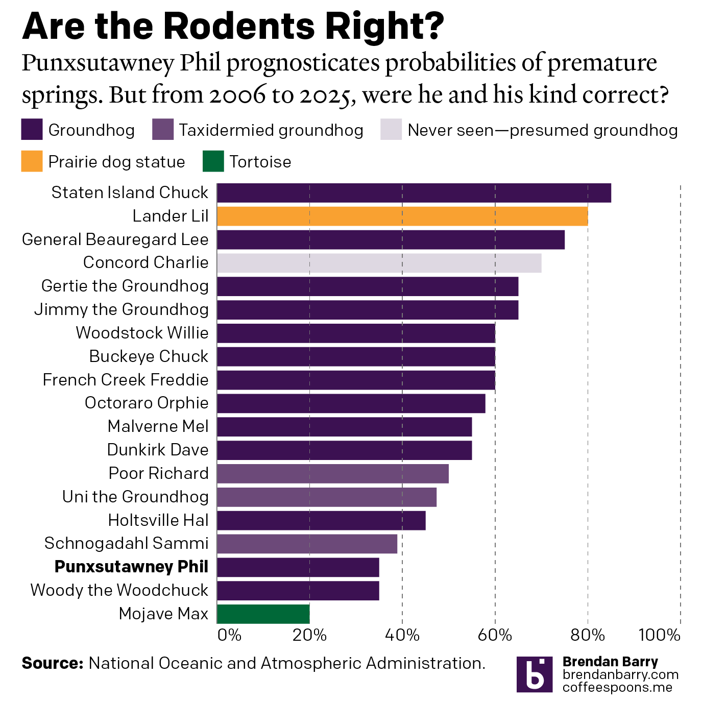
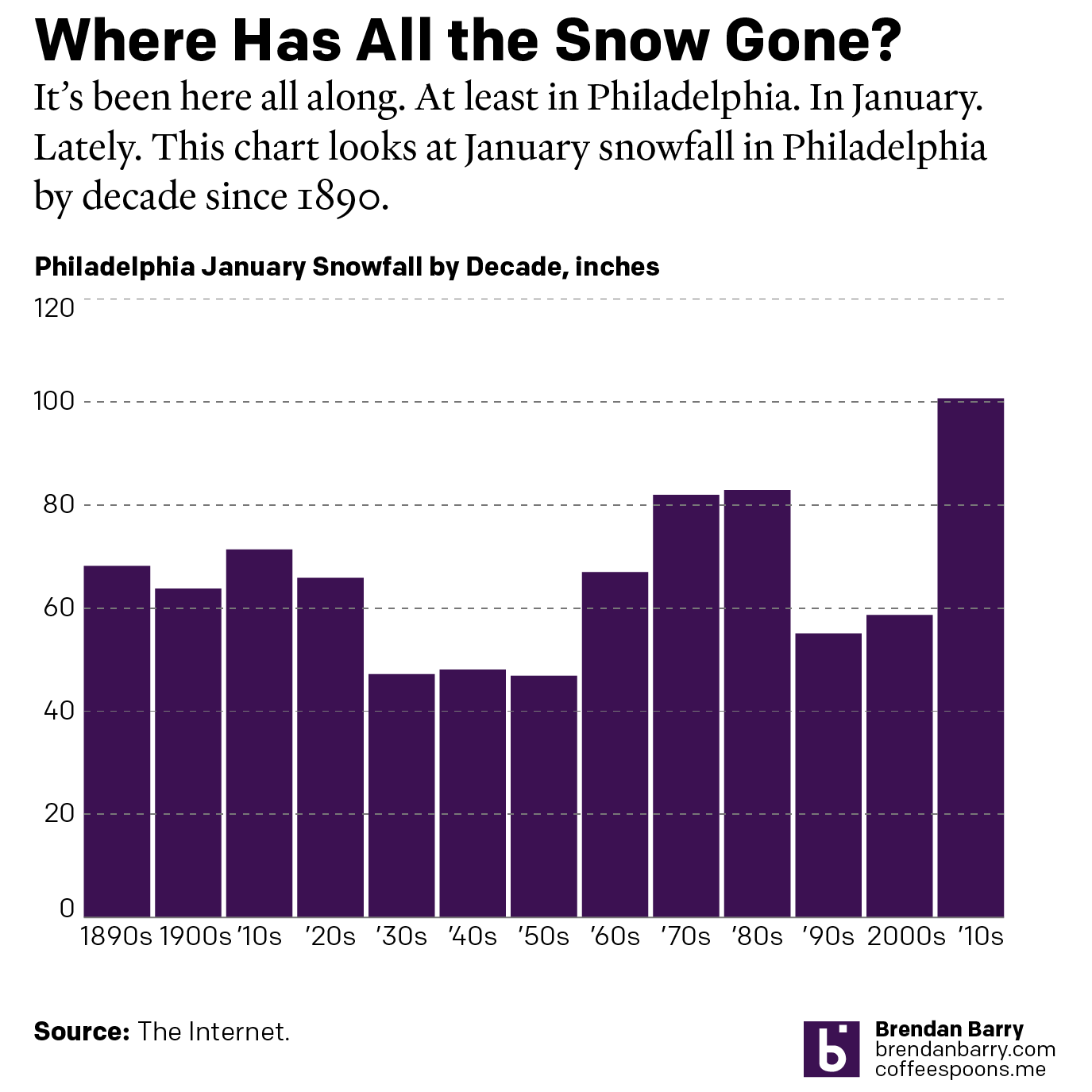
Do We Do This Every Year?
Every year on Groundhog’s Day I feel as if more and more critters crawl up from the Earth to offer their portents of prolonged winter. And every year we look backwards with the fullness of meteorological observations to evaluate the accuracy of these armchair—armburrow?—forecasters. This year, the Philadelphia Inquirer’s required article on the matter included…
-
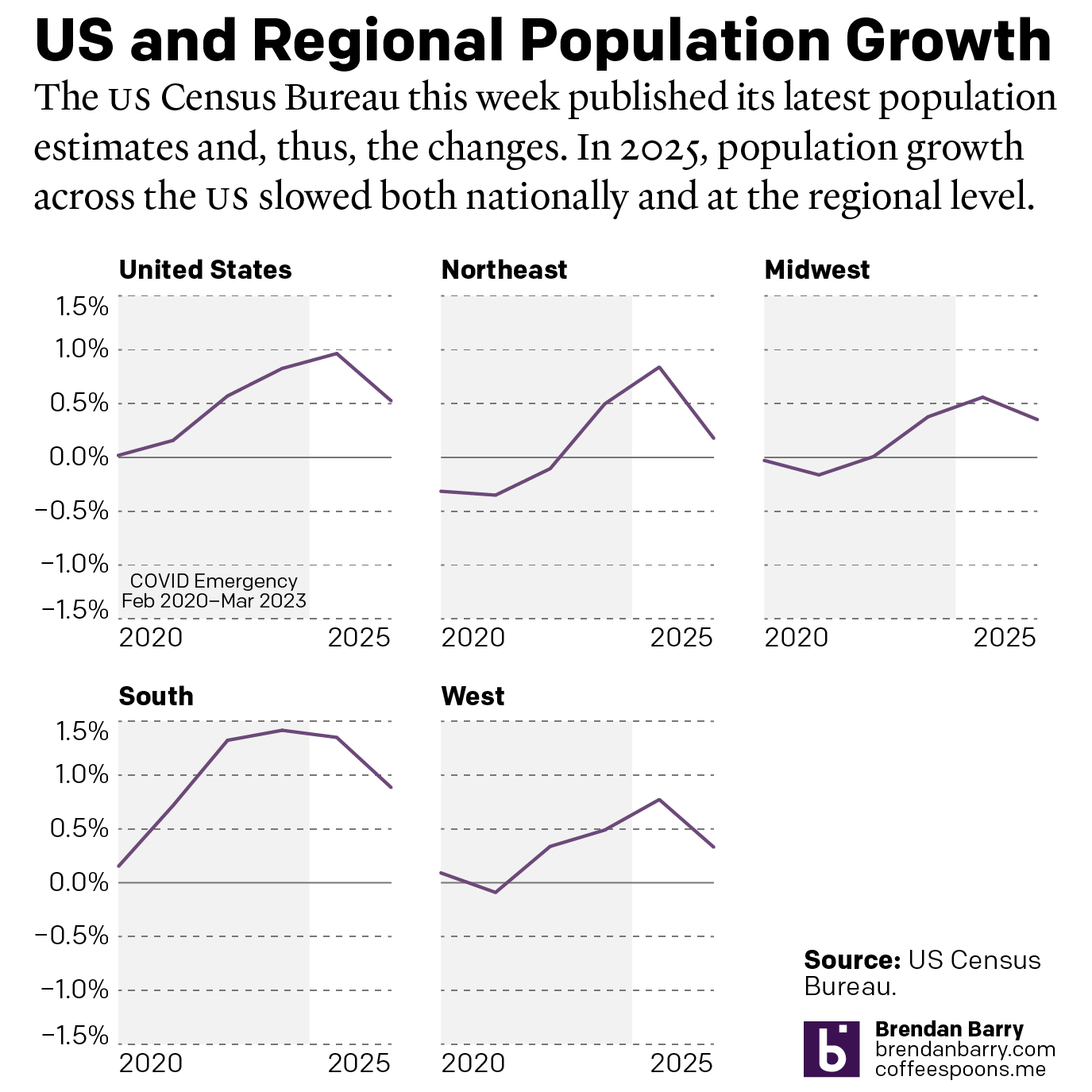
The Slowing of the Growth
This week the US Census Bureau released their population estimates for the most recent year and that includes the rate changes for the US, the Census Bureau defined regions, and the 50 states and Puerto Rico. I spent this morning digging into some of the data and whilst I will try to later to get…
-
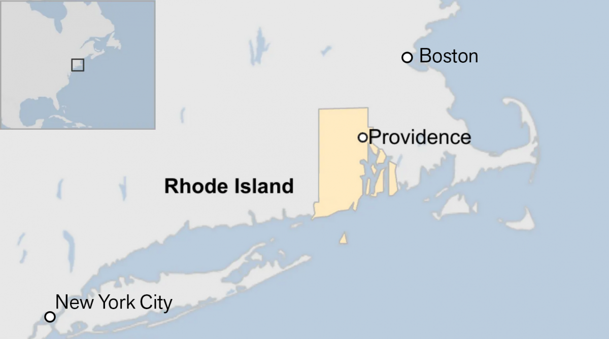
Off on the Road to Rhode Island
Yesterday I read an article from the BBC about this weekend’s shooting at Brown University, one of the nation’s top universities. The graphic in question had nothing to do with killings or violence, but rather located Rhode Island for readers. And the graphic has been gnawing at me for the better part of a day.…