War in Mali

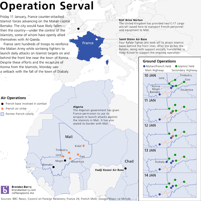
Malian and French forces in Mali have begun to slowly retake cities and towns in the conflict zone and are slowly pushing into northern Mali, which has been held by the Islamists for nearly a year. My infographic for today looks at recent troop movements and the growing arsenal of French weapon platforms involved in the war.

If the conflict is highlighting anything about the French military, in my mind it is the lack of support elements in the French air force. France cannot transport, on its own, its heavier vehicles and helicopters without the assistance of its allies. The first week was largely supported by two British C-17 transport aircraft. Also of some note is the fact that despite the era of drones, France is still relying on human-piloted reconnaissance aircraft because of a lack of sufficient numbers of surveillance drones.

Click for the full-scale image.
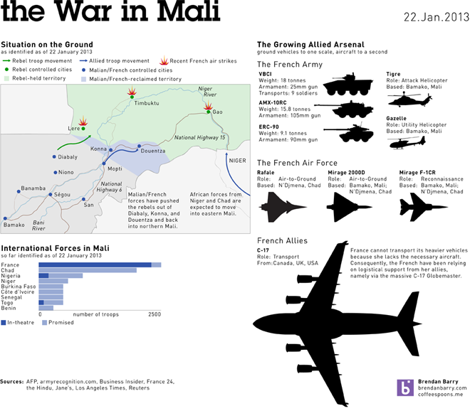
The War in Mali continues with recent troop movements and the growing Allied arsenal depicted

The War in Mali Continues

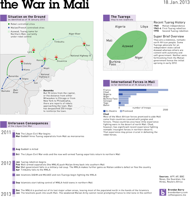
This morning’s graphic returns to Mali. The Malian and French forces are busy engaging the rebels at Konna and Diabaly while the rebels may be attempting to capture Banamba, only 90 miles from the capital Bamako. I also look a little bit more at the Tuaregs and then the basic timeline. That shows how much of the conflict can be traced back to the arming of the Tuaregs by Gaddafi during the Libyan Civil War and then those weapons, training, and experience returning to northern Mali at the end of that civil war.

The war in Mali
The war in Mali

Operation Serval Continues

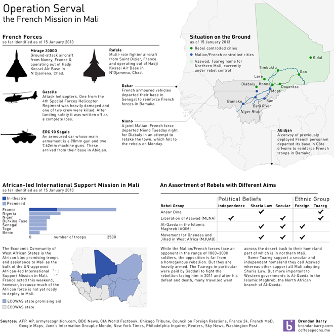
Tuesday saw no particularly startling developments in the conflict in northern Mali. The French continued to reinforce their quick reaction forces and sent their troops north to Mopti and Niono. By Tuesday night, press reports indicated that the first joint Malian–French force had left Niono to attempt to retake the town of Diabaly. My infographic below uses the slight lull to expand further upon what forces the French are bringing to bear, who else has promised support to Mali, and lastly tries to show how the rebels are not a unified fighting force. Instead the rebels are at best a temporary alliance of disparate groups with different aims. (Click the image for the larger view.)

Operation Serval on 15 January

Operation Serval

The tricky part about doing an infographic on a current event, like the conflict/war in northern Mali, is to keep the graphics updated and timely. Alas, I don’t have the necessary amount of time to do that. But, I still do want decent graphics explaining just what is happening.

With Mali, the hard part is that the Islamist/Tuareg rebellion against the democracy-overthrowing military government originally backed by the US in an attempt to beef up that military against the rebellion that then defeated that military is so far away and so foreign to much of the American public that so very much needs to be explained and be made relevant. This piece of mine doesn’t quite do that, but my infographic does attempt to show that France is now fighting a war far from its shores (and largely on its own). It also tries to highlight the fluidity of the ground war, especially around the fighting in and around Konna. Konna is the gateway to the city of Mopti which leads straight to the capital Bamako.

Operation Serval
Operation Serval

Merry Christmas

What words are more synonymous with Christmas than data visualisation? Okay, well probably any other words. For most people. But for family, friends, and co-workers I printed my usual infographic Christmas card. But for those of you who only come to my blog, I created a digital, online version.

The printed version of my 2012 Christmas card

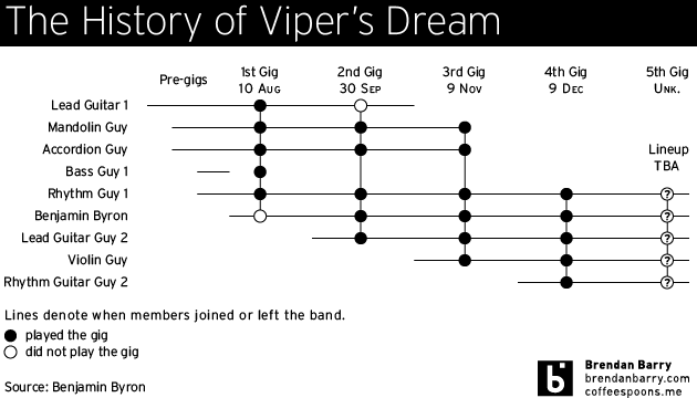
The History of Viper’s Dream

My colleague Benjamin Byron plays the upright bass in a few bands, one of which is named Viper’s Dream. We were discussing the flexibility of jazz band rosters and I decided to make an infographic about the membership history of Viper’s Dream. Unfortunately, I know of nobody’s name but Benjamin’s, so they are all listed as [instrument] Guy.

The history of Viper's Dream

Electoral College Victories

Despite the claims of a select few, President Obama’s victory in the electoral college last week was not narrow. While it was not a blowout landslide, it was a clear and convincing win. But to show how it compared across American political history, I quickly charted electoral college results since the time of George Washington.

It is worth keeping in mind that prior to 1804, electors did not distinguish their votes between president and vice president, so those numbers look a little bit different than they might seem today.

Electoral College Results

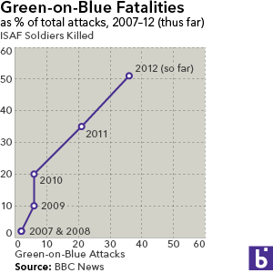
The Enemy Amongst Us

Perhaps the greatest danger now facing NATO and US troops in Afghanistan is the age-old wolf in sheep’s clothing, the insurgent dressed in Afghan Army fatigues. As the graphic below shows, the number of fatalities has been increasing along with the number of attacks. The silver lining in the cloud (to mix metaphors) is that the average lethality of the attacks is on the decline as fewer ISAF soldiers are killed per attack.

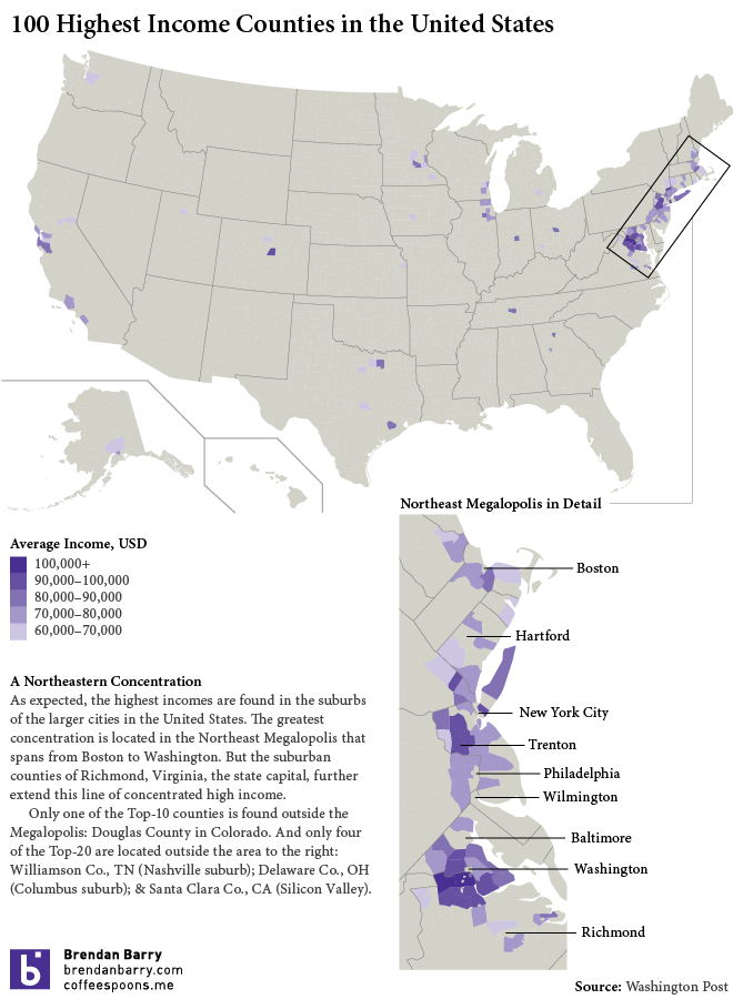
Where to Live for the Highest Income

So perhaps the title is a bit of a non-sequitor, but the Washington Post released a table of the Top-100 counties by average income. As a Washington paper their focus was on that city’s suburbs, three counties of which are Numbers 1, 2, and 3. But I wanted to get a sense of where other counties were, including that of my hometown.

Where the Rich Live
Where the Rich Live