Category: My Work
-
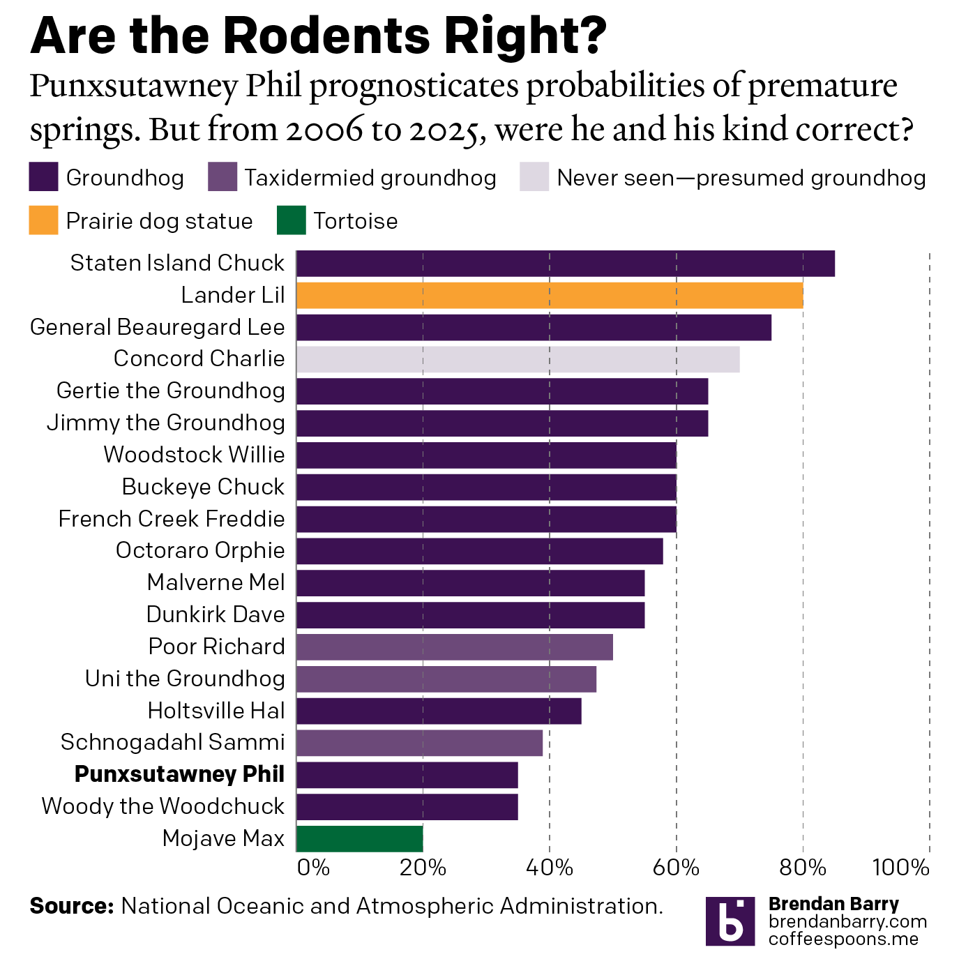
Do We Do This Every Year?
Every year on Groundhog’s Day I feel as if more and more critters crawl up from the Earth to offer their portents of prolonged winter. And every year we look backwards with the fullness of meteorological observations to evaluate the accuracy of these armchair—armburrow?—forecasters. This year, the Philadelphia Inquirer’s required article on the matter included…
-
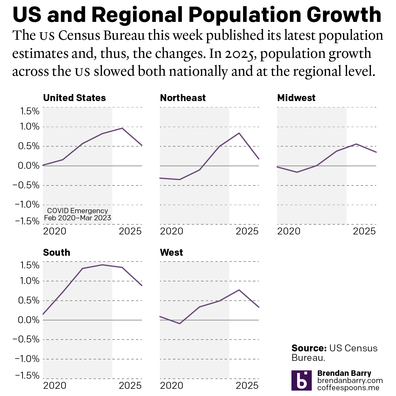
The Slowing of the Growth
This week the US Census Bureau released their population estimates for the most recent year and that includes the rate changes for the US, the Census Bureau defined regions, and the 50 states and Puerto Rico. I spent this morning digging into some of the data and whilst I will try to later to get…
-
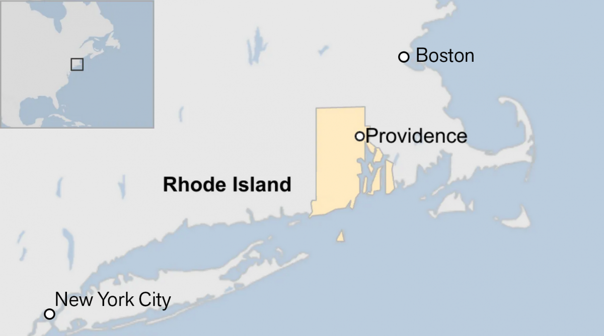
Off on the Road to Rhode Island
Yesterday I read an article from the BBC about this weekend’s shooting at Brown University, one of the nation’s top universities. The graphic in question had nothing to do with killings or violence, but rather located Rhode Island for readers. And the graphic has been gnawing at me for the better part of a day.…
-
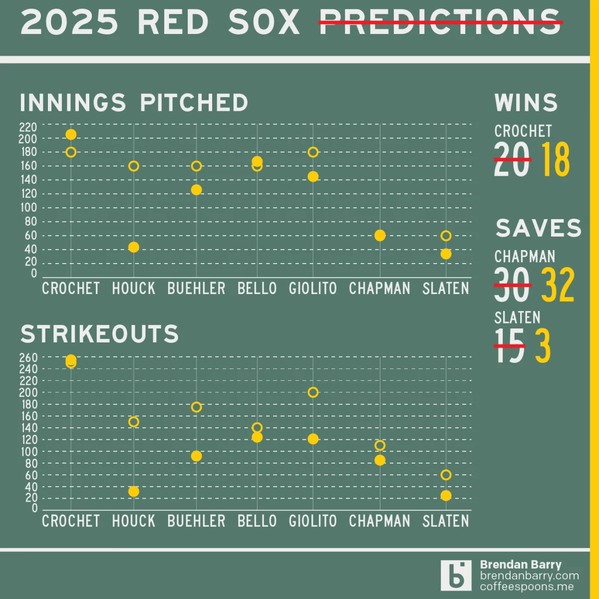
Revisiting My 2025 Red Sox Predictions
Back in March I posted my predictions for the 2025 Boston Red Sox on my social media feeds. I chose not to post it here, because the images had no real data visualisation and the only real information graphic was my prediction of the playoffs via a bracket. I did, however, write about how the…
-

2025 Red Sox Draft Breakdown
Monday and Tuesday, Major League Baseball conducted its amateur player draft, wherein teams select American university and high school players. They have two weeks to sign them and assign them. (Though many will not actually play this year.) Two years ago the Red Sox installed Craig Breslow as their new chief baseball organisation. He has…
-
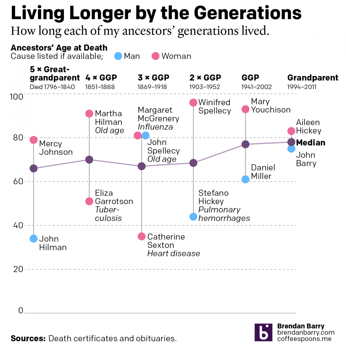
Living Longer by the Generations
Last weekend was Easter—for both the Catholics and the Orthodox—and I visited the Appalachian ancestral home of the Carpatho–Rusyn side of my family. Before leaving town I drove up to the old cemetery on a hill overlooking the old church and the Juniata River to pay my respects to those who came before me and…
-
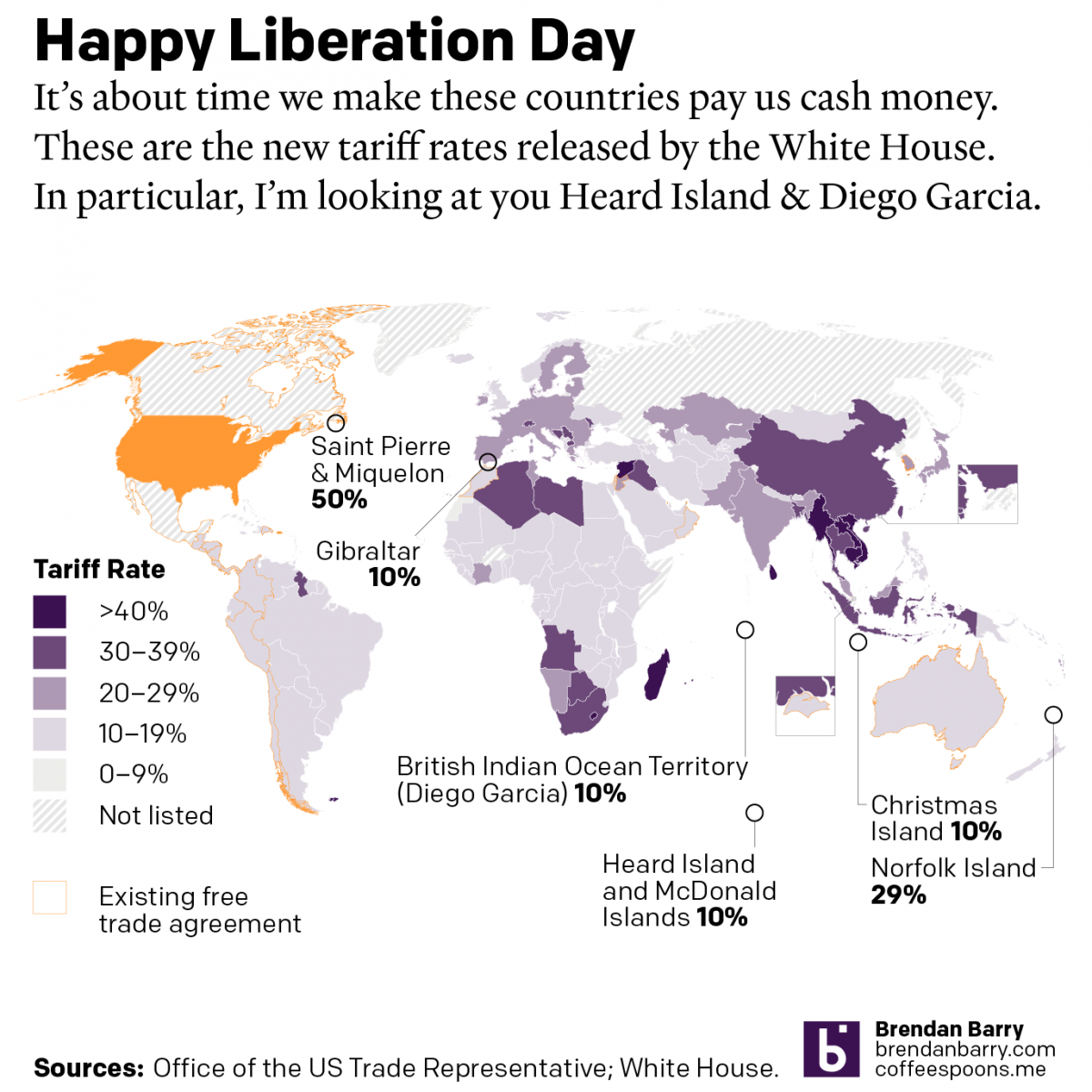
Happy Liberation Day
Yesterday I created a map detailing the new tariff rates released by President Trump on Wednesday. I was inspired by the curious inclusion of several small territories with almost no trade with the United States, and a few of whom are uninhabited. What follows is the graphic and the accompanying text I wrote as I…
-
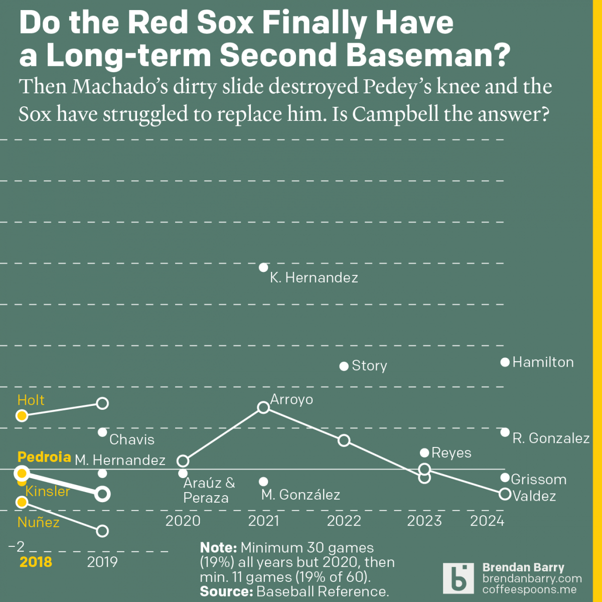
The Red Sox May Finally Have a Second Baseman
Last week was baseball’s opening day. And so on the socials I released my predictions for the season and then a look at the revolving door that has been the Red Sox and second base since 2017. Back in 2017 we were in the 11th year of Dustin Pedroia being the Sox’ star second baseman.…
-
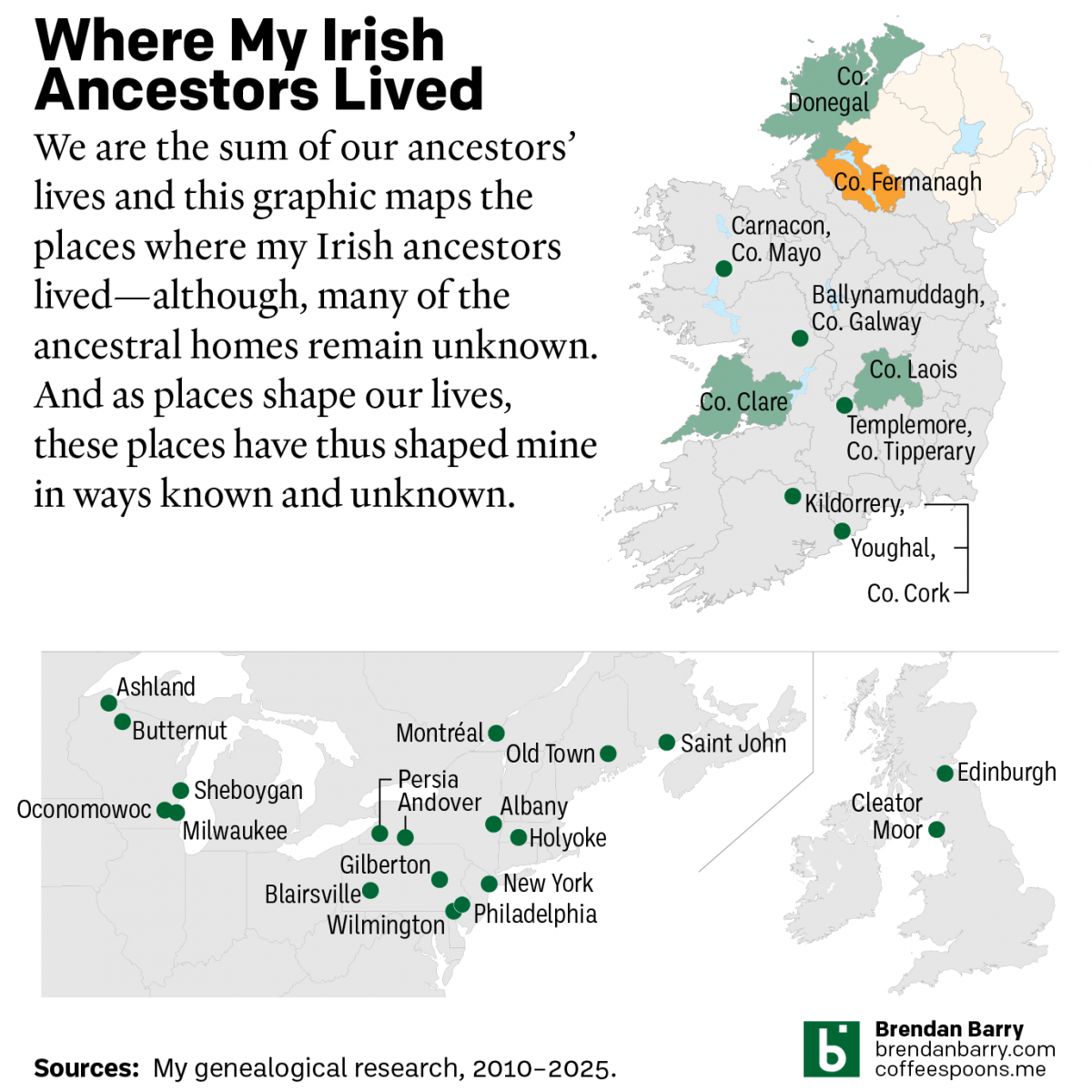
My Irish Heritage
This week began with Saint Patrick’s Day, a day that here in the States celebrates Ireland and Irish heritage. And I have an abundance of that. As we saw in a post earlier this year about some new genetic ancestry results, Ireland accounts for approximately 2/3 of my ancestry. But as many of my readers…
-
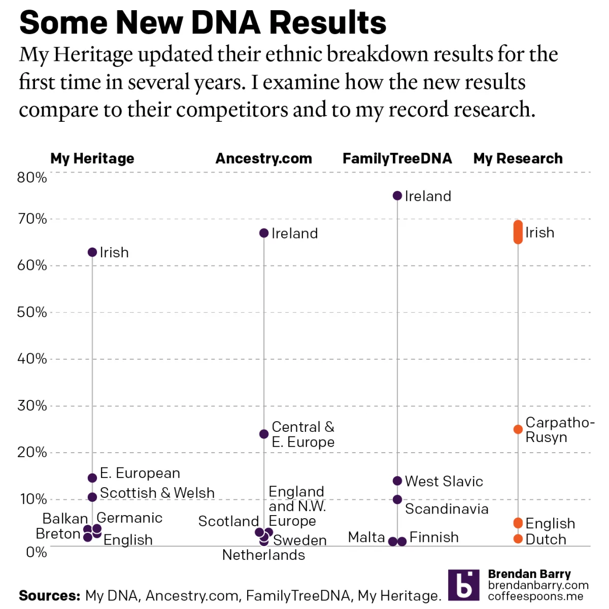
A Refreshed Look at My Ethnic Heritage
Late last week I received an update on my ethnic breakdown from My Heritage, a competitor of Ancestry.com and other genealogy/family history/genetic ancestry companies. For many years, the genealogical community had been waiting for this long-promised update. And it has finally arrived. For my money, My Heritage’s older analysis, v0.95, did not align with my…