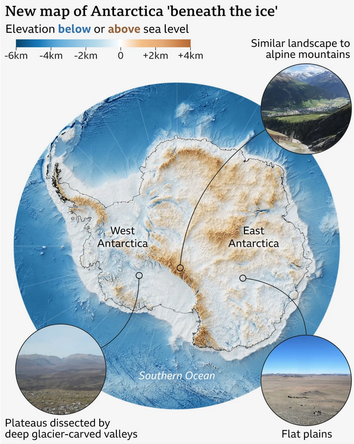
I love maps. And above the ocean’s surface, we generally have accurate maps for Earth’s surface with only two notable exceptions. One is Greenland and its melting ice sheet is, in part, contributes to the emerging conflict between the United States and Denmark over the island’s future. The other? Antarctica.
Parts of the East Antarctic ice sheet cover the continent in over 4 km of glacial ice. Yet if you look at a map of Antarctica you often see some sparse bits and bobs of brown around the continent’s edges—the continent’s sparse strips of barren rock wedged between the sea and the ice. There topographic maps reveal mountains, valleys, archipelagos, and a broad range of geographic features one expects to find on a continent larger than Europe. The rest of the continent, however, sits like a blank canvas in giant white spaces, perhaps with an isoline or two to indicate the ice sheet’s depth.
What rests beneath the ice? To an extent, we do not know. But over the decades modern science has slowly revealed Antarctica’s secrets. And last week a new scientific paper revealed the highest resolution map yet of the world’s southernmost continent.
This screenshot from a BBC article about the new map I thought does a good job of showing the map as well as providing intelligible context for readers.

We see rough scratches of brown over the white, but what does it mean? The paper’s authors describe the landforms as alpine or flat plains, and then something in-between, where erosion is an ongoing and current-day process. Those terms perhaps mean little to the broader audience, so the BBC added photographs of similar unglaciated landscapes from elsewhere on Earth.
I looked at the actual article for a quick comparison, and I believe the BBC adjusted the colour for their audience, a brown–blue spectrum, compared to the paper’s original dark blue to bright green. This brown, white, and blue colour palette certainly plays better to maps with which the general public is familiar.
Regardless, the whole thing is fantastic overall. Sadly, it seems increasingly likely that in the coming centuries more and more of this ice-covered continent will reveal itself to humanity as the climate continues to warm.
Credit for the graphic goes to the BBC graphics team.
Credit for the map goes to R.G. Bingham and A. Curtiss.
