Tag: Groundhog Day
-
Do We Do This Every Year?
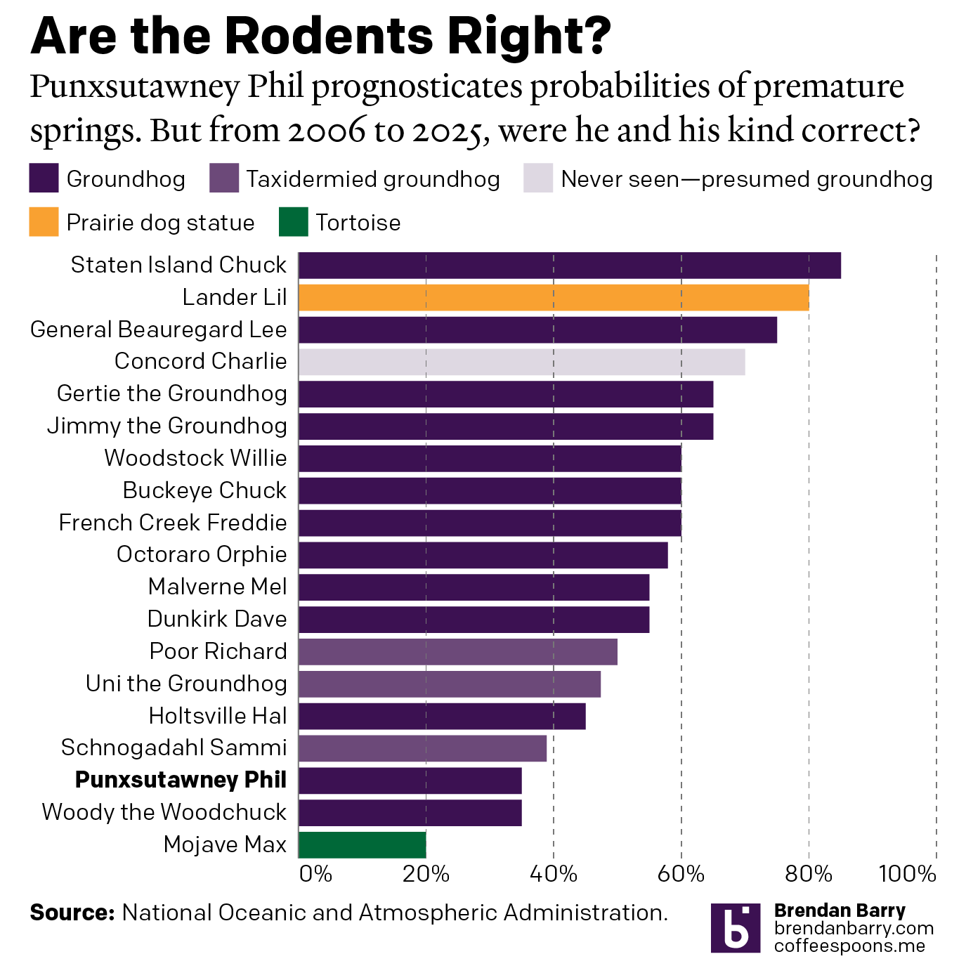
Every year on Groundhog’s Day I feel as if more and more critters crawl up from the Earth to offer their portents of prolonged winter. And every year we look backwards with the fullness of meteorological observations to evaluate the accuracy of these armchair—armburrow?—forecasters. This year, the Philadelphia Inquirer’s required article on the matter included…
-
How Accurate Is Punxsutawney Phil?
For those unfamiliar with Groundhog Day—the event, not the film, because as it happens your author has never seen the film—since 1887 in the town of Punxsutawney, Pennsylvania (60 miles east-northeast of Pittsburgh) a groundhog named Phil has risen from his slumber, climbed out of his burrow, and went to see if he could see…