Humanity’s Not So Finest Hours

Humanity is amazing. We have great emotional power for love, sympathy, compassion, &c. We have great intellectual power; we have/are mastering mathematics and science to explore the depths of this ocean and the surfaces of planets not our own.

Yet with these great powers comes a great responsibility. And as we continue to reflect upon the milestone of reaching a population of 7 billion men and women, Bill Marsh at the New York Times, along with Micah Cohen, Matthew Ericson, and Kevin Quealy, reflected Sunday on humanity’s ability to let this responsibility slip from time to time and how at those times the human population of Earth fell.
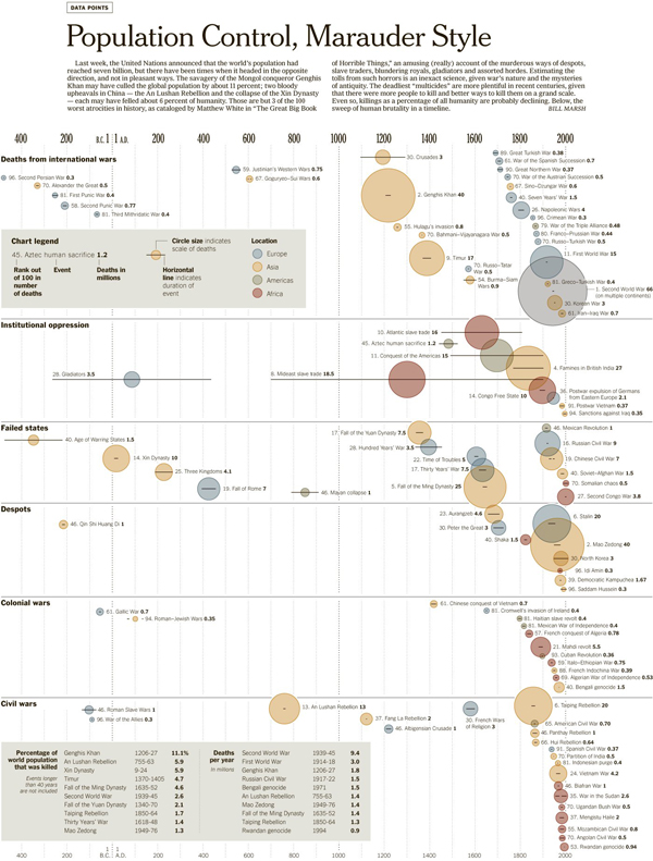
Timeline of Humanity's Atrocities

The data comes from a book by Matthew White called “The Great Big Book of Horrible Things” that details the worst 100 cases of man killing fellow man. (Although, according to Marsh the account is humourous, though I have never read it.) At the top are no particular surprises: World War II, World War I, and Genghis Khan. The reigns of Chairman Mao, Stalin, and the Kims of North Korea. But a look further down the list, further down the timeline reveals in all its tarnished glory the history of humanity when we not quite so amazing.

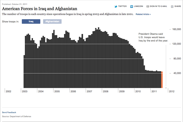
Troop Levels in Iraq

A few days ago, President Obama announced that all but perhaps 150 US troops in Iraq would be home before 1 Jan 2012. While the mission may have been accomplished over 8 years ago, we are finally seeing an end to the Iraq War.

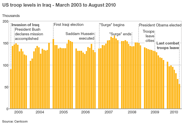
Both the BBC and the New York Times created charts to show the strength of US forces in Iraq since the start of the war up until the end—the New York Times also compares these to troop levels in Afghanistan where we have a new ‘surge’ of troops.

The two are slightly different. The first from the New York Times is an interactive piece that allows you to mouse over each bar and access the actual number of troops present in Iraq that month. The bars are spaced tightly together with only the necessary gap to break apart years and provide the vertical scale.

New York Times chart

The BBC piece is a static image with no interaction. I do not care for the clustering of years, it breaks the visual rhythm of the piece and interrupts the story. I think in the design of the piece that the New York Times has the better and more effective chart. However, where the BBC truly succeeds is in offering bits of explanation for changes in the chart.

BBC chart
BBC chart

One might think that the war lasted several years with periods of great battles and great troop losses because the  number of soldiers stays roughly at 140 thousand. But the text lets us know otherwise. The first is obvious, the war begins. But it progresses to things like the declaring of mission accomplished, the surge, and when US troops left Iraqi cities.

These are not difficult pieces of analysis, nor do they require much investigatory journalism, but they provide the context that allows the chart to tell the story in its numbers.

Oh Great Gatsby

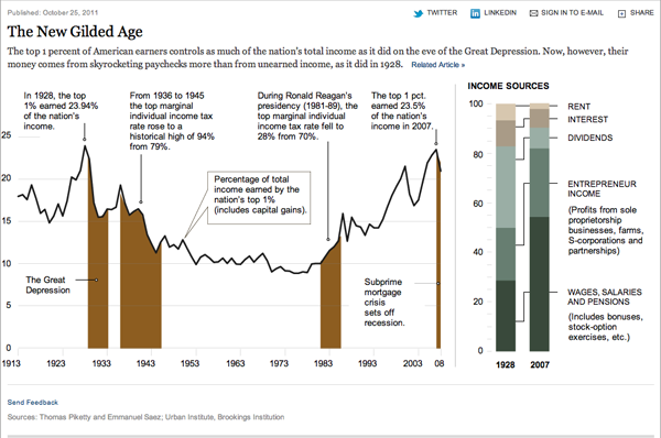
Income inequality basically means that the wealth of a country, in this case, is unevenly distributed with most of it falling in the hands of a very few people or families. Think the era of, as the title alludes to, Gatsby and the 1920s before the Crash.

Broadly speaking, a middle class requires a more dilute concentration of wealth, and as this graphic from the New York Times shows, we are seeing—Great Recession aside—the growing wealth of the wealthy at the expense of the rest of the country. Look at, for example, the 1950s, 60s, and 70s when the highest income bracket had its marginal tax rate in the 70% range. The top 1% owned only about 10% of the wealth. Just before the subprime crisis hit, that number was just under 25%.

Ownership of US wealth for the top 1%

Back in the USSR

So, those of you a little bit older than me—not to date myself—probably remember the evil Reds of Soviet Russia. Some my age do as well. Younger than me, it’s probably all ancient history. And so for those of you who forget, the Union of Soviet Socialist Republics was, if I am to simplify, a Russian empire that featured a centralised, command and control economy and a dictatorial government. In 1991, the empire fell apart for a number of reasons and became 15 independent countries, Russia still being the largest. And a lot has happened in the twenty years between 1991 and 2011.

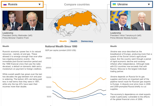
Twenty years being a long time, the BBC has remembered the event by creating a relatively simple piece that compares the fates of the various countries in the aftermath of the Soviet Union’s breakup. One takes one drop-down list and selects a country and then another country from the other list. And in the centre one can control whether the comparison is of wealth (GDP), health (life expectancy), or leadership (no. of times the presidency has changed hands).

Comparing Russia to the Ukraine

I have an issue with some of the metrics and whether they are the best suited to describe the wealth, health, and democracy of the former Soviet republics. But, I think the strength really is not so much the charts but the brief summaries for each country that try to capture the story of the past two decades.

Rule, Britannia

The United Kingdom. England. Britain. All pretty much mean the same thing, right? No. But, if you do not believe me, might I recommend going to Glasgow or Edinburgh and calling a local an Englishman. It may very well be a quick education.

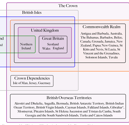
Colin Grey attempts to untangle the constitutional and jurisdictional mess in both a video and an accompanying chart. The video takes about five minutes and is largely correct with most of the errors I have picked up on being rather small in nature, e.g. Ireland is not the Republic of Ireland but just Ireland…not a big deal unless one wants to be enraged by minutiae.

The chart is simple and effective in delineating the structure of the UK and expands about how the UK fits into Europe.

Breaking Down the United Kingdom

Credit for the piece is to Colin Grey and thanks to Kim Nguyen for the tip.