A few days ago, President Obama announced that all but perhaps 150 US troops in Iraq would be home before 1 Jan 2012. While the mission may have been accomplished over 8 years ago, we are finally seeing an end to the Iraq War.
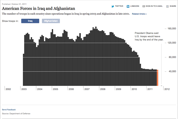
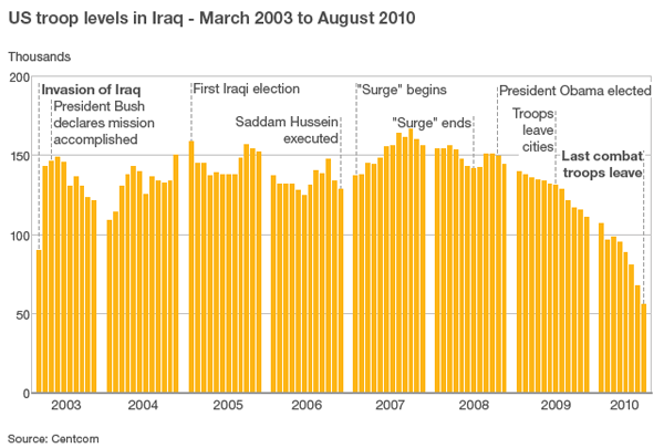
Both the BBC and the New York Times created charts to show the strength of US forces in Iraq since the start of the war up until the end—the New York Times also compares these to troop levels in Afghanistan where we have a new ‘surge’ of troops.
The two are slightly different. The first from the New York Times is an interactive piece that allows you to mouse over each bar and access the actual number of troops present in Iraq that month. The bars are spaced tightly together with only the necessary gap to break apart years and provide the vertical scale.

The BBC piece is a static image with no interaction. I do not care for the clustering of years, it breaks the visual rhythm of the piece and interrupts the story. I think in the design of the piece that the New York Times has the better and more effective chart. However, where the BBC truly succeeds is in offering bits of explanation for changes in the chart.

One might think that the war lasted several years with periods of great battles and great troop losses because the number of soldiers stays roughly at 140 thousand. But the text lets us know otherwise. The first is obvious, the war begins. But it progresses to things like the declaring of mission accomplished, the surge, and when US troops left Iraqi cities.
These are not difficult pieces of analysis, nor do they require much investigatory journalism, but they provide the context that allows the chart to tell the story in its numbers.
Leave a Reply
You must be logged in to post a comment.