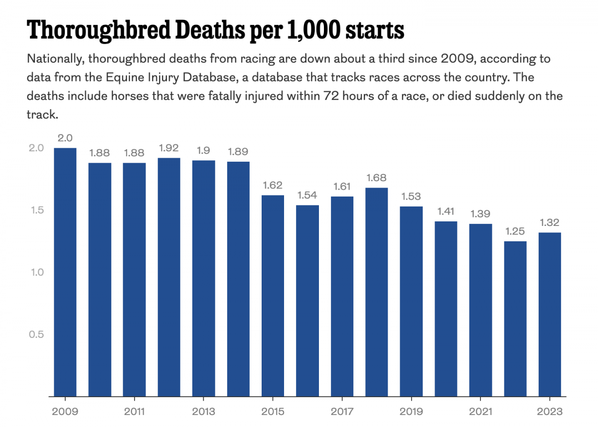
Too Much Horsing Around

Last week the Philadelphia Inquirer published an investigation of the staggering number of horse deaths in Pennsylvania’s race track facilities. I found the article fascinating, but admittedly at a point or two a wee bit squeamish when the author described how horses essentially die. Then about halfway through the article I ran into the first of two graphics looking at the data.

Seeing red…

The first is pretty simple, a timeline of deaths over the course of one year, 2019. Overall it works, you can clearly see clusters of racing deaths, but that those clusters spread across the year. When I sat with the graphic for a moment, however, a few things began to stick out at me. The first was a distracting vibration in the background. Not the alternating beige and blue of the months, but if you look closely you’ll see tightly spaced lines within the colour fields: presumably the days of the month for aligning the deaths.

On a large enough graphic it makes all the sense to tick off sub-monthly increments, but in this space I would have probably opted to show only the months. Maybe weeks could have worked, as that approach may have reinforced the statistic about a horse dying every six days on average.

The second point is the black stroke or outline of each dot. Here the designer faces a challenging constraint. Essentially, the smaller the dot (or the symbol) the brighter the colour. In a rich, blood red colour you have a dark heavier colour. Compare that to say a stop sign that is bright red. It has a lighter feel. The blood red colour, in a given space, has let’s say an amount of black ink or pixels—I’m simplifying here—mixed in with the red. But in a large area, there’s enough red ink or pixels to still be clearly blood red. The stop sign red has no other colours but red. And in large areas, it can be an eye-stabbing amount of red—precisely why it’s likely so useful for, you know, stop signs.

But at the small scale of these very small dots, you still proportionally have the same amount of red and black ink, but with fewer and fewer amounts, the eye can begin to experience difficulty in truly reading the colour for what it is. For example, in an area of say 49 pixels (7×7), while the ratio of red to black may be consistent, you still only have a total of 49 pixels with which to convey “red” to the reader. Consequently, in smaller spaces, you may find that designers sometimes opt for brighter colours, a la stop sign red, than they would in larger fields of colour.

Here we have a nice use of brighter red, green, and yellow. (I will quickly add that the choice of red and green can be problematic for colour blindness, but I don’t want to revisit that here.) But to provide better separation between those small, circle sized fields of colour a border probably helps. A thin black line, or stroke, makes sense. But the black is darker than the colours themselves, thus it can draw more attention than the colour fill. And that begins to happen here. I wonder if a thin white stroke may have been less distracting and placed more emphasis on the fill colours.

As I said, overall a really nice if not sobering graphic in an important but disturbing article. I think a few small tweaks could really bring the graphic over the finish line. Pun fully intended. Sorry, not sorry.

Credit for the pieces goes to John Duchneskie.

The Science Behind the Thoroughbred

I do not know a thing about horses. I leave that knowledge to others in my family. However, this piece from the South China Morning Post explains quite a bit of why the thoroughbred is such a famous type of horse for racing.

The science behind thoroughbreds

Credit for the piece goes to Alberto Lucas López.