Apparently the flu is going around. Boston has a city wide health emergency on its account. So if you’re wondering what to do on a sick day, well I shall allow you in all my magnanimity to use a pie chart. As Randall Munroe did.

What words are more synonymous with Christmas than data visualisation? Okay, well probably any other words. For most people. But for family, friends, and co-workers I printed my usual infographic Christmas card. But for those of you who only come to my blog, I created a digital, online version.
The Economist often does clear, concise graphics to accompany their articles. And from to time they also do more interactive works that allow a more in-depth exploration of data. And then sometimes they do awesome maps like this. The realms of GAFA.
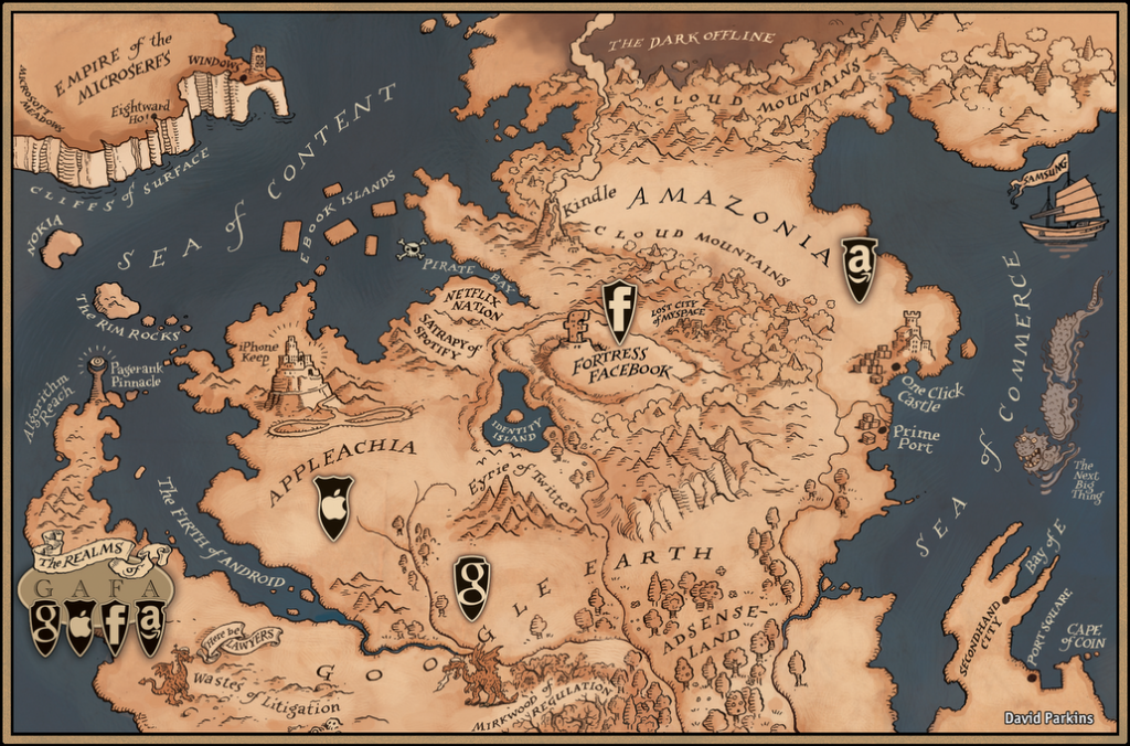
Credit for the piece goes to David Parkins
This Friday at Happy Hour as you sip your pint, are you going to wonder what your beer choice says about your politics? Okay, probably not. But you could. And if you did, this chart from the National Journal would help you identify just what your drink is saying.
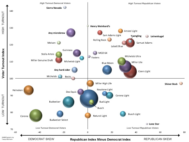
Is your favourite on the chart? Do you have to reevaluate your choices for November? Or whether or not to go vote?
Credit for the piece goes to Tracey Robinson, NMRPP via the National Journal.
For your Friday comic relief comes the infographic of the week.
The content is serious. But the graphic is laughable at best. And undercuts the message in my opinion. Seriously, it’s like the mobile weapons labs, but worse. All over again.

Photo credit goes to Mario Tama at Getty Images, via the Los Angeles Times.
Evolution is a myth. Creationism is where it’s at. So thankfully we have this new timeline that takes into account the age of fossils, radiocarbon dating, and all that other science-y stuff. I’m just glad to know that the reason we won World War I was because we had the raptors on our side.
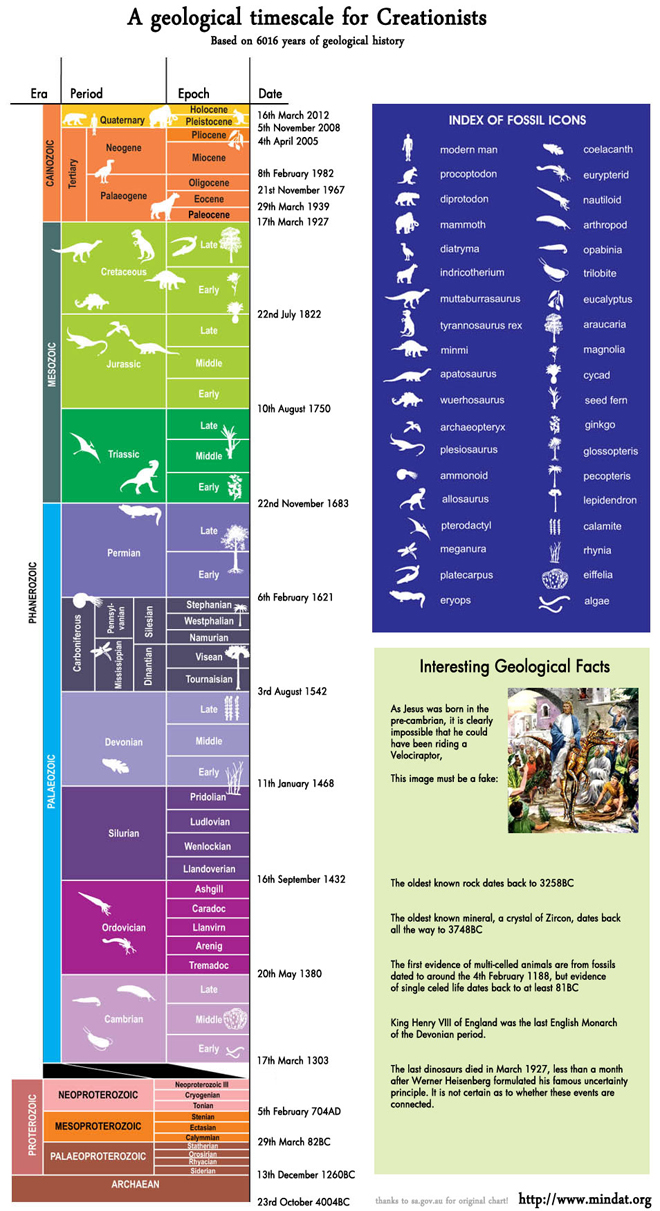
The original graphic comes from the Government of South Australia, but the manipulated graphic is courtesy of chartgeek.com.
When I was younger—albeit not by much—I applied my interests in geography, history, and politics to create maps of fictional places. I used knowledge of things like the Hadley cell and the Koppen climate classification system to figure where on the maps I drew people would be able to live in temperate climates and where nobody could live because it would be an arid desert. I also read encyclopedias growing up, so go figure.
But I never bothered to apply my amateurish interest in geography and climatology to Earth. Rather, to an alternate Earth. But Randall Munroe over at xkcd did take a “what if” about a rotated Earth’s surface and investigated what would be the results. Of course he is also not an expert and even after thousands of years of living on this planet, humanity has yet to figure out all the variables that determine climates. But he gave it a shot. And he explained how it works (in theory). The result is called Cassini.
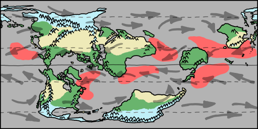
Blue is cold; think Siberia. Green is temperate; think rain and trees and, well, green things. Yellow is arid; think deserts. Red is hurricane zones—appropriate for summer. Think, well, hurricanes.

Turns out Philadelphia would still be a great place to live. Just saying.
The Secret Service screwed up not so long ago with the whole hookers in Colombia scandal. (Proof that it pays to pay.) This infographic was passed along to me by my colleague Eileen and it investigates the results of congressional hearings into the Secret Service.
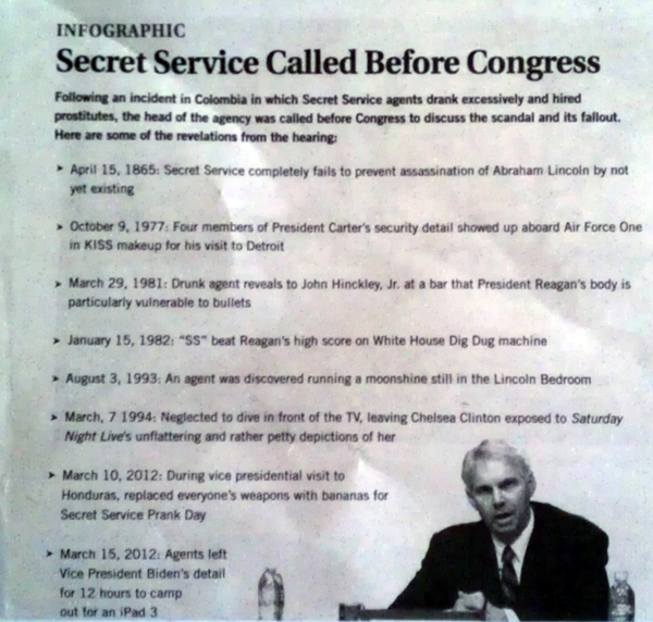
Credit for the piece goes to the Onion.