North American Transit Map

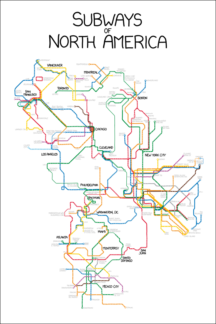
Wrapping up this week of map-themed work, we have xkcd. He created an integrated map of North America’s subway systems from Vancouver to Chicago to Philadelphia to Washington to Mexico City.

I only wish I could take the Red Line from Belmont and transfer to the Market–Frankford near West Trenton. Because I could then take the (Frankford) El out to 69th Street and catch the 104 to West Chester.
Subways of North America

Credit for the piece goes to Randall Munroe.

New Data Visualisation Forms

Monday was an odd day, both 1 April and the start of baseball. I had a tough decision to make: Do I post a serious baseball-related piece or a humourous April Fool’s Day one instead? If you recall, I went for the serious baseball option. But that leaves me with Friday, where I try to post work that is a bit on the lighter side of life.

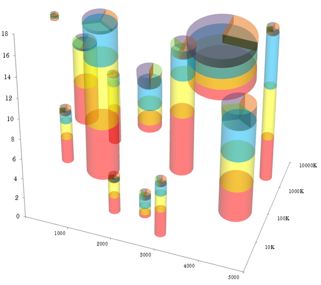
So here is EagerPies, published by EagerEyes on 1 April. It’s in the style of the EagerEyes site, a blog with posts about data visualisation. This selection is EagerPies work to improve upon Minard and the layering of data sets. But if you worry about complexity, fret not for they realised that encoding data in transparency would be a step too far.

Stacked scatter column pies

Credit for the piece goes to EagerPies.

Periodic Table of Beer Styles

Today’s post comes via a friend and is about beer. What else do you need for a Friday post? Here’s one of the several versions of the chart. It appears to have been based off an original design, but now variations of the re-interpretation are floating around the internet. More importantly though, I’m a whisky guy so I have no idea how true this  work is.

Periodic Table of Beer

Credit for the original piece goes to Mantis Design.

National Pi Day

Yesterday was National Pi Day. That’s Pi as in 3.14…not as in pie pie. Unless you celebrated Pi Day with pie. In which case, way to go, you. Me, I’m more traditional. I celebrated Pi Day with talk of pie charts. But at the Wonkblog over at the Washington Post, Sarah Kliff posted about several really impressive pie charts.

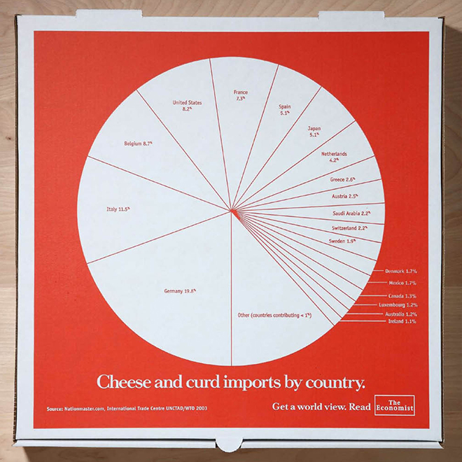
My favourite was the actual advertising done by the Economist back in Philly a few years ago. Their advert was printed atop a pizza pie box. It’s the double-whammy of Pi Day: pie charts atop a pizza pie.

The image below comes from a different site about the Economist ad campaign, found here, but the link goes to the celebration of pi with pie.

Pizza Pie Pie Chart for Pi Day

Thanks to my co-worker Eileen for passing on the tip.

The United States Compared to the Rest of the World

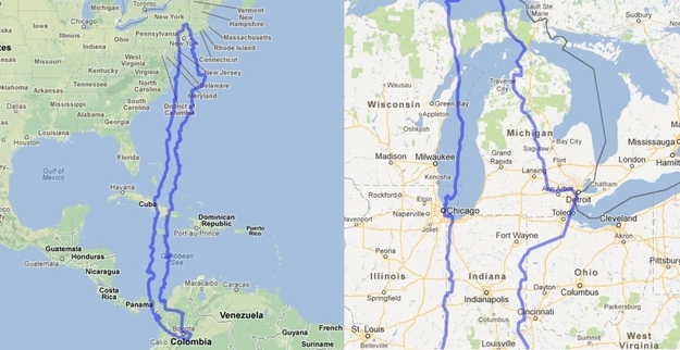
Have you ever wondered how big the United States is? MAPfrappe allows you to compare different geographies in Google Maps.

My employer has an office in Chicago and an office in Santiago, Chile. How big is Chile? North-to-south it is quite large. But east to west, the distance is like that of driving from Chicago to Detroit.

The United States compared to Chile

Via BuzzFeed.

Counting Zombie Kills in the Walking Dead

I watched the first season of the Walking Dead, but I have not followed the show closely since. That is not to say it is a bad show or is not entertaining, I just haven’t had the time. Fortunately Richard Johnson and Andrew Barr of the National Post have been following along. Otherwise, they would have not been able to create the infographic from which this cropping comes.

Who Killed What When and How

The piece examines which character killed which zombie and with what weapon. They then pivot the data to examine the total kills by type and by character. What is interesting, however, is that when the image is reduced and rotated, you get a quick overview of the amount of carnage.

Reducing the image and rotating it provides a concise view of the carnage

Credit for the piece goes to Richard Johnson and Andrew Barr.