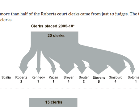
The New York Times has a story about the clerks supporting the Supreme Court justices. And how, surprisingly, the Supreme Court is polarised. Truly surprising considering how unpolarised—or would it be depolarised—the remaining two branches of government are these days. Sarcasm aside, the staff at the Times put together a diagram to explain the polarity.

My only real concern, however, is the potential for an audience disconnect. While you and I may know who John Marshall and William Brennan are, would the rest of the infographic’s readers? Does that mean not to include the justices? Personally, I always believe that design should lift and educate people and that designers should always avoid ‘dumbing things down’ for their audiences. Maybe not having the information in the diagram helps, and it will spur casual readers to do their own research. Or perhaps the targeted audience are those who have a grasp of the history of the Supreme Court.
Leave a Reply
You must be logged in to post a comment.