Tag: politics
-
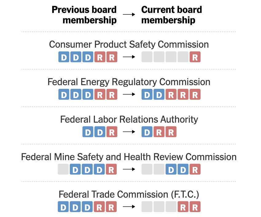
Bye, Bye, Blue Boxes
Yesterday the Supreme Court ruled the executive branch can largely replace the leadership of executives at Senate-confirmed federal agencies at the White House’s discretion. The big exception? The Federal Reserve. The New York Times produced a datagraphic looking at how Trump has changed the boards of nominally independent federal agencies. The graphic works really well…
-
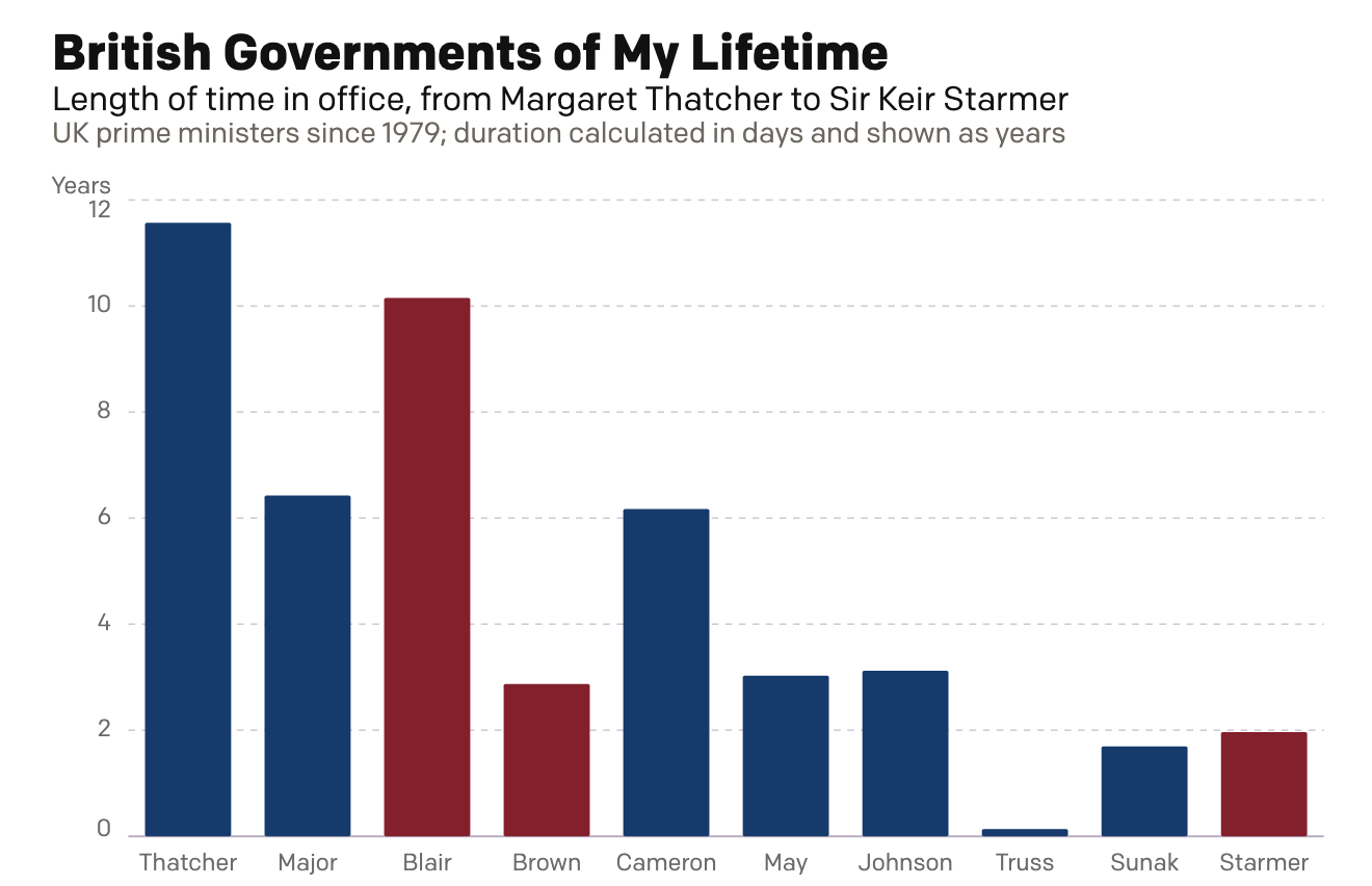
A Dan Miller Coronation?
Six weeks ago I created a small interactive chart on the news that Wes Streeting, the then British health secretary, resigned in order to challenge Prime Minister Sir Keir Starmer for the leadership of the Labour Party. Six weeks hence, Starmer has resigned. Lo and behold, my interactive graphic still works: British Governments of My…
-
Rise of the Nutters
For most of my life I have been interested in British politics. I can recall talking with my mates about Tony Blair’s Prime Minister’s Questions (PMQs) in high school and at university. During the Brexit debate, my American friends would frequently ask me just what was going on across the pond. Through that point in…
-
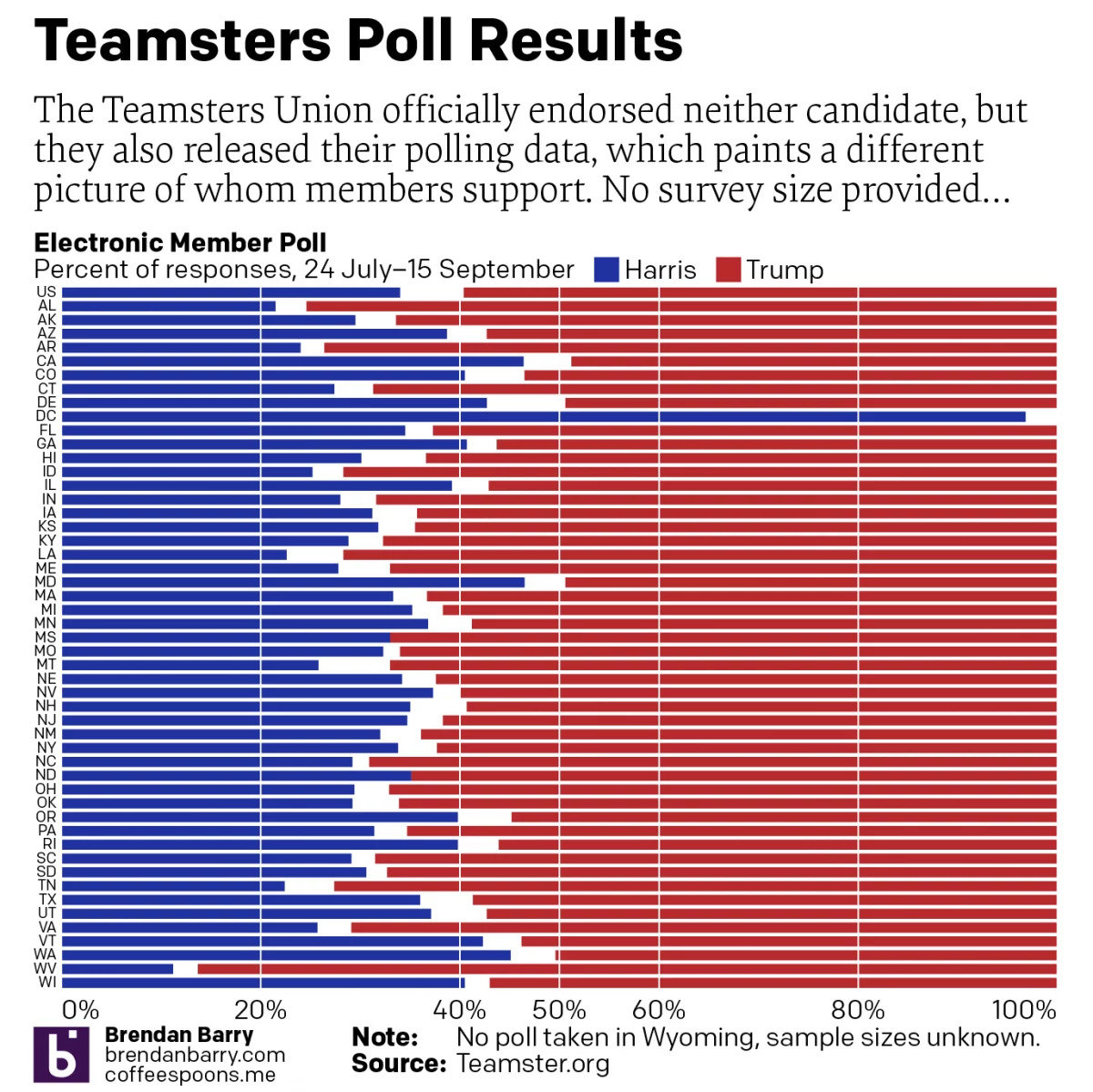
For Whom the Teamsters Poll Tolls
The Teamsters Union decided to officially endorse neither candidate in the 2024 US presidential election. Prior to their non-announcement announcement, however, the union surveyed its members and then released the polling data ahead of the announcement. Of course, the teamsters represent but a single union in a large and diverse country. More importantly, the survey…
-
248 Years Later, Philadelphia’s Still Hosting Debates
For those of you living under a rock, 2024 is a presidential election year in the United States and the campaign for the November election truly kicks off post-Labour Day. And post-Labour Day here we are. Tonight features a presidential debate between the two candidates, Vice President Kamala Harris and former president Donald Trump. Harris…
-
Electing An Expert in Nameology
Congratulations on making it to Friday. Though it was a short week for my American audience. Now that the State’s Labour Day holiday has passed, the 2024 electoral season can begin in earnest. And to begin the insanity we have a helpful graphic from xkcd. Clearly I’m not cut out for high office with a…
-
Warming Towards Women Leaders
We are going to start this week off with a nice small multiple graphic that explores the reducing resistance to women in positions of leadership in Arab countries. The graphic comes from a BBC article published last week. These kinds of graphics allow a reader to quickly compare the trajectory of a thing between a…
-
Whilst We Wait for Roe…
to be overturned by the Supreme Court, as seems likely, states have been busy passing laws to both restrict and expand abortion access. This article from FiveThirtyEight describes the statutory activity with the use of a small multiple graphic I’ve screenshot below. Each little map represents an action that states could have taken recently, for…
-
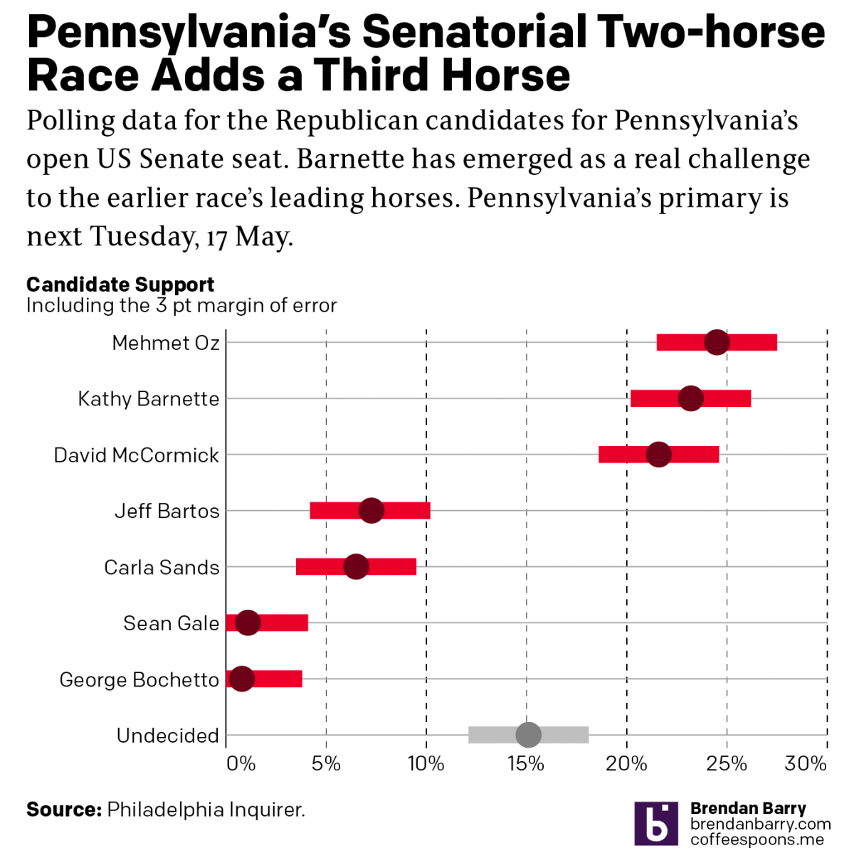
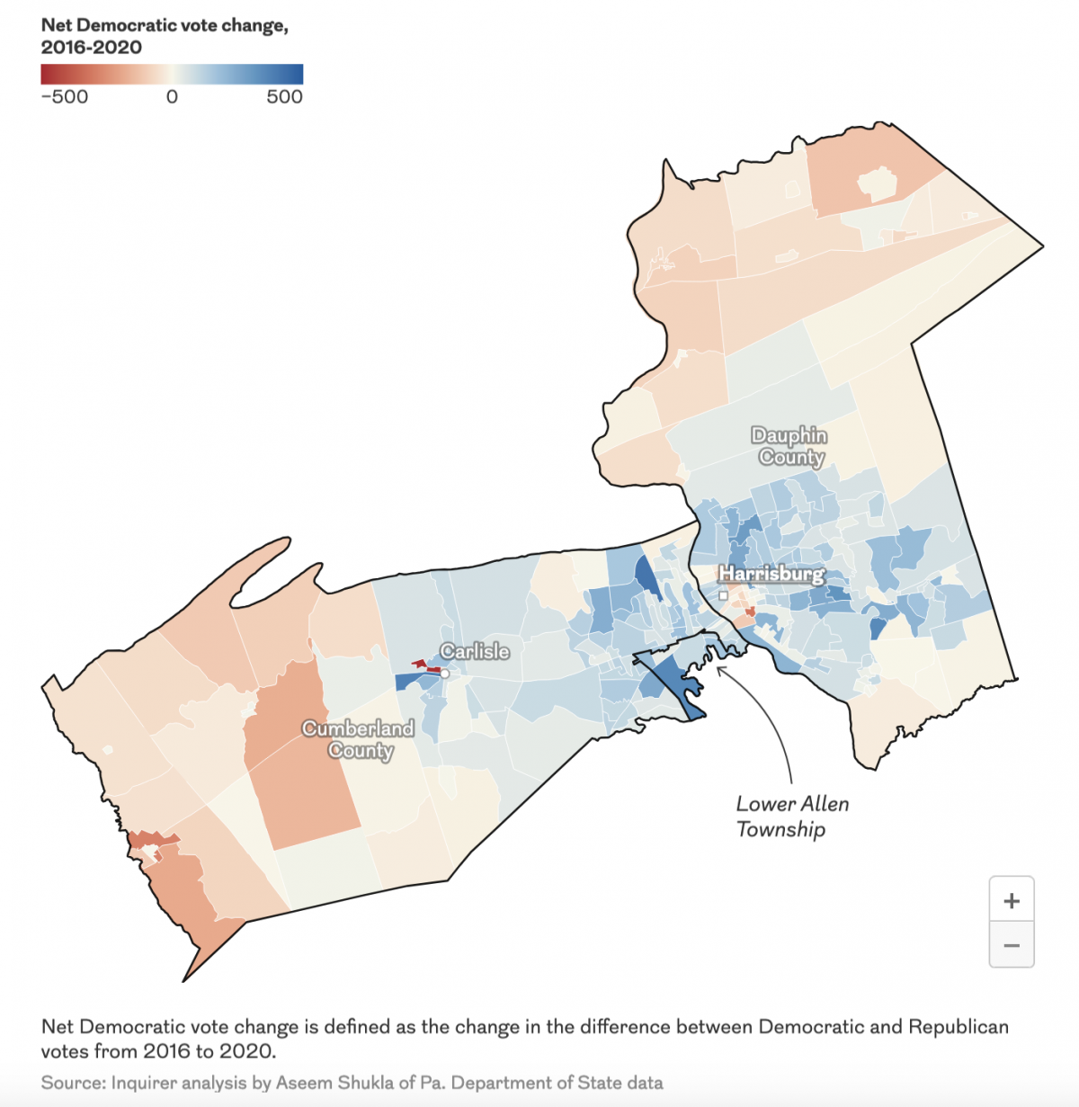
Political Hatch Jobs
Earlier this week I read an article in the Philadelphia Inquirer about the political prospects of some of the candidates for the open US Senate seat for Pennsylvania, for which I and many others will be voting come November. But before I get to vote on a candidate, members of the political parties first get…