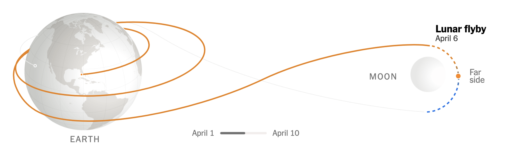
Cannon, Howitzers, Mortars—Oh My!

For the last two days I have been writing about the Fort Pitt Museum and some infographics, environmental graphics, diagrams, and dioramas that help explain the strategic value and thus history behind the peninsula at the confluence of the Allegheny, Monongahela, and Ohio rivers. In particular, we looked at Fort Duquesne, the French attempt to fortify the position, and then Fort Pitt, the far more successful British attempt.

But a fortress without weaponry is like a snapping turtle without a sharpened beak. And once the fortifications were built, the British began moving in artillery pieces and hundreds of soldiers to defend their claim on the land. Local Native American tribes invited the British in and to station soldiers, but relations soured after a few years when it became clear the British, unlike the French, were more interested in settling the land.

In 1763, Native American discontent coalesced around Pontiac, an Ottawa warrior chief, who directed the outrage into violent actions in the western colonial lands. Pontiac’s War had begun. The British, recently victorious over the French, suffered several defeats as Native American forces took several British forts and raided settlements killing unknown numbers of settlers.

At the forks of the Ohio, local Native Americans besieged Fort Pitt. For two months, Fort Pitt was cut off from resupply and local settlers, who had poured into the fort, even took up arms. But the biggest weapons the British had were the artillery at the fortress.

Though it should be noted this was the incident during which a small smallpox outbreak occurred amongst the settlers and British military forces used smallpox infected blankets as gifts to the Native Americans. In later letters, this tactic was commended by senior British military officials. However, the efficacy of the action from a military perspective is debatable at best.

The British had three main types of artillery at their disposal: cannon, howitzers, and mortars. And if you have no idea what the differences are, no worries, because the Fort Pitt Museum has several great graphics explaining their differences and the pros and cons to each.

Get out of the way.

Above we have a diagram of a cannon. At the time cannon differentiated themselves by being relatively easier to construct and maintain. They fired solid, non-explosive projectiles at relatively flat trajectories. If you ever saw the Patriot with Mel Gibson, the scene where a gun fires a ball that then bounces through ranks of infantry and severs numerous legs, most likely that was a cannon.

The remaining two types were used for launching projectiles at higher angles, almost lobbing them up and over fortifications or enemy troop formations. Howitzers were the longer-ranged of the two and whilst broadly similar to cannon, at the time they differentiated themselves by being able to fire explosive projectiles. In other words, instead of a solid ball of iron as described above, this could explode and send shrapnel down on a larger area of massed infantry.

More ouchies.

The mortar, in that sense, is similar to the howitzer. It could send explosive shells above troops and fortifications, but it was designed to do so at high-angles. This was particularly important in counter-siege warfare when the British defenders needed ways to fire at Native American soldiers who closely approached Fort Pitt’s defensive walls.

The graphics do a great job showing just how these three types of artillery were different and could be used to different effects. The graphics don’t do too much and don’t use elaborate illustrations. They are very effective and very efficient. Well done.

Credit for the pieces goes to the Fort Pitt Museum design staff.

Fort Pitt

Yesterday I discussed some of the work at the Fort Pitt Museum in Pittsburgh, Pennsylvania. Specifically we looked at Fort Duquesne, the French fortification that guarded the linchpin of their colonies along the Saint Lawrence Seaway and the Mississippi and Ohio River valleys.

In 1753, the royal governor of Virginia dispatched a British colonial military officer, a lieutenant colonel, to demand the French withdraw from the chain of forts along the Allegheny River. The French politely refused. Undeterred, the lieutenant colonel, after returning the refusal, was sent with several dozen soldiers to push the British claim.

The lieutenant colonel discovered a French force south of present-day Pittsburgh. After largely surrounding the French force, the lieutenant colonel ordered his soldiers to open fire and in the ensuing battle the French force was destroyed by killing or capturing the vast majority of the force. That was the opening battle of the Seven Years War, a global conflict that stretched across North America, South America, Africa, India, and Asia.

The lieutenant colonel who started it all? George Washington.

At the war’s outset, Washington was involved—but did not lead—in another operation to oust the French from Fort Duquesne. This operation failed spectacularly with the death of its commander, Major General Edward Braddock. Three years later, British forces had sufficiently regrouped that they again attempted to take Fort Duquesne. After some tactical losses, the British continued to press the French. The French, seeing the vastly superior numbers of British soldiers, decided to withdraw and in blowing up their ammunition stores, destroyed Fort Duquesne.

The British, operationally commanded by Lieutenant Colonel Henry Bouquet, a Swiss-born veteran British officer, occupied the smoldering ruins. There they proceeded to build an even larger fortification named after the British prime minister who ordered the site taken. The prime minister? William Pitt the Elder. The fort? Fort Pitt. The town that would develop around the fort? Pittsburgh.

When completed, Fort Pitt was the largest and most sophisticated British fortification west of the Appalachian Mountains. It guarded British colonial interests from both French and native forces who would have gladly retaken control of the area.

Today the Fort Pitt Museum has several diagrams and dioramas detailing what was at its completion. The photograph below is a reproduction of a diagram made in 1761 just prior to the fort’s completion of the fort and its immediate environs. Even the reproduction is itself a reproduction in that the creators used the same materials and methods as would have been used in the 18th century, lending it some of that aged quality.

To be clear, this is large at least maybe six feet wide.

And here we have a closer view of the fort itself. If you look closely to the left, nearer the forks of the Ohio, you can see the outline of the far smaller Fort Duquesne.

You can see more of the details in this shot.

But for me the amazing part was walking into the museum where you are greeted with an amazing diorama of the Fort as it appeared in 1765. You can already see the emerging town of Pittsburgh outside the fortifications.

A fortress for ants.

Credit for the original diagram goes to British military engineer Bernard Ratzer, its recreation was made by artists from the Carnegie Museum.

Credit for the diorama goes to Holiday Displays.

Diagramming and Diorama-ing Fort Duquesne

Pittsburgh exists because of the city sits at the confluence of the Allegheny, Monongahela, and Ohio Rivers. As far back as the early 18th century, English and French colonists had recognised the strategic value of the site and as imperial ambitions ramped up, the French finally wrested control of the area from the English and constructed a fort to defend the forks of the Ohio. They named it Fort Du Quesne (now Fort Duquesne) after Governor-General of New France, Marquis Du Quesne.

Fort Duquesne anchored a north-south chain of French forts linking the Ohio River to Lake Erie via the Allegheny River. Since the Allegheny drains into the Ohio and not Lake Erie, the French used a navigable tributary of the Allegheny, the imaginatively named French Creek, to reach just a few miles from the fort on Lake Erie, Fort Presque Isle, from which they portaged overland to Fort Le Bœuf. From there they travelled down the river or overland via the Venango Path to Fort Machault situated at the confluence of French Creek and the Allegheny River.

This chain of forts and the control they established over the Ohio allowed the French to link their colony of New France in present day Québec along the Saint Lawrence River to their colonies along the Mississippi in the Illinois Country via Lake Erie then the Allegheny and Ohio Rivers, which feed into the Mississippi River. The Mississippi of course then empties into the Gulf of Mexico through the then French colony of Louisiana and New Orleans. Strategically this allowed the French to surround and choke the British colonies along the eastern seaboard from territory and resources west of the Appalachian Mountains.

At the site of Fort Duquesne on what is now called Point State Park, a granite stone outline of the original French fort sits in a grass field. And at the centre of the outline is a plaque diagramming the fort’s design.

The marker for the centre of Fort Duquesne

Thankfully for history lovers, the park also contains a history museum dedicated to Fort Pitt, the larger British successor fortification to Fort Duquesne. But inside, the history of Fort Pitt would be incomplete without a discussion of Fort Duquesne and that includes a nice diorama. You will note more details here, however, as the initial fort seen in the above diagram was expanded to include more area for barracks, farms, and ancillary activities like forges.

Fort Duquesne and its expansion

But even still a closer shot of the fort itself shows what the physical buildings would have looked like above and beyond a two-dimensional diagram.

Closer view of Fort Duquesne

Having been to the site, however, you can see that Fort Duquesne and the later Fort Pitt weren’t necessarily as defensible as one may think. Just to the south across the Monongahela River is a ridgeline that offers clear lines of fire into the forts. Some well positioned artillery would have made holding the forts tenuous at best. Of course hauling artillery and ammunition up to the ridge’s summit is easier said than done. Here’s a photo from the Fort Pitt Museum, whose exterior walls reconstruct one of the later Fort Pitt’s bastion walls. You can see in the background the ridge line of Mount Washington (originally named Coal Hill) stands far above the fort’s defences. Artillery could easily angle down and fire into the forts, be them either Duquesne or Pitt.

It would have been like fish in a barrel.

Credit for the marker goes to I assume the designers at the Pennsylvania State Park commission.

Credit for the dioramas goes to Holiday Displays, who created the originals in the 1960s.

Those Quirky Quarks

Last week scientists working at the Large Hadron Collider in Switzerland announced the discovery of new sub-atomic particles: a pentaquark and tetraquarks. This BBC article does a really good job of explaining the role of quarks in the composition of our universe, so I encourage you to read the article.

But they also included a graphic to show how quarks relate to atoms. It’s a simple illustration, but it does a great job.

There’s only one Quark though.

Sometimes great and informative graphics can be simple. They needn’t be flashy or over-designed. I could quibble about the depiction of the electron cloud around the nucleus, but it’s not terrible.

Credit for the piece goes to the BBC graphics department.

Black Holes and Revelations: Remastered

Two years ago I posted about how the Event Horizon Telescope Collaboration managed to take the first photograph of a black hole, in particular a supermassive black hole at the centre of the M87 galaxy, one of those galaxies far, far away that we see at a long time ago.

This morning, the same group of scientists released the first photograph of Sagittarius A*, the supermassive black hole at the centre of our very own Milky Way Galaxy. The BBC article I read this morning included the photo of the black hole, which you should definitely check out because of its importance in the history of astronomy. But, for our purposes here on Coffeespoons, I wanted to look at the diagram the designers at the BBC made to explain the photograph.

So cool.

The designer used some simple white lines with a thicker stroke for the axis and defining features and a thinner line to point to elements of the photo. In particular I like the dotted line for the black hole, because there is no real way to photograph the hole itself since it consumes all the light we would need to image it. Instead, we photograph the “black hole” at the centre of the accretion disk, all the super heated gas and matter slowly swirling around and collapsing into the singularity. We also get two axes to show the size of the ring and that of the black hole itself. The ring measures a diameter of about 63 million kilometres. The distance from the Sun to Mercury, the closest planet to our Sun, is 58 million kilometres.

Supermassive indeed.

Well done, science. Well done.

Credit for the piece goes to the graphics team at the BBC.

Toronto Keeps It Cool

Last month the Washington Post published a nice article that detailed the deep water cooling system that the city of Toronto, Canada uses to keep itself cool. For the unfamiliar, deep water cooling at its simplest means sucking up very cold water from the bottom of a lake or ocean or wherever you can get very cold water, and then pumping that inland to absorb heat before cycling it back.

Of course, for the longer explanation—and what makes Toronto’s system different—you should read the article. And for our purposes it includes some nice illustrations that diagram just how that system works. The screenshot below captures the basic process I just described, but there are additional illustrations that do a great job showing just how the system works.

Just look at those gloriously cool temperatures…

What I particularly enjoy about this style is how the illustrations of the building and similar are minimal and restrained. This allows the diagrammatic elements to come to the forefront, which is important to make the system understood.

Credit for the piece goes to Daisy Chung.

Mt Greylock Cross Section

I spent the better part of the last two weeks travelling and hanging out in the Berkshires and Connecticut River Valley in western Massachusetts. One of the coolest experiences was driving up the automobile route for Mt Greylock, the tallest point in Massachusetts.

Most of the drive itself was just regularly spectacular as the mid-morning sunlight hit the trees above the road, creating a warm yellow-orange light that bathed the route. But maybe about halfway or two-thirds of the way up, I rounded a bend in the road and came upon a clearing—and convenient pullover. The scene elicited an audible swear and not surprisingly I stopped the car to enjoy the scenery and take some photos.

Whilst there, I also noticed a small sign that, among other things diagrammed the cross section of Mt Greylock and points to the east and west. And I figured that would be a good way to start the week.

Mt Greylock

The sign uses an old map to illustrate the different rock layers that define the mountain. Marble, which is a soft rock, erodes during glaciation whereas schist, a hard rock, does not. And during the recent ice ages, when glaciers covered the area, most of the marble areas of the mountain range were eroded away, leaving just the sharp stony peaks of schist.

Credit for the piece goes to the US Geological Survey designers, ca. 1894.

Threats from Little Bodies Inside and Outside

Of course the inside threat are those little bodies of coronavirus causing Covid-19. We cover them a lot here. But there are also threats from little bodies outside, way outside. Like asteroids impacting us. And that was the news yesterday when NASA announced improved data from a mission to the asteroid Bennu allowed it to refine its orbital model.

And we have reason to ever just so very slightly worry. Because there is a very slight chance that Bennu will impact Earth. In 2182. The New York Times article where I read the news included a motion graphic produced by NASA to explain that the determining factor will be a near pass in 2135.

Too many keys

Essentially, the exact course Bennu takes as it passes Earth in 2135 will determine its path in 2182. But just a few slight variations could send it colliding into Earth. Though, to be clear, it’s only a 1-in-1750 chance.

NASA used the metaphor of keyholes to explain the concept. The potential orbits in 2135 function as keyholes and should Bennu pass into the right keyhole, it will setup a collision with Earth in 2182. Hence the use of little keyholes in the motion graphic that accompanied the article.

But who knows, if we’re lucky the United Federation of Planets will still be formed in 2161 and the starship Enterprise will gently nudge Bennu back into a non-threatening orbit.

Credit for the piece goes to NASA.

But Where Are the Spiders?

Yesterday I mentioned more about revolutions, well today we’re talking about Mars, a planet that revolves around the Sun. Late last week scientists working with the InSight lander on the Red Planet published their findings. Turns out we need to rethink what we know about Mars.

First, the planet is probably much older than Earth. Mars’ composition also differs from Earth in some significant ways. InSight mapped the interior of Mars by studying the seismic waves (think like sound waves but through the inside of planets) of marsquakes.

The Wall Street Journal published a great article spelling out the findings in detail that is well worth the read. It also included some nice graphics helping to support the piece. The one I wanted to highlight, however, was a brilliant comparison of Mars to Earth.

But how many licks to get to the centre?

Conceptually this is important, because many diagrams and graphics I’ve seen about these findings only detail the interior of Mars. But what makes Mars important is how it differs from Earth, and let’s be honest, how many of us remember our Earth science classes at school and can diagram out the interior of Earth?

And right here the designer compares the smaller—and now older—brother of Earth. Again, read the article for the details, but in short, some of the key findings are that the core is larger, but also lighter, than we thought. Our planet’s core differs because Earth has two parts: a solid and heavy ball of iron and nickel surrounded by a liquid core that spins. That spinning core creates the magnetic fields that protect our planet from the Sun and have kept our atmosphere intact. Mars doesn’t have that. And that’s in part because, given the core is larger than we thought, the mantle is smaller.

A smaller mantle means that certain materials couldn’t form that insulate the Earth’s core. So while Earth’s core has been prevented from cooling and slowing down, Mars was not. And so while it did have a magnetic field at one point, that slowing, cooling core slowly dissipated the magnetic field. That may be why the planet, once rich in water, now is a barren rock exposed to the Sun.

Again, this is a big deal in terms of planetary science. Consider that Earth and Mars are broadly made of the same materials that orbited the Sun billions of years ago. But Mars took those same ingredients and made itself into a very different planet. And now we know quite a good deal more about the Red Planet.

One last point to make about the graphic above. Again, many illustrations will increase the size of the crust to make it more visible. Here the designer chose to keep it more in proportion to the scale of the planets’ interiors. (Even though Mars’ crust is quite a bit thicker than Earth’s.) I think that’s important because it puts us into perspective. We can build monuments like the Pyramids that last thousands of years and dig bore holes miles deep and tunnel out connections through mountain ranges, but that also just scratches the surface of the crust. But that crust is the thinnest of shells over the mantle and cores of these planets.

That life began and took hold on Earth, on that thinnest of shells protected by a magnetic field because of a spinning molten core buried at the centre of the planet…something to think about sometimes.

Credit for the piece goes to Merrill Sherman.

The Western Heat Dome(s)

For the last two days Philadelphia and much of the East Coast suffered from a heavy haze of smoke that blanketed the region. This wasn’t just any smoke, however, but smoke from the wildfires on the West Coast. This post isn’t about the wildfires, but rather something that exacerbated them. We are talking about the heat domes that formed earlier this summer. The ones that melted trolley cables in Portland.

This was a nice print graphic in the Guardian Weekly, a magazine to such I subscribe that had several articles about the domes.

Missing that cold, cold Canadian air

It does a nice job of showing the main components of the story and sufficiently simplifying them to make them digestible. One quibble, however, is how in the second map how oddly specific the heat dome is depicted.

The first graphic in particular is more of an abstraction and simplified illustration. But here we have contours and shapes that seem to speak with precision about the location of this heat dome. It also contains shades of red that presumably indicate the severity of the heat.

There’s nothing wrong with that, but it stuck me as odd juxtaposed against the top illustration.

Credit for the piece goes to the Guardian Weekly graphics department.