Tag: New York Times
-
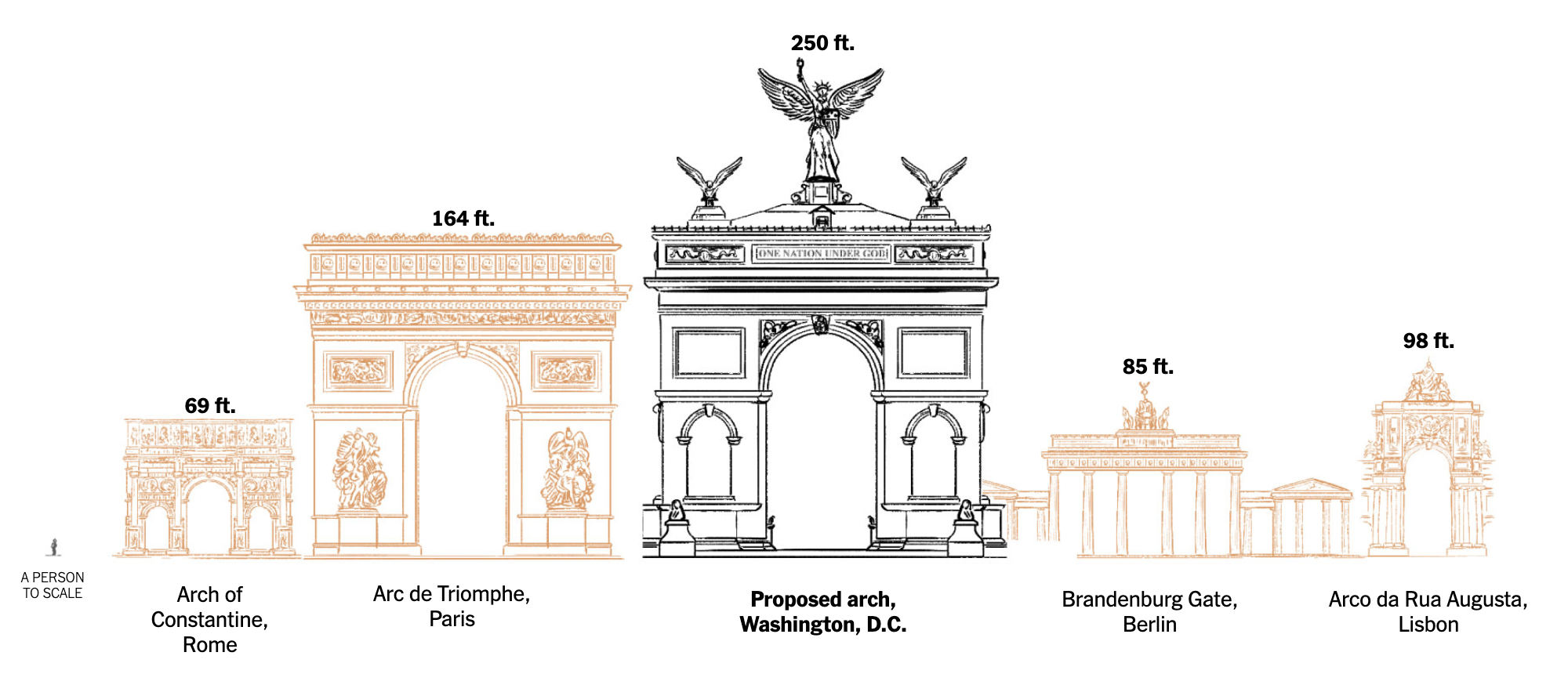
An Arch to Nowhere?
Last week the New York Times published an article comparing the proposed triumphal arch by President Trump to other triumphal arches both in the United States and abroad. Firstly, it ought to be pointed out, as my title alludes, significant questions remain about the legality of the proposed arch. Personally, I’m still waiting for Infrastructure…
-
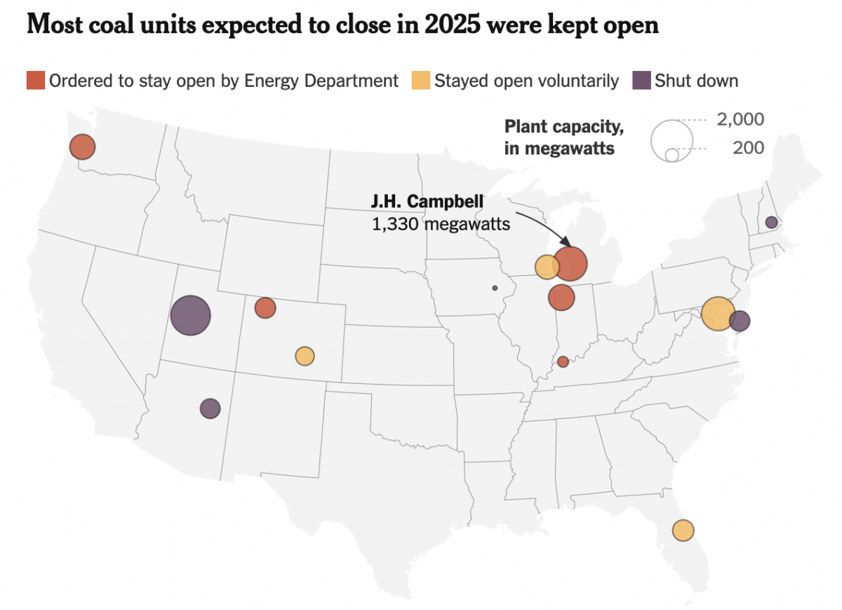
The Phoenix Rises from the Charcoal
To be clear, climate change is real. We know humanity drives the bulk of it via emissions of carbon and other greenhouse gasses, e.g. methane. Electricity generation plays a significant role in the total output, though not all means of generating power are equal. Wind, solar, hydro, and nuclear, for example, produce no carbon emissions.…
-
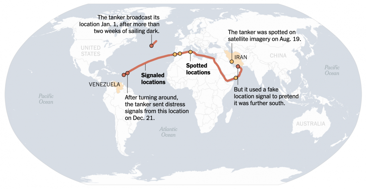
When the Ship Hits the Fan
On Friday I flagged this article from the New York Times for the first post in the new year here on Coffeespoons. The article discussed a Venezuelan oil tanker fleeing US Coast Guard and US Navy forces attempting to interdict the vessel as she steams into the North Atlantic. Whilst the article led with a…
-
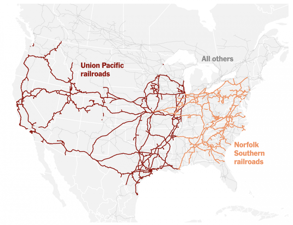
Truly Transcontinental
Last week two of the largest American freight railroads agreed to a merger with Union Pacific purchasing Norfolk Southern. Railroads have long played an important part in the history of the United States, from the Second Industrial Revolution to settlement and development of the West, through to the time zones in which we live and…
-
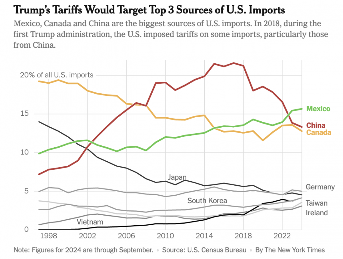
Imports, Tariffs, and Taxes, Oh My!
Apologies, all, for the lengthy delay in posting. I decided to take some time away from work-related things for a few months around the holidays and try to enjoy, well, the holidays. Moving forward, I intend to at least start posting about once per week. After all, the state of information design these days provides…
-
Climate Conscientious and Cheaper Cars
Sometimes in the course of my work I stumble across graphics and work that I previously missed. In this case I was seeking a post about one of my favourite infographics, but it turned out I’ve never posted about it and so I will have to rectify that someday. However in my searching, I came…
-
We’re a Long Way from Kansas
I had something else for today, but this morning I opened the door and found my morning paper. Nothing terribly special. No massive headline. No large front-page graphic. See what I mean? But then as I bent down to pick it up, I spotted a little tree map. But it turned out it wasn’t a…
-
Small Dog Days of Summer
For my readers in the northern hemisphere, which is the vast majority of you, we are in the middle of meteorological summer, the dog days. And whilst my UK and Europe readers continue to bake under temperatures greater than 40ºC (104ºF), the northeast United States and Philadelphia in particular is looking at a heatwave starting…
-
Legendary Adjustments
The other day I was reading an article about the coming property tax rises in Philadelphia. After three years—has anything happened in those three years?—the city has reassessed properties and rates are scheduled to go up. In some neighbourhoods by significant amounts. I went down the related story link rabbit hole and wound up on…
-
New Mexico Burns
Editor’s note: I was having some technical issues last week. This was supposed to post last week. Editor’s note two: This was supposed to go up on Monday. Still didn’t. Third time’s the charm? Yesterday I wrote about a piece from the New York Times that arrived on my doorstep Saturday morning. Well a few…