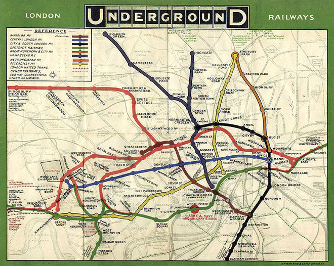
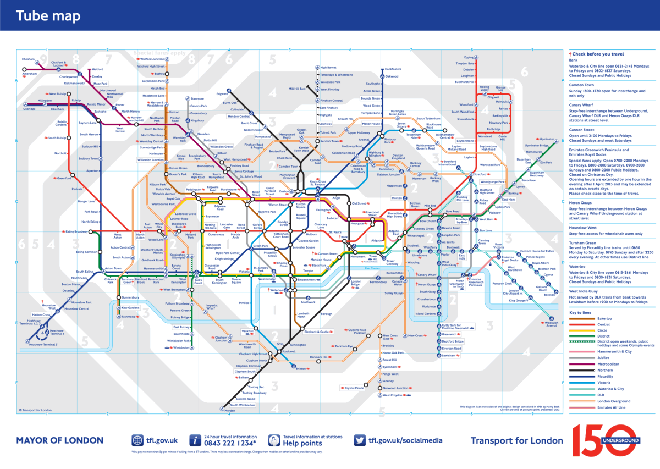
Today the London Underground turns 150. The Tube opened on 9 January 1863. Yes, the whole endeavour is a marvel of engineering, but from a design perspective think of the map, man. Think of the map. The Underground map is now 150 years old. And we all know transit maps are cool.
Of course the map has evolved and changed over all those years and at the Huffington Post UK, there is an article with a slideshow of different maps. The one below being the first map to show the combined lines.

Compare that original system map to the 150th anniversary map.

Credit for the photos goes to the London Transport Museum, via the Huffington Post.
Leave a Reply
You must be logged in to post a comment.