2012 was the hottest year since 1895. That’s 117 years by my count. Of course just being the hottest year ever recorded does not mean everywhere was warmer than usual. Some places were cooler. And the New York Times looked at the US pattern of warmer and cooler than average temperatures. Below the map are small multiples of charts recording the number of days above or below the normal for that day.
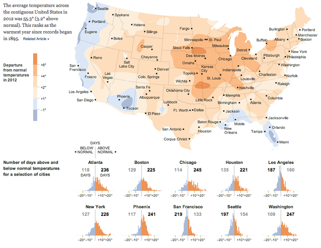
And for anecdotal evidence, I will say that this past summer was godawfully hot in Chicago.
Author: Brendan Barry
I am a graphic designer who focuses on information design. My day job? Well, they asked me not to say. But to be clear, this blog is my something I do on my own time and does not represent the views of…my employers. I think what I can say is that given my interest in information design—be it in the shape of clear charts, maps, diagrams, or wayfinding systems—I am fortunate that my day job focuses on data visualisation. Outside of work, I try to stay busy with personal design work. Away from the world of design, I have become an amateur genealogist and family historian. You will sometimes see that area of work bleed into my posts.
View all posts by Brendan Barry