Happy Friday

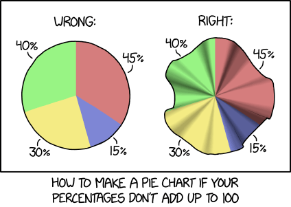
What a week, right? Thankfully it is coming to an end as we look to begin another weekend. So let’s take a look at xkcd, who has thankfully provided us with a form of pie chart that shows percentages of sums of more than 100%. And you thought you should only use pie charts when the slices add to 100%…

But will it work as a pizza pie?

Now I want pie. Thanks, xkcd.

Credit for the piece goes to Randall Munroe.

Author: Brendan Barry

I am a graphic designer who focuses on information design. My day job? Well, they asked me not to say. But to be clear, this blog is my something I do on my own time and does not represent the views of…my employers. I think what I can say is that given my interest in information design—be it in the shape of clear charts, maps, diagrams, or wayfinding systems—I am fortunate that my day job focuses on data visualisation. Outside of work, I try to stay busy with personal design work. Away from the world of design, I have become an amateur genealogist and family historian. You will sometimes see that area of work bleed into my posts.

Leave a Reply