Last Thursday, the US entered its longest bull market in history. And the New York Times covered the story on the front page, which makes this another episode of covering graphics when they land on the Times’ front page. Of course, last week was a big news week away from the economy and so it is no surprise that the above-the-fold coverage was on the scandals besetting the president and those of his team who have pleaded guilty or been convicted of crimes by juries.
But you will note that below the fold is that nice little graphic. Here we see it in more detail.
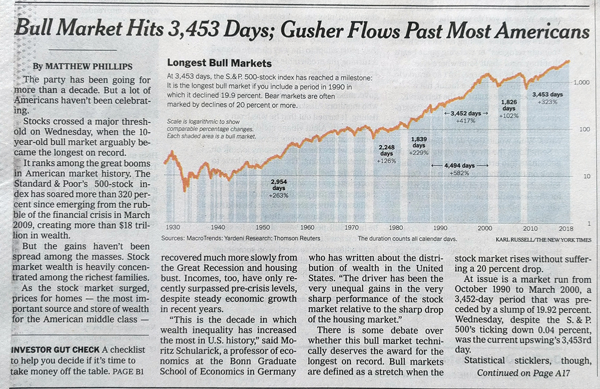
What I like about the graphic is how it uses the blue fill to draw attention to the bull markets but then also labels how long each was. Those keen on the story will note there is a debate whether a particular 19.9% drop qualifies for the 20% drop usually used to benchmark the beginning and ending of a bull market. That is why there is that second label with the black arrows on the graphic.
It also uses the negative space created by the shape of the graphic to contain its title, text, and caption information.
Credit for the piece goes to Karl Russell.
Leave a Reply
You must be logged in to post a comment.