Category: Datagraphic
-
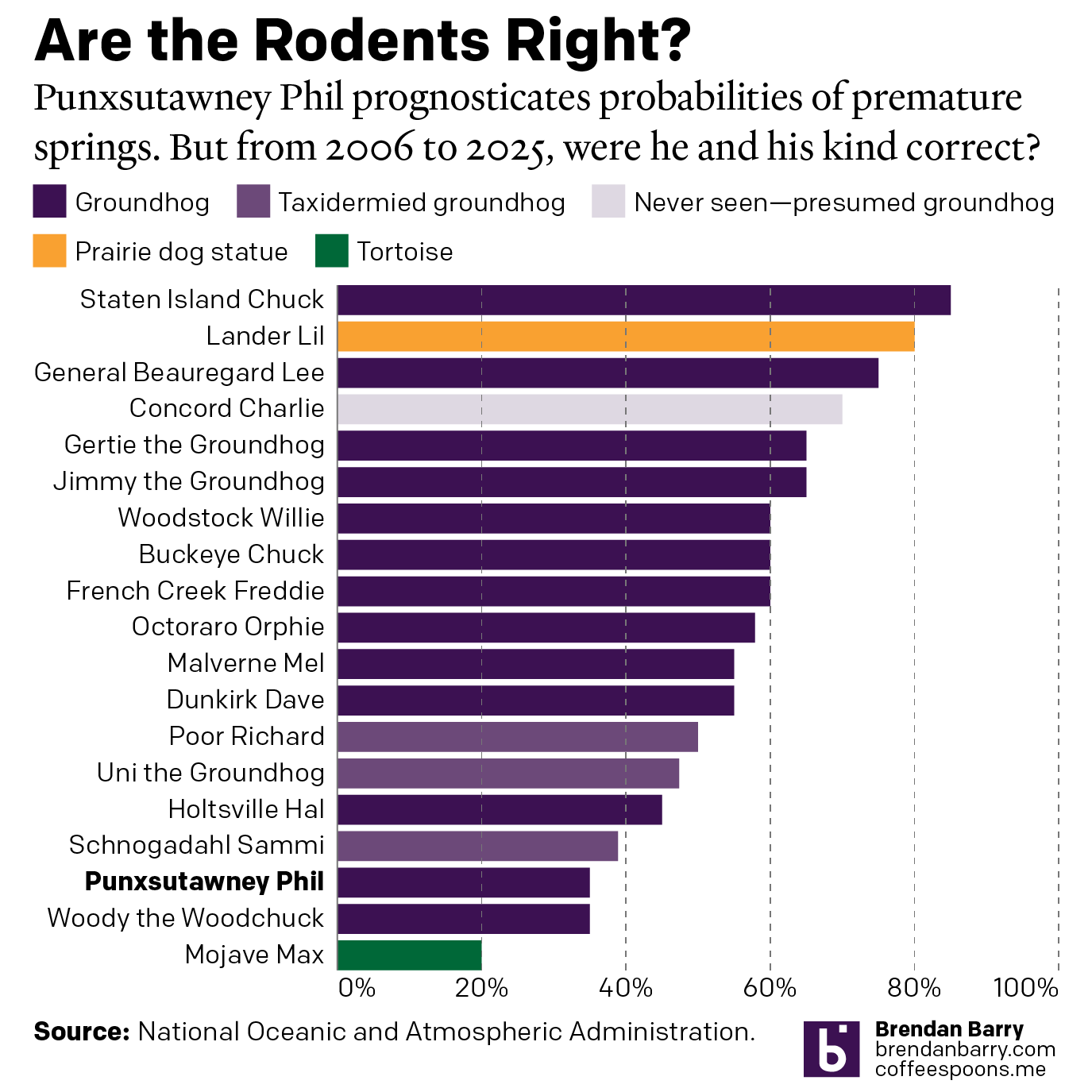
Do We Do This Every Year?
Every year on Groundhog’s Day I feel as if more and more critters crawl up from the Earth to offer their portents of prolonged winter. And every year we look backwards with the fullness of meteorological observations to evaluate the accuracy of these armchair—armburrow?—forecasters. This year, the Philadelphia Inquirer’s required article on the matter included…
-
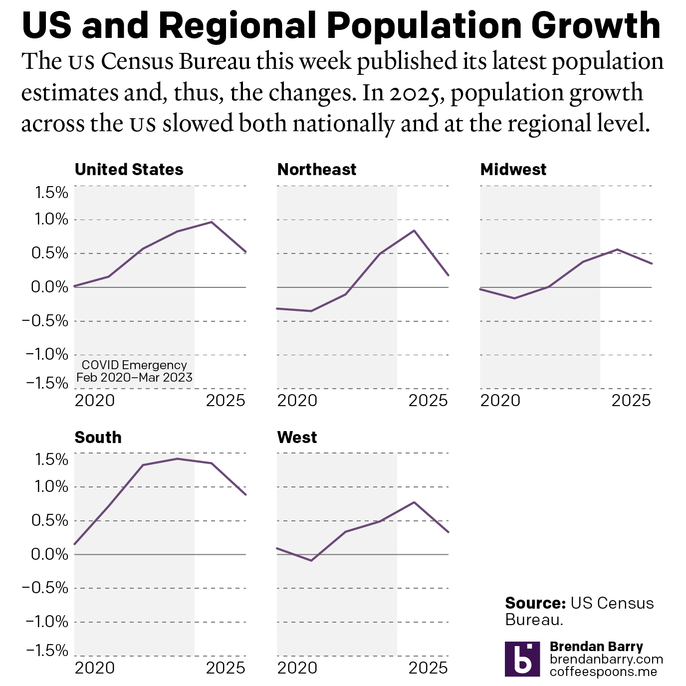
The Slowing of the Growth
This week the US Census Bureau released their population estimates for the most recent year and that includes the rate changes for the US, the Census Bureau defined regions, and the 50 states and Puerto Rico. I spent this morning digging into some of the data and whilst I will try to later to get…
-

Xi-nnie the Pooh Purges the PLA
This past weekend, Xi Jinping, the leader of China, purged the top leadership of the People’s Liberation Army (PLA), the armed forces of the People’s Republic of China. Purges themselves are nothing new as Xi has solidified his iron grip on the country and its political leadership in the Chinese Communist Party. But unlike his…
-

The Philadelphia Beat is Pretty Big
Early last week I read an article in the Philadelphia Inquirer about where the city’s police officers live, an important issue given the city’s loose requirement they reside within the city limits. Whilst most do, especially in the far Northeast, the Northwest, and South Philadelphia, a significant number live outside the city. (The city of…
-
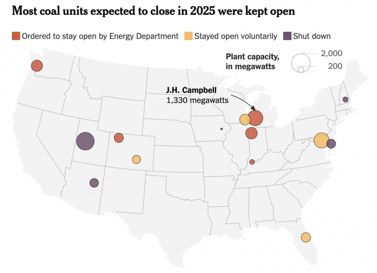
The Phoenix Rises from the Charcoal
To be clear, climate change is real. We know humanity drives the bulk of it via emissions of carbon and other greenhouse gasses, e.g. methane. Electricity generation plays a significant role in the total output, though not all means of generating power are equal. Wind, solar, hydro, and nuclear, for example, produce no carbon emissions.…
-
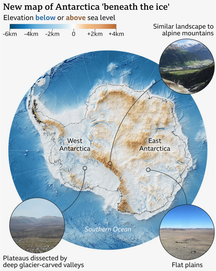
A View Beneath the Ice
I love maps. And above the ocean’s surface, we generally have accurate maps for Earth’s surface with only two notable exceptions. One is Greenland and its melting ice sheet is, in part, contributes to the emerging conflict between the United States and Denmark over the island’s future. The other? Antarctica. Parts of the East Antarctic…
-
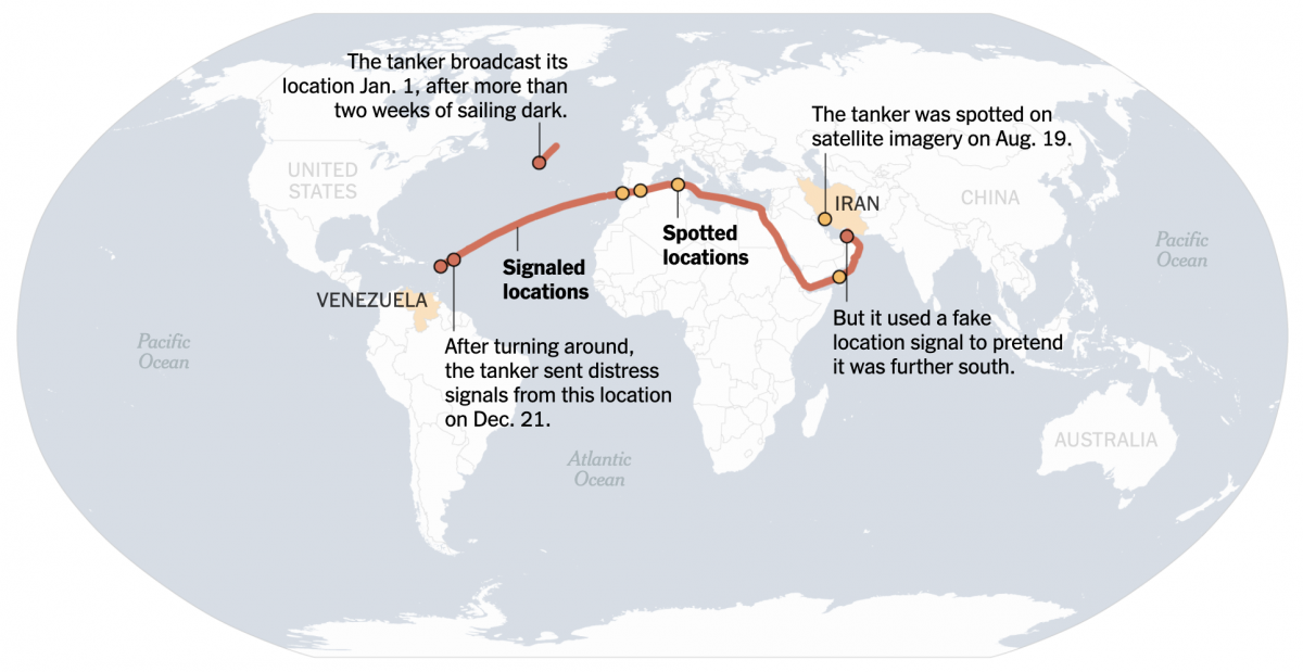
When the Ship Hits the Fan
On Friday I flagged this article from the New York Times for the first post in the new year here on Coffeespoons. The article discussed a Venezuelan oil tanker fleeing US Coast Guard and US Navy forces attempting to interdict the vessel as she steams into the North Atlantic. Whilst the article led with a…
-

Off on the Road to Rhode Island
Yesterday I read an article from the BBC about this weekend’s shooting at Brown University, one of the nation’s top universities. The graphic in question had nothing to do with killings or violence, but rather located Rhode Island for readers. And the graphic has been gnawing at me for the better part of a day.…
-
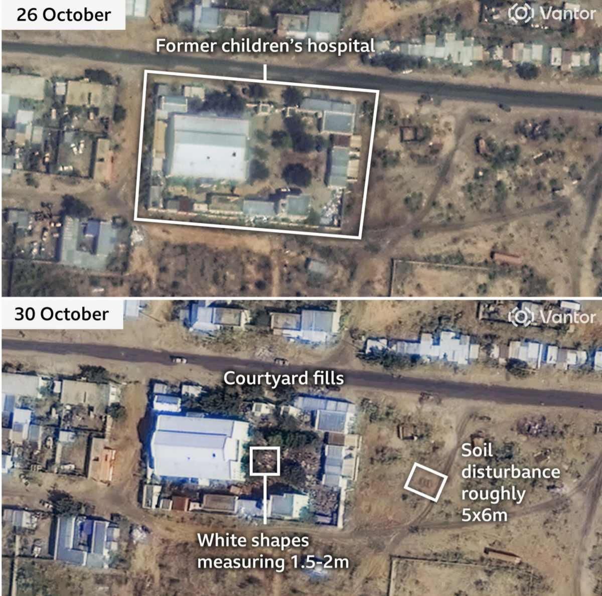
When the Walls Fell
Back in September I wrote about the siege of el-Fasher in Sudan, wherein the town and its government defenders faced the paramilitary rebel forces, the Rapid Support Force (RSF). At the time the RSF besiegers were constructing a wall to encircle the town and cut residents and defending forces off from resupply and reinforcements. At…
-
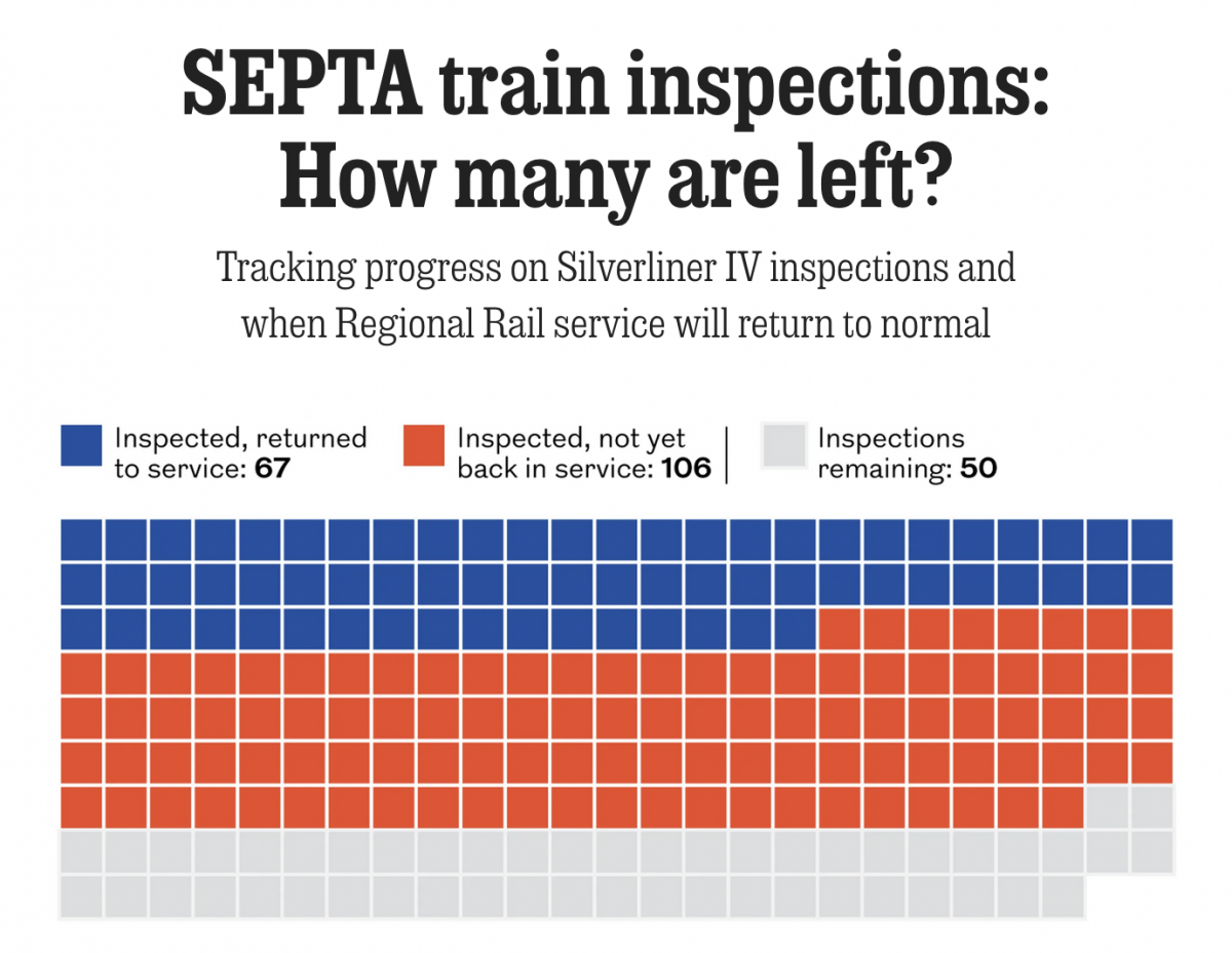
Tarnished Linings
Last month the National Transportation Safety Board (NTSB) ordered Philadelphia’s public transit system, SEPTA, to inspect the backbone of its commuter rail service, Regional Rail: all 225 Silverliner IV railcars. The Silverliner IV fleet, aged over 50 years, suffered a series of fires this summer and the NTSB investigators wanted them inspected by the end…