Category: Illustration
-
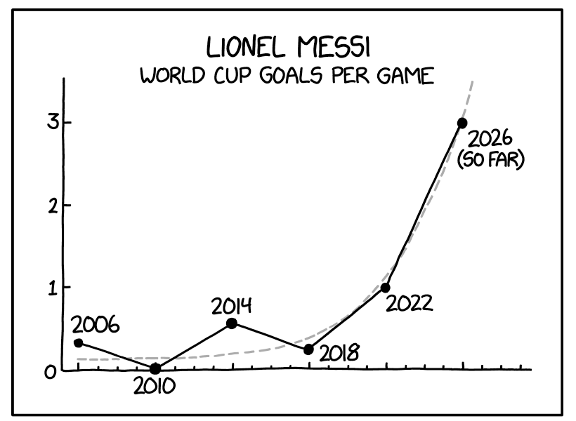
A Messi Hat Trick
Messi. Messy. Get it? The World Cup continues across North America, including in my own hometown of Philadelphia. Argentina has not played in the city, but even here in Philadelphia, you could hear of Lionel Messi’s scoring three goals—a hat trick—against Algeria a little more than a week ago. Messi, the famous Argentinian footballer, then…
-
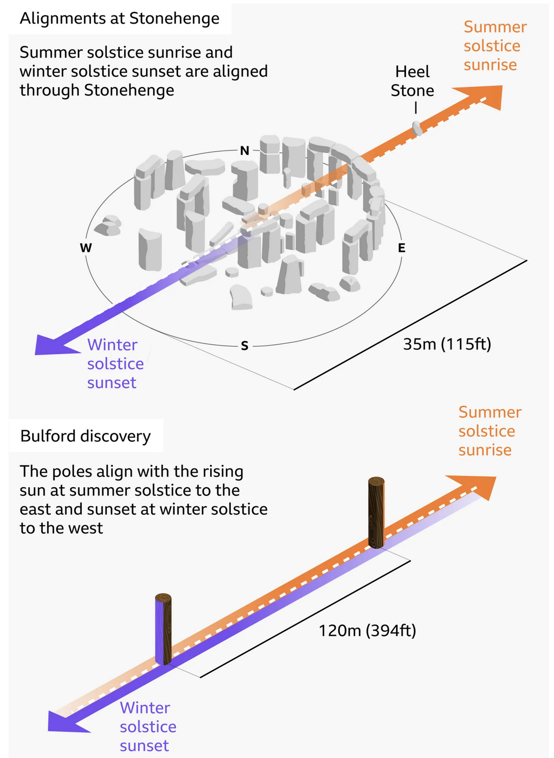
Stone Hard(ing)ly Beats Wood
At least in chronological dating. I debated posting this today or Monday, given that this weekend is a three-day holiday in the States, and that the selected graphic—in this case an illustration—explains the alignment of Stonehenge and—the focus of the BBC article wherein this graphic appears—a prehistoric, pre-Stonehenge, well, henge of wood posts only a…
-
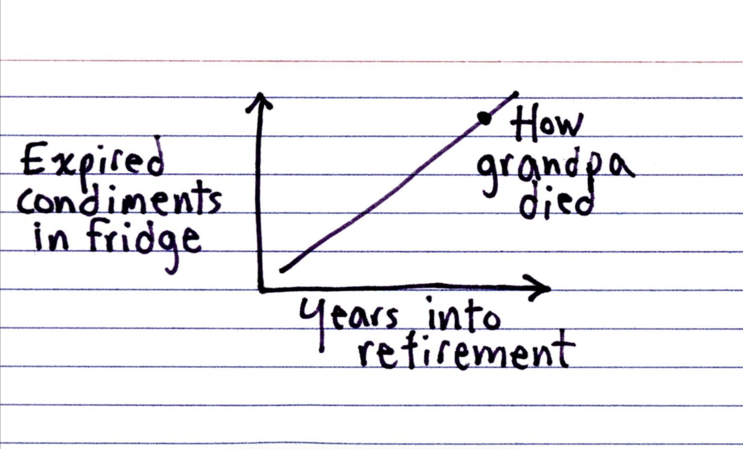
Colonel Mustard in the Refrigerator
Happy Friday, all. I have been eating a lot of leftovers and things scrounged up from fridges this past week, and being home today it shall likely be the same. But that does not mean you want to be looking into my refrigerator and seeing just what condiments I have available. Spoiler: (pun intended) it…
-

Keyholes to the Memory Holes
For those who have yet to read 1984, my favourite book by my favourite author, memory holes are what the government dump data and documents into to incinerate them and remove all record of their existence. Where is your proof that chocolate production is down this year? The government then points to fabricated replacement data…
-

Vexing Vexillology
Happy Friday, all. As a young child, I always loved flags. I collected international ones from random places in the US. I no longer collect them, but I still love their design and was fortunate to live in a city that has a good one: Chicago. (Philadelphia and Pennsylvania, sadly, do not have good flags.)…
-
Board of Modern Religious Architecture
Yesterday evening I received an e-mail about some of my work over on my Ganister website, where I try to capture, record, and preserve the history of the small quarry town in western Pennsylvania whence my grandfather came. The e-mail’s contents led me back to some old photographs I took from my trip to the…
-
The Long, Winding Road
At the beginning of the week I wrote about a table as a chart, for which I designed a light-duty interactive bar chart. Tables can be great, when used well, but they are not ideal for showing trends in data—hence the term data visualisation. But today is now Friday and we made it to the…
-
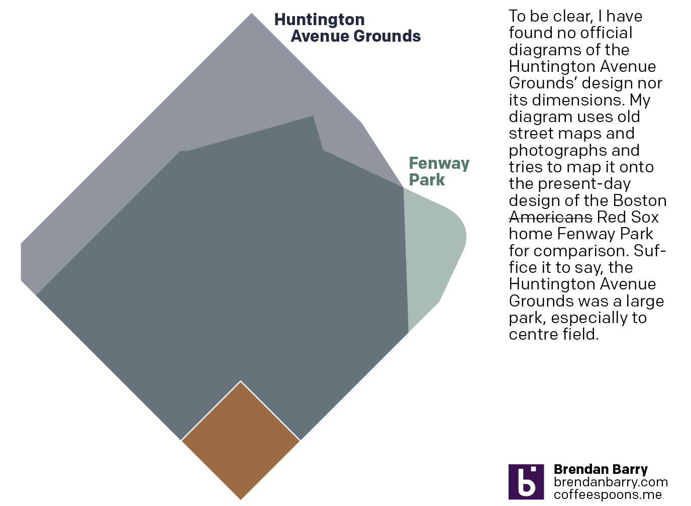
Back to Boston’s Beginning
And I don’t mean the city’s. No, 125 years ago today, the Boston Americans, later to be renamed the Boston Red Sox, played their first home game. Not at Fenway Park, mind you, but their original home—the Huntington Avenue Grounds. I decided to make a graphic comparing Huntington Avenue to Fenway, but could not find…
-

Just a Little Annoying
To be clear, this is a comment on a hero graphic—not an actual graphic representing data. Nevertheless, it does represent the borders of states within the United States. Most obviously, because there is not a giant state called Mosquita occupying the centre of the United States. (Fun fact: there is a Mosquito Coast located in…
-
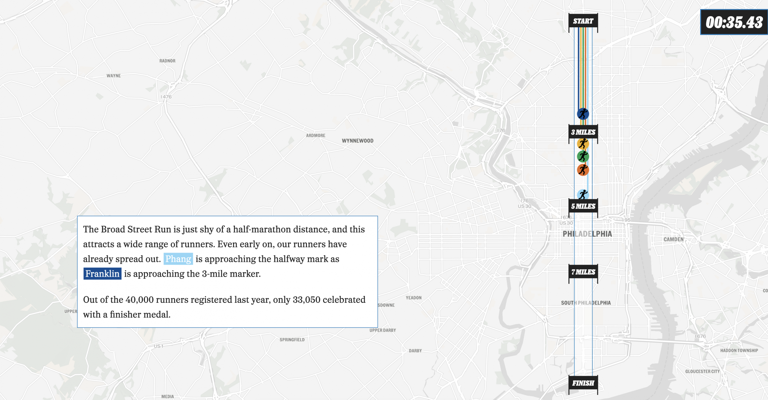
The Broad Street Run
This past weekend, Philadelphia hosted the Broad Street Run, a 10-mile run from the “top” of the city’s Broad Street in the north to the end at the bottom in the Navy Yard, a length of—you guessed it—10 miles. And congratulations to my sister for not just running it for the first time, but completing…