Category: Infographic
-
Bring on the Beantown Boys
For my longtime readers, you know that despite living in both Chicago and now Philadelphia, I am and have been since way back in 1999, a Boston Red Sox fan. And this week, the Carmine Hose make their biennial visit down I-95 to South Philadelphia. And I will be there in person to watch. This…
-
Bridging the Difference
When I was a wee lad, I entered the school science fair and made models of different types of bridges. Suspension, cantilever, &c. I saw this a little while back and bookmarked it. As I am trying to get back into the swing of publishing here on Coffee Spoons, it’s time to bring back the…
-

2025 Red Sox Draft Breakdown
Monday and Tuesday, Major League Baseball conducted its amateur player draft, wherein teams select American university and high school players. They have two weeks to sign them and assign them. (Though many will not actually play this year.) Two years ago the Red Sox installed Craig Breslow as their new chief baseball organisation. He has…
-
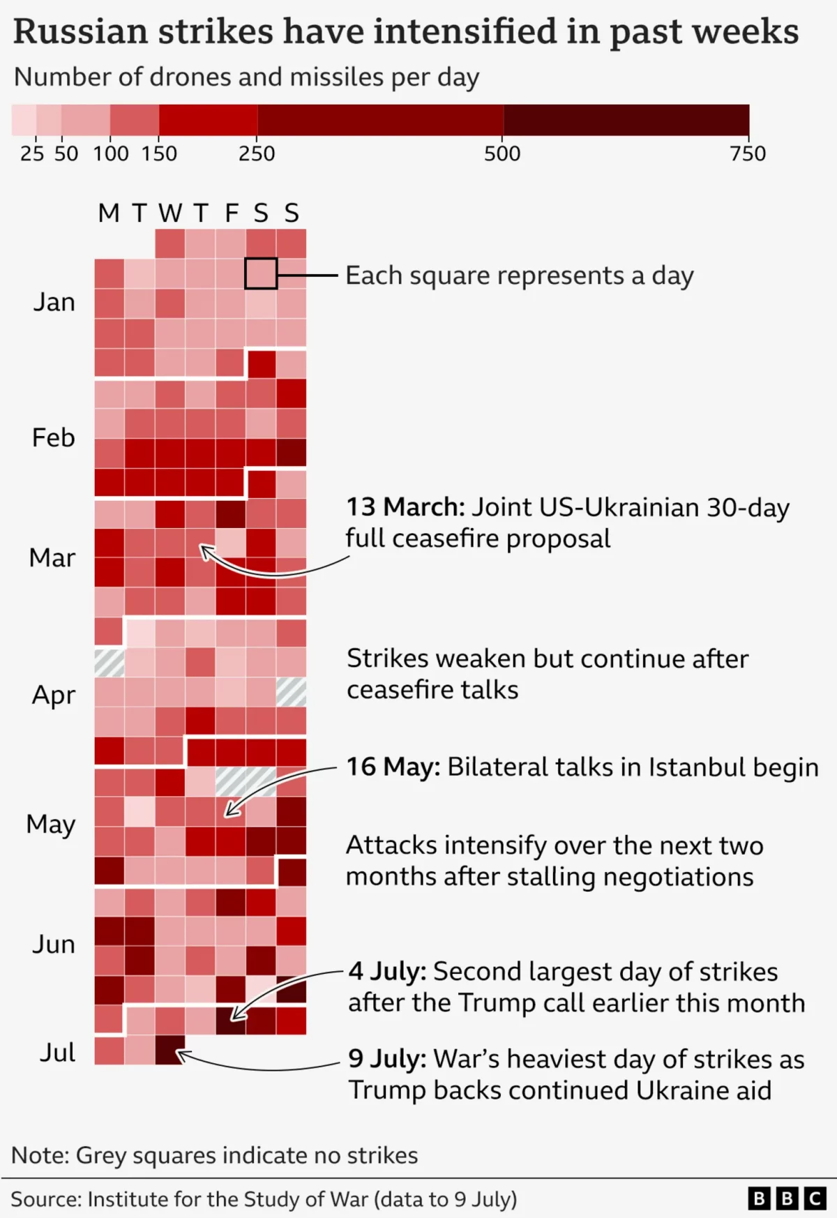
It’s Raining Drones
Last Friday the BBC published an article about the US’ resumption of supplying military assistance to Ukraine in its defence of Russia’s invasion. But in that article, the author referenced the increased intensity of Russian drone and missile strikes on Ukraine over that week. To show the intensity, the BBC included this graphic, which incorporates…
-
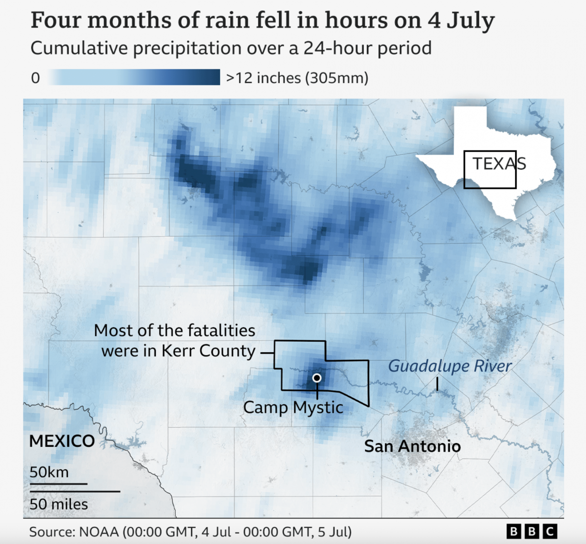
A Warming Climate Floods All Rivers
Last weekend, the United States’ 4th of July holiday weekend, the remnants of a tropical system inundated a central Texas river valley with months’ worth of rain in just a few short hours. The result? The tragic loss of over 100 lives (and authorities are still searching for missing people). Debate rages about why the…
-
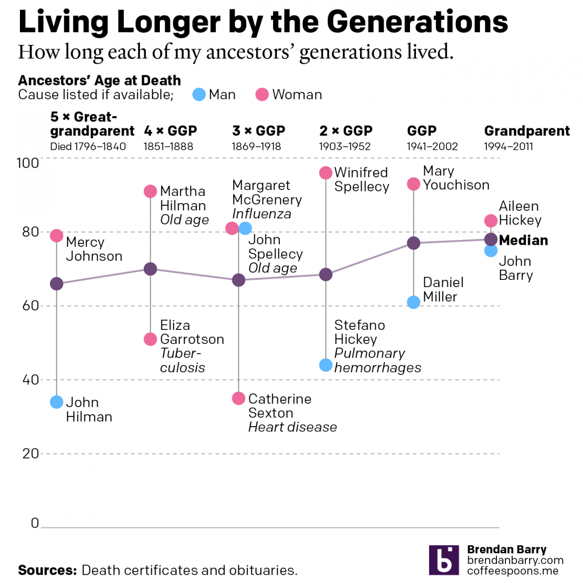
Living Longer by the Generations
Last weekend was Easter—for both the Catholics and the Orthodox—and I visited the Appalachian ancestral home of the Carpatho–Rusyn side of my family. Before leaving town I drove up to the old cemetery on a hill overlooking the old church and the Juniata River to pay my respects to those who came before me and…
-
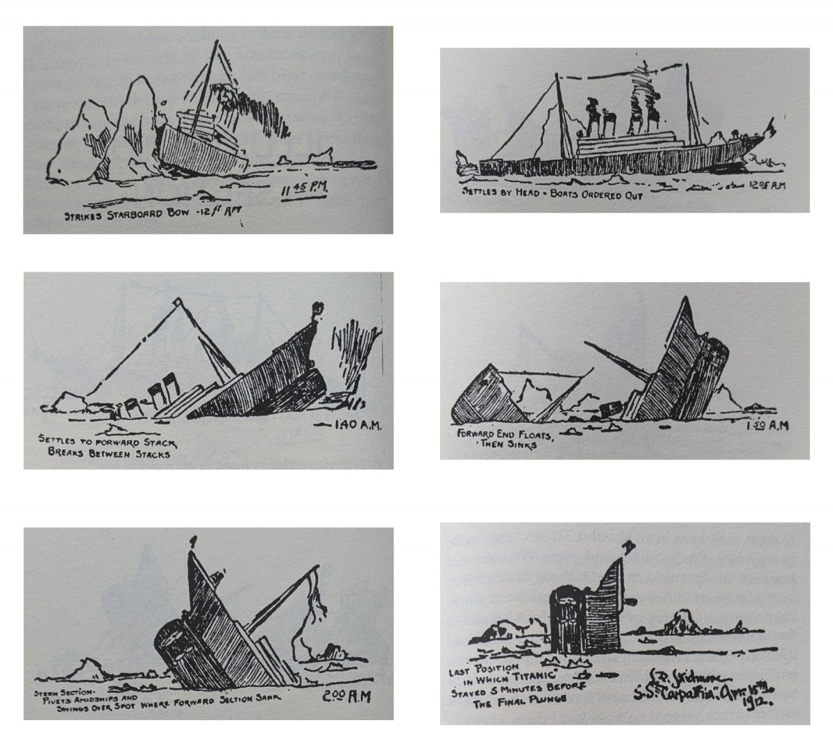
Illustrating the Sinking of RMS Titanic
After all the years of writing and publishing here on Coffeespoons, content centred on the sinking of RMS Titanic remains the most popular. And it was in the early hours of 15 April 1912 when she slipped beneath the surface of the North Atlantic. 700 people survived. 1500 people did not. Titanic’s sinking was the…
-

When Is a Torpedo Is Not a Torpedo?
When it’s a torpedo bat. Last week I looked at baseball’s new torpedo bats in a humourous light. But I did want to take a more serious look, because bat evolution has been part of the tale of baseball since its beginning. Back in the day bats featured long lengths and heavier weights. These days,…
-
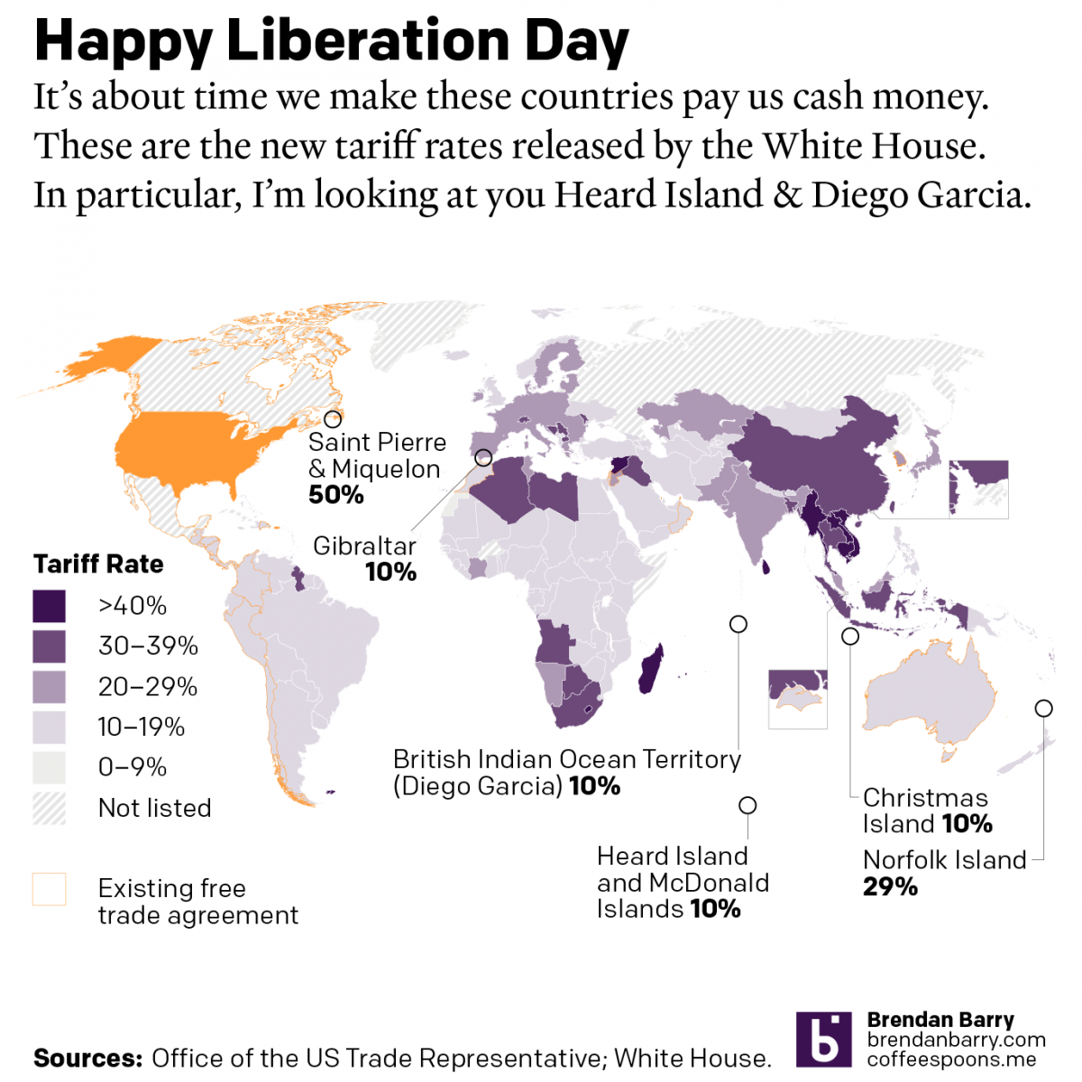
Happy Liberation Day
Yesterday I created a map detailing the new tariff rates released by President Trump on Wednesday. I was inspired by the curious inclusion of several small territories with almost no trade with the United States, and a few of whom are uninhabited. What follows is the graphic and the accompanying text I wrote as I…
-
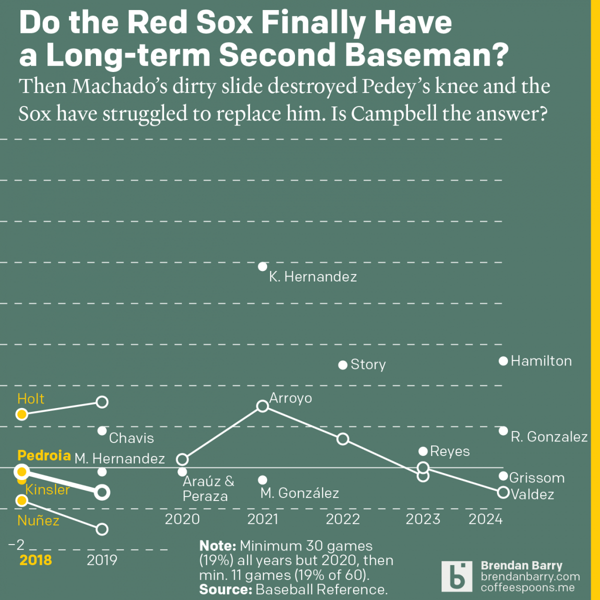
The Red Sox May Finally Have a Second Baseman
Last week was baseball’s opening day. And so on the socials I released my predictions for the season and then a look at the revolving door that has been the Red Sox and second base since 2017. Back in 2017 we were in the 11th year of Dustin Pedroia being the Sox’ star second baseman.…