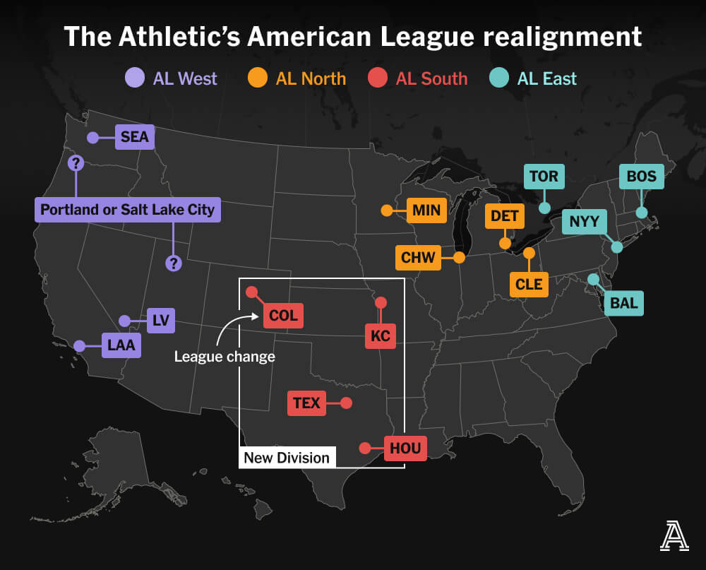
When Is a Torpedo Is Not a Torpedo?

When it’s a torpedo bat.

Last week I looked at baseball’s new torpedo bats in a humourous light. But I did want to take a more serious look, because bat evolution has been part of the tale of baseball since its beginning. Back in the day bats featured long lengths and heavier weights. These days, bats are in the mid-30 inch length and mid-30 ounce weight. Current regulations limit bats to 42 inches in length and a maximum diameter of 2.61 inches. 1 (There is some other stuff in there that is not terribly relevant to the torpedo bat.) And that’s it. Nothing about where the widest part of the bat need be nor the overall shape—merely a round, solid piece of wood.

The solid piece of wood is connected to corked bats. At my age I remember seeing the ESPN clips of Sammy Sosa’s corked bat in 2003 and the story of Albert Belle’s bat, stolen from the umpire’s room.

The torpedo bat, however, is not corked, instead it uses increased mass at the bat’s sweet spot, where it generates the greatest exit velocities when the batter hits the pitch. This graphic from ESPN shows how this works.

How a torpedo bat differs from the normal bat

Overall I like the graphic. The use of contrasting red and blue does a good job highlighting, particularly at the end where the normal bat continues with its edges running parallel as a regular cylinder. The torpedo bat changes into a cone with its top sliced off then rounded. I might have exaggerated the vertical dimensions of the bat illustration, but it still works.

Additionally, as I understand the design, it maximises the diameter of the bat to the aforementioned 2.61 inches. I have heard—but not confirmed—most bats do not reach the full diameter. If that is true, perhaps an illustration where the red lines fell below the maximum diameter of the torpedo bat could do a better job differentiating between the two shapes.

I prefer the above illustration to that produced by the Athletic/New York Times, which attempts a similar distinction.

New York Times version of the graphic.

I think ESPN’s overlay better shows the difference and that the Athletic’s wood pattern distracts from the graphic overall. Whereas ESPN uses the solid red vs. blue hatching to distinguish between the two shapes.

Of course that begets the question, why doesn’t every batter use the torpedo bat?

Suffice it to say, some players are better at hitting the ball consistently at the same spot on the bat. If a hitter can repeatedly make contact at a specific spot along the length of the bat, it makes sense to concentrate the mass of the bat at that spot for better hard contact. If, however, a hitter spreads his contact out along the length of the barrel, he probably wants a more evenly distributed mass to help create a better spread of good contact.

Regardless, as I wrote on Friday, the torpedo does not look like a torpedo. If anything, the normal baseball bat looks more like a torpedo than a torpedo bat.

Credit for the ESPN piece goes to ESPN’s graphics department.

Credit for the Athletic’s piece goes to Drew Jordan.

  1. https://mktg.mlbstatic.com/mlb/official-information/2025-official-baseball-rules.pdf ↩︎

Sankey Shows Starters Sticking with Sticky Stuff

I spent way more time trying to craft that title than I’d like to admit. Headline writing is not easy.

Quick little piece today about Sankey diagrams. I love them. You often see them described as flow diagrams—this piece is in the article we’ll get to shortly—but they are more of a subset within a flow diagram. What sets Sankeys apart is their use of proportional strokes or widths of the directional arrows to indicate share of movement.

The graphic in question comes from an article about Major League Baseball’s (MLB’s) problem with “sticky stuff”. For the unfamiliar, sticky stuff is a broad term for foreign substances pitchers put on their fingers to provide better grip on the baseball. A better grip makes it easier to create movement like sliding and sinking in a pitch there therefore makes it harder for a hitter to hit it. Back when I was a wannabe pitcher, it was spitballs and scuff balls. Now professionals use things like Spider Tack. These are substances that allow you to put the ball in the palm of your hand, then turn your hand over to face the ground and not have the ball fall out of your hand.

So the graphic looks at starting pitchers and how their spin rate, the quantifiable measure impacted by sticky stuff, of their fastballs has changed since MLB instituted a ban on sticky stuff. (It had actually long been in place, see spitballs for example, but had rarely been enforced.)

Showing a small number of pitchers have managed to increased their fastball spin rates

This graphic explores how 223 pitchers saw their spin rates change in the first two months after the change in policy was announced to the nearly month after that period.

Sankeys use proportional width not just to show movement from category to category but the important element of what share of which category moves to which category. For example, we can see a little less than half of starting pitchers saw their spin rates stay the same after the policy change and another almost equal group saw their spin rates decrease. That’s probably a sign they were using sticky stuff and stopped lest they get caught.

But we can then see of that group, maybe 1/6 then saw their spin rates increase again over the last month. That could be a sign that they have found a way to evade the ban. Though it could also be they’ve found new ways of gripping or throwing the baseball. Spin rate alone does not prove sticky stuff usage.

Similarly, we can see that in the group that maintained their spin rate, a small group has found a way to increase it. Finally, a small fraction of the original 223 saw their spin rates increase and a fraction of that group has seen their spin rates increase even further.

This was just a really nice graphic to see in an article from the Athletic about sticky stuff and its potential return.

Credit for the piece goes to Max Bay.