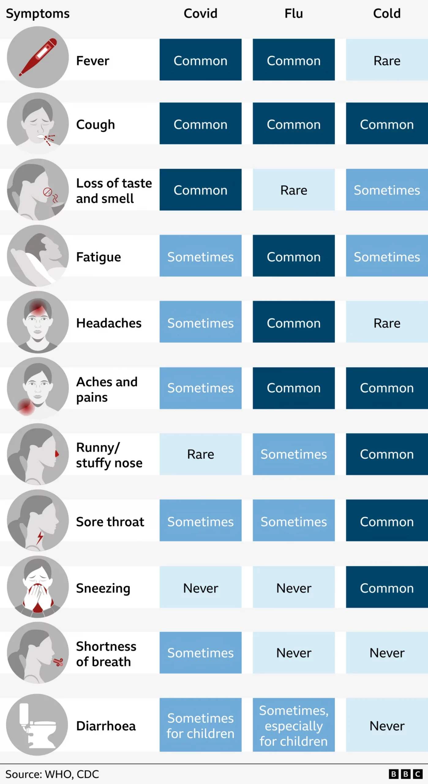
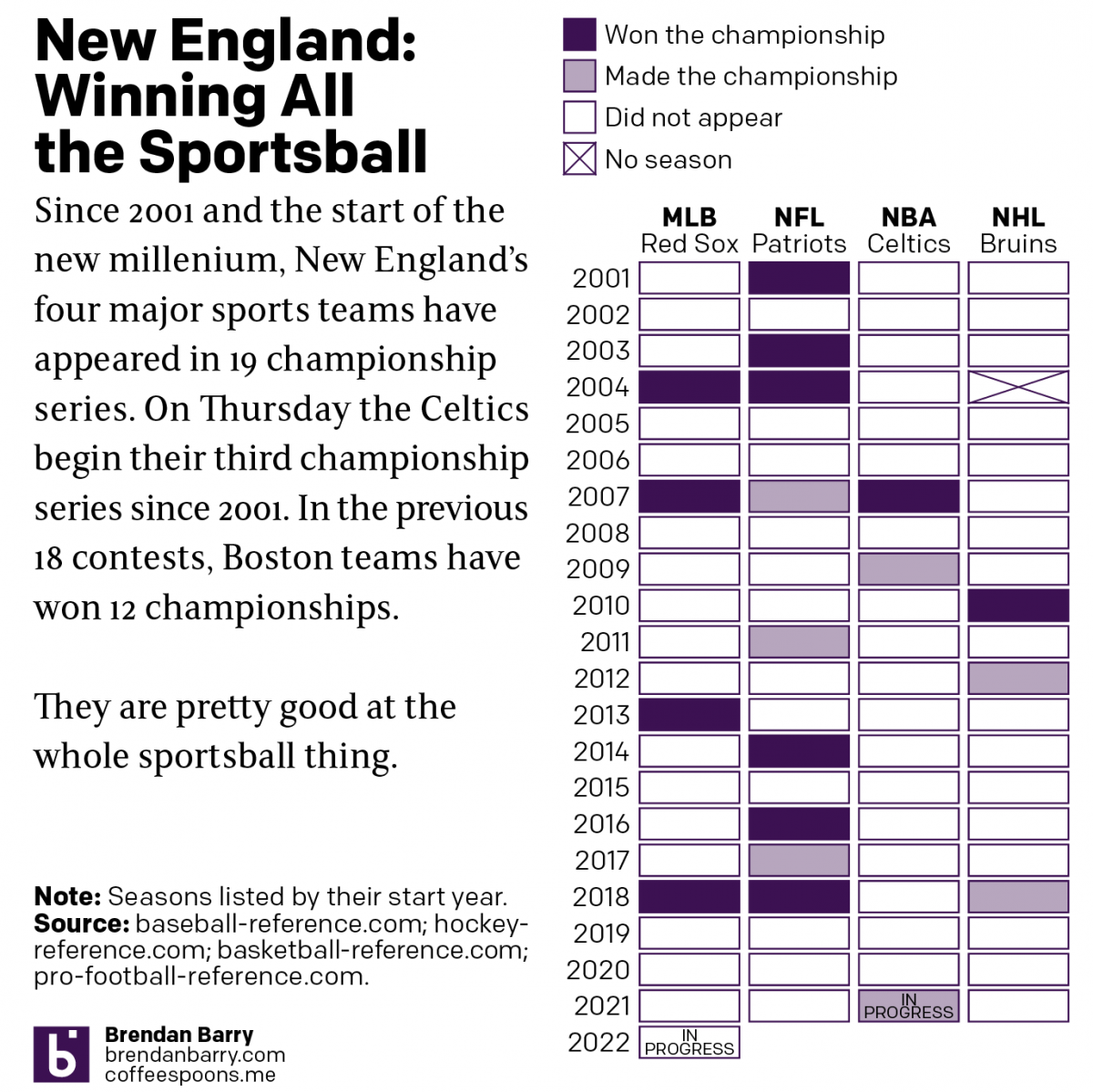
Boston: Sportstown of the 21st Century

Tonight the Boston Celtics play in Game 1 of the NBA Finals against the Golden State Warriors, one of the most dominant NBA teams over the last several years. But since the start of the new century and the new millennium, more broadly Boston’s four major sports teams have dominated the championship series of those sports. In fact tonight marks the 19th championship series a New England team has played since 2001. And in those 18 series thus far, Boston teams have a 12–6 record.

Let’s go Celtics.

Of the 12 titles won, the New England Patriots account for half with six Super Bowl victories out of nine appearances. The Boston Red Sox have won all four World Series they have played in since 2001. Rounding out the list, the Celtics and Bruins have each won a single championship with the Bruins appearing in three Stanley Cups and the Celtics in two NBA Finals. Tonight begins their third.

Credit for the piece is mine.

Sugary Sweet Donut Charts

I know, I know. You probably expect some sort of climate post given the whole Paris thing. But instead, this morning I came across an article where the supporting chart failed to tell the story. So today we redesign it.

The BBC has an article about MPs backing a tax on sugary drinks. Within the text is a graphic showing the relative importance of sugary drinks in the sugar consumption of various demographics. Except the first thing I see is alcohol—not the focus of the article. Then I focus on a series of numbers spinning around donuts, which are obviously sugary and bad. Eventually I connect the bright yellow to soda. Alas, bright yellow is a very light colour and fails to hold its own on the page. It falls behind everything but milk products.

The BBC likes sugary donuts

So here is 15 minutes spent on a new version. Gone are the donuts, replaced by a heat map. I kept the sort of the legend for my vertical because it placed soda at the top. I ran the demographic types horizontally. The big difference here is that I am immediately drawn to the top of the chart. So yeah, soda is a problem. But so are cakes and jams, you British senior citizens. Importantly, I am less drawn to alcohol, which in terms of sugars, is not a concern.

My version of sugar is so much sweeter

Credit for the original goes to the BBC graphics department. The other one is mine.

Cycling Deaths in Australia

Cycling can be quite dangerous. But apparently this summer was quite dangerous over in Australia. So much so that the Guardian did some data reporting on it back in June. Thankfully they included some charts in that reporting, the heat map below being one example.

Cyclist fatalities
Cyclist fatalities

None of the data visualisation in the piece is revolutionary or earth-shattering, but it is a solid piece with some solid charts backing up an interesting story.

Credit for the piece goes to Nick Evershed.

Bad Film February

Did you go to the cinema in February? Well, according to some research done by Slate, what you watched probably sucked. I’m just glad I never went last month. Maybe March will be a little bit better.

Bad films seem to define February

Credit for the piece goes to Chris Kirk and Kim Thompson.

Peyton Manning is a Pretty Good Quarterback

On Sunday night the Denver Broncos played the New England Patriots. The contest sported two of the game’s best quarterbacks: Tom Brady and Peyton Manning. This interactive graphic by the Guardian detailed how, in this season alone, Manning is putting up record numbers.

Comparing Manning's stats
Comparing Manning’s stats

Credit for the graphic goes to the Guardian US interactive team.

When it Rains…

Today’s interactive piece comes from Axis Philly and it looks at the total amount of rainfall in Philadelphia (1990–2013) to find both which months and what time of day receive the most rainfall.

When it rains…
When it rains…

As it turns out, evenings in the summer months receive the most rainfall. And since 1990, the most rain has fallen between 19.00 and 20.00 in July. A nice complementary piece would have been a small graphic showing total distribution of rain over the months, without segregating the data into hourly chunks. But again, that would have been a nice complement to the piece as it is far from necessary.

Credit for the piece goes to Jeff Frankl, Casey Thomas, and Julia Bergman.

Where in the World is the Secretary of State?

On Friday Hillary Clinton steps down as Secretary of State to (likely) be replaced by John Kerry whose confirmation votes will (likely) be later this week. One of the big roles for the Secretary of State is to travel abroad and represent the United States. If secretaries go where the US needs to be represented, that would imply that some states are more important for foreign visits. So has there been a shift in priorities in recent years?

In this interactive piece the Washington Post looks at where James Baker, Warren Christopher, Madeline Albright, Colin Powell, Condoleeza Rice, and Hillary Clinton visited during their tenure at Foggy Bottom. The screen shots below only show the maps—there are very useful tables for finding data on trips to specific countries—for Baker and Clinton and comparing the two. The shift from the European/Cold War mentality is quite pronounced.

James Baker's trips abroad

Hillary Clinton's trips abroad

Credit for the piece goes to Emily Chow and Glenn Kessler.

Having Your (Presidential Birthday) Cake and Eating It Too

Presidents’ Day originally celebrated the birthday of George Washington, the first president of the United States. (Though, one could get crazy and say it was actually Samuel Huntington, but I fear I would digress.) Now technically the holiday still does celebrate Washington as the official name of the federal holiday is Washington’s Birthday, but by and large we group folks like Lincoln in there too.

Regardless of who exactly is remembered, we remember a United States of the 18th and 19th centuries. And thus it seems appropriate to share a piece from Charles Blow over at the New York Times.

United States' Ranking

The information graphic is a heat chart of various rankings and index numbers that compare the United States across various metrics to the rest of the world’s “advanced economies”, as decided by the IMF. I certainly have some issues with a few of the metrics, for example what exactly does Gallup mean by percentage of people thriving? And are the math and science scales out of 600 total points? I presume as much but cannot be certain. These could have briefly explained in the footer, or similar to how the food insecurity metric is handled—though I suspect that would be too much from an aesthetic standpoint. The use of drop shadows, from a design perspective, I disagree with; the dark crimson should surely be enough distinction to stand alone. And for completeness, I would have included what appears to be the beigish middle ground between the best and the worst in the scale at the top of the piece.

As to the story the piece supports, I leave that for the audience to decide. Is the United States of the President Obama/Bush as great as that of President Washington/Adams?